Table of Contents
Design
Design Overview
Website
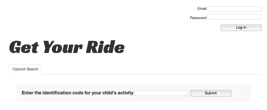
Our web app consists of an interface with 6 tabs: Carpool Search, Next Date, Swap Dates, My Full Schedule, My Carpools, and Pending Groups.
When the user first visits Get Your Ride, they see only the Carpool Search tab with a search box that asks for the ID code of their child's activity that they should have received from the instructor.
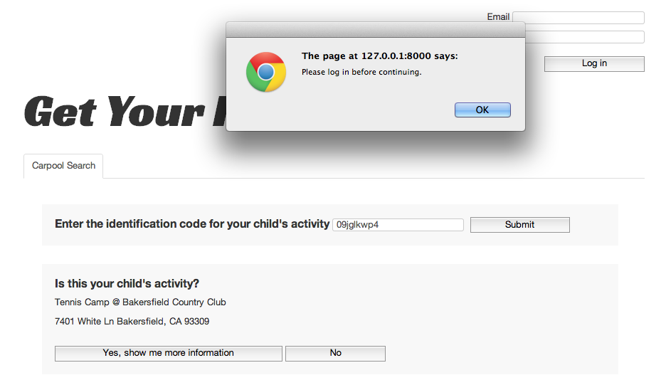
Entering the ID code correctly will then display a section underneath with details of the activity that asks the user to confirm if the activity is the one that they were searching for. If the user clicks "Yes, show me more information," an alert will pop up that asks the user to log in to continue.
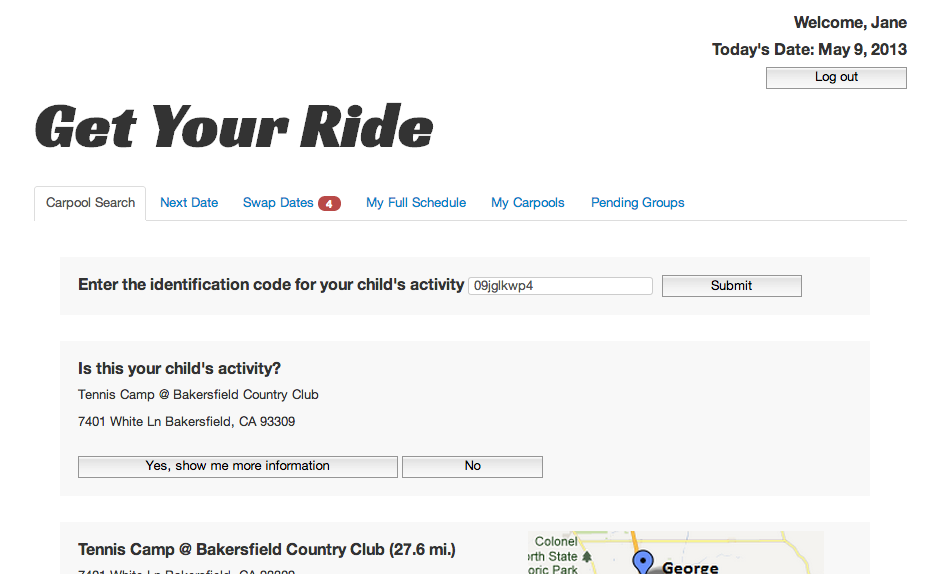
After logging in, the rest of the 5 tabs appear for the user, and the next portion of the form is loaded, which shows the user a list of other parents interested in carpooling for the activity, sorted by the distance of their home from the user's home.
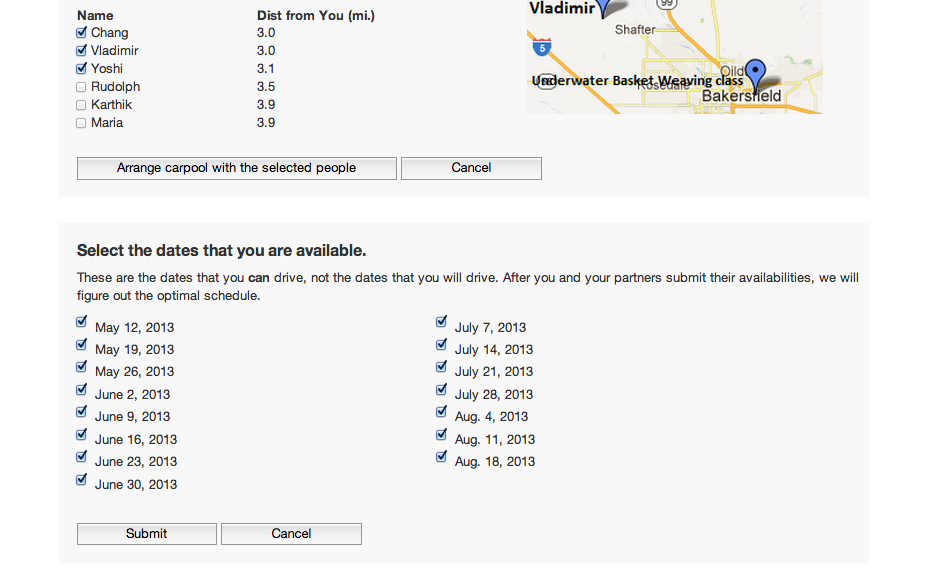
The user can proceed to fill out the rest of the carpool search form, choosing people they would prefer to carpool with and dates that they are available to drive. Subsequent sections only display after the user has filled in the previous parts.
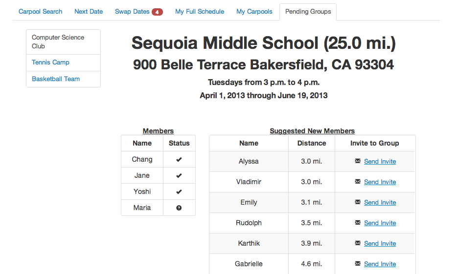
Successfully filling out the carpool search form will cause the activity to show up under the Pending Groups tab, which allows the user to keep track of all their groups that do not yet have 4 confirmed members.
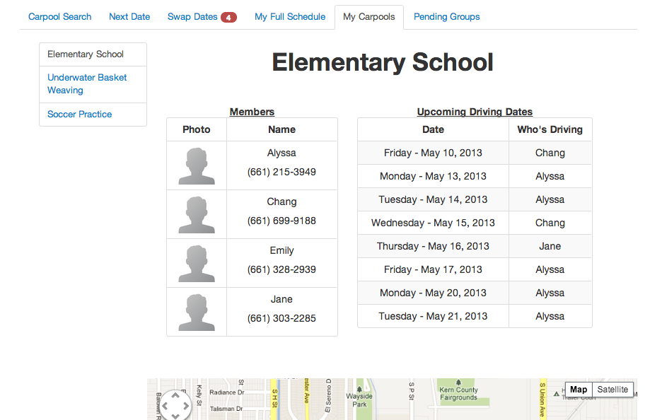
The user can keep track of their active carpools under the My Carpools tab, which keeps track of the list of parents with contact information, the list of dates, and the map and directions for each carpool.
The Next Dates tab shows the time, date, and carpool of the next drive for which the user is responsible. The tab also displays the map and directions for the carpool that the user is driving for. There is a button below the map that allows the user to print a printable version of the map and directions.
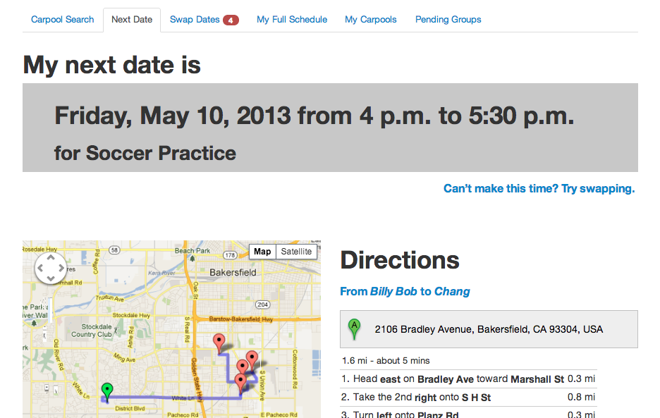
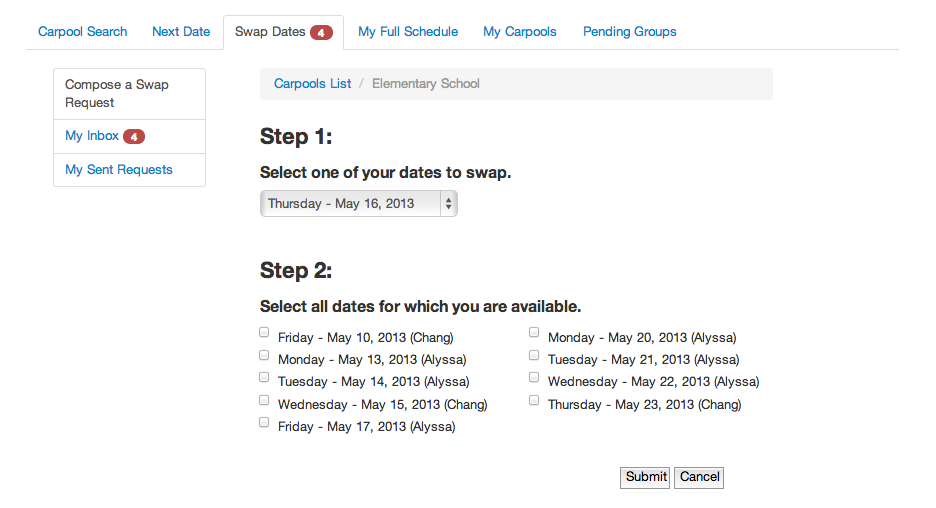
If the user cannot make the date, they can click the link that says "Can't make this time? Try swapping," which would link them to compose a swap request under the Swap Dates tab.
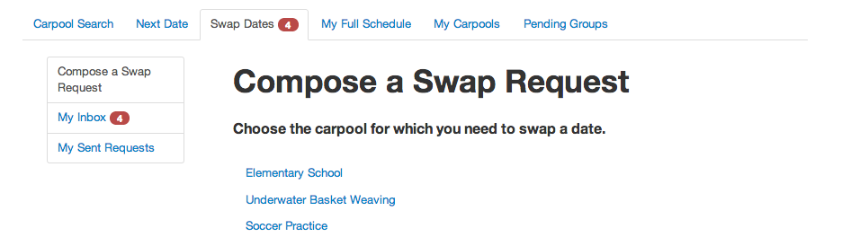
Clicking on one of the groups causes the swap request form to display, which allows the user to switch their date with another member of the carpool. In the form, they must specify one of their dates for which they cannot drive as well as all the dates that they can drive.
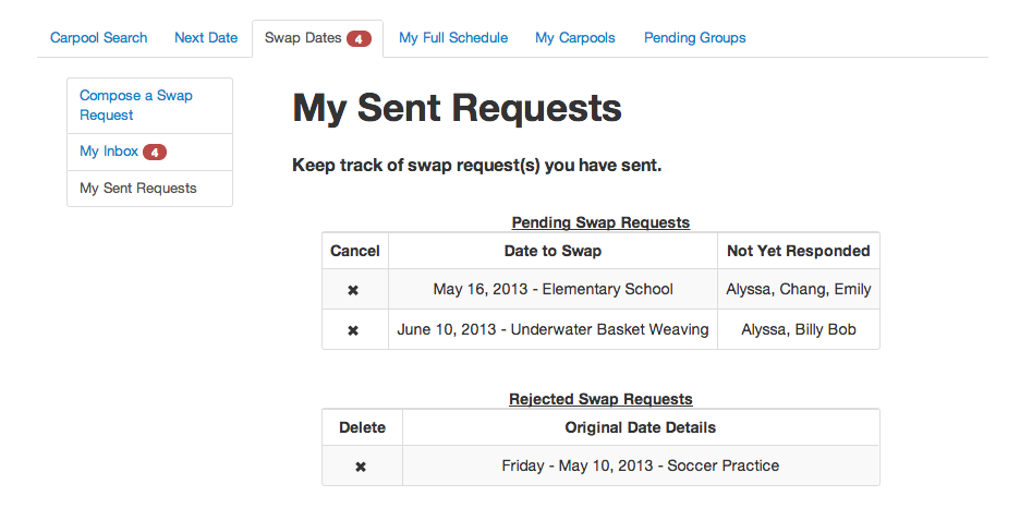
After submitting the form, the user can then keep track of their outgoing swap requests by clicking on "My Sent Requests." The interface allows the user to cancel the request if they no longer need to swap.
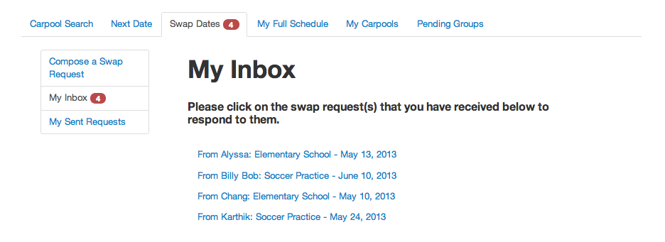
The red notification besides "My Inbox" indicates that the user has received swap requests from other users that they should respond to. Clicking on it causes the list of received swap requests to load, each one indicating the sender, the carpool, and the date.
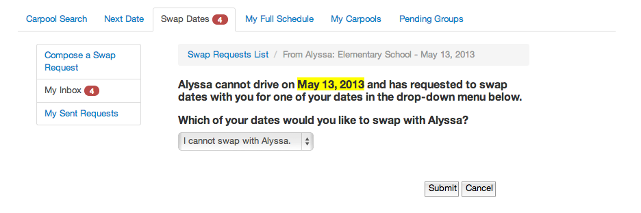
Clicking on a request will display a form that allows the user to either decline the request or choose one of their dates that they can agree to swap with the sender.
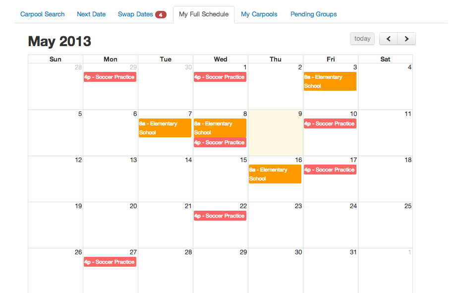
If the user wishes to consult his calendar before making a decision, he can click on the My Full Schedule tab, which displays all of the dates across all of his carpools for which he is currently responsible driving.
#Mobile App
The main purpose of our mobile app is to allow users to enable ride tracking, which gives parents at home the opportunity to see where their kids are on the drive home. It is not intended to be a mobile version of our website.
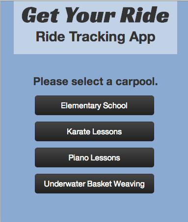
The home screen of the mobile app displays a list of the user's active carpools.
Selecting one of the carpools leads to a screen with 3 options: Enable Ride Tracking, Get Contacts, and Get Map and Directions. To enable ride tracking, the user should press the Enable Ride Tracking button.
![]()
Design Decisions
Prototyping
- Users were concerned with safety, something that we had egregiously failed to address in the carpool search portion of our paper prototype. While originally users could search for any carpool and look up potential carpooling partners' addresses without even logging in, the current version of our site requires the user to input an ID code (that they should have received from the activity instructor) in order to search for their activity. In addition, users cannot view other users until they have logged in.
- Our original interface for swapping dates, which was merged with the My Carpools tab, was very confusing for users because it lacked explanation and was not intuitive. To fix this, we decided to move the swapping interface under its own separate tab because 1) we predicted that it would be a commonly used feature, and 2) if it had its own tab, we would have more space to briefly provide instructions.
- The original form for sending swap requests did not include the names of the other users with whom the user would be swapping because we did not think that information would be relevant. However, most test users indicated that they were interested in knowing who they would be swapping with, so we decided to change our form to include this.
- The original form for accepting swap requests was inefficient because it involved multiple steps, which were somewhat redundant with each other. We decided to condense the form into a single step.
- For the web app overall, we noticed that the ordering of the tabs from left to right was important; users stopped scanning once they thought they had found what they wanted, failing to realize that we had included shortcut tabs further to the right. We decided to reorder the tabs so that shortcut tabs, such as Next Date and Swap Dates, would be located further to the left and thus appear more immediately obvious to the user.
- In the paper prototype of our mobile app, the option to enable ride tracking was confusing for users. The original wording on the button was "Track Ride," which didn't make sense because users couldn't understand why they would want to track their own ride. To fix this, we changed the wording to "Enable Ride Tracking."
Heuristic Evaluation
- For the Next Dates tab, one of our evaluators suggested that we remove the Confirm Date button and change the Swap Times button to a link that said, "Can't make this time? Try swapping." We agreed with this suggestion because we predicted that a lot of parents would forget to confirm, which would only lead to confusion; we agreed that changing the button for Swap Times was a good idea for the sake of external consistency with other web apps.
- One of our evaluators pointed out the safety concern of not being able to see outgoing swap requests. They also complained that the interface was not as intuitive as it could be. We decided to redesign the Swap Dates tab to closely resemble Gmail's interface, so it would be more intuitive for users by taking advantage of external consistency. Users can now keep track of outgoing requests by viewing My Sent Requests.
- Both evaluators pointed out efficiency problems with not being able to easily access the user's full schedule. We decided to add a separate tab for this, My Full Schedule, so that the user would be able to find their calendar easily.
- For the mobile app, one of our evaluators suggested that we add more functionality to the mobile app so that it would more closely resemble the web app. We realized that they had not understood that the intended purpose of the web app was merely to allow users to enable ride tracking. We changed the title of the mobile app to "Ride Tracking App" in order to make this more obvious.
- In studio, a classmate pointed out that the home screen for our mobile app looked identical to the screens for the carpools; the only difference was the text on the buttons. We decided to invert the background colors for the carpool screens in order to establish a contrast.
User Testing
- One of our test users suggested that we put the keyboard focus on the email input field for logging in, which we implemented in GR5.
- A test user tried to submit inputs using the enter key, but nothing happened, so they had to use the mouse instead. We decided to allow input submissions using the enter key for our final implementation.
- Another one of our test users suggested differentiating map pins with color. Our final implementation uses red markers for the locations of the parents' homes and a green marker for the location of the activity.
- There was some confusion over the way the tasks were worded, so we rephrased them.
- Note: At the time, there were still many bugs with functionality that inhibited user testing.
Implementation
Implementation Overview
Both our web app and mobile app were implemented with HTML, CSS, JavaScript, and jQuery on the front end; we also used Twitter Bootstrap to make our design look more clean and professional. For the back end of the web app, we used Python because the majority of the team had substantial experience programming in Python; we chose to use the Django web framework because it is widely considered to be the most popular web framework for Python, and we thought it would be a useful learning experience. We opted not to implement a back end for our mobile app because we knew we would not need it in our tasks for user testing. For version control, we chose Git because most of the team had some experience with it, and it did not have a steep learning curve like other version control systems such SVN. We deployed our app with an MIT scripts account because it would be easier to set up and would also be free of charge.
We used Django to create our SQL database, which we used to keep track of information for users and carpools, amongst other relevant data. We then used the Django template language in our HTML file in order to display the data we pulled from the database for each user. The calendar was implemented with FullCalendar, a jQuery plugin by Adam Shaw. For displaying the maps and directions for each carpool, we used the Google Maps API.
Implementation Problems
Our form submissions don’t work. We had realized that we would need to use AJAX to prevent page refreshes upon form submission. We had made significant progress towards implementing this; however, we discovered that pursuing the AJAX route would require us to rewrite all of our Django template code to HTTP Requests. As the deadline was quickly approaching, we did not have time to do this. Instead, we opted to make our front end function as though user’s actions had succeeded despite the changes not showing in the back end. This temporary, hacky solution could potentially cause confusion in user testing should the test user decide to logout and then log back in because their actions were not saved in the back end.
Evaluation
Users
User A
- User A is a friend of one of our team members. He is a parent.
User B
- User B is a parent and graduate student at MIT. User B is friend of a friend of one of our team members and is a parent interested in carpooling in the future.
User C
- User C is a parent of two children ages six and eight. She is in her mid twenties and interested in carpooling as her children age into activities that require it.
Briefing
Thank you for volunteering to test our prototype for 6.813/6.831 User Interface Design. Our website is a tool designed for parents of school-aged children to coordinate carpooling for school and after-school activities. Our goal is to create an easy-to-use interface that makes it easy to set up carpools, helps users keep track of commitments, allows for scheduling flexibility, and ensures the safety of the children.
Scenario and Tasks
We have created three roles in which you will play the parts of various parents participating in a carpool.
First Role
Your name is Jane, you have a son, Bob, who has signed up for Tennis Camp, and you want to carpool with other parents. The coach introduced all the parents to Get Your Ride when you signed up for camp and provided you with the following ID code: "09jglkwp4".
- Task 1: Log in to Get Your Ride; your email address is "jane@gmail.com", and your password is "enaj". Join the carpool for your son’s activity and send invites to Chang, Vladimir, and Yoshi.
You have a feeling your turn to drive is coming up, but you aren’t quite sure when.
- Task 2: Get the next date and map for your next drive.
A few weeks later, you realize that you cannot drive on one of your dates for the Underwater Basket Weaving carpool.
- Task 3: Swap one of your dates for a new one.
Second Role
Your name is Billy Bob, one of the other parents in Jane’s Underwater Basket Weaving carpool. Your email address is "billybob@gmail.com", and your password is "bobyllib". Jane has proposed to swap dates with you, and you need to accept her proposal to complete the swap.
- Task 4: Agree to swap dates with Jane.
Third Role
Your name is Alyssa, another one of the other parents in Jane’s Underwater Basket Weaving carpool. It is your turn to pick up the kids, but the other parents want to know that their kids are safe. Luckily, we have a mechanism for letting them keep track of where you are on the pickup route.
- Task 5: Use the mobile app to allow the other parents to track your drive.
Usability Problems
User did not know whether to log in or search a class ID
- Severity: Medium
- Heuristic: Efficiency
- Problem: The user did not know whether or not he should log in first or enter the class ID
- Solution: Remove search option before logging in
User felt the maps for carpool search was unhelpful
- Severity: Medium
- Heuristic: Learnability
- Problem: The user did not understand what users corresponded to markers on the map
- Solution: Add users names on the map and have links from a name to the marker on the map
User are not noticing the next Carpool Search panel
- Severity: Major
- Heuristic: Learnability
- Problem: The user did not notice that the next panel appears after clicking the appropriate buttons.
- Solution: Have the focus change the new panel when it appears.
Maps are grabbing the scroll function
- Severity: Minor
- Heuristic: Consistency, Track state (i.e., mode)
- Problem: As the user scrolled around the page using the mouse wheel, if the mouse crossed a map, the page would stop scrolling and the map would zoom in and out.
- Solution: Turn off the functionality that allows the user to zoom using the scroll wheel. Instead, let them change the zoom by clicking on the appropriate buttons in the map.
The time of a given class is not displayed
- Severity: Minor
- Heuristic: Anticipation
- Problem: If the user is curious when a certain event meets for which he or she is signed up, no tab on our site shows him or her the time.
- Solution: Add the timings of each event to the My Carpools tab.
A stronger confirmation is needed on the Swap Dates tab
- Severity: Major
- Heuristic: Feedback
- Problem: After swapping dates with someone, the user does not get a message summarizing his or her new date.
- Solution: Add a stronger confirmation message.
Popup confirmations are too obtrusive and easily ignored.
- Severity: Major
- Heuristic: Efficiency, Safety
- Problem: The user ignored popup confirmations.
- Solution: Use in-page confirmations that fade away automatically.
User cancelled further popup confirmations and lost direct feedback on submitting swap requests
- Severity: Major
- Heuristic: Learnability
- Problem: The user was unsure if his swap request was submitted.
- Solution: Use in-page confirmations that fade away automatically.
Using browser "back" causes a user to logout
- Severity: Major
- Heuristic: Safety
- Problem: When a user uses a browser back button when filling out a form, they are logged out losing their work.
- Solution: Override the browser's default back functionality to traverse our breadcrumbs or panes
Accordion labels are not obvious
- Severity: Minor
- Heuristic: Learnability
- Problem: The "From ___ to ___" label for our direction accordion is not tied closely enough to their corresponding directions
- Solution: Box and highlight each label when it is selected.
Reflection
Early Stages
- Overall, we think that paper prototyping is very effective, especially since most people don’t think to do it in this high-tech day and age.
- One thing we noticed was that we took safety into consideration early on. However, when we were developing the paper prototype, our designed emphasized efficiency; as young people without children, we had a preference for efficient designs. It was only after user testing on the paper prototype that we realized how important safety was.
- We learned that it is really important to understand our user class because that defines what they want. It sometimes takes multiple iterations to get usability right. It took three iterations of scrapping what we did in order to make the Swap Dates and Full Schedule features intuitive for users.
Back End Implementation
- Regarding implementing the backend, we should have branched the code just before we started implementing with Django. That would have allowed us to scrap our implementation and start over without wasting the front-end HTML and CSS that was fine.
- We also think it would have been better to design the data model first before integrating that into our front end code, so that we could take variable names into consideration when writing the HTML.
- In general, we did not fully take advantage of Git as a consequence of inexperience. We learned at the end that when implementing a feature, it is best to create multiple branches, finish implementing individual features, and then merge them with the main branch. Because all of our changes were located in the main branch, whenever we reverted the code, we lost a lot of other useful changes as well.
Overall
- As a group, we benefited strongly from user testing results because we discussed them together and bounced ideas off each other. We assessed the results from user testing as a group to distill what we felt should be implemented. Thus, we left such meetings with an actionable list of improvement ideas.
- We chose not to prototype certain features that would not come up in user testing. For example, our the prototype for our mobile app lacked breadth. We did not prototype the Get Contacts or Get Maps and Directions features because the main focus of our mobile app was the Enable Ride Tracking feature. We also did not include a backend (i.e. actually using a GPS system) because we knew that the test user would only interact with the front end.