General Guidelines
Field Spacing – Element widths
- For form-like applications (like HSA, below) where users enter a series of data and then hit submit/save, keep a consistent vertical line between the label fields and the input/value fields, or “left edge”.
- It is often desirable to have the “right edge” also line up consistently but this more of a design choice and may vary from project to project, or within different sections of the screen, without jeopardizing the overall consistency of SAP web applications. This is mostly desirable for display information/ready only fields. Editable fields that have a fixed length (e.g. 2 character state code) should be left at their original length so users aren’t confused about how much data they can input on a given field.
- Consistent spacing can be achieved by creating several global variables, e.g. “Label-width”, “Field-width”, and “Table-width”, then assigning those variables to the “width” property of the Cells and UI elements in the first row of page / page section. (** sometimes content of UI elements can still push the right edge, must test)
- When setting the value of those global width variables, it is preferable to use relative field widths, e.g. “em” or “ex”. Pixel counts can be used also but may cause problem in cases of extreme zooming.
- SAP's SDN recommends the use of “ex” over “em”… need to validate.
- Use Matrix layout type over Grid layout alternative.
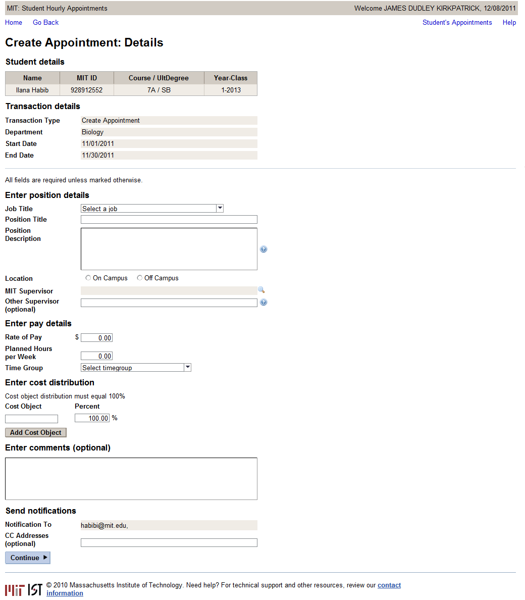
Hourly Student Appointment (HSA) Example:
For form layouts applications like Hourly Student Appointment, fixed width values works best.
1. Made all label widths: 150px
2. Changed the CellDesign of the Labels and the containers with the $ sign under the Pay Detail section to be lrNoPad. When working with the fixed width UI elements, having containers and elments add extra left or right padding results in things not lining up properly. Dont use paddless however – then you lose your vertical spacing between lines.
3. Changed the width of all free text / display / entry elements to 350px.
4. Changed the width of the table and comments box to 500px (150px + 350px)
5. Because of the fact that you are using a CellDesign for the shaded TextViews, it seems that these will not line up with the rest of the UI elements since I assume the cell is always a couple of pixels bigger than the UI element – I made the cell widths for TextViews about 5 pixels narrower than the UI elements. Screenshot below shows three UI elements with equal width, but displaying differently:

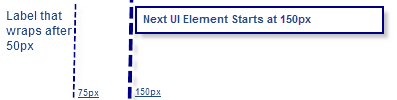
The most important thing is that when using Matrix Layout, you can control a lot by using the width of the cell as well as the ui element. For example: If you make a cell's with 150px, and the ui element width (e.g label with wrapping switched on) 75px, the result is this:
Screen capture of Hourly Student Appointment: