Design
- Our sited rested heavily on the assumption that a skeuomorphic design would make the execution of this task using a web platform feel more natural for users. Our aesthetic was designed to mimic a student's desk and a corkboard with post-it notes attached.
- During paper prototyping we noticed that our test subjects struggled with knowing from where they could pick up and where they could drop the class icons on the screen. In response to this we used texture to communicate the distinction between the schedule region and the desk region. That is, the area where the user can drop courses is mounted on cork (also a skeuomorphic choice) and the region from which they pick up courses is on wood.


- For the course icons we chose a shape that was reminiscent of a time slot on a schedule.
- We used color to distinguish GIR's from Course Requirements from HASS's. Although this could pose a problem for color blind users, the different kinds of courses are functionally identical so it wouldn't actually impede their ability to use the site.
- The course icons look differently depending on if they are situated on the desk or on the schedule. In both cases there is an "i" icon that can be clicked to display information on the course, but when the icon is placed on the schedule an arrow icon also appears. This allows the user to snap the course they selected back to the desk region if this is preferrable to dragging it back.

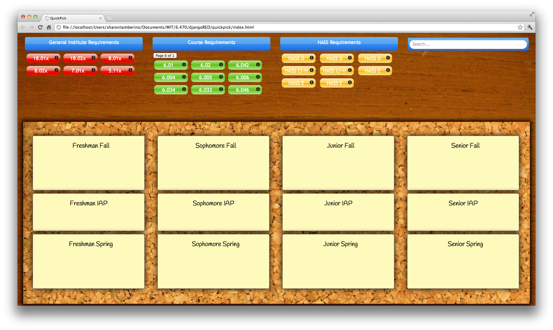
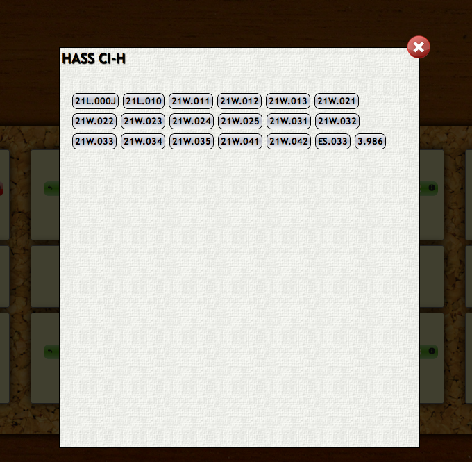
- Above are the views that are displayed when the user clicks the "i" icon on one of the GIR courses. At first there is no information displayed, only the possible choices for this requirement displayed at the top right. We styled these to look like buttons so they would appear clickable. Ideally we wanted these to appear as tabs and for the window itself to look like an index card, but we ran out of time to style the tabs and it proved nearly impossible to make the info text "stick" to the blue lines on the index card.
- When the user clicks one of the course options, information on this course is displayed, including a course description, professors' names, prereq's, and units (see above right).
- When the user decides which course he/she wants to take, he/she can click the "Select" button and this course will automatically be inserted into the schedule.
- There is also a red exit icon in the top right corner in case the user wants to go back to the main screen without selecting a course option.

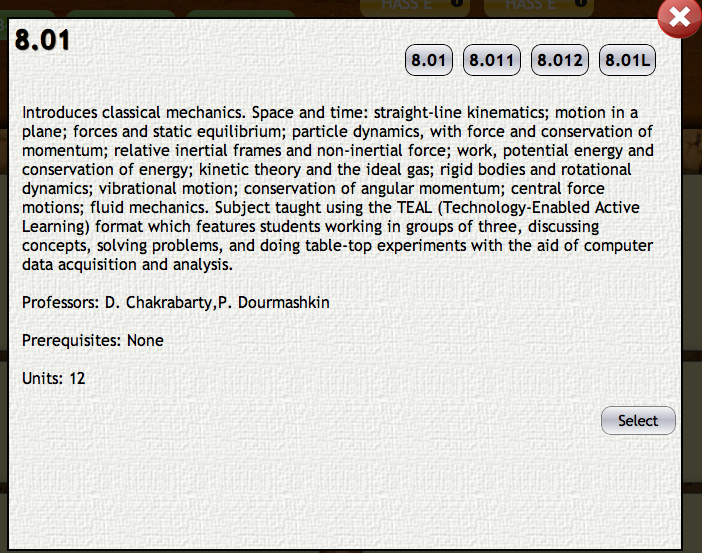
- The info view for choosing HASS classes is similar. One element we wished we could have fixed on this view was the lack of fading or other distinction between the scrollable box containing the course options and the info text below.
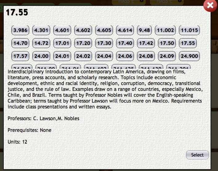
- The Course Requirement classes are inserted explicitly into the user's schedule, so there are no options to choose from in this info view. The user can only return to the main screen using the "X" icon.
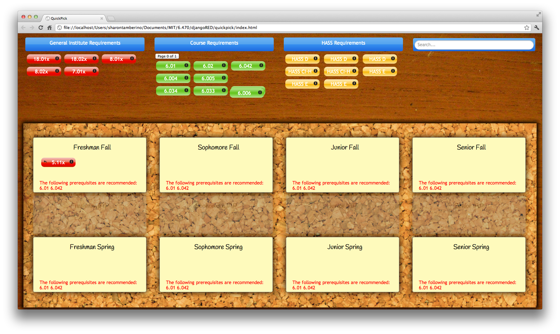
- When the user selects a course to drag onto the schedule, the app automatically "greys out" semesters when this course is not offered in order to communicate that this course cannot be dropped onto this slot.
- Also, if the user tries to drop a course onto a semester when they would not yet have taken the recommended prereq's, they are able to do so but a red warning message will appear.

- Users also have the option of searching for other courses (even ones not in their major) if they want to take a class that was not automatically filled in by the app. This is a functionality that we chose to implement after requests from several test subjects during the paper prototyping phase.
- The search bar allows users to search for courses by class number, professor, or class title.
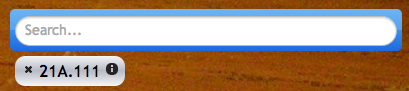
- Once the user chooses a course from the auto-complete table on the search bar, a course icon similar to the others (but colored grey to indicate that this class was not originally part of the schedule) appears on the desk.
- These icons also have the option of opening the info window.
- These icons have an "X" icon that is not present for the other courses which allows the user to remove this class from the desk entirely.
Implementation
QuickPick was created using HTML, CSS, and Javascript/JQuery. Additionally, we used a few libraries such as JQuery UI to not re-implement functionality that already exists. We simply fitted them to work for our tasks and to look and match the rest of our website.
While it would not directly affect the end result, the look and usability, of our design, we maintained many coding principles such as keeping clean and clear code that was as modular as possible. Additionally, we made sure to separate our HTML, CSS, and Javascript which greatly simplified and relegated the bulk of the functionality to Javascript, and the look and appearance to the CSS, with HTML providing the structure of our page.
The HTML provided our skeleton for everything that was static: each of our bins including the semesters and our requirement bins, along with their headers and titles. Then everything else (our classes) were added dynamically through the Javascript; this was done to facilitate the functionality that would be added to each object such as dragging, clicking of the information button, and excluding the semesters a class is not offered.
Evaluation
User Testing
Users were selected from our network. Because QuickPick is currently focused for students in 6-3, we selected MIT students who were 6-3. Two of them knew they wanted to major in CS when they arrived to MIT. One of them was course 2 first, and then switched to course 6. This is representative of the user population of QuickPick in its current state. When we expand to other majors, our users testing population should be expanded and diversified to reflect this change. There was no demo, but rather we gave them the tasks (included below) and access to the live site on one of our computers.
Briefing
You’ve been selected to test QuickPick, a four year course planner for MIT 6-3 Students. There are three tasks for your to complete. When doing so, please voice aloud your thoughts as you try and complete the tasks. If you have any questions, please ask them, but note that we may not be able to answer them. Thanks!
Task 1: Schedule GIRs
Remember back to freshmen year, all fresh faced and excited. You’re trying to figure out what classes you want to take for the next four years, but first! You have to schedule your GIRs. Look through the options for each of the GIRs, and schedule your freshman year at MIT.
If you don’t know which GIRs you want to take, select the following schedule:
- Fall: 8.01, 18.01, 5.111
- Spring: 8.02, 18.02, 7.013
Task 2: Schedule All Four Years
Fast forward one year. You’re about to enter sophomore year! Schedule your next three years at MIT. For your AUS/LAB requirements, look through the different options and select ones you’re actually interested in / have taken. If you don’t know which classes to take, select the following schedule:
- Sophomore Fall: 6.01, 6.042, 18.03
- Sophomore Spring: 6.02, 6.005, 6.006
- Junior Fall: 6.004, 6.034, 6.172
- Junior Spring: 6.033, 6.046, 6.813
- Senior Fall: 6.828, 6.UAT
- Senior Spring: 6.UAP
Task 3: Search
Now that you’ve scheduled your requirements, you’ve got a few more spaces to take some fun classes on your own. Search for a few classes you’d like to take and add them to the schedule.
If you don’t know what classes to search for, add the following to your schedule:
- 21L.004 Reading Poetry
- Professor Winston’s AI seminar, Human Intelligence Enterprise
- MAS.110 - Computational Media Design by Professor Bove.
Usability Problems
Catastrophic: 7.01X does not work
- Fix should be relatively straight forward, there were some parsing issues in our JSON file for bio classes. It was fixed but the fix was not pushed.
Severe: 0 out of 0
- As mentioned in GR5, our original design idea for the pagination of classes > 9 would be that it would animate, like the iPhone home screen. This was not implemented. Users did not know what 0 out of 1 meant, but because it looked like (and is) a button, they clicked it and found the effect. ⅔ users did this without verbalizing the question.
- Fix: We were unable to figure out how to do this animation, so fixing is difficult.
Severe: 18.0X Confusion
- 18.0X was a confusing designation for ⅔ of our users. They eventually got it, but as one of them is MEnging (and has taken 18.03, 18.05, and 18.06), there was some confusion as to what it was supposed to indicate, and for the MEnging user, what they were supposed to do if they have taken both 18.03 and 18.06). We classified this as severe, because the fix will require some design thinking and it caused significant confusion considering how small of an aspect it is. Relabeling the course as 18.03 OR 18.06 will require us to restructure the blocks (or make the font considerably smaller), 18.0X was confusing for ⅔ tested users. “Math” is too generic of a label.
Severe: Names of classes
- For classes where the selector screen comes up, the name of the class is not listed. For the course requirements, this is less important. However, for the AUS/LABs, and especially for the HASS classes, just the number designation is not useful (and as pointed out by our TA, any use of just the numbers and not the names would be difficult for the graduate student users). For the HASS classes, unless you knew already which class you wanted to take (and, furthermore, there’s no affordance for scrolling in the selector screen), its difficult to find a class to find without clicking on a bunch of the options.
- Fix: Either some sort of classification, whether by major or by topic. Or a search feature? Search would not be too difficult, as we already have it implemented, but if we could tie the classes that people searched for to the requirements (more on this below), this could help.
Major: Search/Requirements Fulfilling
- One user felt strongly that they should be able to search for classes using the search bar and by selecting a class, have that fill the requirement that it could fill. For example, if the user searched for 6.170, it should replace the 6.LAB block. The user preferred the search interface to the scroll / visual search interface, especially for the HASS classes.
- Fix: It would be doable to fix this, but a bit of a time sink. We’d just have to search the “Possible Classes to Satisfy a Requirement” list for the class the user searched for in the auto-complete.
Minor: New HASS requirements
- QuickPick does not currently handle the new HASS requirements. One of the testers was a sophomore and they pointed this out.
- Fix: We’d have to allocate new blocks (divs) for the HASS requirements, and then reclassify the classes in the classes JSON file. Because the classifications were parsed automatically from the registrar’s site, this would only require a bit of time to fix.
Minor: Duplicate classes?
- You can’t search for/add duplicate classes, however, there’s no affordance to let the user know the reason for the failure (a user tried to add 6.813 after already adding it through the AUS requirement. The user tried to search for 813 again before realizing the cause of failure).
Cosmetic: Color blindness
- GIRs are red, course requirements are green. While, functionally speaking, the colors make no difference, picking colors not linked for colorblindness in 5-7% of the male population might be better.