-
Created by Unknown User (yuhan@mit.edu), last modified by Unknown User (paradesi@mit.edu) on Mar 11, 2012 23:45
You are viewing an old version of this page. View the current version.
Compare with Current
View Page History
« Previous
Version 37
Next »
Home Screen
|
Storyboard
|
Learnability
|
Efficiency
|
Safety
|
Visibility
|

|
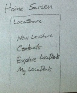
This is the home screen shown to Joe
when he starts LocaShare.
He can add contacts using "New LocaShare",
view existing contacts, explore deals and view
deals he is subscribed to.
|
Pros:
- The interface provides good
information scent by explicitly
stating what the links would
do.
Cons:
- Exploring/Viewing deals is not
immediately learnable.If Joe wants to
explore deals by
his commercial contacts, should
he click "Explore LocaDeals"
or "My LocaDeals"?
- "New LocaShare"'s
functionality is not immediately
apparent since LocaShare is the
name of the application (and not
a specific task/option). This makes
the interface hard to learn.
|
Pros:
- The listing interface is intuitive and
direct. It shows Joe what he can do with
LocaShare at a glance.
|
Neutral:
- Since this task does
not involve any
irreversible actions,
safety is not the
main concern for the
home screen. If Joe
clicks on a different
option by lapse,
|
Pros:
- All important tasks are clearly
represented on the home screen
with good visibility.
|
Task 1: Add Social Contacts |
Storyboard |
Learnability |
Efficiency |
Safety |
Visibility |
 |
This is the place where new LocaShares
are initiated. Joe wants to share his location
with Bob during this trip. He also wants to
share his current city with his mother
Alice. Both of these can be set up here.
From the system perspective, there are
many parameters associated with a location
share. In order to limit the number of these
settings that users have to deal with explicitly,
in this design we use sharing types, which
are essentially templates of settings.
Joe can set up his two shares as Vacation
shares -- a vacation share defaults to all
the time and is not a radius share. The
choice that Joe is presented with is whether
he'd like to share just his exact location or
just his current city. For Bob he's going to
choose exact location, and for Alice he's
going to choose current city.
After the trip, Joe wants to set up a different
LocaShare with Bob, where Bob can see
whenever Joe is in his neighborhood. This
is an In Your Neighborhood share.
These shares are based on a location-- this
way, Joe doesn't have to reveal to Bob
where he is all the time-- just when it's
relevant to him. The place should be
relevant, and so should the time -- Joe
chooses to share with Bob only when
he's in the neighborhood in the evening.
Out and About sharing is meant for sharing
whenever you're in one of several specific
places. For instance, Joe may want to let
his friends know what places he goes to
eat and how often he goes to them. |
Pros:
The interface speaks the user's
language by using "Share My City"
and "Share My Exact" location. This
will prevent misunderstandings
on the part of the user.
Cons:
- Few recognition hints are provided in
this interface which
makes it hard to learn.
- The pre-defined
lists puts a burden on the user
by forcing them to
retrieve information from their
head (poor recall). Giving an
example of the type of
information that will be share will be
helpful.
- Inconsistent setting options (9-5 'M-F'
or 5-12 '7 days')
- What does custom time mean?
It sounds like jargon. An
example would be
helpful here.
|
Pros:
Having pre-defined/
user-defined
sharing lists
enhances efficiency.
Cons:
- "In Your Neighborhood"
screen wants
the user to enter/search for
places. The
model that the user would
have is that
the current neighborhood
location will be
automatically shared.
System
model seems to
contradict user model.
|
Cons:
- The user may inadvertently
give incorrect permissions
for the contact. A confirmation
dialog will be helpful.
|
Pros:
Providing a list
view offers good
visibility.
Cons:
- Scrolling area may
become too large.
|
Task 2: View real-time location of social contacts |
Storyboard |
Learnability |
Efficiency |
Safety |
Visibility |
 |
Recall that Joe is looking for
Bob, who isn't there to meet him.
From the home screen, Joe clicks
on People and then finds Bob.
By staying in the "now" tab, he
can see Bob's exact location on
a map. |
Pros:
- Design has external consistency
with other mobile apps
- Provides visual feedback by showing
the map.
- It speaks the language
of the
user since the labels are
easy to understand.
Cons:
- The map interface can
be confusing if Bob
gives a state-level permission.
Would the marker mean
that Bob is in that location?
|
Pros:
- The current location is clearly
shown to the user. Easy to
view in a couple of glances.
Cons:
- The user has to browse through
the entire list of contacts to spot the friend.
Having a search feature will be more efficient,
since that is externally consistent with other
mobile applications.
|
Neutral:
- Might press on
Alice when you want to view
Bob. This can be solved by
using the back button on the app.
- Since this task does
not involve irreversible
actions, safety is not
the main concern.
|
Pros:
- The map is large on the screen
and provides strong information
scent by showing only
the essential details.
Cons:
- Important information is
not directly visible. See the
learnability 'Cons' for an example.
|
Task 3: View offers and opt-in to create commercial contacts |
Storyboard |
Learnability |
Efficiency |
Safety |
Visibility |
 |
Deals are offered based on proximity.
Joe is at the resort and is looking to
buy some ski gear. He sees that Rei
and Walmart are offering deals. He
is more of an REI kind of guy, so he
explores that deal, and finds out that
Rei is willing to give him 3% off of
his purchase if he agrees to share
with them whenever he is at an
Rei location. He signs up by clicking
Sign Up. |
Pros:
- The arrow (>) is
externally
consistent
with other
mobile applications
in
indicating that there
is additional
information to be viewed.
Cons:
- The phrase "Sign Up"
in this context is not
consistent with the
usual meaning of
signing up (to use a
service, for example).
|
Pros:
Cons:
- If there are multiple
nearby stores providing
offers, the user has to
manually scroll through
the entire list to spot offers
that he is interested in.
Having a search feature will be
more efficient.
|
Pros:
Cons:
- The user may inadvertently
agree sharing location information
with Rei. The design lacks a
confirmation step to prevent such
errors.
|
Pros:
- Important details (from
the merchant and from
the user) are clearly
communicated.
Cons:
- The exact meaning is not
conveyed. What does it
mean
to "tell them". What
exactly
will LocaShare tell
them? Providing a sample
message showing
data that will be
given to the merchant
will be helpful.
- The interface
does not convey whether
Rei is offering an offer or
not.
|
Task 4: View aggregate information of social contacts |
Storyboard |
Learnability |
Efficiency |
Safety |
Visibility |

|
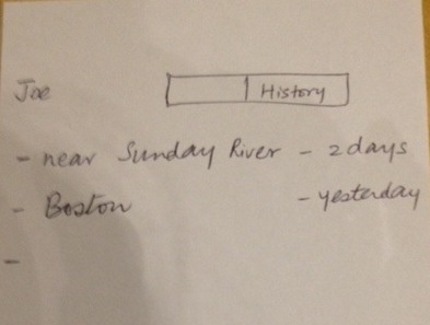
Joe's mom Alice has access to Joe's city-location
and wants to view it. She hits People from the
home screen and then selects Joe.
She clicks on the History tab to see a list of
places Joe has been. |
Pros:
Since this screen is easily accessible from
that in task 2 (thus
providing internal consistency),
this task is easy to learn.
|
Pros:
- Relevant information
is presented in an
easily-digestible manner.
Cons:
- The user has to view
a time-based
aggregated list. Multiple viewing
options are not provided. For
example, Alice
will not be able to
use this interface to view an
aggregated history based
on frequency.
|
Neutral:
- Since this task does
not involve irreversible
actions, safety is notthe main concern. |
Pros:
- The aggregation is represented visibly
by showing how long the user has been
at a place.
|
Task 5: Edit social contacts |
Storyboard |
Learnability |
Efficiency |
Safety |
Visibility |
 |
After the ski trip, Joe wants to stop sending his location
to Bob. First he browses to the share by clicking on
Bob in his contacts. He sees the Vacation share,
and can click on it to view the details of the share.
He can then delete it either directly from the
details view, or by returning to the listing screen
and selecting it from there. |
Pros:
- The mechanism to delete is externally
consistent (the minus symbol) with other
mobile apps.
Cons:
- The design does not provide any
explanation for the user to learn
how to navigate through the steps
described.
- The button/option
called "Change" gives the
perceived affordance of
being able to edit the
setting.
However you just
mention about deleting
the setting and not
editing it.
|
Pros:
- The design also provides
multiple ways to delete a
contact. Thus, if Joe wants
to delete Bob from his
contact list (irrespective of
what Bob can view), he can
directly delete him from the list
of contacts.
- Enabling deletion based on
the pre-defined settings can
reduce the need to view detailed
information that the contact can see.
|
Pros:
Cons:
- The user can
inadvertently delete
a social contact (by a lapse).
The interface
should employ an
undo mechanism
to resolve this
problem.
- Providing multiple
ways to delete the
contact
could however lead to unintended lapses.
If the user just
wanted to delete Alice from his
list, by clicking anywhere other
than the little circle would open up the next screen.
|
Pros:
The design provides the
location
information viewable by Bob in an
easy to understand manner.
Cons:
Only the names are
displayed on the first
screen. It would be helpful to show a hint
of the actual information that
the contact
can see.
|
Task 6: Edit commercial contacts |
Storyboard |
Learnability |
Efficiency |
Safety |
Visibility |
 |
By selecting My LocaDeals from the home screen,
Joe can see the deals he's currently participating in.
Clicking each one displays details regarding that Deal.
They can be deleted either from the details view or
from the list. |
Pros:
- Interface provides
internal consistency with
the "Edit Social
Contacts" screen.
Cons:
- The "note" icon's
functionality as described
here is
externally inconsistent with
what that icon means in
general.
|
Pros:
- The list interface
provides an
easy-to-view
option for the user.
- As before, providing multiple
options/paths to delete
the contact improves
efficiency by decreasing
the number of steps
required
(especially when Joe
is no longer
interested in a
business, for
example).
|
Cons:
- The user can
inadvertently delete
a commercial contact
(by a lapse).
The interface
should employ an
undo mechanism
to resolve this
problem.
|
Pros:
The information seen
by
Rei is
conveyed to the
user very clearly
and visibly.
Cons:
- The delete
mechanism is
not visible in the
design.
|


