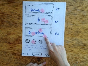
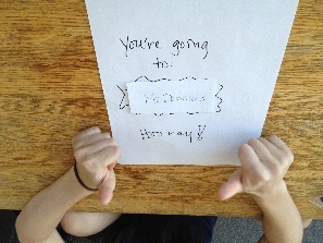
Prototype Photos
The following are photos of our second prototype. The app only provides one sequence of tasks, which users must follow in order to arrive at a final restaurant decision.
Please view the photos starting from the first row, going from left to right and then proceed to the second row.


Briefing
Can’t decide where to eat as a group? Play Dedice --- An interactive social decision-making game for dining out. Dedice will help you decide with “dice”, but with a twist. The randomness is weighted, so instead of blindly choosing a restaurant, Dedice will pick a restaurant for you based on the weighted preferences of location, price, and cuisine type that each player individually bets on. It’s fair. It’s fun. It’s Dedice!
Scenario Tasks
1) Pick Criteria Choices: Pick a couple of choices for location and cuisine type. You are all sharing one phone.
- For location: choose Kendall, Central, Harvard, and Chinatown.
- For cuisine: choose American, Chinese, and Indian.
2) Bet on Criteria Choices: Place bets on the location, cuisine, and price you want most.
3) Decide on Criteria Choices: Spin the Dedice Wheel once each for location, price and cuisine.
4) Vote on Restaurant: Vote on the restaurant choice that you like the most.
Observations
First Prototype
Learnability
Betting concept was not completely clear
- Users did not understand the purpose of the betting screen. They did not realize that their individual coin assignments would be used later in a group decision round. As one user initially commented, "What am I betting on?"
- Users did not understand that their coins were split across three criteria. They would often use all their coins on the first criteria (location), only to realize that there were more criteria (price, cuisine) to bet on later. This suggested that the idea of weighting across criteria was not clear (e.g., location is more important to a user than price).
Transitions between group/individual modes were not clear
- Some users did not see the transition indicators for the betting round (e.g. Person 1/3), so they did not know when to switch player turns.
- Users did not know they were all sharing one mobile phone, so they did not know when to pass the phone to the next player.
- Users did not know when to switch between individual to group mode, and there were no labels to help them.
- Users did not know the initial round of selecting criteria was a group activity, so often, only one user would pick the choices.
Some UI elements were unclear and inconsistent
- Some users didn't notice or understand what individual transition labels (e.g., Person 1/3) in the betting rounds meant. This could have been caused by inconsistent terminology, as we used "Person" and "Player" (e.g., "How many players are in your group?" in initial screen) to refer to the same thing.
- Some users didn't understand what the criteria labels (e.g., "Criteria 2/3) in the betting rounds meant. We never explicitly referred to location, price, and cuisine as "criteria", so the word may have seemed random.
- The "+" button for adding criteria was placed on the top-left side of the screen, where the back arrow is usually placed.
- The list of cuisine and location were not ordered in an obvious way (e.g. alphabetical).
- There was inconsistency between "Done" buttons and next arrows.
- Many users didn't understand what the percentages meant on the choice wheel during the criteria decision rounds.
Efficiency
Some convenience features were unnoticed (e.g., the "+" button on add-(location, cuisine, etc.) screens)
- Many users failed to notice the "+" button on the Add Location and Add Cuisine screens.
- Many users did not realize the location and cuisine lists were scrollable.
- Some users did not realize that their coins were exhausted in the coin pank, rendering all their subsequent selections void.
Users tried using some efficiency features that didn't exist
- Users tried to drag the entire stack of chips instead of one 10-point chip at a time. We assumed people would drag them one at a time because they had to bet on multiple criteria and didn't allow for stack-dragging.
Decision-Making process too lengthy
- Many users felt that there were too many criteria selection and criteria betting rounds. This made the decision-making process too long.
- Users had to perform some mental math to figure out how to distribute their 100 chips within and across criteria.
Safety
Certain combinations of criteria have no restaurant choices
- One group of users decided on Indian food in Chinatown. There were no restaurant choices for these final criteria.
Insufficient feedback for user manipulation
- The app did not inform users that their choices were not saved when they used up all their chips. One user kept betting chips and assumed his choices were being saved.
- The app displays a list of restaurant choices to vote on before the final voting round to provide users with more information about the restaurants they will choose from. However, some users incorrectly thought that this was a list of final restaurant choices and did not bother to proceed to the final voting round that would generate a single restaurant choice.
Second Prototype
Learnability
Betting concept was much more clear
- Better visual metaphor, more akin to a real gambling setup (e.g., craps or blackjack table, with spaces to place chips.
- Explanatory labels ("Drag chips to choices above to show their relative importance to you") made the purpose of the betting task clearer.
- Users better realized that chips were split among the three criteria, because they were presented together all on one screen.
Transitions between group/individual components were not clear
- Same problems as with the first prototype. We should add full-screen indications that the app is switching between users, or from group to individual mode.
Some interface components were unclear and inconsistent
- The screen showing restaurant choices and providing restaurant info does not allow voting, and this was not clear. In the next iteration, we can combine these two screens into one.
- It's not clear why the group suggestion-making interface exists. Users are allowed to make only one choice for each criterion, so it is not clear why the group can make an arbitrarily high number of suggestions. It is conceivable that the initial group selection stage could be removed entirely.
- (Same as in prototype 1) Some screens use right-pointing arrows, and some screens use "Done" buttons.
Efficiency
Some convenience features were better noticed
- "+" button was replaced with an "Add from list" button, placed in a more obvious location. Users found it more easily.
Information should be presented in a more accessible fashion
- The "Add cuisine" list should be organized in a meaningful fashion (e.g., alphabetical).
- The betting screen should show a counter for each criterion, indicating the total number of chips placed there (instead of having to count the number of chips on that spot).
Decision-making process shorter but still too lengthy
- The restaurant choices/info screen and the restaurant voting screen are separate, when they could logically be combined: this results in more screen transitions than necessary.
- The process was shorter than for the first prototype, but is still too long. The initial phase of selecting criteria choices for location, price, and cuisine seemed long and may not even be necessary. For example, we can replace the list with an automatically generated list. This would skip the initial step and allow users to start off in the betting stage.
Safety
Certain combinations of criteria have no restaurant choices
- Same as in first prototype.
More feedback/signposting for user manipulation
- We informed users in the briefing that they were all sharing a phone.
- We provided explanatory labels hinting at task purpose, so users were more likely to perform tasks properly (e.g. distribute betting among three criteria at first try instead of through trial and error).
- Users could actually see that they were betting on each of the three criteria, and they knew more easily that they were using coins for betting on all three criteria and that coins are shared among the three.
Prototype Iteration
These are the changes we made between the first and second prototypes:
Component Changed |
Prototype 1 |
Prototype 2 |
|---|---|---|
Add Location/Cuisine screens |
A "+" button at the top-left side of the screen allows users to choose locations/cuisines from a stock list. |
Removed "+" button. |
Betting Round screens |
Users bet on criteria in separate screens. Many users did not realize there were separate criteria to bet on and had to move back and forth between screen to change their bets when they realized there were more criteria to bet on. |
Users bet on all three criteria (location, price, cuisine) in one screen, improving efficiency and understanding of betting purpose. |
Choice wheel |
Each section of the wheel has a percentage label, reflecting the proportion of total chips (across all players) that were bet on that particular choice. |
In addition to percentages, each section of the wheel is also populated with different colored chips to reflect how much each player bet on that particular choice. Each player is assigned a different color. This design makes the origin of the percentages clearer. |
Signposting and feedback for user manipulation |
App does not alert user when there are no chips left in bank. It merely write that total chips left = 0. |
App alerts user with a popup dialog box when there are no chips left in the bank. |
1 Comment
Unknown User (juhokim@mit.edu)
"Prototype: Some parts could be of higher fidelity.
User testing observations: Iterations are well-documented.
Overall: Be careful not to keep adding cool ideas. They have to be consistent. Was a lot of fun to playtest your prototype.
"