ElderConnect
Connecting family members via the web.
<STYLE mce_bogus="1"><!--
.pagetree2 a
--></STYLE>
GR3 - Paper Prototyping
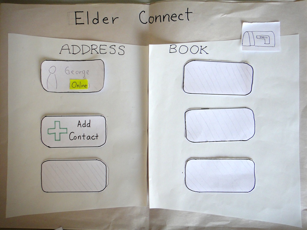
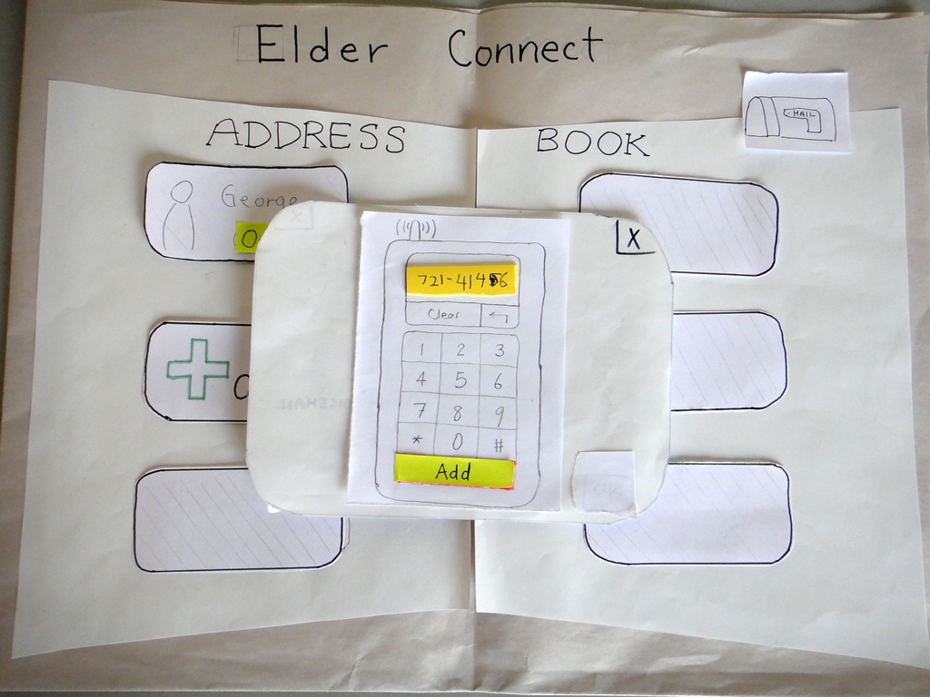
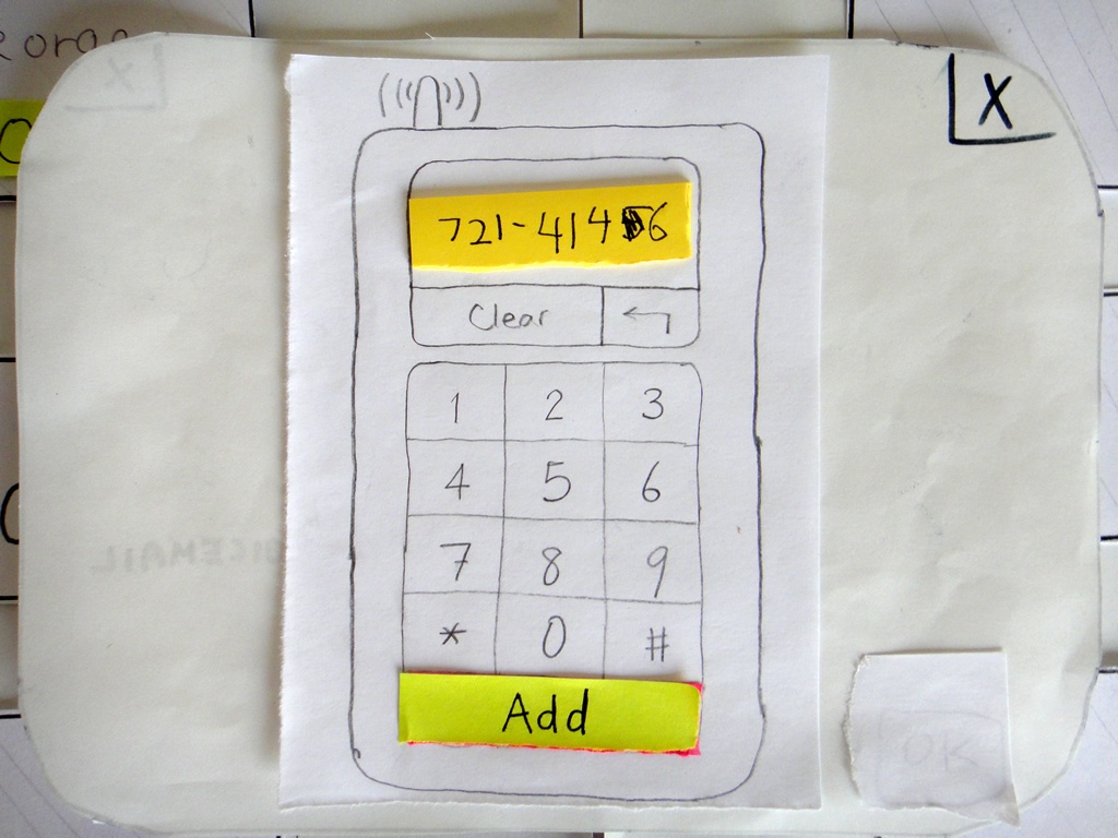
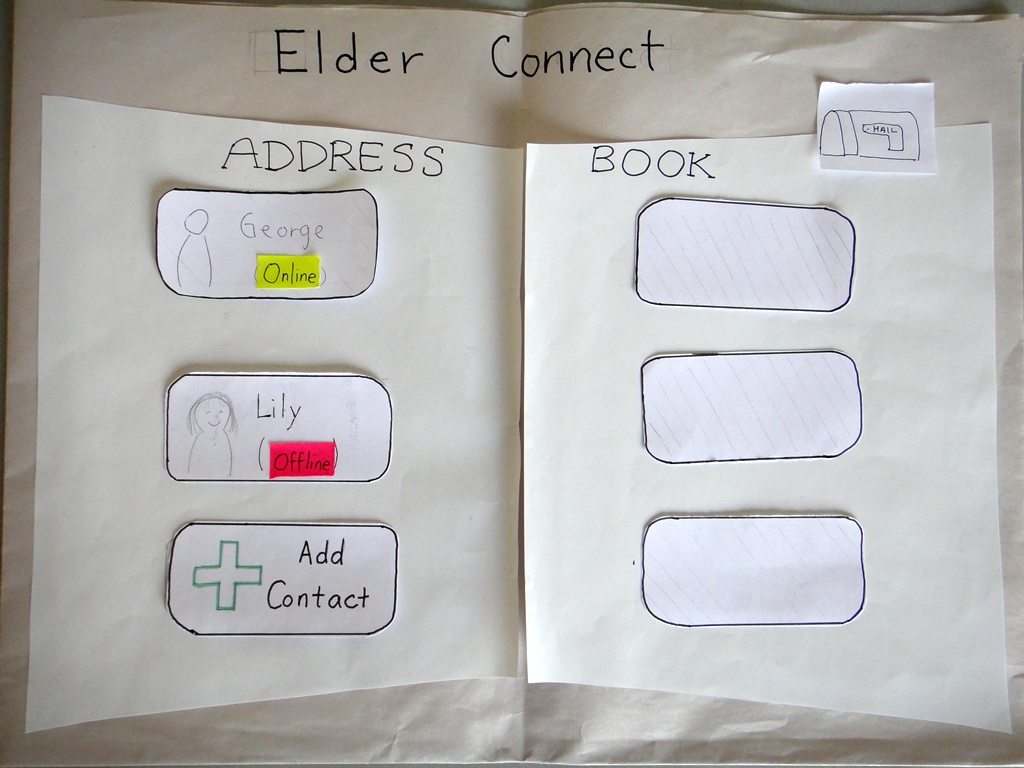
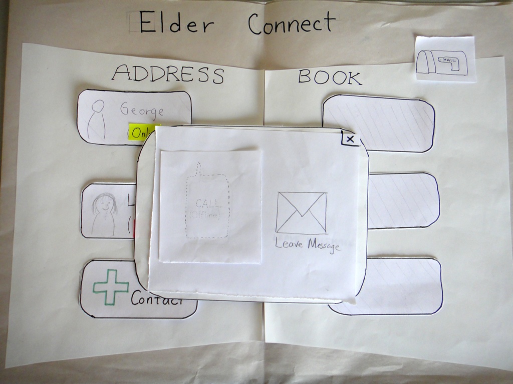
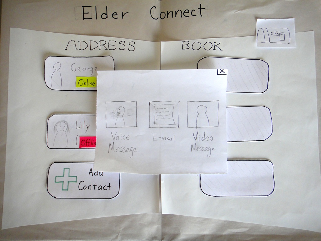
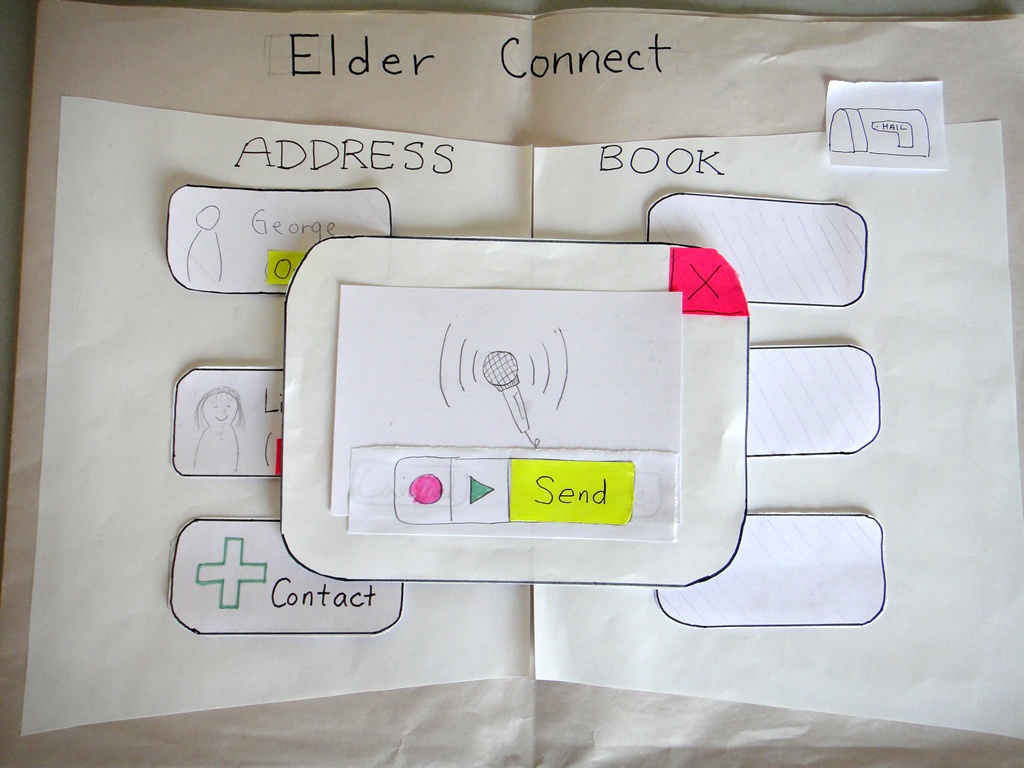
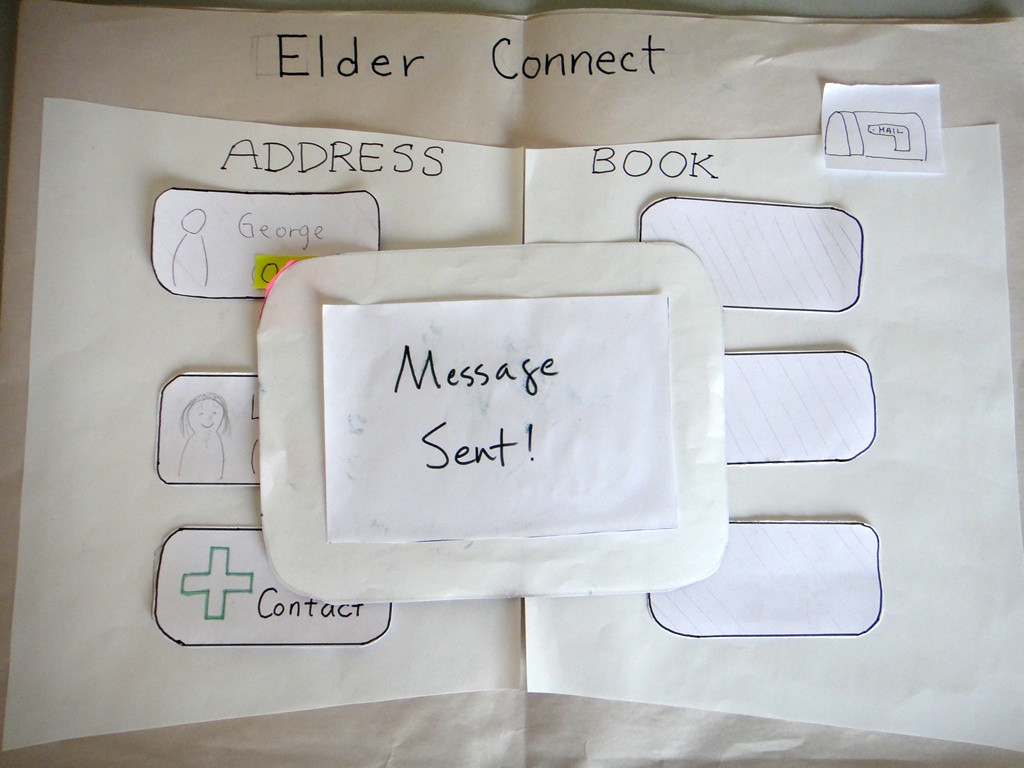
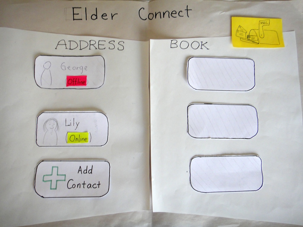
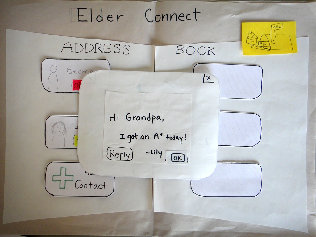
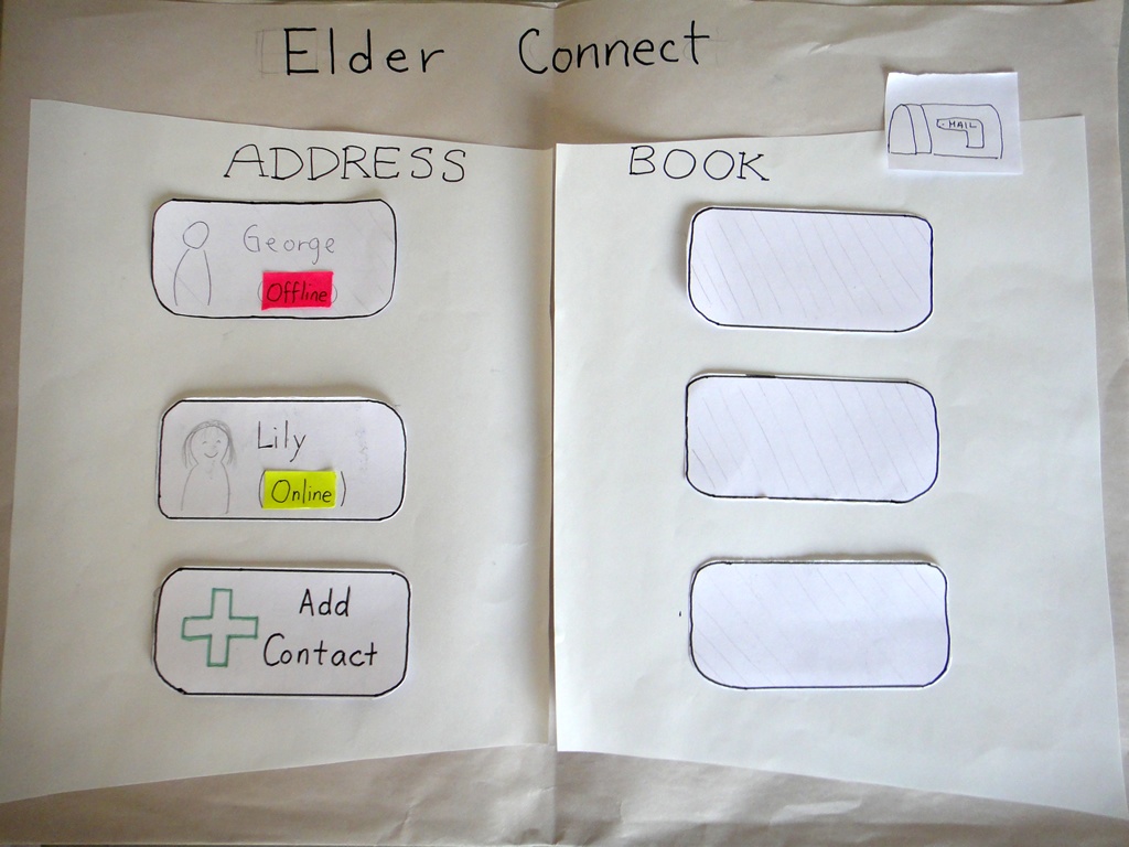
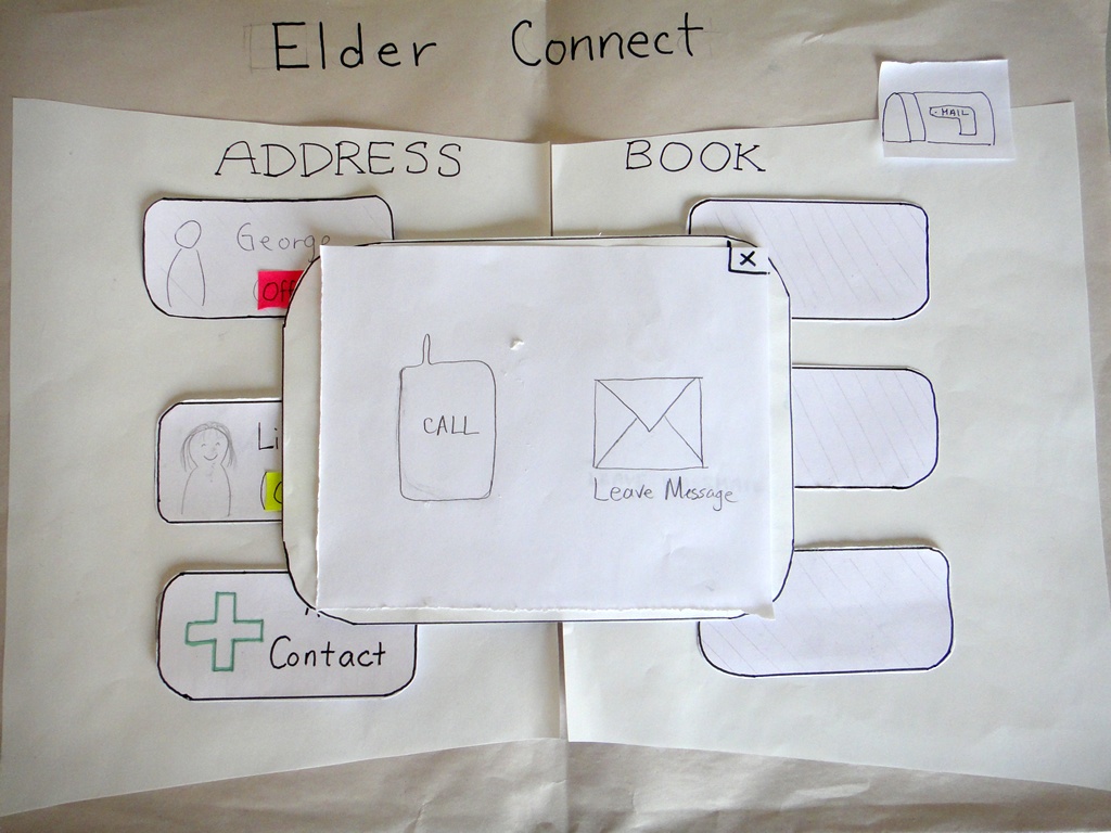
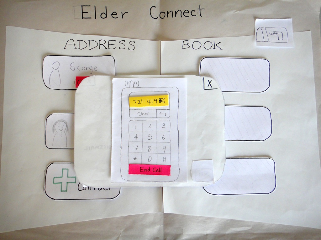
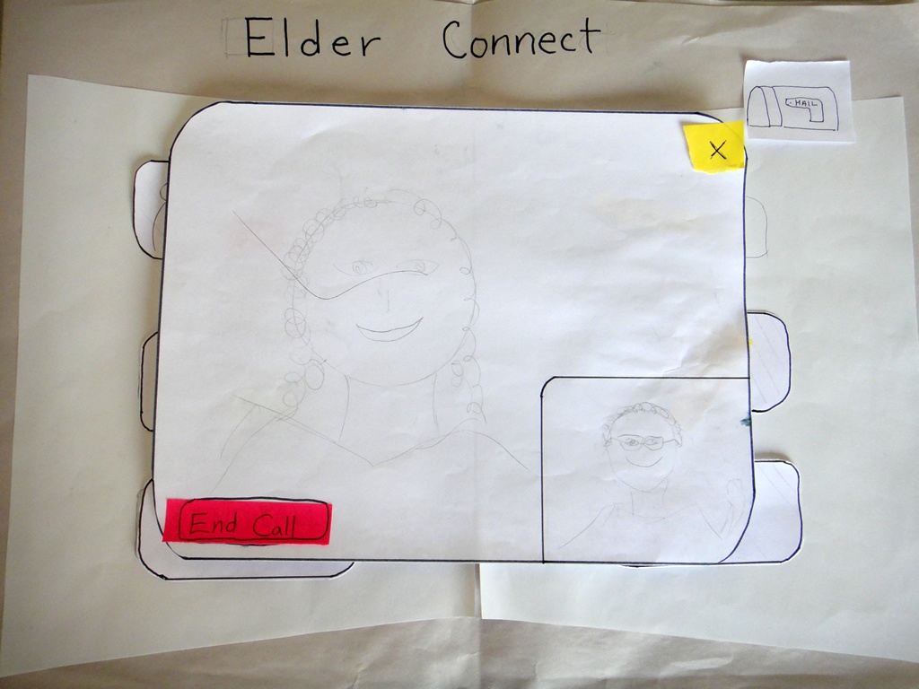
Although we created three different prototypes and tested them all in Round 1, the photographs below show the Address Book prototype specifically, which we chose to focus on for Round 2 after the feedback received from Round 1.
Prototype photos
Main Screen
|
Adding a contact
|
Adding a contact (closeup)
|
Contact added
|
Choices after clicking an Offline contact
|
Further choices after clicking Leave Message
|
Leaving a Voice Message
|
Message Sent!
|
New Mail notification
|
Showing a received message
|
Lily is online
|
Options after clicking an Online person
|
Calling Lily... Ring Ring~~
|
Video chat!
|
|
Briefing
Here is the briefing we gave to users:
Purpose of application: To connect the elderly with their younger family members
- You are a grandparent named Harry.
- You are a native English speaker, but you have trouble typing and you are somewhat unfamiliar with using computers.
- Your granddaughter is Lily, a college student in California.
- This is your home computer, and it is the computer you use to go online. Assume webcam and microphone come with the computer, ready to use.
- Pretend Lily calls you one day and asks you to add her as a contact on ElderConnect so that you can stay in contact and chat sometimes.
Scenario Tasks.
Here are the tasks we gave to users, one after another.
Task 1: Lily calls you and asks you to add her as a contact by dialing the number 721-4146.
Task 2: One day later, you want to send Lily a message.
Task 3: A few days later, you go on ElderConnect again. You want to call Lily.
Observations from Wednesday's Testing (Round 1)
Total number of users tested: 5 (Address Book: 3, Phone Metaphor: 1, Action wheel: 1)
We built and tested all three prototypes to get a more holistic comparison between the three designs.
User testing descriptions
Address Book Metaphor Prototype
- Phone
- During the add-contact task, users were uncomfortable with the fact that the phone call actually went through to the granddaughter. Some expressed that “Add contact” should feel different from a normal phone call, and should allow them to hit an “OK”-like button to confirm before the request is sent.
- Lacks a “send” button. old dial-tone phones with no numerical feedback do automatically start dialing, but since our display looks like a cell phone that displays numbers, it should be consistent with cell phones having a “Send” button.
- No way to delete one digit at a time. This is poor safety for the elderly who may make errors while entering digits. Having no digit-backspace also threatens efficiency; the user would need to completely start over if he/she makes any mistake.
- Lacks an “end call” button. This was simply an oversight on our part.
- Not a real cell-phone number (only 6-digits long).
- User not sure if * and # keys are necessary since they are never used when dialing a phone number.
- Mail
- Yellow mail icon misconstrued to be a “compose mail” button.
- “You’ve got mail” icon being inside the address book seemed to be inconsistent with the address book metaphor; normal address books don’t have mail-receiving functionality inside. User suggested to put the inbox in a corner of the browser instead rather than associating each mail icon with a particular contact.
- Can’t hear message playback or see previously sent/received messages again.
- Options/Widgets
- No way for grandparent to write an email, yet receives emails from grandchild. Makes user feel somewhat mistreated.
- Doesn’t make sense for “call” and “send voicemail” to be two diverging options. Normally the caller would call and, if the recipient doesn’t answer, the caller would leave a voicemail.
- Call/Send Voicemail screen: user wondered why both options were shown even though the contact was not online.
- Need video vs. audio option
- No way to send a video message.
- User said that it may feel more like an address book if the user can fill in the details right on the book instead of on a popup. So maybe clicking on Add Contact will turn that entry into some text fields.
Phone Metaphor Prototype
- Phone:
- There is no end call button.
- No way to confirm that the phone number is correct because it automatically dials.
- Mail:
- User did not associate “leave a message” with “send a voicemail.” Strong association between “leave a message” and textual message.
- No way to review a previously received message again.
- “Call” and “Message” are currently either-or options. Would like the option to both call or send message even when the recipient is online.
- Immediate start of message recording was a bit startling.
Voice Search / Action Wheel
- Circular action wheel:
- Circular selection momentarily confused user because it does not look like normal button options. However, user understood that they were probably buttons after thinking for a brief moment.
- User did not know what what voicemail icon stood for.
- User thought the X over the phone meant “end call” instead of “calling is not an option.”
- No functionality to delete a contact.
Feedback summary
Inconsistency with Expectations:
- Having a phone actually dial the recipient during the “add contact” task was disorienting to users.
- The reason for having “call” vs. “send voicemail” options is not intuitive. Used to leaving voicemail as a failed call attempt, rather than an upfront option.
- Many users were so caught up in recording their voice messages that they forgot to click “Done” until they realized they needed to do something.
- Users wanted the option to send a text message, not only voice messages.
- Letter icon was ambiguous to users (compose mail vs. receive mail).
- (Phone metaphor prototype) No user attempted to punch numbers into the phone to dial the recipient.
Consistency with Expectations:
- All users correctly clicked on the phone digits to dial the phone - understood that the interface was mimicking a phone.
- All users clicked on the recipient to initiate communication with the recipient. Some noted that they did so because it was the only thing to click on.
- Users used the X’s in the upper right corner of layovers to exit out of the layover or to undo the selection. This was as we had hoped/expected.
- Users clicked the “Cancel” and “End call” buttons correctly.
- When mailbox icon was in upper right corner of the browser, all users knew to click there for mail.
- Users noticed the address book metaphor.
Positive and Meta-feedback:
- Users remarked liking the simplicity of the interface (aside from the call vs. messaging options confusion)
- Users expressed some degree of amusement/excitement over recording a voice message and talking over webcam. The excitement may be partly a result of feeling nervous, but users seemed on the whole happy and played along with the voice-recording/webcam components of the study.
- One user (playing the Grandparent) remarked over webcam: “It’s nice to see your face!” This remark suggests that college-aged students assume and are aware of the notion that their grandparents would like to see them more often.
Changes for Round 2
We decided to continue with only the Address Book Metaphor design.
Flow:
- To address all the communication-option confusion, change to the following flow hierarchy.
- If online: see call vs. send message →
- If click into messages: see 3 options (voice message, email, video message)
- If offline: goes directly to the 3 message options (voice message, email, video message)
- If online: see call vs. send message →
Phone changes:
- Make “Add” button so that user has control over when phone starts connecting during Add Contact task.
- Show “End call” button once user and recipient have connected live, during Call task.
- Add back-arrow icon to allow deletion of 1 digit at a time.
- Make sure phone number is 7 digits long.
Receiving Mail:
- Change mail icon to mailbox icon. May want to try mailbox on yellow paper.
- Place mail icon in upper right of browser, representing mail from all contacts rather than from individual contacts.
Voice Mail:
- change wording from “voice mail” to “voice message” so that it is not confused with real-world voice-mail recording when the recipient does not pick up
- perhaps change icon from a tape to a person speaking
Observations from Friday's Testing (Round 2)
Four users tested against the updated Address Book Metaphor prototype.
User testing descriptions
User 1
Observations:
- User expressed discomfort with the name “ElderConnect”; feels the name points out his old age
- Yellow mailbox with mail flying out was effective in signaling to user to that something has changed. User was highly tempted to click on the mailbox once it changed.
- User thought contact buttons led to profiles rather than actionables; user attributed this thought to the “Address Book” metaphor which usually does not contain actionable items
- User had trouble recording a video message because there was no way to initiate the recording.
Feedback:
- User remarked that the interface makes it “easy to recover” from errors.
- User suggested that the blank slots should be made transparent so that the user does not mistake them for buttons to click on.
User 2
Observations:
- User attempts to click "Call" even when it is disabled.
- User asked "What kind of message?" during the second task after seeing the message type choices.
- Mailbox was effective for signifying that the user has a message. User discovered the change from closed to open mailbox.
- Regarding the voice message controls:
- User speaks “Good Job” without clicking on Record.
- User tries again, but clicks Play, and “Good Job” and Send.
- Third time, clicks Record, “Good job” and Send.
- There's a serious mode error in this interface.
- Video call interface operated correctly.
Feedback:
- The voice message interface is very confusing. User interpreted "Play" as "Start".
- User suggests "Repeat" instead of "Play" button.
- User thinks that the disabled "Call" button is not a problem and that he simply made a mistake.
User 3
Observations:
- “Big plus sign” for adding a contact was effective, user clicked appropriately.
- Options available after choosing to “Leave Message” confused user. Needs to be more intuitive.
- Video message interface should provide more feedback and/or control. User looked for a “Ready” button to start leaving his/her message.
- Video call interface was operated correctly.
- Once again, user experienced a mode error with the voice recording interface. User wasn't sure whether the interface was already recording.
- The user thought the Record button was a Stop button.
Feedback:
- When asked "Do you think you prefer it starts recording right away or press a button?" (regarding voice message), user prefers pressing a button.
- When asked "Do you want to hear your own message?", the user says yes.
- Maybe make "Add Contact" be in the upper left corner.
- Change the name of the app.
- Change "Address Book" to a different name so the user feels like clicking the contact can yield some options.
User 4
Observations:
- User offended by the name ElderConnect.
- User says "So many options!" after seeing the three message types.
- During the third task, user sees the mail icon, but was not sure whether it was the same icon was before. Nevertheless he tapped it.
- When replying to a message, the user expected that simply calling the sender would be a clearly available action, given that the sender is online.
- User wonders whether he can send a message either by clicking the user or clicking the mail icon.
- Voice message interface operated correctly.
- Video call interface operated correctly.
Feedback:
- User: "What happens if I tapped mail?"
- We haven't implemented this but we might say No Mail.
- User suggests maybe we should put text on the mailbox such as the number of mails or "No Mail".
- User: "You have two separate loci on the starting point. One is the user - people centric, and the other is the mail icon - task centric."
- We used to put mail beside person. But people got confused.
- We also used envelope, but that turned out confusing, so we changed to a mailbox.
- User: "I guess there'll be arrows for flipping pages?"
- Yes we will.
- User likes the fact there is no history, so there are only two things to do in the main interface.
Issues to consider/resolve moving forward
- Placement of Add Contact button (especially whether it should be a member of the contacts list) has been a point of contention and confusion.
- Voice/video recording and playback modes: Users misunderstand which states correspond to which buttons.
- Tension between keeping the functionality simple and meeting add-on requests from users (i.e. email history)
- How to resolve the ambiguity between "send message" vs. "see new email" in the mail icon?
- How will the interface allow the user to interact with contacts not displayed on the first page? Any sorting necessary?
2 Comments
Edward Oscar Benson
Excellent work. Good documentation of prototype with captions. Extremely detailed notes. Missing a user test (was supposed to have 6). Would be nice to see +/- with each observation.
Unknown User (cjcai@mit.edu)
Thanks for your feedback. We actually had 9 users total (5 in round 1, 4 in round 2)...