Prototype Photos
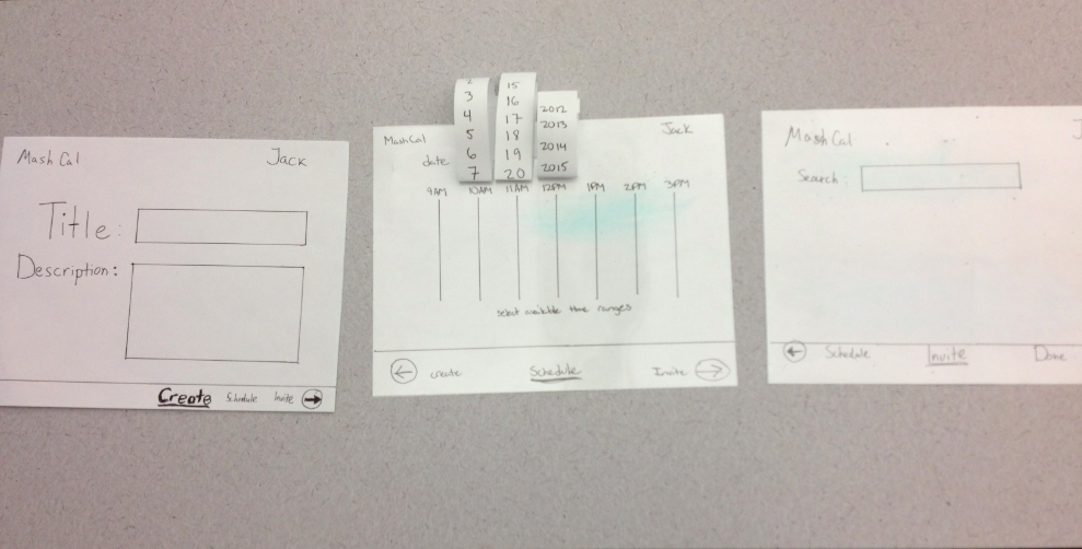
Event creation and inviting
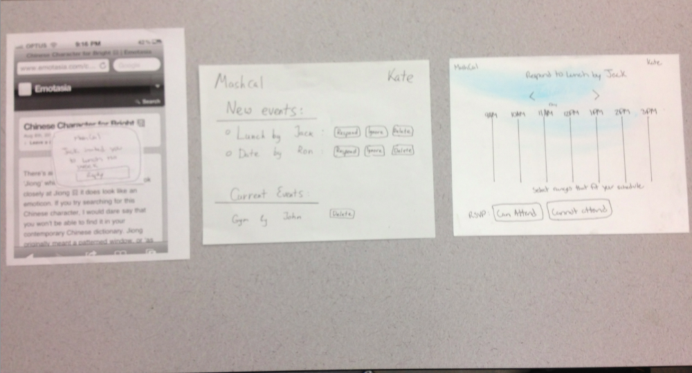
Respond to an invitation
Briefing
MashCal
The purpose of MashCal is to make it easier to schedule meetings among groups of people. It goes about making it easier in two ways:
- The creator of an event can set several times that the proposed meeting may occur
- Invitees are encouraged to RSVP rapidly by mobile push notifications
The entire experience (creating events and responding) occurs on a mobile phone interface such as an iPhone.
Tasks
First Round
- Create the event "Lunch." You are available anytime this week from 12pm-2pm except Thursday. On Thursday you are only free from 12:30pm-1pm
- Invite Bill and Kate to Lunch.
- Respond to the Lunch invitation. You can go in all of the proposed times except Thursday.
Second Round
- Create the event "Lunch." You are free today from 12-2, tomorrow from 12-12:30, and the next day from 12-2.
- Invite Bill and Kate to Lunch.
- Respond to the Lunch invitation, You can go from 1-2 today, can't go tomorrow, and can go from 12-2 the day after.
Observations:
First Round
User 1:
- Task 1: Pressed on the schedule after creating. Then pressed back on create. Used direct swipe to select the dates. Had no problem using the scroll selector for dates
- Task 2: Searched for Bill and Kate successfully and chose from the dropdown
- Task 3: Pressed reply and respond. Pressed on Can attend and waited. Then did that for the other days.
Comments: Thought can attend meant it was for all the days.
User 2:
- Task 1: Hesitation on advancing to the next screen. Pressed create and realiized the arrow button and pressed on it.Used direct swipe to select the dates. Had no problem using the scroll selector for dates
- Task 2: Searched for Bill and Kate successfully and chose from the dropdown. Used arrow to advance
- Task 3: Pressed reply and respond. Pressed on Can attend for all the days.
Comments: Helpful if can do "can attend for all". Confusing menu. Assumed pressing on create completed the task
User 3:
- Task 1: Pressed on create twice after inputting titles. Used direct swipe to select the dates. Had no problem using the scroll selector for dates
- Task 2:input Bill choose, input kate choose, press done
- Task 3: Reply, respond, can attend for all the days.
Comments: Underlined create was confusing. Make it visually visible that it represents the flow. Some group selection mechanism would be helpful. Ignore vs delete?. Consisten UI
User 4:
- Task 1: Pressed on arrow after inputting. Used direct swipe to select the dates. Had no problem using the scroll selector for dates
- Task 2: input Bill choose, input kate choose, press done
- Task 3: Reply, respond. Then swiped to select the times he can attend.
Comments: Overall intuitive. Name of the day would be helpful. Confirm window after creation of an event would be helpful.
Second Round
User 1:
- Initial Create Page
- User clicks and writes on title and adds short ddescription
- Clicks on create wrongly then schedule
- Schedule page
- Notices scrollbars
- Drags from 12-2pm
- Clicks Invite page
- Didn't schedule all times possible
- Goes back to schedule page
- Understand scrolling pages
- Wants feedback for when you finish adding date
- Invite
- Clicks and writes bill
- clicks wasn't clear on who billiards is
- Clicks on bill
- Clicks on kate
- Popup
- Clicks reply
- Overview of events
- Clicks respond
- Doesn't understand what to do on that page initially
- Schedule other event page
- Erases times he can't go to
- clicks done
User 2:
- Create
- Writes in Lunch and Description
- Clicks Schedule next button
- Schedule
- A liitle confusded about how to input
- Not clear what the feedback will be
- Initially wants to click on start and end
- Finally drags her fingers from start to end
- Clicks Create to go back
- Realizes it was a mistake
- Changes the date
- Marks the available times
- Clicks Create and then schedule
- Not clear what to do when done selecting her range
- Invite
- Writes on Bill
- Autoselects
- Kate and knows about the autocomplete
- Notification
- clicks reply
- Overall events
- Responds
- Schedule
- Takes a while to understand what is going on
- Looks confused initially
- Taps to highlight
- Still doesn't understand how to selecte those times
- Confusing about the date
- Doesn't know what to do next
- Clicks on highlight and then done
- She RSVPed for all of the times
- Doesn't know how to select specific ranges
- Draws a line correctly for the next schedule
- Clicks on the range time again hoping it would
- Clicks Done
- Didn't realize that she could erase things at all
- Expected to click on the entire range and it will select the whole time
User 3:
- Create
- HIt arrow button
- Used the scrollers to set the dates
- Direct drag to set the dates
- Invite
- Assumed keyboard interface
- Then realized it was a search. iNputted bill chose bill from the dropdown.
- Input kate and dropdown
- Respond
- Press reply,
- Press ignore
- Press respond
- Schedule
- Took some time to realize the dates were at the side.
- Drag to select
- Press Done
- Comments:
- ignor beside reply when notifying the user, title at the invitation window to see what you are creating
- When inviting, have quick delete option (x beside the names) like KATE x and Bill x .
Prototype Iteration
For the first round of prototyping, we selected our design 2 for testing. One of the main interfaces we wanted to test is our window for scheduling and accepting scheduled events. The figure on the top shows the interface we had for the first round of testing and we presented it to the users to see how they reacted to it. Via testing, we wanted to figure out what mental model the users formed of our scheduling interface given the tasks.
From our first round of user testing, we discovered two problems with our interface:
- Users misunderstood the navbar on the bottom that moved forward and backward among panels.
- There were efficiency concerns when responding to an event.. Their feedbacks were that some sort of multi-select and deselect technique would be useful to save effort
To address these concerns, we made the navbar consistent across panels. The navbar only displayed the current, next, and previous options instead of all screens. Additionally, both the task to go to and the arrow icon were clickable.
To make responding to an event more efficient, we more effectively used space on the screen by allowing the user to confirm/decline multiple days at once, as shown below.
