Scenario:
Local Linda is a college student in a town away from home. She loves exploring and experiencing new things, but she and her friends always have a lot of school work to do. Local Linda's high school friend Tourist Tom has decided to make the long trek to visit Linda at college. Linda wants to show Tom around the city, but hasn’t done many of the “touristy” things herself. She wants to check out some of the local museums, parks, shopping, restaurants, and nightlife. Linda uses Torch to find a good walking tour that hits many of the locations she's interested in, and Linda and Tom follow it over the course of the day. At the end of a full day, Linda decides that there were a few landmarks that would have been better-suited for the tour, so she uses Torch to modify the tour and save a new version of it. Now Linda has a fun list of activities to do any time that her friends come to visit.
Our Three Tasks: Find, Follow, & Form
These lists represent different interfaces that we brainstormed for completing each task. Each bullet is highlighted and prototyped in one of the Storyboards below.
1. Ways to find a tour
- Map displaying landmarks that the user can include & list of tours (clicking would go to map)
- Map displaying landmarks that a user can include, auto-generate tour based on that
- Map displaying possible tour routes & filter using a list of landmarks with checkboxes
- Some way to do search/filtering (slide-down, parameter search, etc).
2. Ways to follow a tour
- Map view with current location and a route to follow (like an iPhone)
- Show you a picture of the next landmark with description, direction (like a compass)
- Ordered list of landmarks on the route potentially with a map (landmark #, picture, name) with the step you’re on, perhaps with a small map (like Winphone 7)
- Shows you the next step and then landmarks that are nearby/related/on the way
3. Ways to form a tour
- Modifying a tour by making changes while following
- Drag your finger in between landmarks on a map
- Drag-and-drop tour ordering
- Adding locations to a database, don’t specify tour route
Storyboards
Storyboard #1
- Map displaying landmarks that the user can include & list of tours that include those landmarks (clicking would go to map)
- Map view with current location and a route to follow (like an iPhone)
- Drag your finger in between landmarks on a map to create new tours
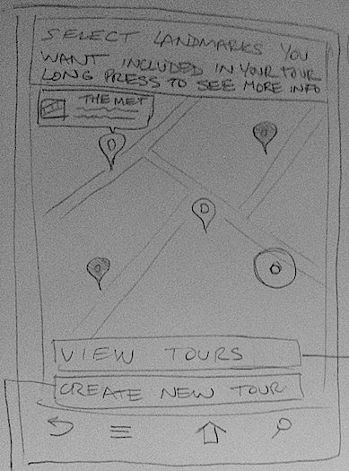
Screen #1 - This is the starting screen. All landmark markers start out grayed out, and selecting them makes them bright. Long pressing displays a picture and some info about that landmark. There are two buttons on the bottom of the screen. "View tours" takes you to a list of tours filtered to only include tours that contain the landmarks you selected (Screen #2). "Create new tour," takes you to Screen #4.
Analysis:
- Learnability
- A lot of text is required to explain actions
- Long presses are hard to discover, as is dragging between points
- External consistency with Google Maps
- Efficiency
- Once understood, the UI is efficient in terms of choosing landmarks you definitely want to see
- There are a lot of steps before you are actually following a tour, which is not efficient
- Long pressing to see info on every landmark might be time consuming
- Safety
- Easy to accidentally include or not include a landmark in your filter by accidentally tapping or double tapping
- Adding or removing a landmark from the filter is easily undone
- There is no way to view all selected landmarks, so there may be selected landmarks that are no longer on-screen
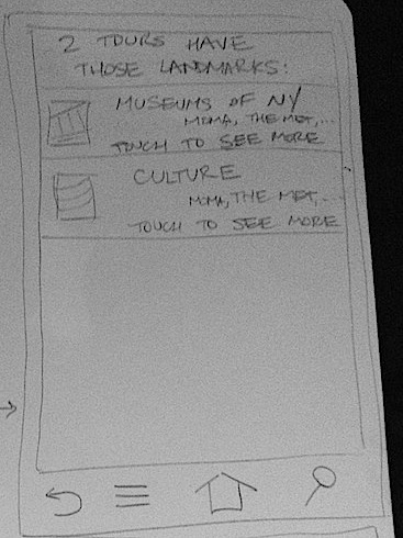
Screen #2 - Selecting a tour from this list brings you to a screen with more detail about the tour, including all of the stops, an estimated time for it to take depending on your method of transportation, etc. (not shown). On this other screen there will be a "Start Tour" button, which will take you to Screen #3.
Analysis:
- Learnability
- The selection of the list of tours will be straightforward and easy to understand.
- Smartphone users are used to this type of UI
- Efficiency
- There are a lot of steps before you are actually following a tour, which is not efficient
- You need to select a tour to see more detail before you can start the tour
- Safety
- Easy to go back if you select the wrong tour
- Easy to select the wrong tour, especially if the preview images and preview landmarks lists shown are similar.
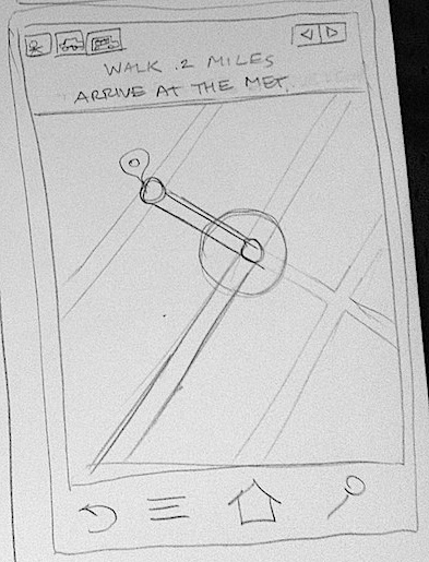
Screen #3 - This screen is very similar to the iPhone directions app. It gives words on the top and a map with your path laid out for you. There are arrows to step back or forward in the directions. You can select a method of transportation as well.
Analysis:
- Learnability
- This will be familiar to users and easy to understand (external consistency with other map applications)
- Efficiency
- The arrows are fast to use, so stepping between steps is fast
- Safety
- Hard to misuse the GPS feature, since the only input is the arrows, which are easy to undo (they are a form of direct manipulation)
- Could be easy to accidentally switch mode of transportation, but it is easily undone.
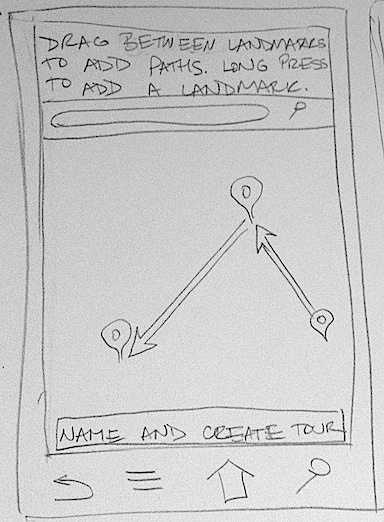
Screen #4 - This is a map view with a search widget to find locations you may want to add. You drag between landmarks to create your tour, or long press on the map to drop a pin and make a new landmark. On the bottom there is a button to create the tour and give it a name.
Analysis:
- Learnability
- A lot of text is required to explain actions
- Long presses are hard to discover, as is dragging between points
- Efficiency
- Long presses and dragging are efficient and fast to use if you know they're there
- Safety
- Adding or removing a landmark from the filter is easily undone
- When dragging between landmarks, it might be easy to make a mistake, but again this is direct manipulation so it is easily undone
Storyboard #2
- Shows you the next step and then landmarks that are nearby/related/on the way
- Adding locations to a database, don’t specify tour route
Screen #1 - Basic homescreen showing the user main uses of the app.
Screen #2 - When finding a new tour, this is the first screen the user will see. Allows them to input their starting location manually or to use their current position.
Screen #3 - After entering a starting location, the user is brought to a map showing all the registered POI's near them. Each location is marked with an icon based on the category under which is falls. The user can filter out certain types of locations if they have no interest in seeing them. Users can select places by touch to view a small pop-up window with basic information. From this window, they can continue to the location's main page for further info/actions. A button at the top takes them to a screen listing all the user's selected places.
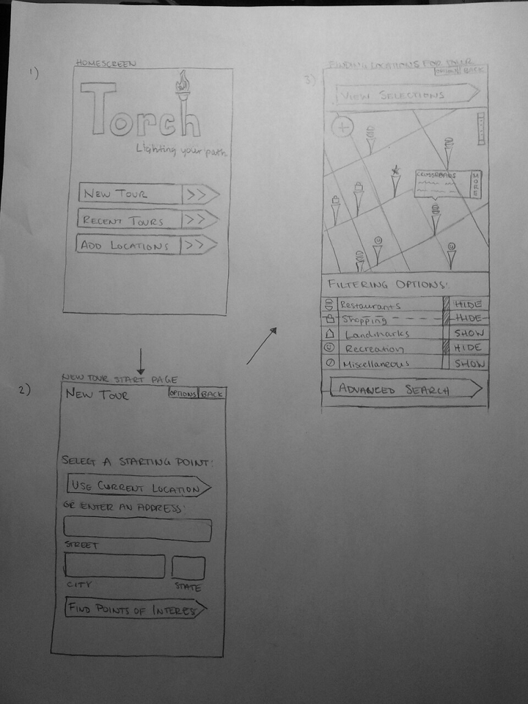
Analysis:
- Learnability
- Unique icons for each type of location may not be implicit.
- Finding detailed info by clicking on icons shown on map may not be obvious.
- Ambiguity on "type" of location (Is a bar recreation or restaurant?).
- Map areas behave as expected (no additional learning if already familiar).
- Icons are used consistently throughout the tour process to solidify/clarify their purpose.
- Efficiency
- User cannot see selected locations while choosing additional ones.
- User cannot get an estimate on time/distance until all locations have been chosen.
- Several different screens to navigate to add a location (home page -> map page -> location page).
- Using map in substitute of address input saves time (starting spot, new location)
- Hard to add/search for a specific place if it isn't on the map (have to go to the "advanced search" page).
- Finding a "subtype" of a more general "type" can be inefficient since each location has to be looked at individually (for instance, finding an authentic Italian restaurant among a wide variety of other restaurants).
- Safety
- Requires several deliberate button presses to add an event (good for error prevention)
- Incorrectly entered address requires the user to go back and reenter the correct information
Screen #4 - Basic page for each location. Button at the top allows user to quickly add the location to the tour. Page also includes information on the location, a picture, and user reviews (if available).
Screen #5 - Page that lists the currently selected locations. User gets here by adding a location or pressing the "view selections" button from screen # 3. Allows user to return to the map to add more locations, or to generate tour based on the current selections.
Screen #6 - Main page for following a generated tour. Show current location and route to the next location(s). Also displays other POI's along the way. Still lets the user filter these suggestions. Displays estimated time of arrival at next location and the distance remaining to it.
Screen #7 - Page for adding a location to the database. Allows user to enter all of the relevant information about the place.
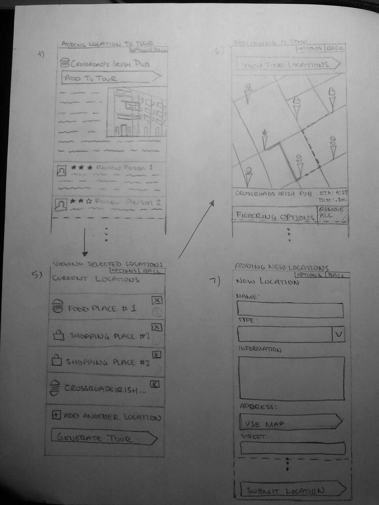
Analysis:
- Learnability
- Location page is very traditional. Picture, info, and review arrangement should be familiar to most users.
- Adding the location to the tour is very easy once the user gets to this page.
- Location listing page is very straightforward. The way to add/remove selections is clearly visible.
- Tour directions are given in a familiar manner.
- All the necessary fields for adding new events are clearly labelled.
- Efficiency
- One button press to add location to tour from location page.
- Easy to add/remove selections
- "Remove All" filtering option makes it easy for users to get rid of all suggestions.
- Safety
- Easy to remove unwanted locations
- Directions to locations are not very detailed (just show the map, leaving potential for user to get lost).
Storyboard #3
- Map displaying possible tour routes & filter using a list of landmarks with checkboxes
- Show you a picture of the next landmark with description, direction (like a compass)
- Modifying a tour by making changes while following
Screen #1 - Linda has searched for tours in Cambridge, MA. A map is displayed with the three results. The tours are overlayed on top of each other, with different line styles (this could easily be changed to color, or some other distinguishing factor). The different stops along the tour are represented with dots or markers of some sort at their location. Tapping on one of them opens a popup with the location’s name, category, rating, reviews, pictures, etc. Clicking again would go to a more detailed view (perhaps on Yelp or another service), and clicking anywhere on the map would clear the result. Moving around on the map should re-do the search, such that tours on the current map are always shown.
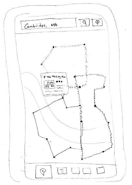
- Learnability
- External consistency with Google Maps interface, so it supports standard actions (panning, pinch-to-zoom, search for locations, etc)
- Unclear whether or not the search is for cities (“Cambridge, MA”) or specific locations (“Thirsty Ear”)
- Stops along the tour appear clickable (or should) so that the users know how to get more information
- Efficiency
- Several tours are overlaid on each other to view lots of information at once
- Several tours could possibly lead to information overload
- Safety
- There are no binding actions on this screen
- Any search can be repeated
- Clicking to find out more information about a stop can be undone by clicking anywhere else
Screen #2 - Clicking on the list icon at the bottom brings up a list of all the landmarks in the area that Linda has chosen. They have checkboxes next to them, such that they can be selected/deselected. Linda can choose the landmarks that she wants to be on her tour, and when she returns to the map view only tours containing all the landmarks she selected will be shown.
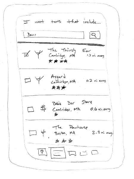
- Learnability
- Clicking the list icon brings up a list of what you were already viewing on the map, which is not obvious (these two views are more linked than that, so maybe they should be presented as such)
- The interface has external consistency with many other "list views"
- The search bar at the top is clearly labelled
- The list items present check boxes, which users are likely to be familiar with
- It is not clear that you need to go back to the map to view the results, so perhaps a “View Results” button should be added.
- Efficiency
- Not as efficient as viewing results on a map (but since the user selected to have the items appear on the map, so it’s acceptable in this case)
- There should be a “check/uncheck all” button in order to improve efficiency
- Long-pressing on a category icon (such as a martini glass for a bar) should give you the option to check/uncheck all items of that type
- Safety
- Not very easy to make a mistake, since checkboxes are separated with large margins
- Easy to immediately undo a “check” operation by clicking it again
- If you check something and then do another search, it’s not clear how you can uncheck something that’s no longer visible
- There should be a “view checked” or “clear all checked” button
Screen #3 - Once a tour has been selected from the map, a compass points the way toward the next stop on the tour. There is also the name of the next stop, how far away it is, and more information about the stop. The compass will use the internal compass in order to point the arrow in the correct direction. Additionally, there will be a map in the lower section of the screen (with north always toward the top of the screen). It shows Linda’s current location and the location of the next landmark, and a suggested route for how to get there.
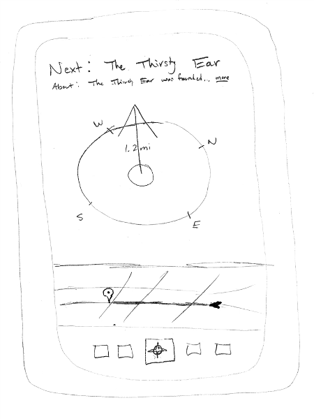
- Learnability
- External consistency with a typical compass, as well as other applications that take advantage of a compass interface
- Ideally the movement of the compass needle will teach the user that it is actually pointing to the location
- The map provides more information (in a well-known format) if there is any confusion
- There are two mental models being presented here: the compass where the direction to the landmark is always at the top of the screen, and the map where north is always at the top of the screen. Perhaps it would be better to have a map/compass button at the bottom that switched between the two views, so that the user could take advantage of whichever one aligned best with his or her mental model
- Efficiency
- The map recommends the fastest way to get to the desired location
- The compass provides real-time updating of the direction toward the goal
- Safety
- Mistakes are unlikely; the only action that can be taken from this screen is to click a button at the bottom or find out more about the chosen landmark
- The compass button will always be in the bottom, so you can easily return
- Perhaps there should be a "cancel" button that stops tracking you and pointing you to the next landmark
Screen #4 - At any time during the tour, Linda can click the pencil icon on the bottom in order to edit the tour. All the landmarks on the tour will be shown, in the order they occur on the tour. Tour landmarks can be removed from the tour by clicking the “x” on the right side. Tour landmarks can be re-ordered by dragging them around by their handle on the left side. There is an “Add new stop” button that brings you back to the map interface, but a search reveals only landmarks (instead of tours). Selecting one of these would add it to the tour. Finally, there is a “Save tour” button that will save your tour as a new tour (to not overwrite the old one), after a dialog box that asks you to name the tour.

- Learnability
- The draggable handles on the left provide affordances that you can drag the landmarks around
- Direct manipulation of the landmarks makes it easy to reorder them
- External consistency with an "x" to delete something
- It's not clear that the "Save tour" button will make a copy of the tour and save it, so that should be relabelled
- Efficiency
- Users can make all changes before having to "save" anything, to prevent unnecessary waiting
- No easy way to automatically order stops, perhaps by type or distance
- Safety
- No changes are committed, so you can quickly reorder, add, or delete a landmark if you didn't like your most recent change
- Perhaps an "undo" button should be added to automatically undo the last change
Storyboard #4
- Some way to do search/filtering (slide-down, parameter search, etc).
- Ordered list of landmarks on the route potentially with a guide (landmark #, picture, name) with which step you’re on and perhaps with a small map
- Drag-and-drop tour ordering
Screen #1 - When making a tour, the users start at the following screen where they can pick parameters such as where they are starting from, how long they wish the tour to last, how they are travelling, and what they would like to see (all parameters that limit/dictate how users pick tours). On this screen, after they have picked parameters, they can proceed to either follow the generated tour (screen #2) or continue to add to their tour and clearly visualize the tour in a map view (screen #3).
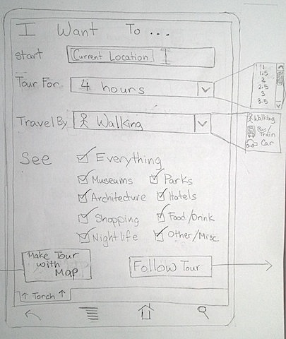
Screen #1 Analysis:
- Learnability:
- Simple, straightforward menu for picking parameters
- A lot of text is required to explain actions
- May be confusing what are the options
- Not clear what is clickable and what is not clickable
- Efficiency:
- Very few steps/screens to navigate before following a tour
- Default tour parameters exist on menu (start: current location, tour: 1 hour, travel: walking, see everything) making it easy for the user to start
- Safety:
- Requires deliberate actions on the user's part before moving to next screen/part
- No binding actions, easy for user to undo anything they have done
Screen #2 - Here Torch makes it easy to follow tours with a small map showing the closest landmarks as well as a list/guide of the landmarks they will be travelling to in a scrollable list. This list has a picture of the stop, the stop's name, a small stop description, and an estimate for how much time users on average spend at that specific stop. Users can return to the previous menu by pressing the tab button labelled "Torch" at the top. In addition, at the header at the top, it shows how many stops makes up the tour being shown and how long the whole tour will take. It will also let users easily switch between the transportation modes: walking, public transportation, and personal car (inspired by map views found on most phones).
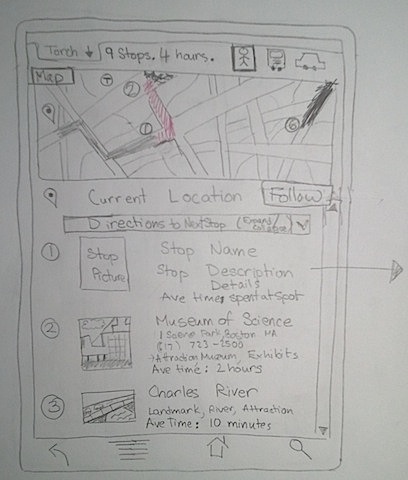
Screen #2 Analysis:
- Learnability:
- Explicit markings for each stop
- External consistency on map areas (no additional learning if already familiar)
- Icons are used consistently and may be already familiar to user
- May be confusing how to get back to main menu
- Not clear what is clickable and what is not clickable
- Efficiency:
- User can easily change tour time or parameters even when following a tour
- User can easily change mode of transportation from walking to car or vice versa
- Few steps for user before following a tour
- Safety:
- Requires deliberate button presses to make a tour from main menu (good for error prevention)
- Directions to get from one stop to the next are detailed and time estimates provided
- A lot of direct manipulation so easy to make mistakes but also easy to undo
Screen #3 - In map view, the users can see all the landmarks close to the location they chose and they can add or remove landmarks/spots from the menu on the side. They can simply click on a landmark to add it to the list or they can drag and drop it to remove or add to the list on the side. At the top it will show how many stops they have selected and the estimated time to see all of them. The users will have to long-press a landmark on the map to see a description of that spot. To add a landmark to the map, the users must long-press an area of the map that doesn't already have a landmark. Once the users have made their tour, they can click the follow tour button and will be taken to screen #2. In this screen, the users can still return to screen #1 by pressing the Torch tab in the top left corner.
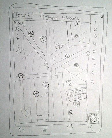
Screen #3 Analysis:
- Learnability:
- Explicit markings for each stop
- Detailed descriptions for each stop, but only after long-press which may not be obvious (although consistent with other map applications)
- Map areas behave as expected (no additional learning if already familiar)
- Icons are used consistently and may be already familiar to user
- Ambiguity about how to drag and drop by long-pressing on a stop
- Ambiguity about how to add a stop
- May be confusing how to get back to main menu
- Hard to discover actions like long-presses and dragging
- Not clear what is clickable and what is not clickable
- Efficiency:
- Not clear how to add location
- Easy to form a tour by clicking or dragging and dropping
- User can easily switch order of stops
- Long pressing to see info on every landmark might be time consuming
- Users can quickly and easily add landmarks to map or tour if actions are known
- Safety:
- Easy to add landmarks by accident
- Not clear how to remove landmarks from map
- Easy to remove or add or undo things dragged and dropped onto tour
- A lot of direct manipulation so easy to make mistakes but also easy to undo
1 Comment
Edward Oscar Benson
Great work. Clean designs, a lot of variation in the types you UIs you tried. Thoughtful analysis. A bit better annotation w/r/t where each task begun and ended would have helped.