GroupTraxx
Jaden downloads the app onto his Android and goes off to the mall to get some new clothes and shoes. As he buys new shoes, he opens the app leading him to the Home Dashboard (figure 1) where he can select to record an expenditure.
|
The Traxx homepage uses a Dashboard layout for easy access. For learnability, the home page is a very simple and consistent design the allows the user to see all of their options and allows a generalized access for the user, thereby allowing the user to find what feature they want to access depending on the use case. Also, to improve learnability the home page uses a sort of Dashboard layout to make it a very predictable way to enable the user to select or access features. |

(Figure 1)
After selecting to record expenditures, Jaden is taken to a second window that allows him to pick between taking a photo of the receipt and then recording the expenditure, or just recording it instead. Jaden decides to take a picture of the receipt and Traxx access’s the Android’s camera and allows him to take a picture. Afterwards Jaden selects and enters his expenditure. He decides to use the voice recorder and states that he bought shoes for $65 at Gallaria. Traxx automatically parses this data and records the expenditure under the tag of “personal”.
|
|
The first window of the new expenditures menu. Users can choose between taking a photo of the reciept or writing the input. Furthermore, this window also enables for quicker access to company expenditures allowing the users to make purchases for a company and connect directly with the company’s expenditures data. |


(Figure 2)
Jaden then realizes he want buy some food and heads to a local restaurant to eat. At the restaurant Jaden orders some food and again goes to his app to record his expenditure. Jaden notices his battery is getting low so he doesn’t want to keep taking pictures of receipts, instead he opts out to just enter the expenditure instead.
|
|
The expenditures window allows the user to input the amount and location of their expenditures. Furthermore, it also allows them to select a tab so that the user can categorize and filter out expenses based on different expenditures. |


Soon after he’s back at work but realizes that he needs to buy some supplies for the HR department so he take a trip to the nears Staples to buy some office supplies. As he records his expenditures, he clicks on groups and selects Pickbox as the tag. He then takes a photo of the receipt and finishes recording the expenditure.
|
The spending Analysis window gives the user a chance to see the trends in spending through both a graphical and a chart view. It also enables the user to access the dropbox account in order to see photos of the reciepts that the user has taken pictures of. |

Later on that night Jaden’s at home and wants to see his weekly spending, and opens the spending report and opts to see his personal expenditures for the week. Traxx gives him a graphical view of his expenditures by data and separates it by tags so that he can see how spends money over time. He can also see his group spending with other groups such as his workplace (Pickbox) and it enables him to keep track of that as well for his record. Satisfied with his new app and his weekly expenditures, Jaden decides to go to sleep.
|
The chart view of the Spending Analysis window, allowing users a full table view of their expenses data. More importantly though the data is organized in a way that allows the user to either filter out by various “tags” or different dates, expenses and amounts. |

Meanwhile, Jaden’s boss Mike is on plane flight from New York after talking to investors and wants to know employee spending for the company’s different groups. Taking Jaden’s advice and having other employees connect to Traxx, Mike opens the app to group expenditures to see how people spend money on the Pickbox.
|
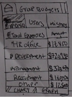
The Group Budets UI allows people to access and see how various members of a group/organization spend money. The UI allows users to see specific item expenditures, and uses a user’s tab to see a generalized graph of a users spending during a specific period of time. |
He gets a graphical view of each employee’s spending, separated by various tags (in this case offices). If he wants a better look at each user he can select the user and see a graph of their spending or a chart with more details. Furthermore, with the graph and chart combination, it becomes easier for Mike to see that the company’s spending has slowly been decreasing over the past couple of months. Satisfied with his analysis tool, he closes the app and enjoys his flight back home.
Analysis
The learnability of the overall design is good because it enables the user to efficiently navigate through a simple, and familiar layout and system. The use of various metaphors that are familiar to the user combined with a tabbed UI design that the user will presumably be familiar with allows efficient data tracking of various expenditures as well as better viewing of various data points. The application enables users to keep track of the data by allowing them multiple forms of input that gives them options on how they want the data to be recorded. This gives the user multiple forms of familiar data entry to make the process simple. Furthermore, the creation of a tag based filter system allows the user to generalize and organize expenditures in a method of their choosing. With regards to group tracking, the application keeps the same UI, which keeps the consistency between both single and group user experiences. The group features allow the user to track group expenditures from an abstract to a detailed level, allowing the user to choose how detailed of a look they want at the data, and based on this intent they can monitor expenditures to this level of detail. The negative part of of this design is basically the UI's feature view, meaning if a user first started to use this it would take sometime for them to figure out what to do in order to complete their intent/objective.