Story (and analysis of each screen)
Jaden makes a purchase at 7Eleven for Pickbox. He opens the app and sees the home screen
|
*The icons on this home page easily convey the messages that when clicking the icons, either New Entry (sorry for the typo in the picture), View spendings, I owe You’s, You owe Me’s, or a graph should open. With quick reading at the top, users can figure out that if you hold down the icons, more options will be provided through a popup (as drawn to the sides). The home page displays a simple summary of expenditure for a preset time frame. The user will be able to make small changes to the fund and the time frame to see different values.
|
He clicks New entry to enter his spending.
|
|
He sees that the date is correct (as today’s date), and clicks the microphone button, and says “Eight Seventy Four at 7Eleven, Convenience Store.”
The input box to the price and tags fill up. Jaden, then, makes sure that the funds say Cash and moves on. He remembers that he should report it to Pickbox so that he can be reimbursed when he sees the button to make it into a “UOME”, and hits the button. This brings him to a similar screen, except now there is an empty field for who owes you.
|
|
He clicks the contact book icon because he knows that he has the Pickbox’s reimbursement contact in there, and selects the contacts.
He then clicks the Share button.
Jaden also knows that Pickbox will direct deposit his reimbursement, so he selects the “Pay To” field as Bank.
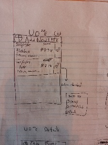
He hits save. Now he sees the UOME on the list of UOME’s.
|
|
Few days later, he is hanging out with his friend Pete, and stops at 7Eleven again to buy a pack of gum. Pete who wanted a bag of cookies, forgot his wallet, so Jaden decides to spot for him. After his purchase, he enters a new UOME, but this time, he leaves the Pay To field undefined as he doesn’t know how that will happen yet. When he has the app open, he sees a notice. The notice says that Pickbox had reimbursed him.
|
|
For now, he clicks “Wait”. When he returns home he looks at the confirmation receipt photo, checks his bank statement to make sure that the payment was actually made, and seeing that it is all good, he clicks “Got It!”.
Later that day, he goes to the Coop with his friend Eliza to buy textbooks. Because there was a giant line, Eliza decides to pay for Jaden’s stuff at the same time. Jaden makes an IOU entry.
|
|
Jaden sees his IOU list has increased.
|
|
General Analysis
Overall this is a fairly simple design, and had its focus on keeping as little clicks to do what the user would want to do by utilizing cameras, microphones, and GPS. At the same time, some extra steps were added to make sure important information were clearly communicated to the users. Those were the IOU's and UOMe's. Especially since the other party might be your company reimbursing you, it is essential that these information are correct and that the users get to confirm what they are submitting to each other. However, when the IOU's and UOMe's are for personal reminders, it is as simple as a press of a button.
Items were placed in such a way that hopefully would anticipate people's actions (e.g.: users may think that a new You Owe Me is like I am paying for it like any other, and use New Entry button; so placing a Make It Into A You Owe Me button) .


