Design 2:

Home Screen

Storyboard

Learnability

Efficiency

Safety

Visibility


                   Home screen                      The list of social contacts (friends)
 
The list of commercial contacts (deals)

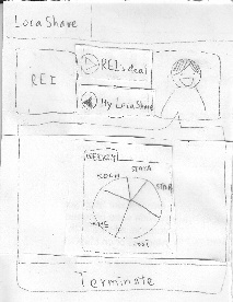
When Joe logs into the
LocaShare app, he sees
the home screen, which
only has two buttons.
By clicking on the "My
friends" button, he sees
the list of his friends
(social contacts),
and by clicking on the
"My deals" button he 
sees the list of his
deals (commercial
contacts).
Also, clicking on the
"LocaShare" button on
the upper left corner 
leads Joe to the home
screen.

Pros: 
1. The user interface is 
externally consistent 
with other social applications. 
2. The user interface is 
internally consistent since 
the ways to list friends and 
deals are similar. 
3. The UI conveys itself to the 
user by using the texts Immediate 
feedback is also provided 
when user clicks on the buttons.
4.The UI speaks in the user's
language. (Instead of using
social/commercial contacts, it uses
my friends and my deals.)


Pros: 
1. Users can find friends
easily by using the search
bar. It also prevents user  
from scrolling down 
on the long list in order 
to find a specific 
person or deal.

If user wants to view deals
but mistakenly clicks on 
the "My friends" button. 
He can easily resolve 
this problem by going 
back to the main screen.

Pros: 
1. The friends and 
deals buttons are huge,  
and this makes them 
salient to users. 
2. The icons for friends/ 
deals are presented by 
pictures.It provides good
information scent.

Cons: 
1. Search bar might be too 
small to be noticed.(We 
should test this in paper  
prototyping.)


Task 1: Add Social Contacts

Storyboard

Learnability

Efficiency

Safety

Visibility


               Home screen                            Find for friends by typing in the
                                                                                 search bar          


   Permission setting page of Joe
                  for Bob

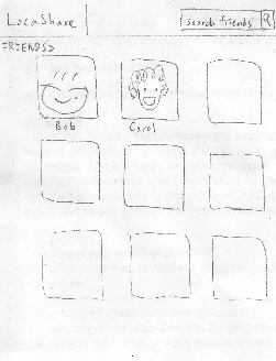
To add a new social contact,
Joe starts from his home
screen and clicks on "My
friends" button. He finds Bob
by typing his name in the
search bar (which is located
at the upper right corner.) Bob's
picture pops out and Joe clicks on
the "Add friend" button to add him.
 
Joe then sets the permissions
for Bob. For example, in this
scenario,
1. Adjust the time by manipulating
    the clock-like interface.
2. Choose the places that are
     available for Bob by clicking 
     on the map. 
  (a)  Click on a new place to 
        create a new one. At the 
        same time, Joe can edit
        the place's radius by
        manipulating a transparent
        circle around the location
        bubble. Joe can also edit
        the name of the location 
        such as STATA or Boston by
        typing in the location bubble. 
             
   (b) Clicking on an existing 
         place can either delete it
         or edit it.
    
3. Hide/show aggregated information
    by clicking on the chart and the 
    Hide/Show button. Click on the
    tab menu to choose different
    kinds of aggregated information
    (weekly or monthly).

Pros: 
1. Adding friends is done in a 
similar way as other social apps.
2. The time/map widget makes 
very easy to select.It is also 
consistent with clock apps
and google maps. 
3. The map provides direct
manipulation which allows
user to choose the locations.  
4. When user chooses a location 
on the map. It provides  
immediate feedback by creating
a bubble around the location.

Cons:
1. Bad feedback about the
outcome*.* User is unable to
know what would happen once
they set the permissions. An
extra page should be created 
to visualize the result.

Pros: 
1. Minimize the amount of
drop-down menu for permission
setting by using pictures and
maps.
 
Cons: 
1. It might be cumbersome 
for users to set the  
permissions of each 
social contact one by one.  
Aggregation should be 
used. (ex. group permission 
settings.) Efficiency problem 
can also be mitigated by 
providing default 
permission settings or history
 permission settings.
2. It would be too much
work for user to type the
name of a location or the
address, auto-complete
could be used here. 
   

Sources of potential
error in this interface
are that the user
enters the wrong
address, name of
location, or perhaps
enters a invalid time.

The auto-complete 
function should help
prevent incorrect
address. In addition,
the engine behind the
interface should 
provide hints to users
about the name/radius
of the location users
click on.

Besides,do users really
need so much freedom 
on the permission 
settings?

The clock widget,
map, and charts
are salient 
to users.


Task 2: View real-time location of social contacts

Storyboard

Learnability

Efficiency

Safety

Visibility

    
                   Home screen                     Find existing friend by either typing 
                                                                                     or browsing

    View Bob's location information

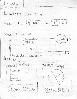
To view real-time location 
of a social contact, Joe 
starts from his home screen 
and clicks on "My friends". He 
can find his friends by either 
typing his name in the search 
bar or browsing through the 
list of friends. 

He then clicks on Bob's picture 
to view his location information.
In Bob's page, the button
" > Bob's LocaShare" indicating
the location information Bob is 
sharing with Joe. Also, his
current location is presented in
the "Current" area (White Mt.
in this picture).

Browsing through past locations
can be achieved by swiping 
the current location map.

Pros:
1. This UI is consistent
with familiar social apps like
facebook. And the map 
widget is consistent with
the Google map.
2. Swiping to view past 
information provides good
feedback. 
3. Map widget provides
 good affordance of the
location.

Cons:
1. Swiping to view past 
information is not obvious 
to users; thus the interface
is not communicating itself
to users. An arrow or an
icon here could be helpful.
2. The swiping direction.
Does swiping left mean
viewing past histories? 
An arrow or some texts
would better explain this.
3. Do users understand the
difference between
"> Bob's LocaShare" and
"< My LocaShare"? We 
need to test this in paper-
prototyping.
4. The question mark might
be misleading. Users
might think the system
doesn't function as
 expected instead of the 
location is unavailable.

Pros:
1. Once user find his/her friend,
viewing is simply one button 
click away.

Cons:
1. Swiping may not be the best
design if user wants to view the 
location information a long time
ago. However, the problem can 
be solved by showing a new 
page in which lists all the past
location information.

The only error here is not
viewing the desired data by
clicking on another friend's
picture. User can undo this 
by going to the home 
screen or the back button
on the browser.

The map is big such that 
users can see friends' current
location easily.


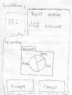
Task 3: View offers and opt-in to create commercial contacts

Storyboard

Learnability

Efficiency

Safety

Visibility

      
Mail box notifies Joe that there are        Click on the mail box to view the 
             offers available                                  list of  available offers


  View Rei's offer by clicking on Rei 

The mail box animation pops up
when there are offers available
to Joe. Upon clicking on the mail
box, Joe sees the list of offers.

To view Rei's offer, he clicks
on Rei's picture and sees the
location information that Rei 
wants from him in exchange
for the 10% discount.

In this scenario, Joe realizes the
information he will be exposed 
to Rei by his own example.
LocaShare mines for Joe's
past locations and visualizes
the information he is about to
share. Joe can choose to 
"Accept" the offer or "Cancel" it.

Pros:
1. Mail box animation is 
a good metaphor for 
receiving a notification.
Joe can easily understand
that there are things 
available to him.
2. Joe can easily learn the
information he will provide 
to the Rei by his historical 
location information. Learn
by example my own example
is an effective way to teach
user what will happen if I
accept the offer.
3. The ">" button on each of the
offer item is consistent with
other smart phone apps which
indicates that there are more
detailed information.

Cons:
1. If the list of offers is long,
scrolling down the long list
might be cumbersome. 
Would be better to aggregate
the offers by grouping them
into various categories.

Errors can result by
 clicking "Accept" or
"Cancel" too quickly.
However, this can be
easily resolved by
providing an alert
menu to confirm with
user again. Besides, 
user can always
terminate this offer by
going to the "My deals"
page.

The mail box animation 
provides high visibility
and good information
scent.


Task 4: View aggregate information of social contacts

Storyboard

Learnability

Efficiency

Safety

Visibility


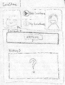
The steps for this task is almost
the same as the steps for task 2.
The only difference is that the 
aggregated information is 
presented in the "> History" area
where you can see a "frequency
chart" and a "duration chart".

- Frequency chart is presented
in a bar chart. It indicates how many
times Joe has been to a certain place.
Also, it has a tab menu where Alice
can choose to view Joe's weekly chart
or monthly chart.

- Duration chart is presented in 
a pie chart indicating how much
time Joe spent in a certain place.
Similarly, it has a tab menu which
allows Alice to navigate between
Joe's weekly and monthly chart. 

Similarly, Alice can swipe the chart to
view Joe's previous aggregated 
information.
 

Pros:
1. Users can learn by 
manipulating with the 
interface.
2. Swiping to view past  
information provides good 
feedback.
3. Charts simplify the way
to represent complex
information.  
 
Cons:
1. Do the charts communicate
the information to users? We
should test this in paper-
prototyping.
2. Swiping to view past  
information is not obvious  
to users; thus the interface 
is not communicating itself
to users. An arrow or an 
icon here could be helpful.

Pros:
1. Tab menu is a good way
to organize information.

Cons: 
1. Swiping may not be a good
design  here if user wants to
view the location information
a long time ago. However,
the problem can be solved
by showing a new  page in
which lists all the past 
location information.

The only error here is not 
viewing the desired data by
clicking on another friend's 
picture. But, users can 
undo this easily.

The tab menu and
charts are good 
information scent.
And the chart is
big to catch users'
eyes.


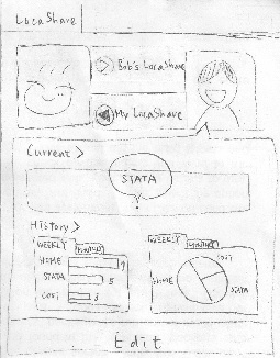
Task 5: Edit social contacts

Storyboard

Learnability

Efficiency

Safety

Visibility

   
Bob's page and his location info.       The location info. Joe is sharing with  
                                                                                     Bob

  Permission setting of Joe for Bob 

Joe enters Bob's page as in Task 2.
In addition to viewing Bob's shared
location with Joe, Joe can view how
Bob sees his location information by
clicking on the " < My LocaShare" 
button.

Joe modifies Bob's permission by
clicking on the "Edit" button at the
bottom and enters the permission
setting. The permission setting page
is the same as the on in Task 1.

Pros: 
1.  Users can learn by clicking
on the Edit button. Then he would
realize it is a way to modify the 
location you are sharing with Bob.

Cons:
1. The word "Edit" might
be misleading. Users might
interpret it as "edit my profile
picture","edit my location", or
"edit my name", etc. Should
use a more precise word to
express "Edit the information
you are sharing with Bob."

Edit can be done by
a click on the "Edit"
button. 

(The efficiency for 
permission setting
is discussed in
Task 1) 

The only error here 
would be mistakenly
click on the "Edit" button.
However, we can 
easily undo this action
by providing a "Back"
button. (or using the
Back button on browsers
or mobile phones.)

The "Edit" button is salient
to draw users attention.


Task 6: Edit commercial contacts

Storyboard

Learnability

Efficiency

Safety

Visibility

   
      The list of commercial contacts                           Rei's coupon             
 
The amount of location information Joe 
has share with Rei in exchange for the coupon

To edit a commercial contact. 
Joe clicks on "My deals" on the 
home screen and clicks on Rei.
The screen shows Rei's
offer for Bob, that is, a 10%
discount in the scenario.
Bob can view how the amount
of location information he has
provided to Rei by clicking
on the "My LocaShare" button. 
He can also go back to view 
Rei's offer by clicking on the
"Rei's deal" button.
  
Them, Joe decides to terminate
this relationship by clicking on
the "Terminate" button.

Pros:
1. The interface for deals is
 internally consistent with 
the interface for friends. 
Besides, the same charts
are also used here.

2. The dialog box is also
a good metaphor to 
represent Rei has 
something for you.

 Cons:
1. The dialog box might
also be problematic if 
user falsely interprets
it as a chatting screen
like what's app.

Pros:
1. Once you find the target
deal,  viewing can be
done efficiently.

Cons:
1. If the list of deals is
long, users need to 
scroll down on the list
to view the desired deal.
We should provide a 
search bar with auto-
complete to help user
search for the target
offer.

One of the errors might occur
in this interface is not  viewing
the desired data by
clicking on another deal's 
picture. User can undo this  
by going to the home  
screen or the back button 
on the browser. 
Also, errors can result by 
 clicking on "Terminate" too 
quickly. A confirmation alert
could be used to prevent this
problem.

The coupon information and
the information user has
shared with the company
can be noticed easily.
However, we should test
whether users are able to
notice the difference between
the button "Rei' deal" and
the button "My LocaShare".

  • No labels