Paper Prototypes for SETENTS
Overview
For our paper prototypes, we initially made prototypes for all three of our designs from GR 2: the smartphone photo design, the webcam video design, and the smartphone drawing design. We chose to initially test all three designs since each offered a substantially different way to accomplish the same tasks (note-taking, capturing diagrams, and reviewing notes), and also because the GR3 instructions were ambiguous in this regard. This offered us unique insight into which design was the most usable and most useful. After testing all of these designs on users, we decided to narrow our focus to the webcam video design, and iterated on that design for our next sequence of testing.
Prototype Photos
Original Designs:
1) Smartphone Photo Integration
|
|
|
|
Note management view - the user |
Main editing interface, with a popup |
Smartphone image capture screen, |
Main interface after snapping a photo |


2) Webcam Video Capture/Sync
|
|
|
|
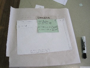
The initial note management view, with |
The note reviewing interface. Video |
The note editing interface. The user |
The popup allowing a user to take a |
3) Smartphone Drawing
|
|
|
Drawing on the smartphone screen |
The drawing annotation popup window |
Drawing inserted into the main note- |


Briefing
We gave similar briefings for each design, with changes to describe the unique capabilities of each one.
Smartphone Photo Briefing
You’re a student at MIT, and you were annoyed with taking notes on paper, so you’re trying out a new web-app instead (for the first time).
The web-app primarily advertises the ability to snap photos on your smartphone and seamlessly insert them into your notes.
As a good student, it’s very important that you take good notes - including all diagrams that the professor draws on the board - and then take time to review those notes later (before the test).
Smartphone Drawing Briefing
You’re a student at MIT, and you were annoyed with taking notes on paper, so you’re trying out a new web-app instead (for the first time).
The web-app primarily advertises the ability to use your smartphone to draw diagrams that instantly show up within the web-app. It also promotes the ability to annotate the diagrams from the web-app using your keyboard instead of drawing text on the screen.
As a good student, it’s very important that you take good notes - including all diagrams that the professor draws on the board - and then take time to review those notes later (before the test).
Webcam Video Briefing
You’re a student at MIT, and you were annoyed with taking notes on paper, so you’re trying out a application (for the first time).
The app primarily advertises the ability to record video with your webcam that’s synced up with the notes as you type them. It also should let you take snapshots from the video to insert into your notes.
As a good student, it’s very important that you take good notes - including all diagrams that the professor draws on the board - and then take time to review those notes later (before the test).
Scenario Tasks
For the smartphone app designs, we had one set of tasks. For the webcam video design, we had a different one. The sets of tasks mostly overlap.
Smartphone Tasks
1. Prepare to take notes for 6.813. The lecture title is “Usability”
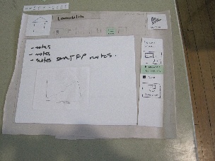
2. Take the following notes:
- notes
- notes
- notes [important keyword] notes
3. The professor drew a diagram on the board. Make sure you can remember it later!
4. Take more notes about whatever you want
5. Review the topic of “Learnability” which was covered in multiple lectures
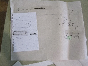
Webcam Tasks
1. Prepare to take notes for 6.813. The lecture title is “Usability.” Make sure you have video to review later
2. Take the following notes:
- notes
- notes
- notes [important keyword] notes
3. The professor drew a diagram on the board. Make sure you can remember it later!
4. Take more notes about whatever you want
5. After a few weeks, you want to review the learnability lecture.
6. When reviewing the lecture, you realize you didn’t quite catch the definition of “safety”. You should figure out the definition and revise your notes.
When we iterated the design, we changed the missing definition to "affordances", which is more relevant to the review topic of learnability. Otherwise we did not change the webcam tasks when we iterated our design.
Reasoning For Chosen Tasks
1. In this task, we wanted to determine whether the file management interface was easily learnable. It also tested to make sure they would start recording the video.
2. Task 2 was intended to see if the user was able to utilize the text editor features. We gave them a bulleted list and told them there was an important keyword, hoping the users would explore the ability to use the bulleted list and bold/italics/underline buttons.
3. This task tests the users' ability to use the snapshot feature of the interface to record important diagrams.
4. The purpose of this task is just to show the user that they can quickly go back to taking notes after taking a screenshot.
5. In this task, we jumped to a different scenario in which the user wants to review notes. This task tests the users' ability to locate their desired notes by using the file management interface.
6. The final task requires the user to replay the video taken with their notes to find a particular section of it. We were hoping the users would utilize the feature of being able to click on a word in their notes and jump to that section of the video. This task also tests whether they could successfully edit their notes while watching a replayed video.
Original Prototype Observations
Smartphone Photo Integration User Observations
The first user we tested with this design had trouble creating notes in the initial notes management interface. That design required that users create classes inside of school years, and then create notes inside of those classes. The user first tried to click the new notes button independent of a class, which didn't do anything. Then he created a new class, but titled it with the title of his notes. We didn't paper-implement one part of our design for this interface which might have mitigated this confusion: in our design sketches we had part of the interface covered with a tip that said "choose a year to start," which, if it had been present, would have prevented some of the user's mistakes.
None of the users we tested this design with had any major issues with the design of the notes taking / photo taking / photo insertion interfaces. One user took a photo, but did not drag it out of the camera roll into his notes without further prompting from us. Users agreed that the camera button was redundant after the first click of it, which presented users with a QR code to download our app. Our design stated that after that point, the button would remotely launch the app on the user's phone. However, users agreed that while the remote launching was clear in paper prototyping when we were handing them paper phones, it wouldn't be obvious in the real world when the phone is in a user's pocket.
Webcam Video Capture User Observations
The first user who tested design 2 thought that the interface was very useful (at the end of the test she stated, "I would use this!"). However, there were a couple aspects of the interface that weren't clearly labeled or intuitive. For instance, she was a little confused about the function of the home button within the review/edit screens - it wasn't immediately obvious that this would take her back to the note management screen. This confusion may have been a side-effect of the fact that our tasks didn't require going from the note editing screen back to the note management screen, so she never had an explicit reason to use the button. She also didn't realize at first that clicking on text during review mode would jump to a location in the video, but eventually figured it out without much additional prompting (just a little more time poking around the interface). In terms of efficiency, she appreciated the ability to select different playback speeds for the video when reviewing notes.
The second user that tested this interface didn't have too much trouble completing the tasks. His only feedback was that he would have liked to be able to edit the notes while the video was playing (when reviewing existing notes). This is something that we addressed in our prototype iteration by merging the review and edit modes into a single screen. More details about this iteration are discussed in a later section.
Smartphone Drawing User Observations
Due to time constraints, we didn't test this design on as many users as our other designs. However, several usability issues did crop up.
The draw on the phone / view on the phone and the laptop way we had of handling diagram creation proved confusing. The user didn't realize at first that the paper she was taking notes on represented a text area, and tried to diagram with the pencil that represented the keyboard. This could have been made more confusing by the fact that we only had one whiteboard marker, so we could not simulate the drawing appearing on the laptop as the user draws it on the phone screen.
The user also found the sidebar document management system confusing. This again could be because of deficiencies in our simulation: in an effort to increase the speed of our prototype, the person running the sidebar failed to properly order and indent all of the category/notes entries in the sidebar.
Prototype Iteration
Based on the fact that our webcam design got the most enthusiastic response from our first round of users, as well as the fact that in our opinion that design has more opportunities for UI innovation, we chose to focus on the webcam design and revise that design for our second iteration.
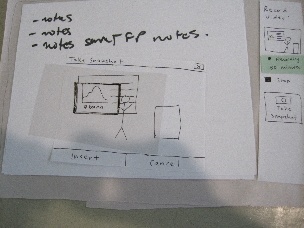
The most negative user feedback we received on our original webcam design was on the separate review and edit modes. For our iteration, we had only one overall mode and had both video recording and video review appear in a single pane, as can be seen in the following photo of our updated design:

A drag bar allows the user to resize the editing pane and the record/review pane as they wish in our design, although we did not simulate this aspect of the design on paper.
The UI's appearance changed considerably, since we eliminated the review screen entirely. However, this design also changed the behavior we were simulating.
In the first design, we allowed only one video clip to be associated with each set of notes, for design simplicity. However, we decided that this would be too annoying for the user, since they might have to break up notes on the same topic into different documents in order to film multiple video clips. It was also a safety issue if the user mistakenly stopped recording before they meant to. So in our updated design, we allow users to record multiple video clips which are all appended together.
The top of the record/review pane contains either a live view from the camera or a preview of associated clips, depending on the state. The live view is presented when there is no video associated with the lecture yet, and while recording a new clip. A preview of the recorded video shows otherwise.
Beneath the live view/preview window are playback and recording controls. Which subset of them is active depends on the the state. While no clips are associated with the video or video is recording, the scrubber, speed control, and play buttons are disabled. While playback is occurring, the record button is disabled.
The final element in the record/review pane is the "Take Snapshot" button, which also functions differently in the different states. While reviewing video, the snapshot taken is of the frame the user is currently reviewing. In our first design, we neglected to incorporate this functionality, which was an oversight since we think people might wish to insert snapshots later in order to not lose time while taking notes. When not reviewing video, the snapshot button takes a snapshot of the current view from the camera. This happens whether video is being recorded at the moment or not.
The ability to review and edit video at the same time also required us to change our behavior when it comes to highlighting the text that corresponds to currently playing video. In our initial design, you could not edit the notes while you were in review mode. Clicking on text would cause the video to jump to the point that was recorded when the text was typed. In our new design, if a user clicks text it might be to edit OR to jump to a point in the video. We decided that if the video is currently playing, clicking on text would only move the cursor. If the video is not playing, clicking text would both move the cursor and jump to the appropriate point in the video.
Design Iteration Observations
In general, we found that users of our modified design enjoyed the interface and had little difficulty completing the tasks. All users were successfully able to begin recording video, take notes, and correct their notes by re-watching the appropriate section of video, without any additional help. We noticed that the users of our revised design were able to complete the note-correction task much more quickly, and with less confusion, than in the original design since they could edit notes while reviewing video. We have included more detailed observations about each test user below.
The first user we tested the new design on instantly created new notes. Only after he was in the editing interface did he wonder how to organize his notes. User took somewhat longer to navigate the take snapshot interface than some of the other people we tested with. When he went to the reviewing tasks, he realized how to create folders to organize his notes. He discovered the ability to click on text to jump in the video. He wished there was a pause button as well as a stop, since stop makes him think the video will reset to the beginning, which wasn't the case in our design.
Our second testing user expressed quite a bit of interest in the design - in fact he said that he has developed similar software himself. His general reaction was that the interface was fairly intuitive, and he expressed that the behavior was consistent with basically every other text editor he had used. After the test he expressed that it was a good interface, and he was really happy that he could change playback speeds when reviewing video. His one gripe was that inserting snapshots popped up a window to crop it right away - he would have preferred inserting it immediately and optionally going back to crop it later (suboptimal efficiency).
Our third user created a folder for class before creating notes inside of them. She explored the interface and inserted snapshots before the tasks prompting her to do so; she also assumed that the text wrapped around the image. She browsed through notes instead of searching to find notes to review. She did not discover the ability to click on text to jump in the video. She also said she was unsure whether taking a snapshot would cause video recording to stop, and found the autosave confusing.
The final user began with no difficulties creating a new note. He didn't create a new folder for the class, though. The user was confused by our [important keyword] notation in the task. He thought he was supposed to use some special syntax to tag it as important. While taking notes, he was able to recognize the buttons for bulleted/numbered lists, but that he would not interrupt his flow of typing to click them so he was hoping there would be some keyboard shortcuts for added efficiency. While searching for all lectures with the word "learnability", he successfully used the search bar. He noted that it would be nice if he could click on an occurrence of "learnability" from this search menu and have it take him to that spot in the notes, rather than just to the beginning of the notes containing that word. While reviewing the video, the user made a good point that if the notes and the video were synced up exactly, then by clicking on the notes for a particular section the video would probably be past that point, since there is some delay between the lecturer saying the words and the user typing them. He expressed that the video slider would likely be difficult to use because the long video would result in granular video seeking with the slider. He said there might be a safety issue with pressing "record" while reviewing other video, because he wasn't sure if the video would insert where he was currently viewing or at the end. He wanted a search bar to be visible while in review mode. He also said that the video is too small and that there should be a full screen button for the video player. The user also suggested that the video might be moving too quickly to take notes along with it, especially if viewing the video at faster than normal speed, so he said we could maybe have the video automatically slow down a bit whenever the user is typing notes.
1 Comment
Victor J Wang
Ambitious to test out all 3 designs! Appreciate rationale for choosing tasks. Thorough and meticulous user observations, good description of rationale behind changes between iterations. Unfortunately, didn't complete testing with 6 users. Well presented and documented. Great job.