Scenario
After getting home in the evening, Bob opens the Smart Grid application to check his overall power consumption for the day. He notes that this consumption is higher than usual. Then he checks the hourly consumption, noting that it was highest during the afternoon. To find out why, he examines the power usage of his devices in more detail, discovering that much of the power was being consumed by his central air conditioning.
To see whether the additional power use is costing him much money, Bob looks at the current price information being provided by the grid. He finds that it is a peak usage time and that prices are high.
In order to save power and money, Bob increases the set point of his air conditioning by several degrees. He also checks the status of his power storage and decides to sell some of his extra power back to the utility company, taking advantage of the peak-time prices. He creates a transaction scheduled to take place an hour in the future, saves it, and closes the application.
Designs
Design 1 - Data Wizard
Overview
The overall layout of the design consists of a navigation bar at the bottom of the screen and a working window on top of it. The navigation bar uses icons for user to navigate among different functional areas of the application, and is shared by all. The working window loads the corresponding view based on the user selection in the navigation bar. Each functional view may use tabbed views as needed.
The intention of improving the efficiency of data presentation can be seen in many parts of the design. For example, current data is presented in one chart along with the historical statistics, such as high, low, and average values. It also attempts to make switching data of different perspectives efficient. For example, user can use a radio button to toggle between the cost data and the consumption data. All these intend to facilitate user’s decision making. These efforts could be extended to the entire application in the future versions of the design.
Storyboard and Analysis
Storyboard |
Learnability |
Efficiency |
Safety |
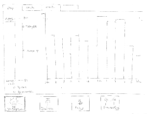
Figure 1.1. Bob launches the Smart Grid application from his tablet. He notices from the consumption bar at the left side of the screen that the energy cost in the past 24 hours is very high - $18 - considerably higher than the average. He then uses the chart at the right side of the screen to find out that the consumption was the highest from 1PM to 4PM. He clicks on the Devices button at the bottom of the screen to navigate to the Devices view, trying to find out why.
|
Pros:
The consumption bar intuitively provides information comparing today’s consumption to the historical records. It uses the metaphor of a thermometer or other similar scaling devices.
The bar chart is a common way to break down data in different time periods, so it’s easy to learn.
The radio button that allows user to select data on consumption or on cost basis is also easy to learn.
Cons:
Using different tabs for daily, weekly, and monthly data is inconsistent with most applications. A user might expect to get different types of presentation on different tabs, although they are the same with only different time scales. Putting them on one page and using radio buttons for selecting time frame would be a better approach.
The consumption bar shows cost, while the chart shows power consumption. It is inconsistent. |
Pros:
The consumption bar allows user to efficiently compare today’s data with historical data, and quickly detects any anomalies.
The chart presents much data efficiently in a small space, and yet makes anomalies stand out in a comparison way. If it further supports swiping to change time frame, it would be more efficient.
The radio button to select consumption verses cost allows quick switch between different kinds of useful information.
Cons:
The screen does not provide information on per device basis. Finding out which device causes problems requires user to dig into other screens, and thus inefficient.
Browsing the chart to a specific date and time is also inefficient. Adding a Calendar widget would remedy the problem.
It’s also not easy to compare same time period, say 1PM-6PM of different days. |
Pros:
There is generally no safety issue. If user chooses a wrong button, for example, he or she can quickly switch back. If the user navigates to a wrong page inadvertently, he or she can also quickly browse back.
Cons:
If the user goes to another time frame in the chart by swiping, it could be difficult for him or her to get back. Adding a “Back to Today” button would fix the problem.
If user navigates back and forth between different screens, inadvertently or not, the selection he or she made needs to persist.
|
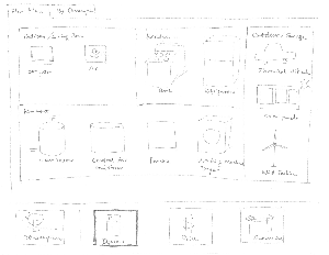
Figure 1.2. In the Devices view, Bob can see the Floor Plan tab, which presents all the devices in his residence in graphics, grouped by areas as he arranged when he first set up the application. Today however he wants to see what devices consume most power, so he clicks the By Consumptions tab.
|
Pros:
The floor plan naturally maps the devices as they are in the real world, and thus is easy to learn.
Using graphics for devices is also intuitive and helps learnability. Adding words or tooltip around the icons helps make information more precise.
Cons:
The device icon should not be just a static image. Clicking on it should allow user to go to the corresponding control page of the device, or view detailed energy information of the device. |
Pros:
Using graphics is more efficient than words for user to glance all the devices.
Cons:
The floor plan may not scale well to large facilities, for example, a factory. More hierarchies, and zooming capabilities would be needed in that case.
When more devices are available in one place, for example, the basement, they may not fit into the space available. This is another scalability concern with this interface. |
Pros:
Using the screen has no safety issue. If user inadvertently navigates to another screen, he or she can quickly come back.
Cons:
Using the screen has no issue. Setting up the screen in the first place would need to consider safety, but it’s not in the scope of this project. |
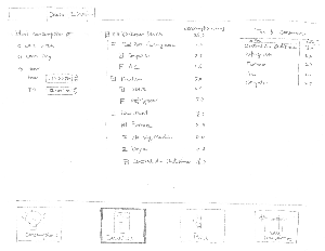
Figure 1.3. In this screen, Bob can see all his devices in a tree view, along with their consumptions in the time period that Bob has chosen at the left side of the screen. Today, he chooses 1PM to 4PM. The screen also lists the top five power consuming devices. The top of the list is the central air conditioner. Clicking on the device brings him to its control screen.
|
Pros:
The interface uses radio buttons, a tree view, and a table to presents perspective information. All offer standard affordance.
If user selects a different time range, the device tree view and the consumption table immediately updates their perspective data, providing immediate feedback.
Cons:
It’s not easy to do various kinds of comparisons in this UI. For example, user can’t compare a specific device’s data on different days. |
Pros:
The device tree view allows user to tailor it according to the task on hand, by collapsing or expanding parts accordingly. This makes it efficient to retrieve information.
The Top Consumer table allows user to quickly find out which devices consume most power in a given time.
The radio buttons for time range selection allows user efficiently see data in different time range without navigating to other screens.
Cons:
It doesn’t provide search capability. If user forgets where a device is, drilling down the tree to find it wastes time.
Individually select start time and end time using the widget provided could be inefficient. |
Pros:
If user selects a different time range by mistake, he or she can quickly correct it, by clicking it back.
Cons:
If user collapses a subtree inadvertently, it may not be easier for him or her to get back to the view before, unless the software specifically remembers it. |
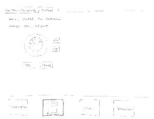
Figure 1.4. In this page, he adjusts the cool setpoint of his home from 65 degree to 75 degree by clicking the up buttons at right side, and the dial at the left side provides immediate visual feedback. After he is done, he clicks the OK button.
|
Pros:
The interface uses standard and intuitive controls.
The dial is a metaphor of the physical ones used in many households. It provides immediate visual feedback upon user clicks the up/down buttons.
Cons:
User may think the dial can be directly adjusted, while it can’t be.
The dial doesn’t give the precise number. Supplementing it with edit control will fix that.
While user is adjusting the set point, it’s not obvious what the current effective value is. |
Pros:
User can see the set point quickly.
Cons:
If user wants to adjust the set point by a large amount, clicking the buttons to do so is inefficient |
Pros:
User has to use the OK button to make an adjustment take effect, so the chance of error is reduced.
Cons:
If user makes a mistake and sets it to a wrong value, the UI doesn’t tell user the previous effective value to be restored to. It also doesn’t support Undo. |
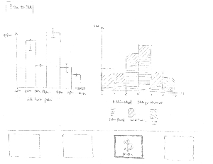
Figure 1.5. Bob is curious about the price information now. So he clicks the Prices button at the navigation bar at the bottom of the screen. The Prices screen provides a chart on how much the market will pay for the power that consumer sells, broken down by hours. For comparison purposes, the chart also provides the highest and lowest records in the past. The right side of the screen provides the estimated extra power that his generators provide during the same period of time. Noticing the price from 12PM to 4PM is very good, and he has extra power, so he decides to sell some. So he clicks the Transactions button at the navigation bar
|
Pros:
The price bar chart is intuitive. The “I” shape mark on top of each bar provides historical statistics data, helping user make decisions.
The storage chart provides the overall storage information. It aggregates the data from different sources, providing the third dimension of information, helping user further manages their devices.
Cons:
The price chart doesn’t allow user to adjust the timeframe.
The storage chart doesn’t allow user to choose devices.
No information is available about the historical storage data. |
Pros:
It’s efficient to use the charts to get price information, and statistics helps user make right decisions.
It’s efficient to see the storage data on a per device basis, helping users plan the use of their devices better.
Cons:
Aggregating devices in this fashion may not scale well when the number of storage devices is large.
User can’t compare the data of a specific device at different time periods.
The page doesn’t allow user to select a device and sells its power from there. User has to navigates to another page to do so. |
Pros:
The view isn’t used to get user inputs, so safety in terms of correcting wrong data doesn’t apply.
Cons:
The Storage chart uses estimated data. Decision making based on it may not be reliable. |
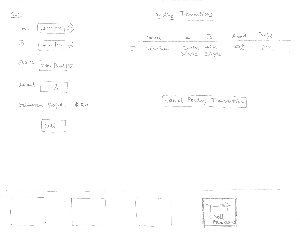
Figure 1.6. In the Transaction page, Bob selects the time, power source, and the amount of power he wants to sell. The Smart Grid application calculates the profit for him. After inputs the correct information, he clicks the Sell button. At the right side of the screen, the Pending Transaction table lists all the pending transactions. Bob can see the transaction he just made is listed there. He can select one or more transactions to cancel if he wants to, but that’s not the plan today. Thinking he can make $10 back, Bob is satisfied, and closes the application.
|
Pros:
The form at the left side of the screen uses standard controls for user to enter a transaction.
The table at right side lists pending transactions effectively.
User can check the checkbox next to a transaction to view more details or to cancel the transaction. This is consistent with many other applications.
Cons:
No interface for user to get historical transaction data.
It doesn’t provide report capability, which should belong to this page. |
Pros:
User can quickly view all the pending transactions and the profits they will generate.
Cons:
User can only initiate a Sell transaction one source for one time period at a time. It’s inefficient to sell from multiple sources and in different time frame. |
Pros:
It allows users to cancel a pending transaction, in case they change their minds, or they initiated a transaction by mistake.
Cons:
Miss a Clear button at the left form. |
Critiques of the overall design |
Pros:
The overall frame structure is sound – a navigation bar at the bottom using large icons, and the screen above provides the corresponding view. It’s easy to navigate around.
The view uses tabbed view as needed. The tabs are clearly visible and intuitive.
The UI is generally based on graphics, and thus intuitive.
It presents information in a self explanatory way.
It generally supports direct manipulation, and provides immediate visual feedbacks
Cons:
The contents seem light to fit in a large tablet screen – the charts and widgets may need to be large in order to fill it. But this remains to be seen.
Price and Transaction screens can be combined, because they provide closely related information.
If we allow user to click on a device in the Consumption screen to jump to the Devices screen to view its detailed data, user may feel the screens change abruptly. If we don’t allow such screen change, however, user may feel the screens are disconnected. The dilemma applies in general in this design.
|
Pros:
Navigation between screens and between tabs is efficient.
Data is presented efficiently, and allows user to easily retrieve the information needed to make decisions.
Cons:
Some useful charts are missing from the design so far.
Data entering in some screens is inefficient.
|
Pros:
The UI is generally fault tolerant. User can return to the original state if he or she makes an error.
It allows user to cancel a transaction if it’s needed.
Cons:
At some places, it only presents estimated data for user to make certain decisions, this can be unsafe.
No Undo capability in certain places where such capability would help.
|
Design 2 - Consolidated View
Overview
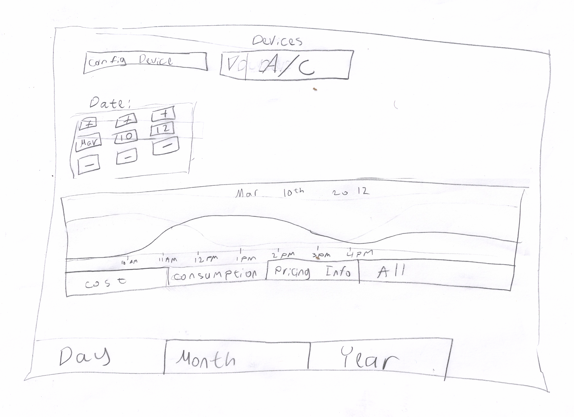
The screen displayed above is the main screen of the application. It gives the user easy access to most of the features the application has to offer.
The user can view different types of graphs by clicking the tabs below the graph display. For energy consuming devices, the user can view a graph displaying the cost (money spent), consumption, pricing information or a combination of all three (each displayed in a different color). The view options for energy generating devices, such as solar panels, are slightly different, allowing the user to view a graph displaying generated power.
The application enables the user to view usage or consumption information for different devices. The user can select a specific device for which to view consumption, or usage data by selecting the device (or appliance) in the devices list at the top of the screen. The application also enables the user to view the total consumption for all the devices by selecting the All option (for more information, see the Storyboard). The user can edit the settings of the selected appliance by clicking the Config Device button. When the All option is selected the Config Device button is disabled, in order to eliminate confusion (since it is impossible to edit the settings for all the appliances together). There are two of appliances, Generators and Consumers (more on that below). For generator devices, the interface enables the user to sell power by displaying an additional button that reads "Sell Power". This button is hidden when a non generator appliance is selected.
The user can change the time frame of the displayed data by clicking the lower set of tabs, which allow the user to view data by day, month or year.
The day view (Day tab) enables the user to view daily data recorded on different dates. The user can view data from a different day by setting the date control (on the top of the screen) to the desired date.
The month view(month tab) enables the user to view monthly data. The user can only change the month and the year (not the day). When the Year tab is selected the user can only change the year and the displayed data includes all the data recorded during the selected year.
Storyboard and Analysis
Storyboard |
Learnability |
Efficiency |
Safety |
Figure 2.1. Bob launches the smart grid application and views the daily consumption for today (March 12th).
Looking at the graph he notices that his energy consumption was extremely high between 12pm and 3pm.
|
Pros:
The application provides an intuitive way to view the daily consumption. The graph makes it easy to see the power consumption throughout the day.
The application presents the user with the option to view the monthly and yearly consumption by clicking the tabs on the bottom of the screen. In addition, the user can view the consumption for a specific device by clicking the device drop down list and selecting the device. These features are easily accessible to the user and the user is not required to click through different screens to discover these features.
Most of the features the application provides are presented to the user, enabling the user to easily explore and discover the various features the application offers.
Cons:
There is no way to overlay the consumption pattens of multiple devices, which would enable the user to easily compare the consumption patterns of different devices.
New users may be overwhelmed and confused by all the features presented on this main screen.
New users are more likely to misinterpret the data presented by the graph, not knowing that the different tabs enable them to view different data.
|
Pros:
The tabs enable the user to view consumption patterns and pricing information for different devices on different dates. The user can easily access these features without having to click too many buttons or menus.
The user can easily access most of the features of the application without having to go to different screens. The user has quick access to most of the features.
Cons:
Since there is no way to overlay the consumption patterns of multiple devices, the user would have to work hard to compare the usage or consumption patterns of different devices.
|
Pros:
There is no way to make irreversible data-related errors on the main screen.
Cons:
The different tabs allow the user to change the display different data. Since the tabs change the mode of the displayed data, the user can easily make mode and description errors, such as viewing the information of the wrong device or clicking the wrong tab (looks similar to the other tabs). The ability to view different types of information for different devices with a single click, makes them more likely to forget which mode they are on.
There is no way to undo view actions, such as tab change.
|
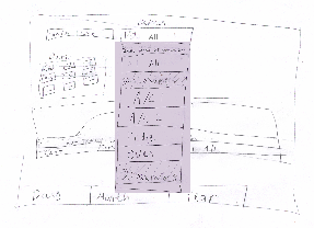
Figure 2.2. Bob clicks the device list, which lists the available devices sorted by their energy consumption on March 12th, where the top item is the highest consumer. He selects the first item on the list, A/C1, which is one of the air-conditioning systems in his house.
The list above is an expendable list that has two groups, Consumers and Generators. The Consumers group contains all the appliances that consume energy and the Generators group contains all the appliances that generate power. The All option enables the user to view the total energy consumption or usage of all the appliances together. Clicking the group headers toggles between showing and hiding the items in the group (i.e. clicking the Consumers header once hides all the items in the Consumers group. Clicking again displays the items in the group.).
The list is sorted by energy consumption during the time frame that the user chose to view. For example, changing the date causes the list to be ordered by the consumption during the day of the selected date. Changing the view to display consumption by month orders the devices by monthly consumption. The items in the Generators group are sorted by the amount of power they generated.
The user can search for a specific appliance by typing its name into the dropdown textbox.
|
Pros:
Viewing data for different devices is easy to discover.
A new user attempting to find the most energy consuming devices is likely to click the device list in order to go through the different devices to find the ones that consume a lot of energy. By clicking the list and reading the label at the top of the list, the user quickly discovers that the list is ordered by consumption.
Cons:
The user has to click the list and read the label at the top of the list to discover that the list is sorted by consumption. Figuring this out could take a while, since users often do not read labels.
|
Pros:
The user can easily find the source of high energy consumption, since the list is sorted by power consumption.
The grouping of the appliances enables the user to easily distinguish the consuming appliances from the energy generators.
Cons:
A large number of devices may require the user to scroll and scroll and scroll, in order to get to a specific device.
The appliances are not grouped by their type, making it more difficult for the user to find all the appliances of a specific type (e.g. all ovens).
|
Pros:
No serious (irreversible data errors) errors can be made.
Cons:
The interface is more likely to cause mode errors as described above (in the previous section).
There is no way to undo selection choices, which can be annoying in cases where the list contains a large number of appliances, requiring the user to scroll down a lot.
|
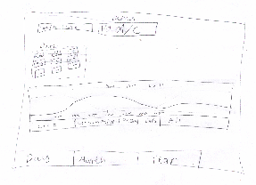
Figure 2.3. The graph changes, displaying the total consumption for A/C1 on March 12.
Looking at the graph, Bob learns that A/C consumes a lot of power in the afternoon.
|
Pros:
The interface provides an intuitive way to switch between different data views.
The graph makes it easy to see the continuous change in energy consumption or usage.
Cons:
New users may find the tabs a bit confusing.
|
Pros:
The user can easily view different graphs for different types of data. All it takes is a single click.
Cons:
The graph displays the data for one appliance at a time or for all the appliances combined. There is no way to view and compare the consumption or usage data for multiple appliances by overlaying their plots.
|
Pros:
No serious (irreversible data errors) errors can be made.
Cons:
As mentioned above, the interface is more likely to cause mode errors.
There is no way to undo selection choices.
|
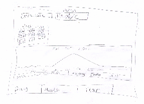
Figure 2.4. To see whether the additional power use is costing him much money, Bob looks at the current price information being provided by the grid by clicking the Pricing Info tab. He finds that it is a peak usage time and that prices are high.
|
Pros:
The interface provides an easy and intuitive way to the pricing information, accessible from all the different data view modes. New users can easily access this feature without getting lost.
The graph view provides a clear way to view the pricing info, even for new users.
Cons:
The pricing info does not depend on the selected appliance. This can be a bit confusing, since the other data graphs display appliance specific data.
|
Pros:
The interface provides a quick way to access the current price information from all view modes (i.e. it always requires a single click without going to a different screen).
Cons:
There is no way to view the price information as a table.
There is no way to overlay the price information for different days or months.
|
Pros:
No serious (irreversible data errors) errors can be made.
Cons:
As mentioned above, the interface is more likely to cause mode errors. |
 => => 
Figure 2.5. Bob decides to change the conditioner's set point. He clicks the "Config Device" button to edit the settings of A/C1. A/C1's settings screen enables Bob to edit the set point.
Bob increases the set point from 75 degrees to 80 degrees and clicks the OK button.
|
Pros:
The interface provides an intuitive way to access the settings of the selected device.
Cons:
Can confuse new users who want to edit the settings of a specific device, but do not care to view its consumption or usage information.
|
Pros:
The device settings are easily accessible from the main screen.
The device selection list and the Device Settings button are close to one another.
Cons:
The user has to access the device specific view (i.e. select the device from the list) in order to be able to edit its settings.
|
Pros:
Setting the set point too high or too low may result in too much energy consumption or overheating or over-cooling the house or office.
Cons:
As mentioned above, the interface is more likely to cause mode errors (such as viewing the settings for the wrong device).
|
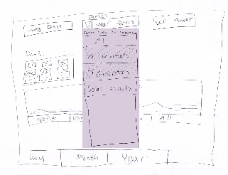
Figure 2.6. Bob checks the status of his solar panels, by clicking the device list and selecting the Solar Panels option.
|
Pros:
Same as above (see row 2).
Cons:
Same as above (see row 2).
|
Pros:
Same as above (see row 2).
Cons:
Same as above (see row 2).
|
Pros:
Same as above (see row 2).
Cons:
Same as above (see row 2).
|
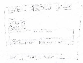
Figure 2.7. Bob checks the generated power information by clicking the Power tab below the graph. The app displays a graph showing information about the power generated by the solar panels. He decides to sell some power back to the utility company, so he clicks the Sell Power button.
|
Pros:
The interface provides an easy and intuitive way to the generated power information, accessible from all the different data view modes. New users can easily access this feature without getting lost.
The graph view provides a clear way to view the generated power info, even for new users.
Cons:
New users may find the tabs a bit confusing.
Consumer appliances and Generator appliances do not have the same view options. New users may find this a bit confusing.
|
Pros:
Quick and easy access to the generated power information.
Cons:
There is no way to overlay the energy generation patterns for multiple devices (the user views only one at a time).
|
Pros:
No serious (irreversible data errors) errors can be made.
Cons:
As mentioned above, the interface is more likely to cause mode errors (such as viewing the settings for the wrong device).
Mode errors may cause the user to make the wrong decisions (such as scheduling transaction for the wrong generator after viewing the graph for the wrong power generator appliance)
|
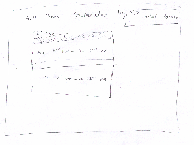
Figure 2.8. The app displays the Sell Power screen, showing a list of all the future transactions scheduled to sell extra power generated by the solar panels.
Bob creates an additional transaction by clicking the +add button.
Transactions can also be edited and deleted. The user can edit a transaction by clicking it (clicking the list item representing the transaction).
The dropdown on the top right corner enables the user to view scheduled transactions for different devices. The user can change the device for which they view and schedule transactions by clicking the dropdown and selecting a different device. The dropdown only lists Generator appliances (e.g. solar panels or power generators)
|
Pros:
The interface resembles the android phone's alarm clock setting interface.
Cons:
Users who are unfamiliar with this type of interface may find this a bit confusing, especially editing.
|
Pros:
Quick and easy access to the different Generator appliances, without having to go back to the main screen.
The interface also provides a quick and easy way to create and edit transactions.
Cons:
A large number of future transactions make it difficult to find the right transaction to edit (requires a lot of scrolling).
No way to copy transactions from one device to another.
|
Pros:
The users can view the scheduled transactions and correct any scheduling errors.
Cons:
As mentioned above, the interface is more likely to cause mode errors (e.g. scheduling transactions for the wrong generator device).
Users may accidentally schedule transactions for the wrong time.
Such errors may result in higher costs (e.g. selling too much energy during peak hours when consumption and prices are high).
No undo/redo.
|
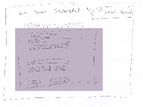
Figure 2.9. The app displays a dialog that enables Bob to schedule the transaction. Bob creates a transaction scheduled to take place at 4pm (an hour into the future). He sets the start and end time by clicking the time fields and setting the time. Then he saves the transaction by clicking the OK button and closes the application.
The interface above enables the user to edit the start and end time by editing the date and time fields. When the user clicks on a date or a time field the application displays a date and time dialog allowing the user to set the date. The user can specify how much power to sell by entering the amount of power to sell into the textbox at the top of the dialog.
|
Pros:
The interface provides a convenient way to edit the start and end date and time of the transaction. It resembles calendar event editing interfaces (the event editing dialog or screen), where the user can change the start and end time.
Cons:
Users who are unfamiliar with these types of interfaces may find it confusing.
|
Pros:
The interface provides a quick way to set the start and end dates and times of the transaction.
Cons:
There is no way to enter duration instead of end date and the user may have to compute the end date as a result.
The interface requires the user to exit the transaction dialog in order to be able to edit a different transaction or a transaction for a different device.
The interface provides no way to view the other scheduled transactions while adding a transaction.
Since this interface is not presented on the main screen, the user cannot view power generation information while scheduling a transaction, meaning that the user is required to remember roughly how much energy is generated in order to schedule transactions that make sense.
|
Pros:
The interface only enables the user to enter valid dates (date and time dialogs do that).
Cons:
The interface provides no undo mechanisms.
The user has no way to recover deleted events.
Scheduling transactions for the wrong time or date may result in selling too much energy at the wrong time of the day, which may require the user to pay for energy from external sources during peak hours, instead of using their own personal power generator or battery.
|
Critiques of the overall design |
Pros:
Most of the features are accessible from the main screen, making them easy to discover.
Cons:
New users may be confused and overwhelmed by all the features on the main screen of the application.
|
Pros:
Quick and easy access to most of the features.
Cons:
The user can easily view usage and consumption patterns for each device separately, but there is no easy way to compare the usage patterns of different devices.
|
Pros:
The interface validates the user input.
Cons:
The interface provides no undo mechanisms.
The similarity between the different views and the way to switch between the different views may cause description errors.
Using combinations of different groups of tabs to control the data views (mainly the graphs) may result in mode errors.
|
Design 3 - Parallel Views
Overview
This design divides the application into tabs based on the types of data which are available: usage data, storage data, and data from the grid. Each tab contains a split-pane view. The top pane displays an graph offering detailed data, which can be interacted with by touching and swiping. The bottom pane allows tasks to be performed based on that data.
The intent of this design is to keep the most relevant data visible while a task is being performed. Since the user may wish to take into account data from other views while performing a task (e.g. considering the amount of stored power while selling power back to the grid), the most relevant statistic from each view is displayed at the top of its tab, keeping that data constantly visible.
Storyboard and Analysis
Storyboard |
Learnability |
Efficiency |
Safety |
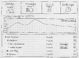
Figure 3.1. When Bob opens the Smart Grid application, he sees a graph of his usage for today. By touching the "month" tab at the left of the graph and looking at the average at the top right, he sees that his usage for today is much greater than his average usage over the past month. He returns to the "day" tab of the graph and notes, by expanding the tree in the bottom pane, that his air conditioner is consuming most of the power. He unchecks the boxes for all devices except for the air conditioner, which updates the graph to show only the air conditioner's power usage for the day. By doing so, he sees that the highest usage was during the afternoon. |
Pros:
The tabbed display is a familiar paradigm, especially on mobile devices.
The expandable tree used to display the devices is also familiar from other applications.
The graph is intuitive to use, and tabs, titles, and axis labels make clear what information is being displayed.
Cons:
The use of the checkboxes in the lower pane to update the graph may be unintuitive.
It may be unclear what the usage numbers in the bottom pane correspond to: are they the current usages? averages for the day? Additional labels would be helpful to disambiguate this information. |
Pros:
The opening screen is easily glanceable. The information likely to be most important to users, the current power usage, is displayed immediately when the application is opened.
The organization of devices into a tree allows the interface to scale well, efficiently supporting operations on large numbers of devices.
Cons:
The user may have to check and uncheck many boxes in order to display the desired information in the graph.
The device list cannot be sorted by power consumption; some exploration of the tree may be required in order to determine which devices are using the most power.
The usage view does not display information about price/cost of the usage. It may be helpful to add such information in a future version of the design. |
Pros:
It is clear how to undo actions in this pane, such as checking a box or selecting a tab.
There are no irreversible data-related errors to be made in this view.
Cons:
If the user navigates far back in time in the graph, getting back to today's usage information may be difficult. Adding a "Back to Today" button would solve this problem. |

Figure 3.2. Bob touches the "grid" tab to view today's pricing information. Simply glancing at the shape of this graph allows him to tell it is a peak usage time. The current price is displayed on the "grid" tab, and can also be viewed by touching the current time on the graph itself.
|
Pros:
The graph view and split-pane interface of this screen is internally consistent with the others.
Cons:
The application requires some background knowledge about the way the grid operates and the way power is priced. Non-expert users without such background knowledge may find it difficult to understand the information presented without more context.
It may be unclear what the price displayed on the "grid" tab corresponds to: is it the current price? average price? Again, a label would be helpful. |
Pros:
The pricing information is easily glanceable. The information most likely to be useful, the current price of power, is visible both on the graph and at the top of the tab.
Cons:
The pricing information cannot be overlaid onto data from other views, such as the usage information. The user would need to switch between tabs in order to compare the information in multiple views. |
Pros:
As with the previous view, there are no irreversible data-related errors to be made, and it is clear how to undo actions.
Cons:
As with the previous view, it may be difficult to return to today after navigating back in time in the graph. |
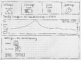
Figure 3.3. To change the settings of his air conditioner, Bob first navigates back to the "usage" tab (Figure 3.1), then clicks the "settings" button for the air conditioner. The top pane displays a graph of the air conditioner's power usage for today, helping Bob decide what settings to change in the bottom pane. He uses the spinner to increase the setpoint of the air conditioner. He then presses "save" and is returned to the screen in Figure 3.1. |
Pros:
The spinners used for numeric data entry are standard Android widgets, familiar from other applications.
Spinners are populated with default values, which, together with the up and down arrows, make clear what kinds of inputs are permitted.
Cons:
By using spinners to change device settings, the application may lose external consistency with the way those settings are entered on the devices themselves. |
Pros:
The graph is automatically updated to display daily view, which is presumably the information that is most relevant to the settings being changed.
After the settings are saved, the graph returns to displaying the data that was previously selected.
Cons:
It is not possible to view data for other devices while changing the settings of a device. If the user wants to take this information into consideration, they will have to go back to the main usage screen to see it.
Since the graph is automatically updated to the daily view, if the user was interested in looking at usage over the last week or month, they will have to readjust the graph after entering the settings screen. |
Pros:
The "cancel" button allows the user to revert any changes they have made to the settings.
Cons:
There is no indication of whether the settings have been modified, so a user may end up saving an inadvertent change. |
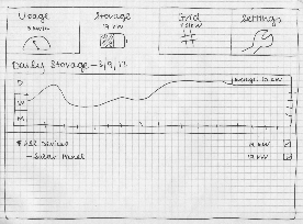
Figure 3.4. Bob checks the status of his power storage device by touching the "storage" tab. He glances at this screen to see both the current amount of stored power and the historical amount of stored power for today. |
Pros:
The graph view and split-pane interface of this screen is internally consistent with the others.
Cons:
As with the "usage" screen, the checkboxes may be unintuitive to use.
The numbers displayed in the devices list and at the top of the tab may be ambiguous without additional labels. |
Pros:
This screen, too, requires only a quick glance to determine the needed information.
Cons:
As with the "usage" screen, devices are not sorted by amount of stored power, and much checking of boxes may be needed to display the desired information.
The storage information cannot be overlaid onto data from other views; the user would need to switch tabs.
|
Pros:
As with other views, there are no irreversible data-related errors to be made, and it is clear how to undo actions.
Cons:
As with other views, it may be difficult to return to today after navigating back in time in the graph. |
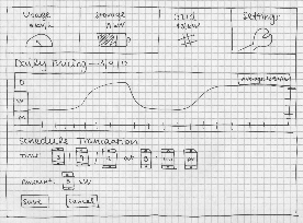
Figure 3.5. To schedule a sale of power, Bob returns to the "grid" tab (Figure 3.2), then touches the "schedule transaction" button. He uses the spinners to adjust the time and the amount of power to be sold. He uses the pricing graph in the top pane, and the total amount of stored power displayed on the "storage" tab, to help him decide. He touches the "save" button and is returned to the screen in Figure 3.2, which now lists the scheduled transaction. |
Pros:
Again, the use of spinners is familiar from other applications, and makes clear the kinds of inputs which are allowed.
Cons:
The interface does not expose all underlying details of the grid and of power transactions. A non-expert user may not know how to decide on the parameters of a transaction, and may not understand where the power goes or how they are paid for it. |
Pros:
The data displayed at the top of the "storage" tab allows the user to decide how much power to sell without having to switch back to that tab.
Cons:
Previously scheduled transactions cannot be viewed from this screen. If the user wants to take this information into account, they will have to return to the main grid page to see it. |
Pros:
Transactions take place at a scheduled time rather than happening instantly, so they can be modified or cancelled in case an error is made.
Cons:
The user receives no suggestions about how much power to sell or when to sell it, so a non-expert user could make a poor selling choice. |
Critiques of the overall design |
Pros:
The similarity of each pane of the application provides internal consistency, enhancing learnability.
The use of familiar widgets and paradigms, such as tabs, spinners, trees, and graphs, provides external consistency.
Text labels clearly show what data is being displayed, and help the user understand the results of their actions.
Cons:
Where labels are absent, the meaning of data may be ambiguous.
Certain controls, particularly checkboxes, may be hard to learn or unintuitive.
For some actions, users need knowledge of the underlying grid system beyond what is provided by the application itself.
|
Pros:
The design attempts to enhance efficiency by displaying the most relevant data for the current decision being made.
Cons:
If the automatically selected view is not the one that is desired by the user, this feature may be annoying rather than helpful.
There is no way to combine data from different tabs in a single view. For instance, power usage and stored power cannot be viewed together in a single chart.
|
Pros:
The use of tabs, widgets, and transaction scheduling makes it clear how to undo most actions.
The use of spinners for input helps to prevent invalid inputs.
Cons:
The absence of suggestions from the application may mean that non-expert users make poor decisions.
|


1 Comment
Victor J Wang
Good diversity of designs - each was optimized for particular focus. Recognized tradeoffs between designs. Very good presentation - would be even better if thumbnails were a bit larger so that the reader can simultaneously view both the text and picture.