Prototype Photos
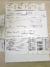
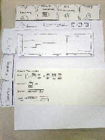
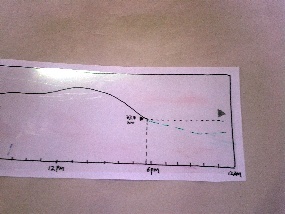
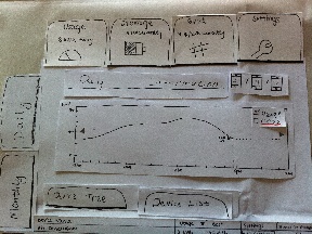
Viewing power usage with device tree (task 1). Graph is zoomed and dotted line shows predicted usage.
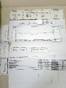
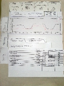
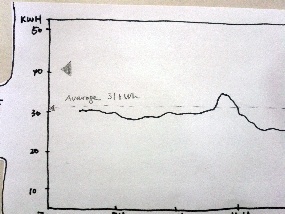
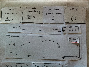
Viewing power usage with device list (task 1). Graph is in default state, showing monthly usage.
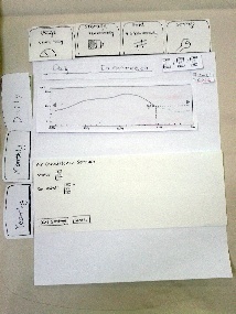
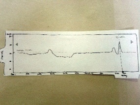
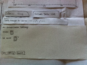
Changing device settings (task 2). Dotted line shows predicted usage after saving new settings.
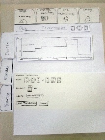
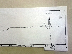
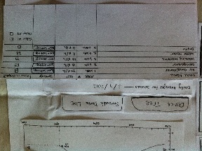
Viewing stored power with device tree (task 3). Graph shows daily storage.
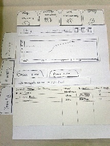
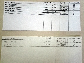
Selling power (task 3). Graph shows grid pricing information.
Briefing
The purpose of the application is to use emerging Smart Grid technologies to help home users manage their electrical devices more efficiently – reduce energy consumption, lower cost, and make profit.
It assumes that the electrical devices are "smart" devices, meaning they can provide real time consumption information to the home network, either by built-in capability or through some sort of adapters. The application monitors such information and presents it to the user. It also provides an interface for user to control the devices.
It receives the electricity price data from the grid, and presents it to the users. It monitors the statuses of the devices that generate electricity, and allows user to sell power back to the grid.
Scenario Tasks
- Compare today's power usage to the monthly average.
- Find the device that has consumed the most power today, and change its settings. (Added for second round: Describe how the power consumption of this device has varied over the course of this year.)
- Find out how much power is currently stored. Arrange to sell 5 kW of the stored power back to the utility company at 8pm today.
Observations
Round 1
User 1
- During task 1, the user noted that our y-axes were not consistent between daily and monthly graphs, and thus it was hard to make the comparison we requested between the two graphs.
- The user was able to perform task 2 quickly, and immediately chose the "device list" view to see a list of the devices sorted by consumption.
- When asked to sell power during task 3, the user tried to touch a device from the "storage" view in order to schedule a transaction. The user did not immediately think to look in the "grid" view to schedule a transaction (even trying the "settings" view first).
- The user mentioned that he did not know what to expect to see under the "grid" view, likely because he lacked a conceptual model of the smart grid and what it was for.
User 2
- When attempting to perform task 1, the user noted that he had difficulty reading exact y-values off of the monthly graph, so making a comparison using just that graph was difficult. He felt forced to switch between the monthly and daily tabs in order to complete the task. He would have preferred that when the graph's x-axis was touched, it would display the exact corresponding y-value. This wold have allowed him to gather all the necessary data from the monthly graph.
- After changing and saving the settings of a device in task 2, the user mentioned that he was unsure about the results of his actions, because there was no immediately visible state change in either the graph or table data.
- Like user 1, user 2 was confused by an inconsistency in the axes of our graphs. He assumed he was misunderstanding the data due to a conceptual mistake (though he was not). This observation seems to indicate user 2's lack of confidence in his understanding of the smart grid and the data it generates.
- Unlike user 1, user 2 immediately looked in the "grid" view in order to schedule a transaction.
- The user expressed a general dislike for the way that the tabbed view obscures some data. He was unhappy that data in one view would be hidden when in another view.
User 3
- The user expressed uncertainty about the "daily averages" heading in the "usage" view. He was unsure whether the values in the table were the averages for the current day, or the averages from each day across the current month.
- Like user 1, user 3 immediately chose the "device list" view when looking for the device that consumed the most power.
- Also like user 1, user 3 expected to be able to schedule a power transaction from the "storage" view. When he found this was not possible, however, he quickly tried the "grid" view and completed the task.
Round 2
User 4
- The user was able to complete task 1 with just a glance at the monthly graph, making use of the display of exact y-values that we added between rounds.
- Intuitively, the user knew how to interact with the graph using gestures (tap, swipe, pinch).
- During task 2, the user scanned the tree view, rather than the list view, to find the device with the greatest usage. He mentioned not understanding the difference between the tree and list views.
- When changing the settings, the user forgot to click the save button.
- The user correctly used the checkboxes to update which devices were shown in the graph. Afterwards, he asked questions about what he could expect to appear when other boxes were checked. His questions indicated that he had the correct mental model for what the checkboxes did, but he was uncertain whether this was correct.
- When scheduling a transaction in task 3, the user pressed the "sell power" button directly from the "storage" view.
User 5
- The user asked questions about the relationship between the graph and table data. Again, his questions indicated that he had the right mental model, but was uncertain whether it was in line with what was being displayed by the application.
- The user appeared not to understand the purpose of the tree view. He wanted to be able to click the headers in this view to sort the data, not realizing that this was the purpose of the list view.
- The user understood how to use the checkboxes to update the graph, but painstakingly unchecked the boxes next to each device except for the air conditioner. He did not use the shortcut of unchecking the box next to "all devices," then checking the air conditioner's box.
User 6
- This user was the first to notice and use the shortcuts for current usage, storage, and price on each tab.
- Like several other participants, user 6 was confused about the difference between the list and tree views.
- In completing task 2, the user went to the yearly view to find the data, but did not uncheck the boxes to view just the usage of the air conditioner. She looked carefully at the data, and even tried to provide an explanation for the pattern, without noticing that she was viewing the total yearly usage.
- The user commented that the application provided an amount of data that looked "intimidating" at first glance, but which was easy to decipher upon closer examination. She also mentioned liking the tabbed view. Despite her sense of familiarity with the application, however, she said that she did not know what to expect under the "grid" tab.
Prototype Iteration
Between Rounds 1 and 2
Based on user feedback, we made a number of changes to our prototype between rounds.
- Because we had made up our data, numerical values were not necessarily consistent between different graphs. Several users expressed confusion about this inconsistency. In response, we modified our data to ensure that it was realistic and consistent between graphs, allowing users to make accurate comparisons between views.
- We allowed users to view exact numeric y-values after touching an x-value in the graph, as suggested by user 2. We also displayed a horizontal dotted line with a label showing the average for the graph. We hoped that this change would improve users' ability to compare different values in the same graph, rather than having to switch views.
- Many users expected to be able to schedule a transaction from the "storage" view. We made this possible by adding a "sell power" button for each device in the "storage" view, comparable to the "edit settings" button for each device in the "usage" view. Clicking this button switches the user to the "grid" view and launches a new power transaction from the selected device, essentially acting as a shortcut for the "schedule transaction" button. We hoped that this change would both improve the learnability of the "grid" view and increase the internal consistency between the "usage" and "storage" views. For more information, see Figure 2.1 and Figure 2.2 below.
- We changed the wording of the "daily averages" heading to include the date from which the data was taken, hoping to address the ambiguity noted by user 3.
- We moved the "day," "month," and "year" tabs and made them larger, so that they appeared to apply to the entire view rather than just the graph. We hoped that this change would also help disambiguate the meanings of the data given in the bottom pane. For more information, see the "Prototype Pictures" table below.
- We noted that no users interacted with the checkboxes that change which devices are displayed in the graph. To test the visibility and usability of these checkboxes, we created an additional subtask for users to perform, as noted in Scenario Tasks, above.
- In the "usage" view, we provided a dotted line which showed the predicted usage values for a short period after the current time. We hoped that this change would give users feedback about the results of a settings change, as user 2 had requested. For more information, see Figure 5.2.1 and 5.2.2.
After Round 2
The user feedback from round 2 gave us additional ideas about modifications we could make to future iterations of our prototype.
- We made several efforts to clarify the function of the "grid" view (for instance, by providing a snippet of data from the view on the tab itself, and by sending users there from the "storage" view when they pressed the "sell power" button). But despite these efforts, most of our users still did not understand the meaning or function of the "grid" view. It may be necessary to change the name of this tab to provide better information scent.
- The naming of the "device tree" and "device list" views also seemed unclear to users. Again, changing these names could provide better information scent for sorting in the list view, and for viewing by group in the tree view.
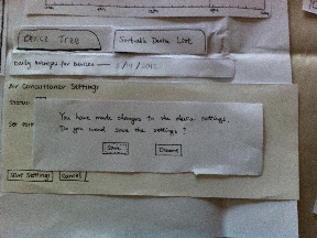
- It may be useful to show a warning before leaving a page without saving, as suggested by user 4's failure to save his changes to device settings.
- We hoped that users would find shortcuts for checking/unchecking boxes in the tree view--for instance, by unchecking the "all devices" button to deselect all of the boxes. Most users did not use such shortcuts. Further, these shortcuts are not possible in the list view. "Select all" and "deselect all" buttons would help improve the efficiency of the checkboxes.
- Most users did not pay attention to the snippets of data shown on each top tab. We hoped that this data would improve both learnability (by providing an example of the data available in the view) and efficiency (by reducing the need to switch tabs). While we still feel that these snippets are useful, we may need to make them more prominent in order for users to notice them.
Rounds 1 and 2 - Prototype Pictures
The table below shows some of the changes we made to our paper prototype between round 1 and round 2.
|
Round 1 |
Round 2 |
|---|---|---|
Device tree tab selected |
|
|
In round 2 we added a "sell power" button to each device. |
|
|
Transaction scheduling |
|
|
Monthly view |
|
|
Other |
|
|
After Round 2 - Prototype Pictures
The table below shows the changes we made based on the user feedback in Round 2.
Changes |
Round 2 |
After Round 2 |
|---|---|---|
Changed the caption and the icon of the Grid tab to Sell Power and a $ sign, so users without smart grid knowledge can easily understand it. |
|
|
Renamed the Device List tab to Sort-able Device List. Hopefully this change could give users a stronger hint on what the page will do. Also added a Select All and a Clear All checkboxes to make selecting and un-selecting all devices more efficient. |
|
|
Added a warning dialog if user leaves the Device Settings page without clicking the Save Settings button after he or she has made changes – we have seen users forgot to do so. No dialog will show up if user has already clicked the Save Settings button. |
|
|

1 Comment
Victor J Wang
Well done! Prototype photos showed interesting states, briefing and task instructions were clear, at least 6 users tested with meticulous notes taken, 2nd iteration improved upon usability issues seen in 1st iteration with pictures, well presented (nice use of tables, bullet points, and headers)