GR6 - User Testing
Design
Our mobile application can currently be accessed at MenuMe2. Evaluation and development took place on an Iphone with a landscape orientation.
Our initial screen uses an initial loading screen to provide users with a subtle tutorial in how to use the application. The animations behind the loading screen show the ways in which the user will be bale to navigate through the application, specifically through swipe actions. This screen also provides the application enough time to perform the necessary queries and geolocation calculations to take place.
|
|
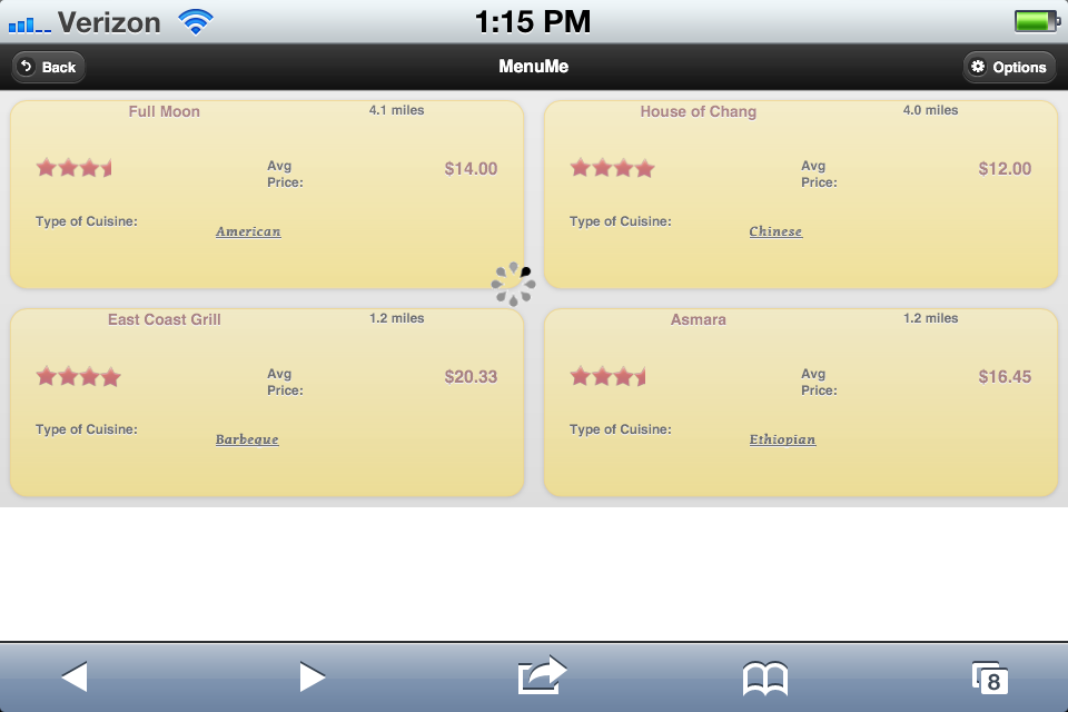
After the loading screen, the user is presented with four restaurants in the immediate area of their location. The screen represent each restaurant on its own tile, and provides basic information for each restaurant such as rating, distance, price, and type.
|
|
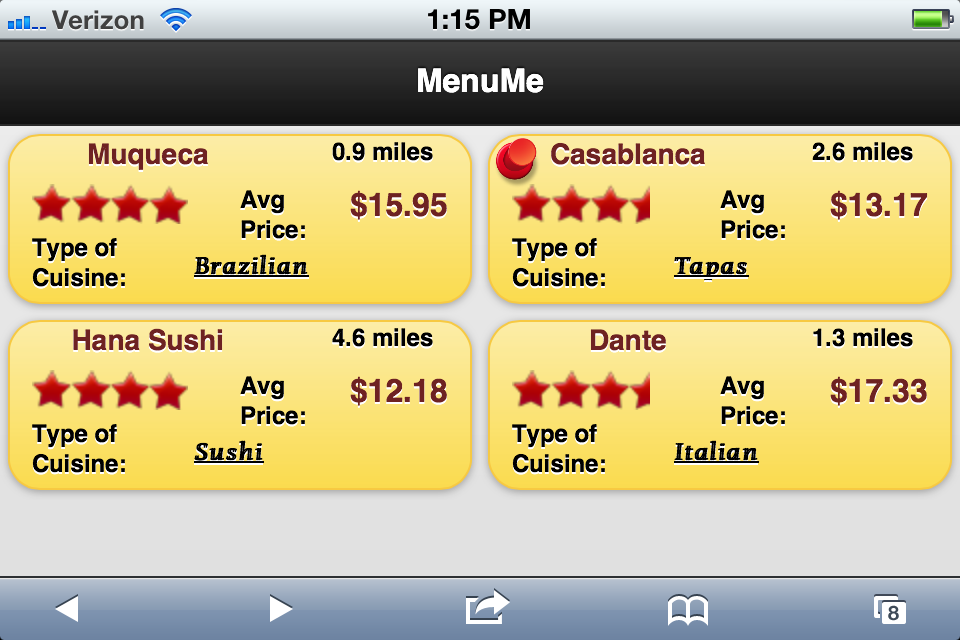
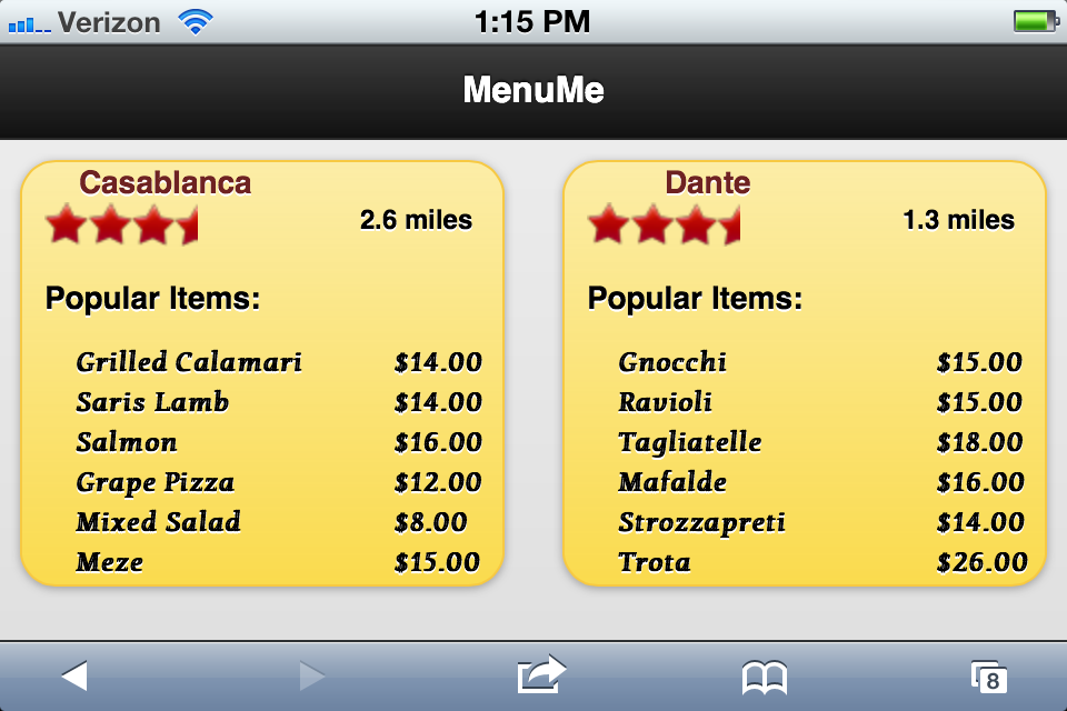
On this page, the user will be analyzing between the two pinned choices, and more menu information is provided for this comparison. The user can now pick one of the choices to receive even more in depth information.
|
|
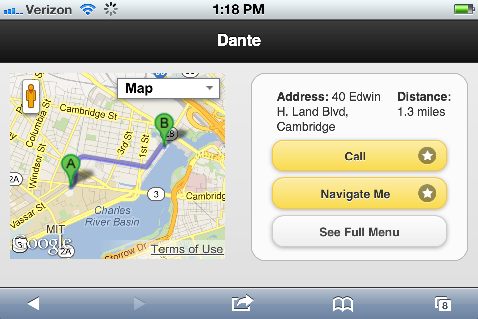
The last page displays details for the restaurants that will help the user finalize his or her decisions to go to restaurant of their choice. The page displays a general map to represent the location of the restaurant as well as links to external sites for more information. The user can use this page to make calls, receive detailed information, and look at the full menu.
|
|
Implementation
MenuMe was implemented for Mobile Web utilizing HTML, CSS, JavaScript, and jQuery. No formal framework was used. The key feature of the application was the user's ability to swipe away restaurants in which they were not interested, and retain restaurants that were appealing to them. The goal was simplicity, and this design choice achieved this.
As seen in the first computer prototype, users could initially drag the restaurant tiles around. If the tiles moved more than a certain number of pixels from the starting point, the information on the tile was changed to contain a new restaurant's data. A user could then click the tile to highlight it and keep it on the page. While the implementation worked, learnability was not great since the actual process of choosing two restaurants was not immediately apparent. Also, the process of dragging a tile was not synonymous with removing it.
To fix these usability issues, we removed dragging and bound 'swipe' event handlers to every tile. Swiping a tile removes it, and an animation shows a new one taking its place. This animation is much more intuitive, and users responded by actually knowing what to do without a demo. Another new implementation choice involved showing a loading screen when the app starts. This loading screen showed an animation in the background of tiles being swiped away and new ones arriving. This animation greatly increased the learnability, and the feedback was much better.
The other implementation features of Google Maps navigation and phone calls was straightforward. The main implementation problem involved the swiping of tiles and generally how users picked two restaurants to compare. We concluded that our application successfully conveyed the correct message to users through the implementation, and the application met our satisfaction.
Evaluation
For our user test, it was important that we did not give a demo before the test. The greatest learnability problem in our application is figuring out that tiles can be swiped and pinned. If we showed a demo, this behavior would be immediately apparent, and the test would not be indicative of an actual user scenario.
Our test population was chosen out of a group of poor college students that typically search for new restaurants on a regular basis. We chose three participants, and gave them the same directions: Compare the Hana Sushi and Full Moon restaurants menus, and then choose Hana Sushi to see more information. The last direction was to call Hana Sushi (hang up immediately) and then get walking directions to its location.
In our first computer prototype, the users had trouble determining how to get information from new restaurants. In the final implementation, we showed a loading screen that showed swiping animation in the background. All three users in our test knew how to swipe restaurants away after watching the loading screen. One user did not know that pinning two restaurants brought them to a second page, but the other two users had the right idea. All three users were able to select Hana Sushi and call them. All three were also able to get navigation directions.
In conclusion, the user testing went very well and really showed the necessity for the loading screen animation. We might show two tiles being pinned in the animation and a page transition in order to show users how to use the app. It would basically be an automatic demo in the loading screen, and that is probably the next step in the implementation. User testing was very beneficial to us during this project's implementation.
Reflection
Through the iterative design process, our team learned a great deal about how to design for different user populations. Although we feel that we produced a great product that solves a real problem in a novel way, there are a few things we would have done differently.
First, we would have spent more time thinking about and developing our idea from the beginning. In retrospect, we felt that we could have done more to solidify our idea earlier on in the design process. We had an idea of the problem we wanted to solve, but did not have any strong idea of exactly how we thought it should look. This sometimes prevented others, such as our TA, from really understanding what we wanted to build. If we had been able to explain more precisely, we probably could have gotten even better feedback.
We wish we would have done a better job of taking bigger risks earlier on. Our final product is one that steps outside the box in many cool ways. This final design only developed after we had gone through multiple iterations, and we could have gotten there easier if we had been less risk-averse early on.
One of the hardest parts to paper prototype was the fact that we built our app for mobile. It is hard to simulate actions such as swipe on a paper prototype. It would have been more effective if we had used a Wizard of Oz prototype or something similar on an actual handheld device instead of the paper.
We wish that we would have investigated the possibility of building an Android native application earlier in the design process. We realized that some of the features we were trying to implement would be more natural on Android than on Mobile Web, but not until after we were working on GR5. We made it work on Mobile Web just fine, but we would have liked to have explored other options sooner.
We wish we had prototyped the more complex edge cases of our home screen a bit better. For example, when a user "pins" a certain restaurant that he wants, we don't allow him to swipe that option off unless he unpins the restaurant first. This provides safety for the user, as well as is consistent with our theme. We didn't really prototype this feature though, and occasionally our users would try to swipe pinned items, which would cause problems, because we never learned if users could learn from those mistakes. In other words, we didn't do a great job accounting for edge cases in prototyping, because we thought they were rare and less beneficial. In retrospect, some of those edge cases could have been more prevalent than we realized, and we could have learned more about the correct way to handle them.
We sometimes had difficulty handling situations where two users would provide opposite feedback about a certain feature. We sometimes didn't know what to do in these situations. Usually we would find a "tiebreaker" user to decide which way made more sense. If we could do it again, we really should have gotten even more users to test features that seemed controversial. Doing this would have provided us with two benefits. First, we would have had a larger sample size so we could have made our decision with even more confidence. Second, it is possible that one of our users could have helped us identify a third solution that would have been acceptable to both sets of users that were arguing from the beginning.
Throughout the project, we felt that we made a lot of great decisions and did a great job. The preceding commentary is focused on things we could have done better if we had to do the project again. We chose to omit commentary in this section about things we did well because we felt there was less of an opportunity to learn from those. Going forward, we expect that we could make an even better UI Designed product if we had another chance, and we would learn from the aforementioned cases specifically.