Briefing
Our project is called VoiceComposer, and it's intended to let users quickly record a melody they're thinking of onto their smartphone.
Scenario tasks
- Record a melody line.
- Change one of the notes in your melody.
- Add a harmony line.
- Export the song.
Prototype photos
|
These photos are of the second version of our prototype. |
|
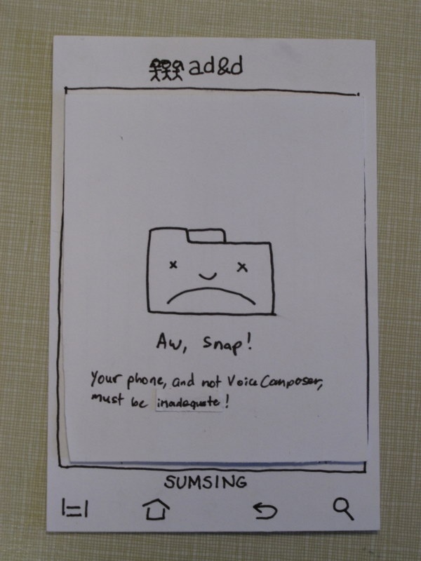
If the user tried to use any Android functionality besides VoiceComposer, they got this screen. |
|
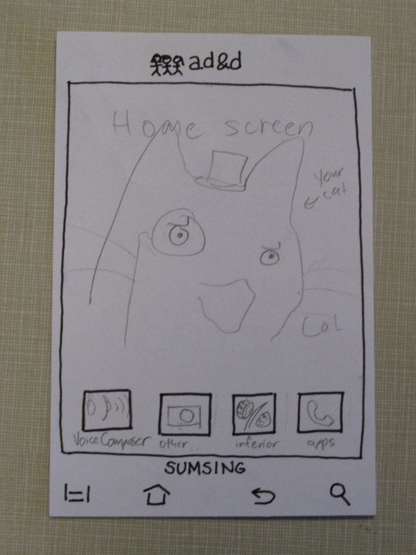
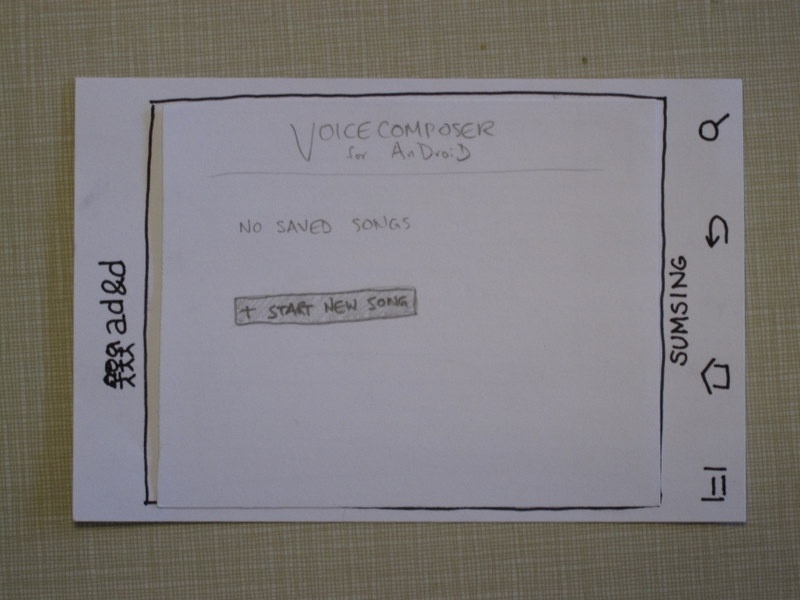
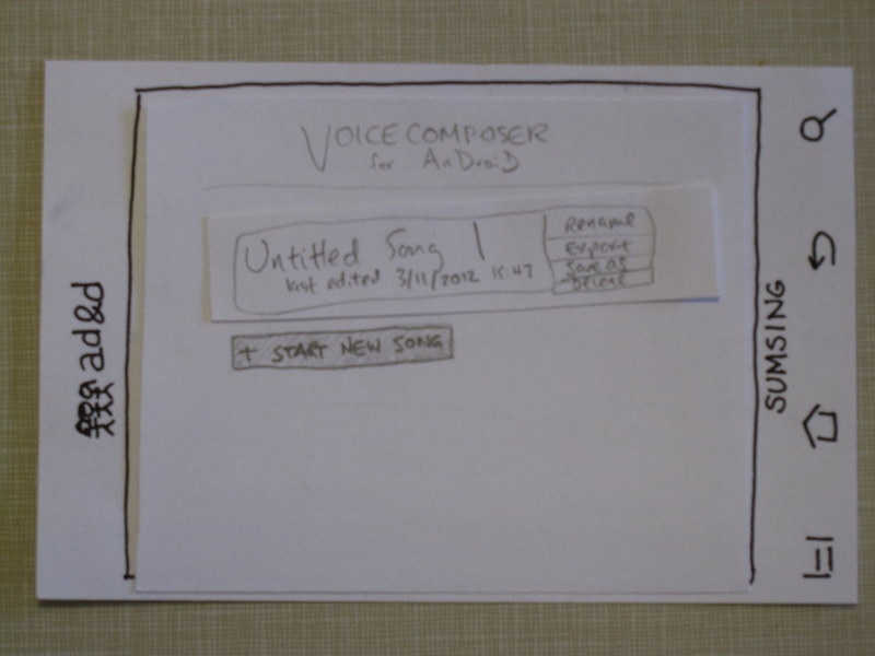
This screen appears when VoiceComposer is first opened. (The a, d & d thing stands for our names.) We have a section that says "No saved songs", and below that a "+ Start new song," |
|
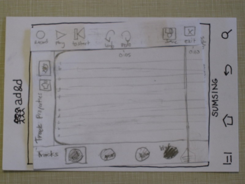
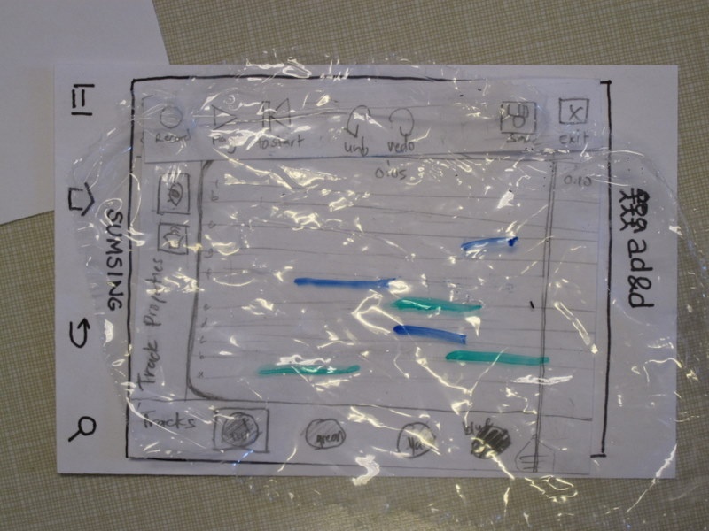
Click "+Start new song." The menu bar at the top reads, from left to right, "Record, Play, To start | Undo, Redo | Save, Exit." |
|
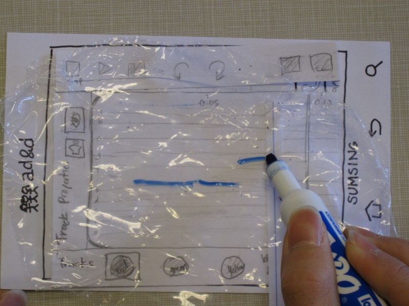
Say the user clicks blue to begin recording on the blue track. The square selection moves to blue, and the color of the timer line becomes blue. |
|
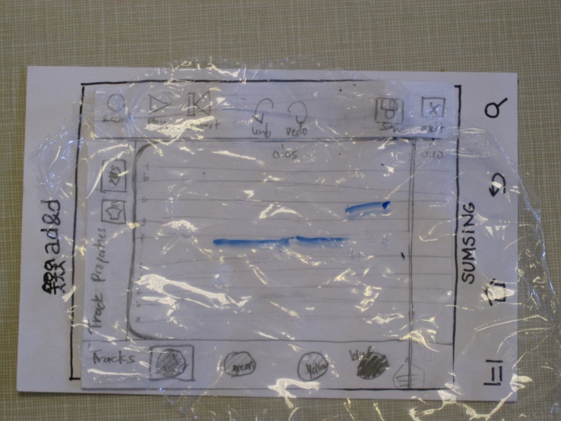
After the user finishes singing (three notes here, the first two of the same pitch), he presses stop. The menu returns to the original menu, and now we have some notes on the track. |
|
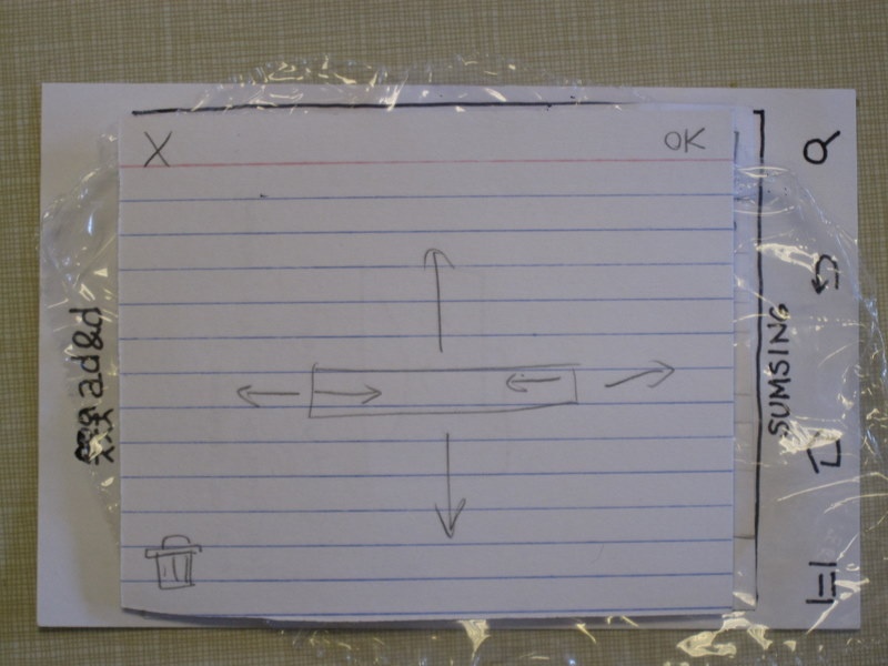
Our second task was to edit a note. Say the user taps on one of these notes to edit it. The note plays, the interface zooms into the note (the note stays the same color, and if there were other notes nearby, they would also be visible in this view) and a transparent overlay pops up with these options. You can manipulate the note by dragging it or extending and shortening it (dragging a note causes it to play all the notes it's dragged to.) |
|
Say the user drags the note down, then exits the mode. The note now appears lower on the track. If the note were dragged below the track, the lines on the track would become more dense to accommodate the lower note. |
|
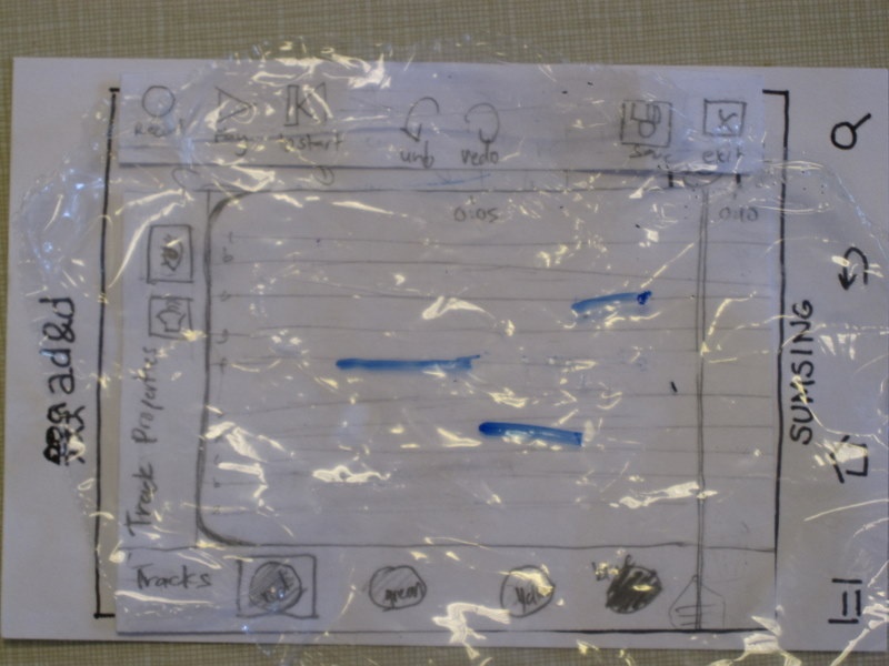
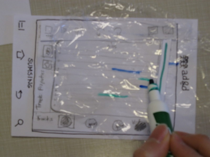
Our third task was to have the users add a harmony line. Many users didn't realize what the different colored tracks were for until we got to this task. This was one of the tasks that changed a lot between our prototypes; you used to access a different screen and get whole new tracks to add harmonies on, but for this iteration, we wanted tracks to act like layers in Photoshop. |
|
The completed piece. I don't think the green lines are actually supposed to overlap, though. |
|
The user presses save, then exit. The song is now visible on the main screen, with its title, time of last edit, and options to rename, export, save as, and delete. |
Observations
First design
- There should be time markings along the screen, probably in increments of five seconds in so, so users can tell how far they are in the song.
- The "cut track" button that used to be in the menu bar was confusing, and no one figured out what it meant.
- We needed to work on how best to represent multiple tracks that would play simultaneously, given the limited screen space.
- People didn't want to tap "main menu" to exit the editing mode, because they were afraid it would discard their changes. We needed either some indication that the app was saving automatically, or an explicit "save" button.
- There used to be a button with a picture of a piano on it, which would change the instrument used to play a track. One user thought that such a button ought to display an on-screen piano keyboard, so that users could enter notes without having to sing into the microphone.
- The main menu should have functionality to duplicate a song, or copy it to a different name.
- The feedback for editing individual notes, particularly the indication of which note was currently selected, needed improvement.
- One (more than one?) user tried to add a harmony line by using the touch screen to add new notes to the same track.
Revised design
- A user pointed out that the buttons next to a saved song on the main menu (export, rename, etc) were too small to accurately select with a finger on a phone touch screen.
- Similarly, the "mute/unmute" and "hide/show" buttons on the edit screen might be small and confusing. (However, they'll likely be more recognizable on an actual phone than a quick pencil drawing.)
- The layer metaphor might be confusing. One user tried tapping on the layer buttons for a while before finding the "record" button, so we might need some feedback on what the buttons do, especially when there are no notes in the song.
- Also, one user recorded over their existing notes before figuring out how to add a second line. We might want to convey more explicitly that they need to change tracks before recording if they want to preserve what they've already written.
- The "save" and "exit" buttons might still need some work. In particular, maybe "save" should prompt for a title the first time a song is saved.
- One user tried to tap and drag on the screen to select notes in a rectangular region. We need to figure out what the app should do if a user taps on empty space in the editing screen: does it start a selection, create a new note at that time and pitch, or do nothing? Should the selection be one-dimensional (time) or two-dimensional (time and pitch)?
Prototype iteration
- Since users found the top menu bar confusing, we removed one of the buttons and replaced the "Main Menu" button with "Save" and "Exit" buttons.
- We decided that editing individual notes would be done through a modal overlay, so that users could use more of the limited screen space to swipe and drag.
- Audio editors commonly support arbitrarily many tracks, which can be moved around, created, and deleted. Our prototype originally used a scrolling list of tracks, but users seemed confused by adding and changing tracks. We replaced that with a layers metaphor where there are exactly four tracks that are overlaid on top of each other on the same staff.
- We added small time markings at the top of the editing screen, as suggested by users
1 Comment
Unknown User (juhokim@mit.edu)
"Prototype: Love the presentation - storyboards with connected frames are smart.
Overall: Great! Looks like a unique experience to prototype a music interface.
"