Design
Selecting a restaurant:
GPS detection |
|
Applying filters:
Checkbox filters |
|
Menu categories:
List of names |
|
Viewing the menu:
Swipe gallery |
|
Shopping Cart
Reasons for adding |
|


Implementation
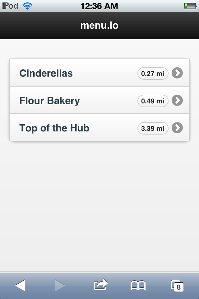
Selecting a restaurant:
After deciding to use GPS to fuel the technology behind selecting a restaurant, the implementation was simple. JQuery mobile and most mobile browsers included for stellar location-based functionality. A few lines of code allowed the site to retrieve its viewer’s location, either through network on the desktop, or full-on GPS on mobile browsers. After retrieving the latitude and longitude of the user, the site used the ‘haversine’ formula to calculate the distance from the user to each restaurant, and displayed them as options to users. Providing the distance with the restaurant name is good feedback, and helps in terms of both efficiency and learnability.
Originally we had planned for the task to have an additional search bar, as a failsafe in case the GPS functionality failed. Instead of a search/filter option, we had the app display all of the restaurants in alphabetical order instead of in order of closest to user location. Implementing a filter bar with our dynamic placement of restaurants seemed excessive and nonessential to the scope of the project, despite its blow to the apps efficiency.
Applying filters:
The first iteration of our filtering system was to be just like our designs: a scrollable bar at the bottom of each menu screen with draggable and tappable filters. Implementing this proved difficult, however. We first learned that the draggable elements would be near impossible with the app living on a mobile browser, as dragging on mobile web is reserved for scrolling on the page. We moved towards having the filters each be a simple toggle button. This implementation proved tedious and ill-suited to the rest of the app design-wise. While the rest of the menu pages proved to move smoothly, the filters overlay was slow and didn’t lend itself to the app’s efficiency.
Following a reevaluation of our design usability, we decided to redesign the filter overlay as a dialog box optionally opened while viewing each restaurant’s menu. The reasoning behind this change was that those users with dietary restrictions (such as Vegetarian or Nut-allergenic) would want to apply those filters regardless of any transient factors like taste or time of day. Our filters were based on more permanent restrictions and so we saved these on a per-session basis, which make the menu-viewing experience more seamless.
Viewing the menu:
We had a lot of difficulty getting the swiping gallery of images to work. We first used the javascript library “swipeview.js”, which advertised as being lightweight and quick. One issue we ran into immediately was that swipeview wasn’t compatible with jquerymobile, which we were using on other pages of our app. We were concerned that this would affect our app’s consistent presentation, but we just made a header using css which had the same coloring as that created by jquerymobile.
We ran into a bigger problem with swipeview when we worked on adapting our app to a change in the phone’s orientation. After spending many days trying to modify our css file to adapt the app to an orientation change, we decided to check out the swipeview demo. It turned out that even the demo of swipeview was buggy when the phone switched from portrait to landscape view. So we began to explore new swiping libraries, and found swipejs, whose demo worked with a changing orientation. After rewriting the entire page in swipejs, we then realized why swipeview had advertised its lightweight structure: swipejs was extremely slow and our pictures did not load. Ultimately, we chose to go with our swipeview version. Even though it limits usability in that the user can’t switch the phone’s orientation without refreshing the page, it was far better than the other option of the images not loading. Even swipeview is not perfect though--it still can take time to load images. But from a feedback standpoint, it is preferable to swipejs, because while swipejs freezes, swipeview appears to be loading.
Shopping cart:
The contents of the shopping cart are stored in the backend, but we added some feedback features in the front-end to avoid some safety problems we discovered with edge cases (such as no items or only 1 item in the shopping cart). Essentially, swipeview is not compatible with fewer than 2 items (which was part of their specs). But since a shopping cart necessarily has to be functional with 0 or 1 items, we needed a way to combat this. We wrote a separate javascript that would handle only 1 item in the cart, attempting to simply pin it down and not allow swiping at all. Unfortunately, swipeview did not like this so it ended up being buggy. To handle 0 items in the cart, we originally emptied the gallery and simply printed “No items to display.” But after we emptied the gallery, swipeview did not allow us to re-add items to the cart. We ultimately decided that if the user clicked on the cart and it was empty, we would just link him back to the gallery page. We realize this is not the appropriate feedback, and was definitely a usability sacrifice for our implementation.
Backend implementation:
The backend implementation was done via Ruby on Rails. We chose Ruby on Rails because RoR is fairly easy to setup and run. However, perhaps choosing a more light-weight framework such as Flask might have decreased loading time and made the app more efficient. Furthermore, the menu loading is highly dependent on database queries. Currently our caching mechanism via Ruby on Rails is not as efficient as it could be. The filter queries partly use Redis (an open-source, networked, in-memory, key-value data store); however, they also make heavy use of the SQLite database - which slows down loading time. Perhaps, shifting this entirely to Redis would decrease loading time, and bettered the filtering operation (thus again making the app more efficient).
The API interface from the mobile app to the backend is entirely RESTful allowing for fairly standard AJAX queries - thus, simplifying a lot of the front-end Javascript code. Off-loading expensive computation from front-end JS to the back-end web server reduces loading time (no more convoluted code either - yay!) and improves safety (reduces the chance of screen freezes on phones with slower computational speed).
Evaluation
User acquisition and demographics
We initially wanted to pilot our app for mobile phone users in Flour Bakery. However, after we visited Flour Bakery and asked users if they were interested in participating in a test - we were rebuffed because a) they had already ordered and b) most of them were too busy involved in their own conversations and work. User acquisition proved harder than expected when monetary incentives were not involved (participants should be volunteers), and social norms were broken (asking strangers). In an ideal situation, we would have agreed with a restaurant to digitize their menu ahead of time, and piloted it there.
Therefore, we decided to simply pilot it to friends and acquaintances by giving them an illusion that they were seated in a restaurant and about to order. We called or asked people we knew to ask them if we could have some time in their day to test our app. If they agreed, we conducted the test.
We piloted our app in front of 4 users. 3 of them are students and fall into the 18-24 population. 2 of these 3 users were male, and 1 was female (ensuring at least no monopoly on genders). Our fourth user was a male in the 30+ category. All of these users have been using smartphones and the mobile web for a while, and were generally used to the paradigm. They generally understand navigation on the web, and are usually on top of the latest trends for new apps and websites (TechCrunch, GigaOm, etc.).
We chose the 18-24 demographic because it is generally reflective of the early adopters of our app in the user population. Most menu apps in the ordering and viewing food category often gain the 18-24 category as their first user base because college students/youth tend to be open to new technologies and follow trends, thus easily adopting and transitioning to new norms, eg: ordering online, checking Yelp reviews before going to a restaurant, etc. They also generally tend to eat outside a fair amount. In fact, startups such as GrubHub in the food and menu space gained critical mass by first launching to college students, and then scaling. Thus, we felt the 18-24 population was our initial best bet in terms of accurately testing our app and receiving the most valuable feedback.
However, we included the last (fourth user) to see if or how the feedback would significantly differ from the 18-24 user population. We wanted to see if a user from this demographic would provide some new fundamental insight and thus improve the user-testing process. Furthermore, if the app is to scale, having an older demographic is essential to achieve full-market utilization and acceptance. Having a successful app most of the time requires appealing and being usable/accessible to a larger demographic.
User testing process, briefing and instructions
Test process (How the test was conducted)
The way we conducted the user test was by first asking users if they were comfortable with such a test and had time (about 10-15 minutes), and informing them that they could quit the test at any point during the test. Next, we asked them to pull out their smartphone, and check if the website for menu.io was compatible.
If this was a yes, we started the briefing. One team member provided the instructions for the tasks and the briefing, while other team members observed and took notes. Once the test ended, we thanked the user for his/her time.
If this was a no and the smartphone was not compatible, we asked another individual to partake in the test. We felt that only natural users of that particular smartphone should be able to participate in the test because not having a compatible smartphone introduces unaccounted for variables in terms of learnability, safety and efficiency that are based on the intersection between smartphone compatibility and the HTML5 mobile app.
Test design and choices
Furthermore, after an internal debate between the team, we decided not to conduct a demo. We felt the demo compromised aspects of learnability and efficiency in the app. As a UI designer when creating an app for the general public, most apps are expected to conform to the standard that most people will generally be able to use the app their first time. Especially, if users want to navigate the menu of a restaurant for the first time on menu.io - they should not be handheld and this should be a generally seamless task.
Most of our tasks we retained from GR3. We did however, change the name of the filters to be applied: Vegetarian and Gluten-free in GR3, but Vegetarian and Nut-allergic in GR6. We also changed the item in demand to be the homemade hummus sandwich. We also added additional tasks to test the cart functionality and how it integrated with our app in general. We wanted to see if this added functionality was intuitive, and whether it was seamlessly integrated with our design.
Test briefing
Initial Briefing
Welcome to menu.io! We are innovating in the domain of Restaurants, specifically menus, trying to expand on the lack of interactivity and dynamic content. We’ll be taking you through one use scenario of our app’s basic functionality. Remember that this test isn’t testing you, the user, but rather the interface and its usability. Feel free to think out loud so we know how you feel about each element of the interface. You’ll have the opportunity to ask questions and give us higher-level feedback when we’re done.
Remember if any of this makes you uncomfortable in any way, shape or form - you have the chance to quit at anytime - just let us know. Thanks!
Task 1: You have just arrived at your favorite restaurant, Flour Cafe, and want to see the menu. Select Flour Cafe.
Task 2: You are a vegetarian and realize you are allergic to nuts. Apply filters to the menu so that you only see vegetarian and nut-free items.
Task 3: Go to the individual menu and browse through the items.
Task 4: You realize that your doctor recently prescribed you medication that removes your nut-allergy. I guess you can eat nuts after all! Remove the nut-allergy filter to make the appropriate adjustments.
Task 5: Find the homemade hummus sandwich and read its ingredients.
Task 6: Add the homemade hummus sandwich to the cart
Task 7: Navigate to fresh mozarella sandwich and add it to the cart to compare it in a smaller menu
Task 8: Go to the cart menu and view both items
Task 9: Remove the homemade hummus sandwich from the cart
User testing observations and feedback
User 1 (18-24 Male):
- Wanted the buttons close by on the main page. Button too far down.
- Doesn't like the map screen and felt it takes too much time loading
- If map used anyways, suggested map should include restaurant pushpins
- Picked Flour Cafe correctly, did not wait much for other options
- Was not expecting to see filters initially
- Felt there were too many page changes for filtering to be redone
- Scrolled vertically initially on the swipe view
- Passed all the tasks
User 2 (18-24 Male):
- Tried to tap the map
- Forgot what filters he applied
- Liked the swipe scrolling
- Wanted feedback on filters
- Wanted feedback on adding to the cart (thought the + buttons were not good enough) - suggested numbers
- Passed all the tasks
User 3 (18-24 Female):
- Confused about the real purpose of the map
- Felt the restaurants took too long to load
- Easily added and removed filters
- Thought tasks were too easy
- Wanted feedback on the cart addition
- Liked how the cart section shrunk when item was removed
- Also suggested number on top right on how many things you have in cart
- Passed all the tasks
User 4 (30+ Male):
- Tried to play around on the map screen
- Applied filters and viewing the menu with ease
- Really liked the swipe feature and praised it highly (but confused why its there when only 1 item is present). Thought it was intuitive.
- Not sure about what the point of the cart was
- Felt perhaps could have a bit more cleaner UI (Web 2.0ish)
- Passed all the tasks
Usability problems, severity and fixes
Initial map does not provide appropriate feedback. Some users tried to play around with it, while others questioned why it did not contain pin labels for restaurants.
Severity: Major
Fix: The map confused a lot of initial users. The best case might be to remove it altogether. Even most apps that use location-tagging (such as Instagram) don’t use maps. A better way is to just automatically provide the list of restaurants the user is closest to altogether - giving the distance and type of cuisine.
Applying filters provides no feedback on which filters are on or off. Users also want to know if filters were applied successfully after they are applied.
Severity: Catastrophic
Fix: This can be fixed by assigning relevant icons to each type of filter in the headbar that perhaps have the first letter of the filter applied and in some small frame. Furthermore, anytime a filter is applied, some animation such as a progress bar stating filters are being applied might help provide further feedback.
Adding items to cart requires different feedback. Though users suspected sliding to the next item meant the item was added to cart, they weren’t 100% sure.
Severity: Major
Fix: A better feedback that many users both suggested, and that we came up with was adding some bubble showing the number of items in the cart at any point in time, and also highlighting the cart button anytime an item is added.
Remove the ‘+” sign from an item after it has been added to cart. Adding the same item additional times to the cart really does not make a difference because only one instance of the item can be added.
Severity: Minor
Fix: This is simply a Javascript code issue which can be quickly fixed with an if statement that removes the + sign from the upper right corner once that item has been added once.
Remove swiping when only one item is present.
Severity: Cosmetic
Fix: Easily do-able. Again this is a simple Javascript issue. swipeview.js can be disabled for this edgecase.
Too many page changes/reloads required to go back to the filter if a filter needs to be added or removed.
Severity: Minor
Fix: This requires finding a place to put the filters button and editing the code to allow changes to happen to the menu dynamically while browsing (once a filter is applied). One way is that the home icon can perhaps be shifted to the right and the Filters button can be added to the top menu on the left during viewing/swiping.
Reflection
We learned a lot over the course of the design process. Most of our general intuitions were right. In the beginning, we predicted that it was best to make more risky design bets - because the cost for testing was slow. This proved to be true. We were able to quickly determine what worked and what did not, and for a low-cost. Also, this allowed us to move to a consensus pretty quickly. We also learned an obvious, yet important truth out of this: “keep it simple.” Though we tried a lot of design risks, in the beginning - we almost ended up using none of them past the paper prototype stage, resorting to a simpler step at each stage.
Another truism we learned is that: provide the user with feedback for almost every decision he/she makes in your application. This feedback to the user greatly improves efficiency and learnability - guiding the user in a subliminal manner. Not only is it a feature of good design, but it makes for a great engaging user experience. The user is drawn in because the app responds to every action. Design that responds is king.
Furthermore, focus in terms of design is everything. After GR1 (due to Juho’s feedback), we were able to narrow down our tasks clearly - which helped layout GR2-6 nicely. Doing too much would’ve harmed, and left us too thinly spread. This probably saved us a lot of headache, and allowed us to explore our ideas thoroughly.
If we were to do this again, we would probably add another round of paper prototyping right after the heuristic evaluation. Seeing those changes enacted for us on paper would firmly solidify the new additions of decisions and help us confirm them with the user. Though heuristic evaluation is important, we have to come fundamentally believe that user feedback triumphs all. Therefore, testing a round of heuristic evaluation before our final project would have perhaps helped us avoid our problems with feedback on filtering and carts. We realize that going from computer prototype to heuristic evaluation midway is a change in direction (from high to low fidelity). However, it would've helped solidify our final conception.
Also, one issue that we faced while prototyping for mobile early on was having too large paper prototypes. Usually in terms of prototyping for web, bigger prototypes help. However, for creating and designing paper prototypes, we felt it was best to have smaller prototypes. For designing on mobile, screen real estate is key. The earlier this constraint is imposed - the better. We spent too much time narrowing down what was good for the small mobile screen and what wasn’t. If we had the imposed the constraint from the beginning, we would have narrowed down features sooner, and user feedback during paper prototyping would have been more accurate. Therefore, we would a paper prototype with a smaller screen size; the size of the phone would be best.
Furthermore, another good thing to have would have been numbers. Throughout the process, we didn’t really take any quantitative metrics of how long it took users to navigate through the app or perform a task. We feel that toward the end this would have helped iron out some issues and polish our app by highlighting some usability issues. Nevertheless, this addition might be out of the scope of this class and better left to tools such as MixPanel, Kissmetrics, etc.
One last meta-level decision we wish we had made was piloting this with a restaurant through some pre-arranged agreement. This would have enabled us to try and test this in real-time and get exact user-situation feedback. We tried testing this live at Flour Bakery (however, this didn’t work as planned as explained in the Evaluation section). A better way to go about it would have been making an agreement before for a set day and time - and testing it with the users present at the restaurant on that given day.
Overall, we are grateful we went through the design process. We felt we learned a lot and have the toolset to take any concept from idea to fruition through the right amount of metrics and testing.
Further work
We plan to release this to the public over the summer. When we initially started, one problem we faced was the task of getting restaurant owners to enter their menus into the database to populate menu.io. Though we narrowed down the scope our project, this problem still exists.
However, we recently encountered a startup, out of MIT CSAIL, called Locu that exists to solve this very problem. Locu has an API that indexes the menus of several restaurants so that they can be queried via other applications. We plan to integrate with this API (http://developer.menuplatform.com/) so that this app can truly be scaled to be released.
We also plan to incorporate A/B testing available via companies such as MixPanel and Kissmetrics to make the app more usable, and increase conversions. However, before we plan to release, more work on the HTML, CSS and Javascript remains to be done (such as fixing the usability issues described above, more graphic design + aesthetics and more robust user testing).
Yet, we are excited about releasing this for the public to use!
1 Comment
Unknown User (juhokim@mit.edu)
"Overall Wiki presentation
: what a thorough and organized writeup!
Design description: good breakdown of user actions to describe the design changes
Implementation: a nice stack of frameworks and technologies for a modern mobile app
Evaluation: nice!
Reflection: well-written, thoughtful
Overall: Your thought process is extensively captured and documented in this write-up. This way your design process is more debuggable and accessible. Hope you apply the lessons learned from this experience to other future projects.
"