GR2
Scenario
Mother (passive user) wants to find pictures from her son's 6th birthday so the grandparents can view it. She is not sure where these picture are stored- if it is on a site, a camera, or anywhere. So she searches on the site for them. Once she gains access to it on the site, she distributes the picture (as well as maybe any other relevant ones) to the grandparents.
Goal: share a picture from son's 6th birthday
Tasks:
- Find the picture/determine if the desired picture is in fact on CoShare
- Share picture with grandparents
Individual Designs
Parker's Designs
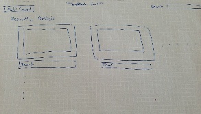
Scrapbooking Display
- Several users we interviewed expressed an affinity towards scrapbooks for viewing pictures. They said that they liked the feel of the presentation. This design aimed at giving users a more scrapbooking view of the pictures.
- It allows the user to view more information about the picture without action, but it reduces the efficiency of viewing by losing the space to view this content.
- The first picture a home screen displaying recently added content.
- The second picture displays search results for a query. Matching results are placed next to the child profile they correspond to.
Learnability
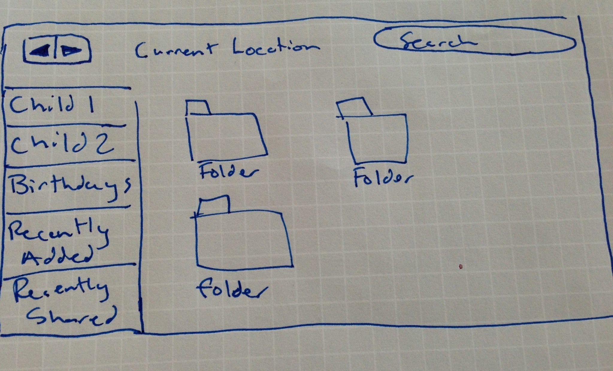
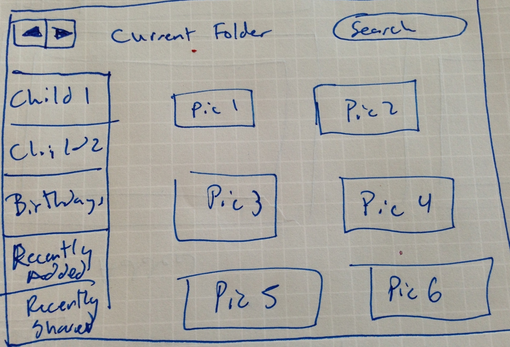
- This design is centered around learnability. It is based on the users familiarity with their own computer's Finder or directory system.
- Similar features to Finder are its overall layout, hotspots on the left including children profiles and a search bar.
- Although the user may feel comfortable using the interface, it is likely to be inefficient with the viewing space and not a fun way to view content.
- The first picture gives a general look at the layout with folders sorting the pictures.
- The second picture shows how the user would actually look through the pictures.
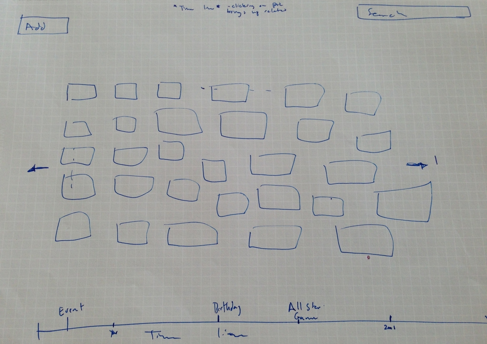
Efficient Design
- This design was focused on efficiently letting the user browse large amounts of content.
- It would be useful for normal browsing/ general searching purposes, but would also be inefficient for searching for a specific picture.
- It revolves around a timeline that users can use to change the pictures displayed. Big events would be highlighted on the timeline giving them faster access to events in general.
- Hovering the user's cursor would also allow the the frame of viewable pictures to shift to show newer or older pictures.
Ken's Designs
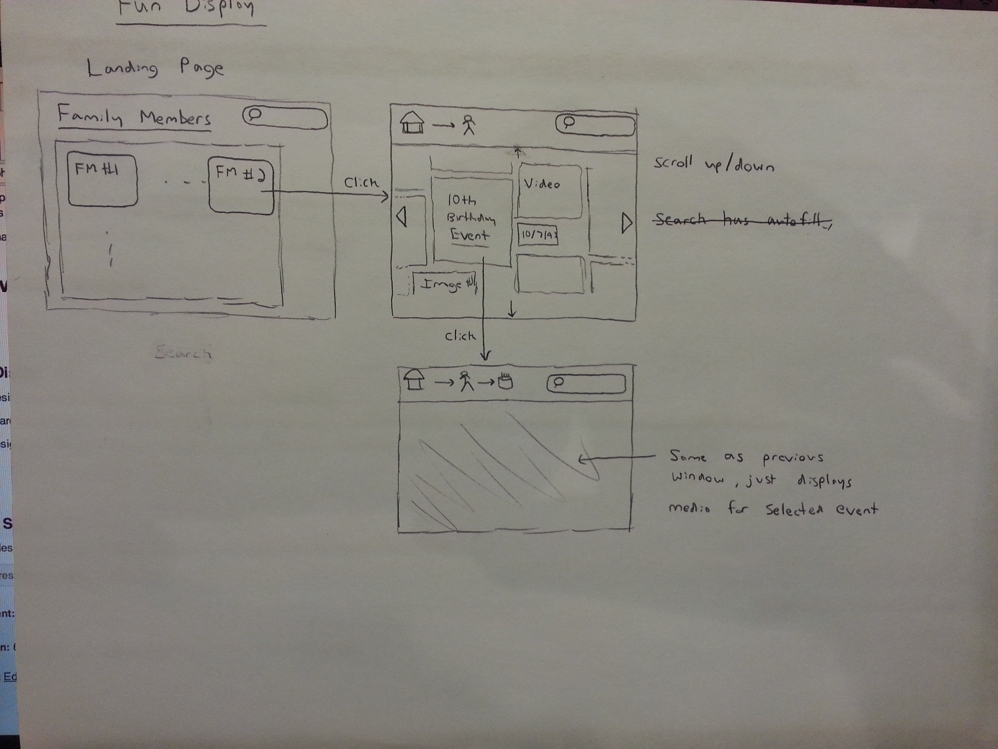
Fun Display
- This design tries to make it fun for users to scroll through and find media. Items are displayed in varying sizes in a mosaic like form.
- This yields some uncertainty as to where certain items are but it gives the user a fun and new way to browse files.
- The search bar is there to find a specific picture or event, but the layout is meant for the user stumble upon desired content in the browsing process.
- The design is not efficient for the user. The layout makes it fairly easy to learn how to use.
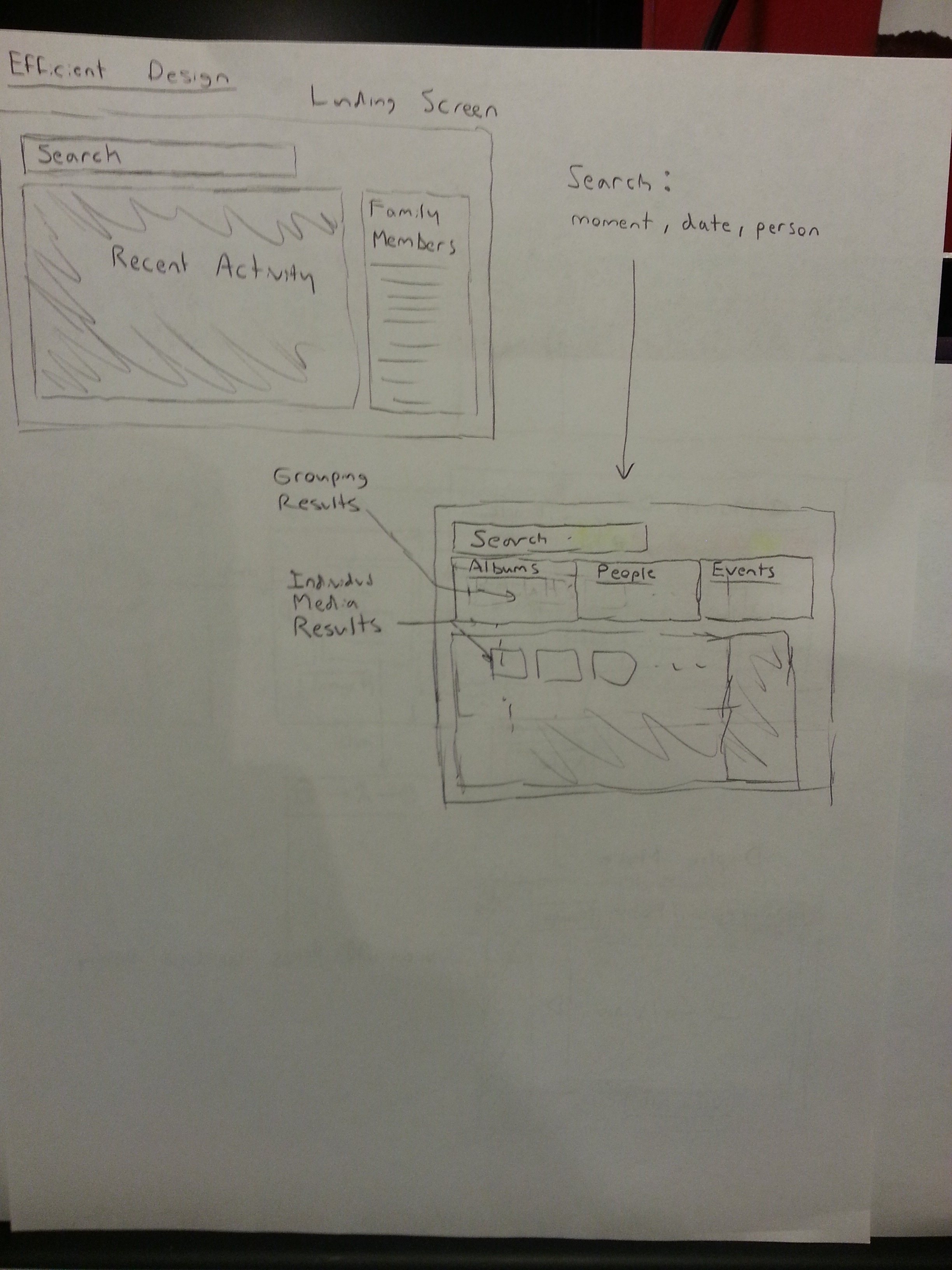
Efficient Design
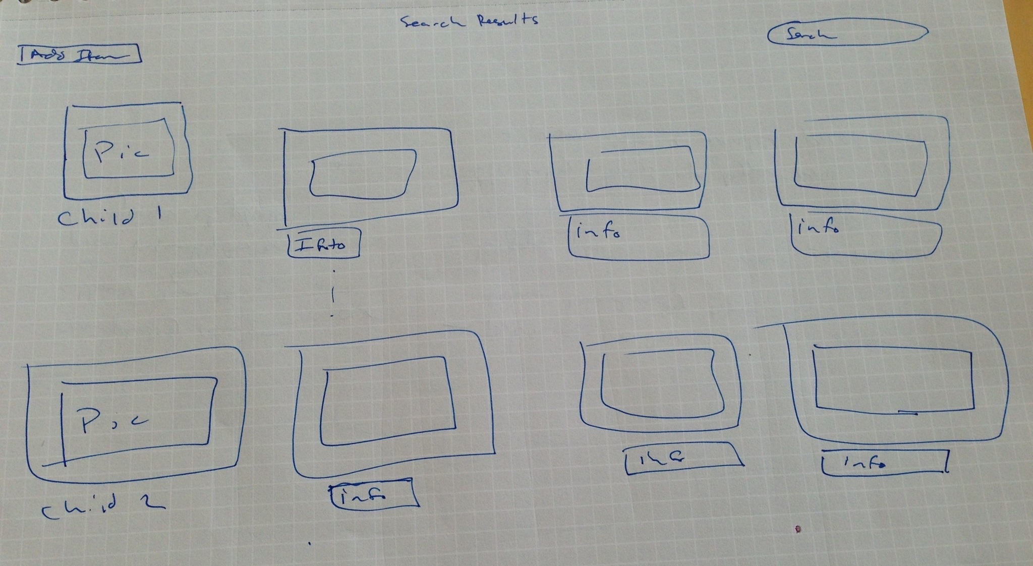
- This design allows the content to get to content strictly by searching.
- The search results page not only displays relavant media, but it also displays potential people, albums, or events in a separate grouping. This gives the user easy access to the result type they wanted. It takes limited scrolling to find what you want in the results so it is efficient to get the result you want, and it only requires one page load.
- Search autocomplete aids the user in searching for relavant things. The user can search by person, event, date, or filename.
- The landing page also presents the user with recent activity in case the other parent recently did something they were trying to do.
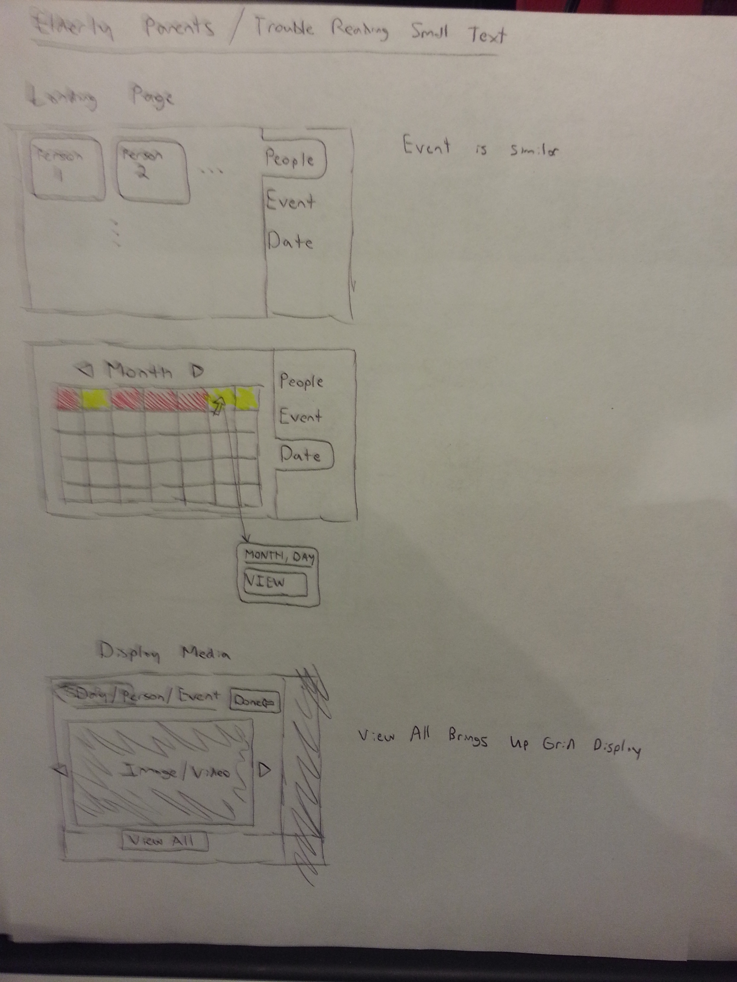
Large View
- The larger view allows users with poorer eyesight to navigate with ease. It also attempts to display things to the user in a friendly way.
- The user will be less intimidated by the overly sized interface because they won't feel like they are missing something.
- It sacrifices some efficiency by initially displaying media to the user one item at a time, however the option remains to see a grid like view of all the media.
- The initial search for something can be made by person, event, or date. The calendar shows users which dates have files associated with them through color and mouse over pop ups.
Joe's Designs
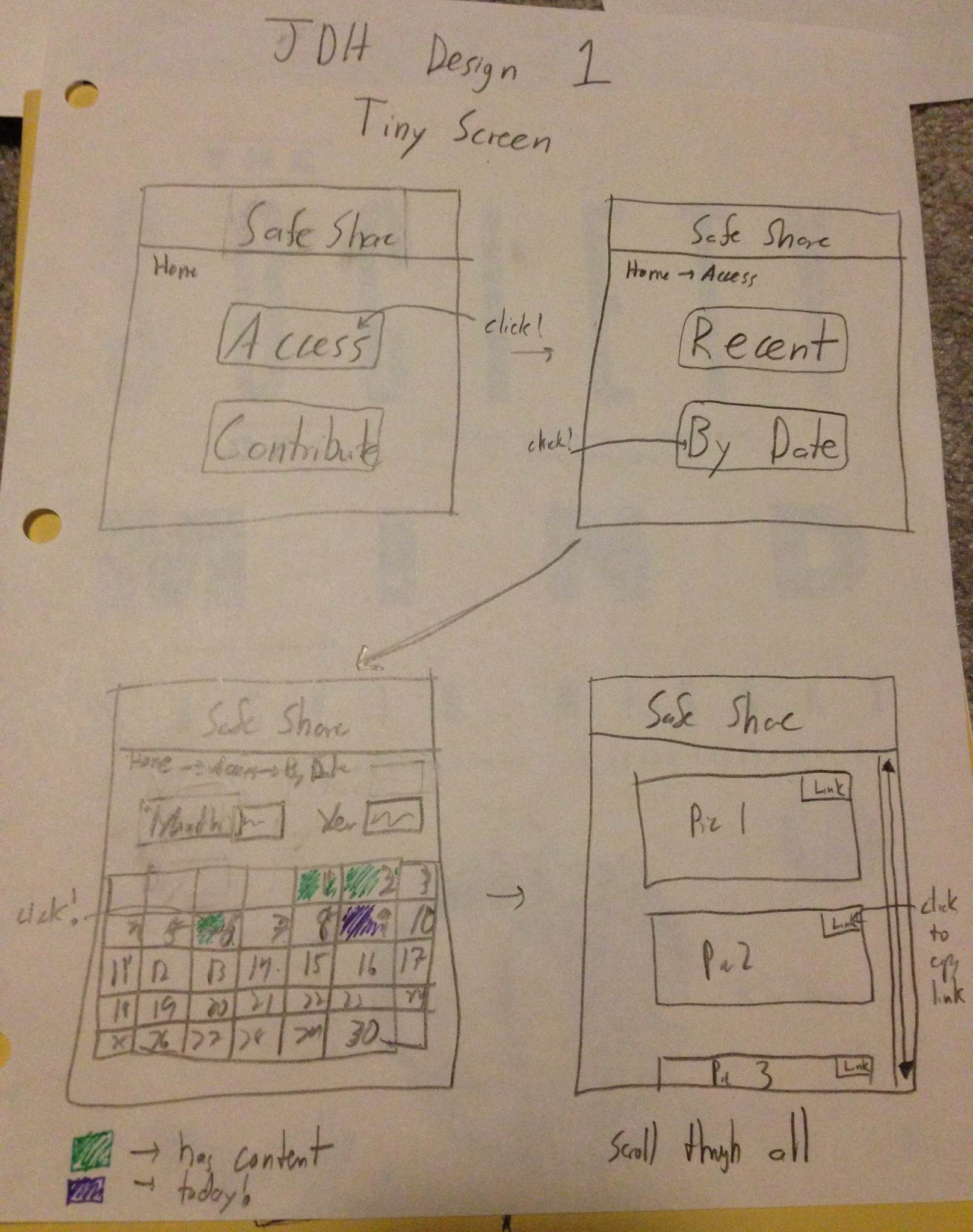
Tiny Screen
- This design tried to tackle the extreme case of having a tiny screen, perhaps on a mobile device.
- The process of finding a specific picture is done by searching through a calendar layout.
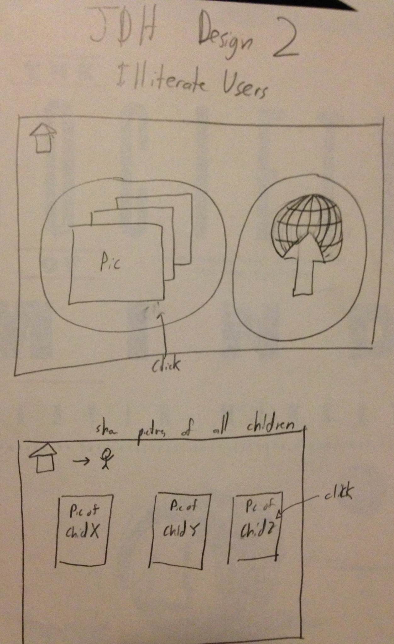
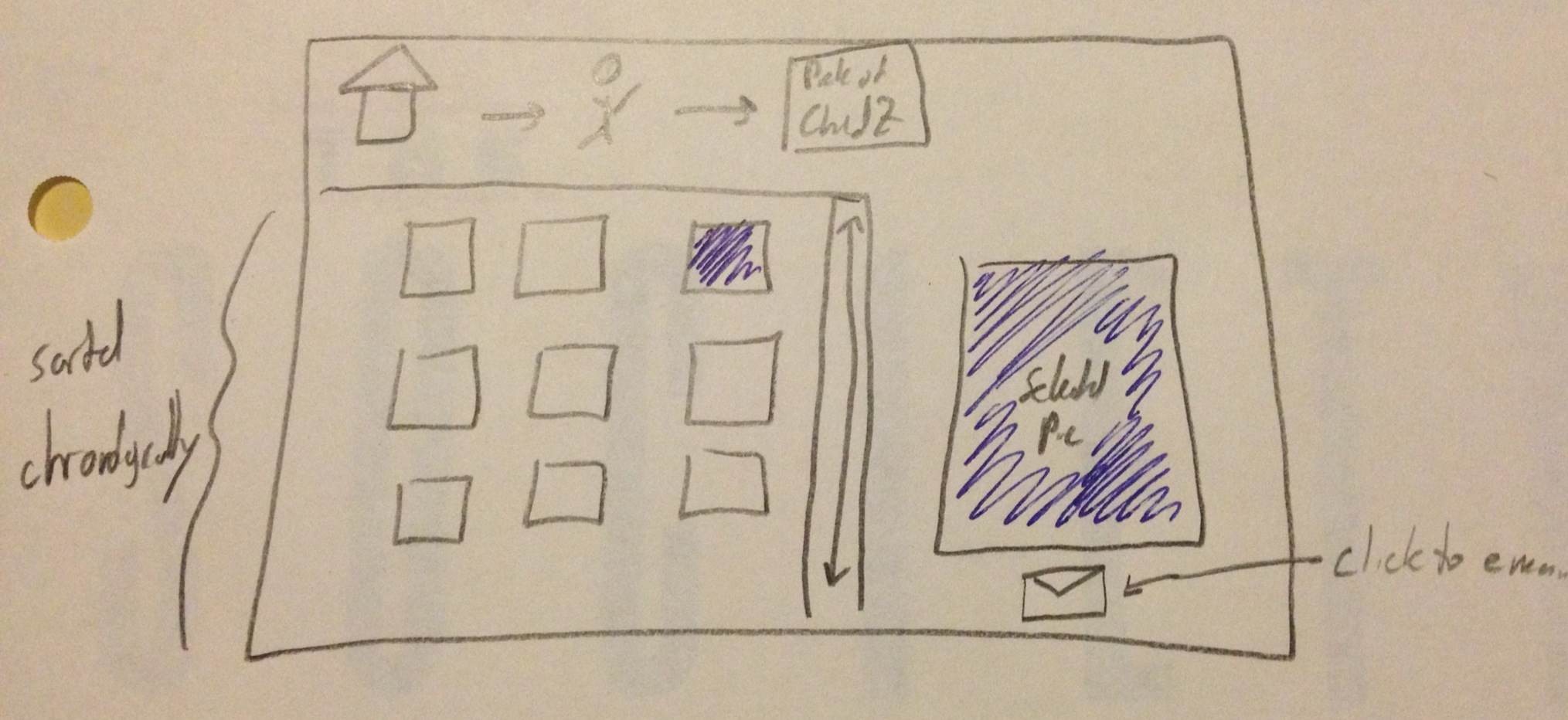
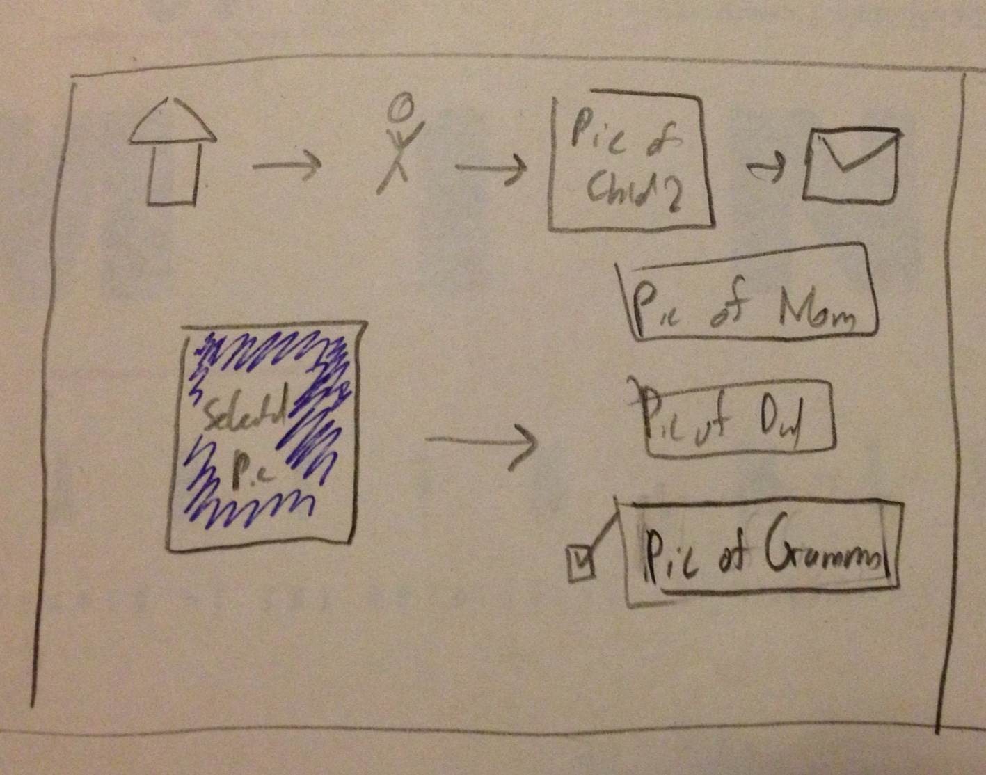
Illiterate Users
- Tried to illustrate flow of site without text, so primarily with images. Visual breadcrumbs help understand where they are in the process.
- Used pictures of children to illustration aggregation by person.
- Pictures would be shown in chronological order which would hopefully be apparent based on the content. An envelope represents a link to email it. The recipients of the email are represented as pictures a well.
- Sharing is accomplished by using the link provided for each picture. It is left to the user to share as they please.
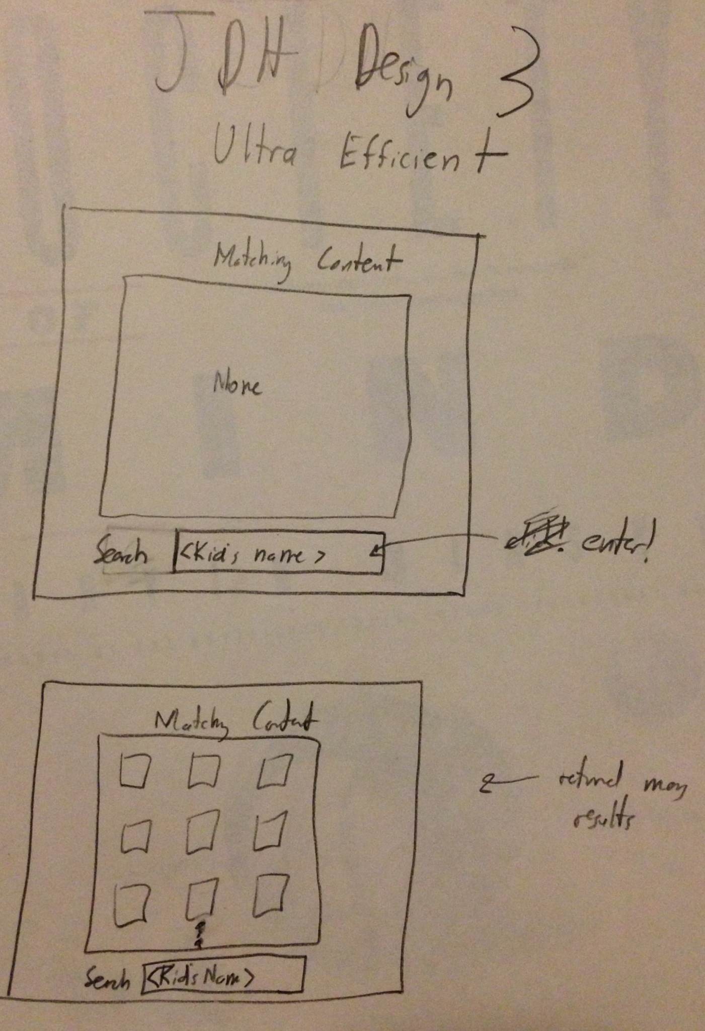
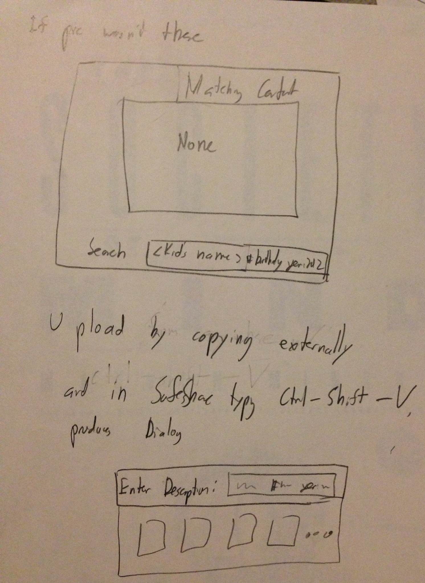
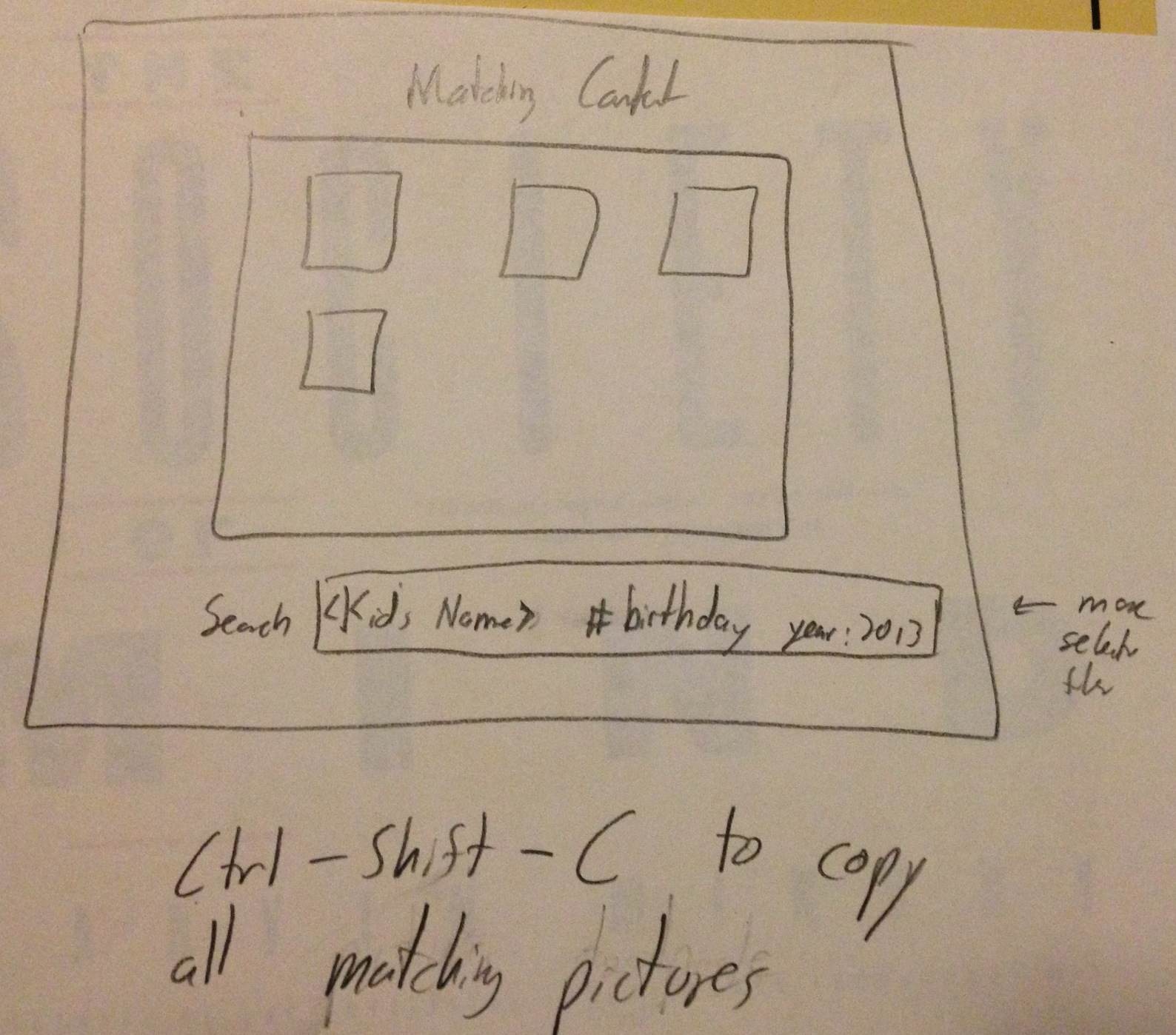
Ultra Efficiency
- All manipulation is done through entering commands and hotkeys.
- The command bar shows the current search query. Can use different keywords. A matching contents bar shows the pictures matching the query.
- Hotkeys can copy links to images, then can be shared as the users wishes.
Justin's Designs
Searching Design
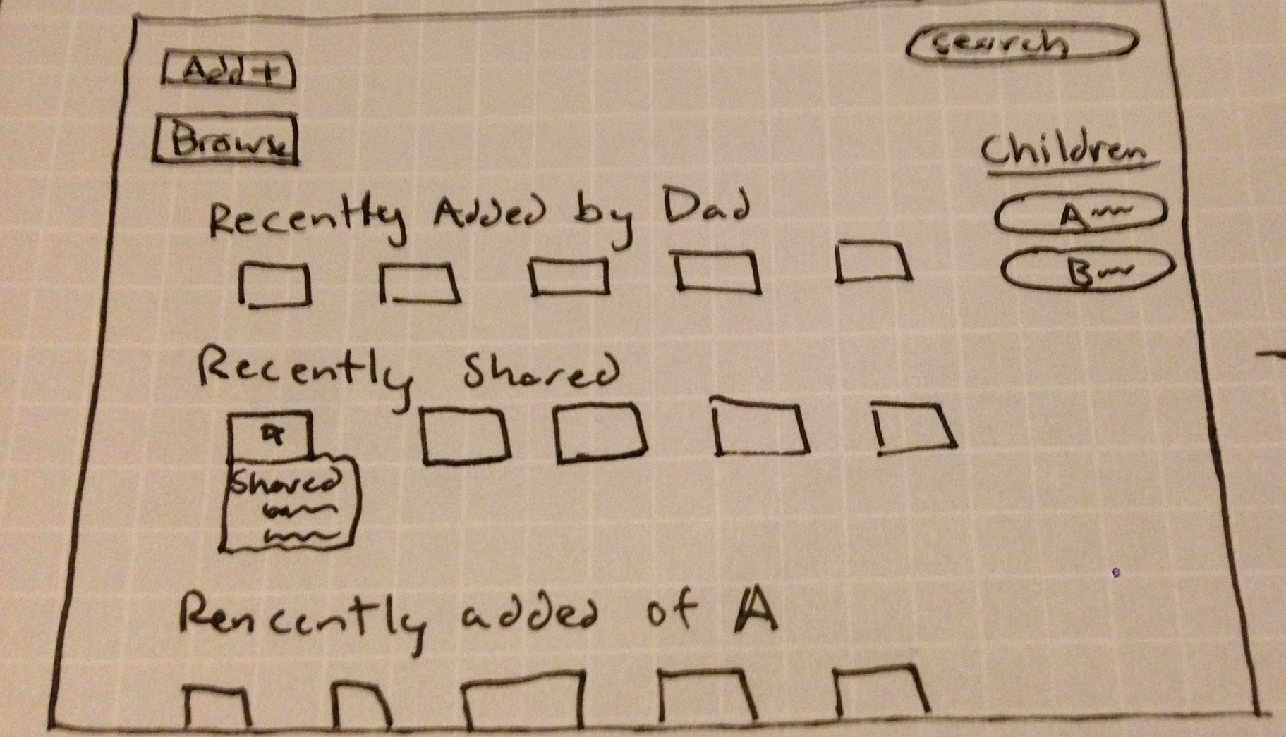
- This design allows users to search for pictures, and it pulls up related ones as well.
- It shows when devices have last been synced to the site, so users can have an idea of where the offline pictures they want might be.

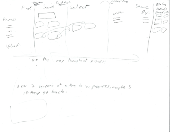
Efficient Design
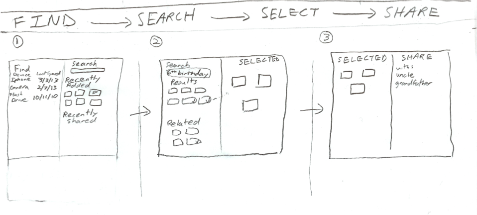
- This is the super-efficient design.
- Intended when users want to find and share pictures as quickly as possible, it leads them right through the steps.
- Their linear progression to the right in going through all steps communicates to them exactly what they need to do next.
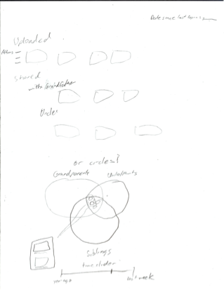
Ownership Design
- This design offers two alternatives for a graphical layout indicating to the user pictures that have been recently added to the site, and with whom they are shared with.
- The first approach uses more orderly rows, while the second attempts to use Venn diagrams in showing pictures that are shared with different groups.
Design Markups - Storyboards and Designs
Design 1 - Browsing
Step 1
- Introduced to homescreen with information about spouse's uploaded content and sharing activity.
- User wants to find picture so they go to browse.
Step 2
- User is not sure on exact specifics of picture, but has an idea of a picture, so they browse.
- Mosaic displays random pictures, which is fast for sorting and fun to view.
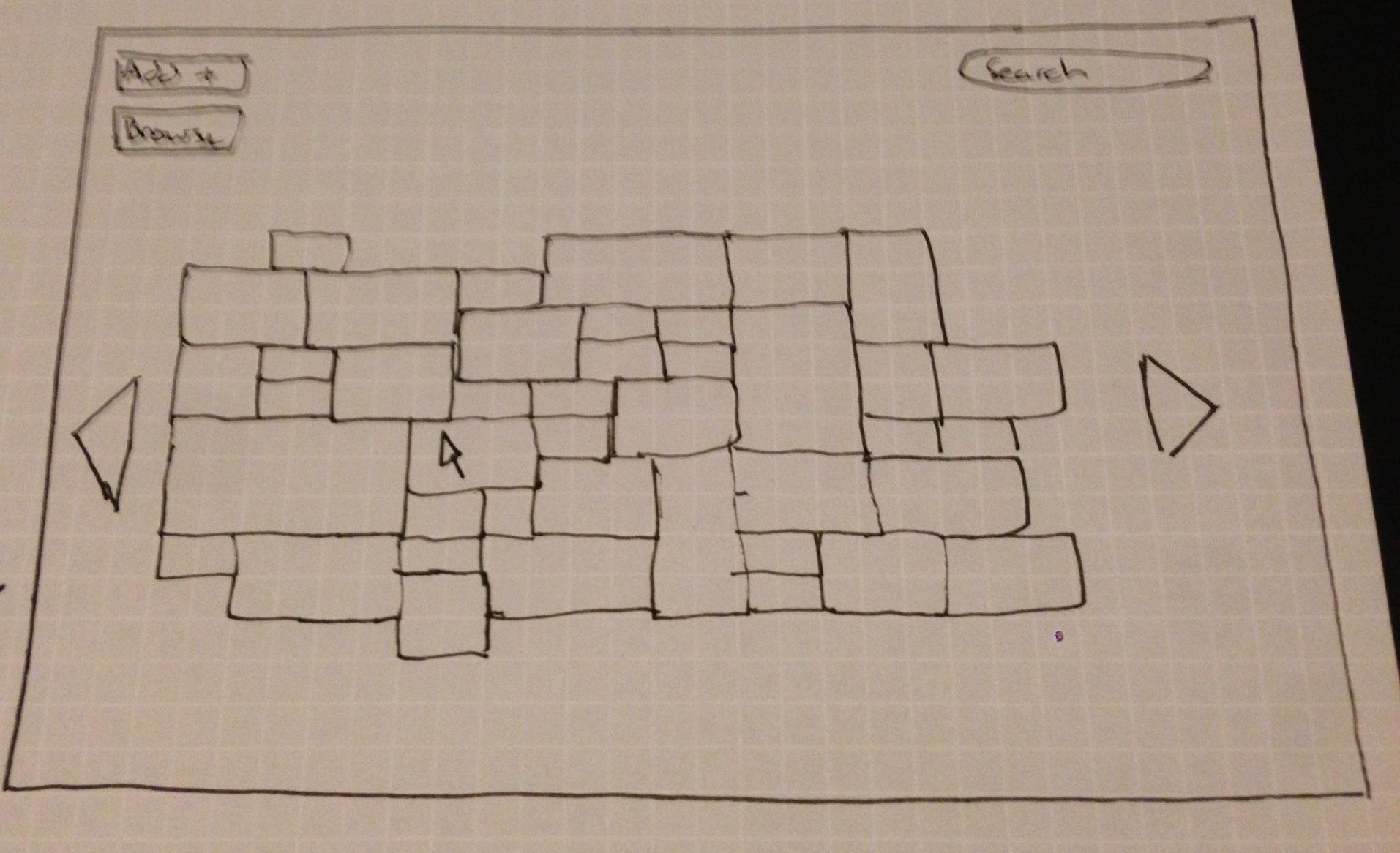
Step 3
- User is not sure on exact specifics of picture, but has an idea of a picture, so they browse.
- Mosaic displays random pictures, which is fast for sorting and fun to view.
Design Highlights
- Design's overall theme is for someone who either has an idea for the content they want, but not a specific picture in mind, or they just want to browse for personal enjoyment.
- Home screen is designated for the dealing with the sharing of content problem. Gives updates on recently shared items, content recently added by spouse and access to child profiles.
- Still allows for functionality of searching for specific content and adding new content (not pictured).
Usability Analysis
- Learnability
- Pros
- Simple interface in terms of few buttons on home screen. This allows the users to know precisely what they can do.
- Mosaic is catchy for the user. They are likely to hover over it with mouse, and learn more about its functionality.
- Cons
- Some users might not understand the mosaic can move adding new pictures. Arrows try to convey this information.
- Pros
- Efficiency
- Pros
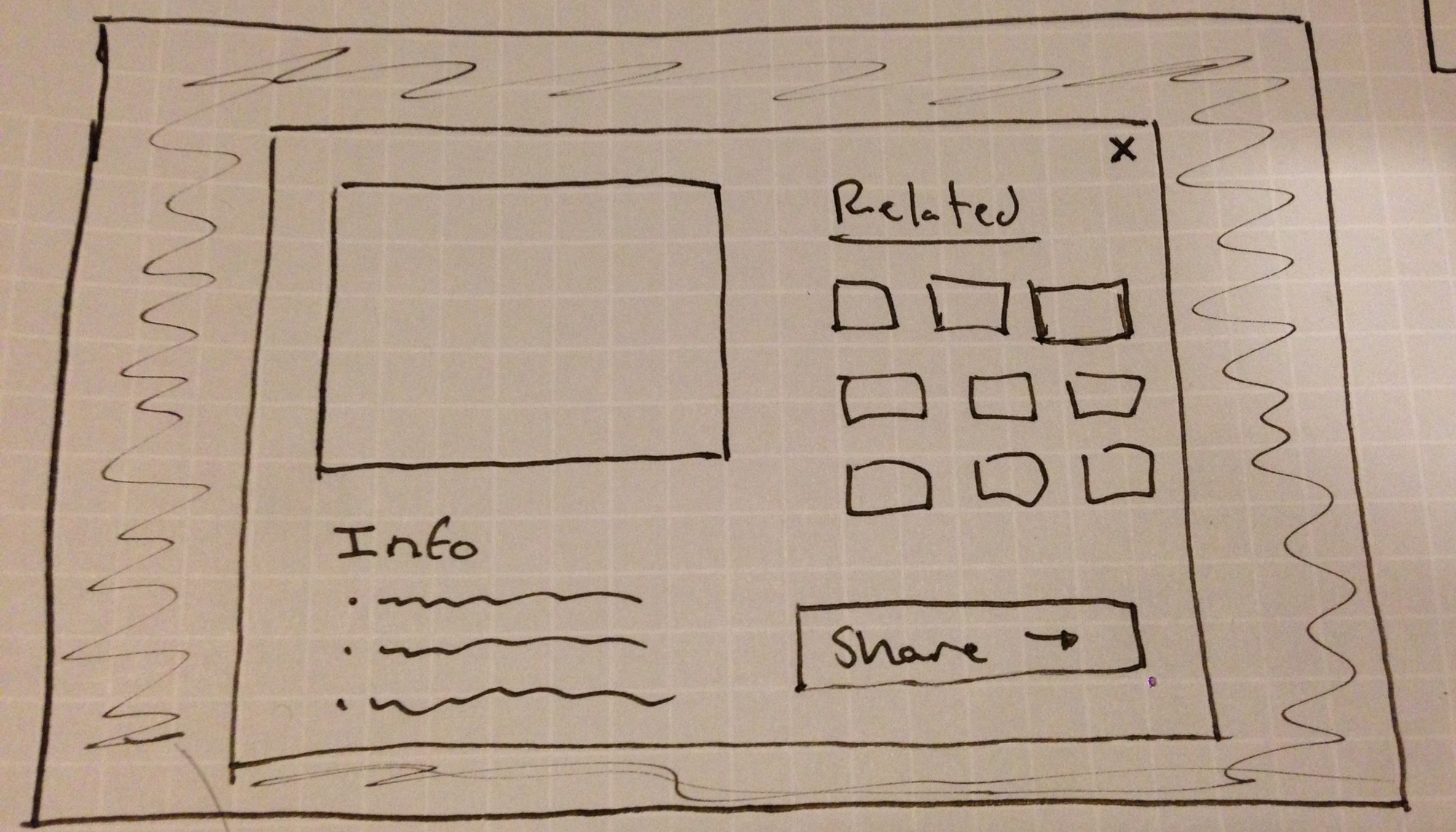
- Showing random pictures at varying sizes allows users to process a lot of data at once. Clicking on picture can get them to related pictures.
- Cons
- Overall process is geared towards browsing, which is inefficient if the user has a specific photo in mind.
- Pros
- Safety
- Pros
- Users are processing a lot of data at once, but it takes a click to actually learn more, not just a simple hover.
- Pressing escape or clicking outside scope of sharing/larger view window goes back to mosaic (easy to undo mistake)
- Cons
- Pictures are close together for the mosaic and user could potentially click on wrong photo.
- Pros
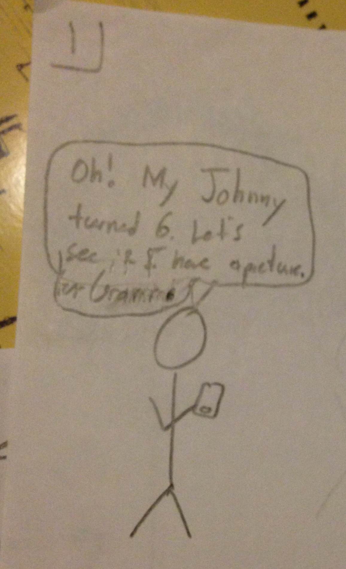
Design 2 - Safety
Step 1
- User wants to find pictures of a birthday party.
- The user logs on, and is able to see recently added/shared pictures from their spouse, as well as the state of devices that upload to the site.
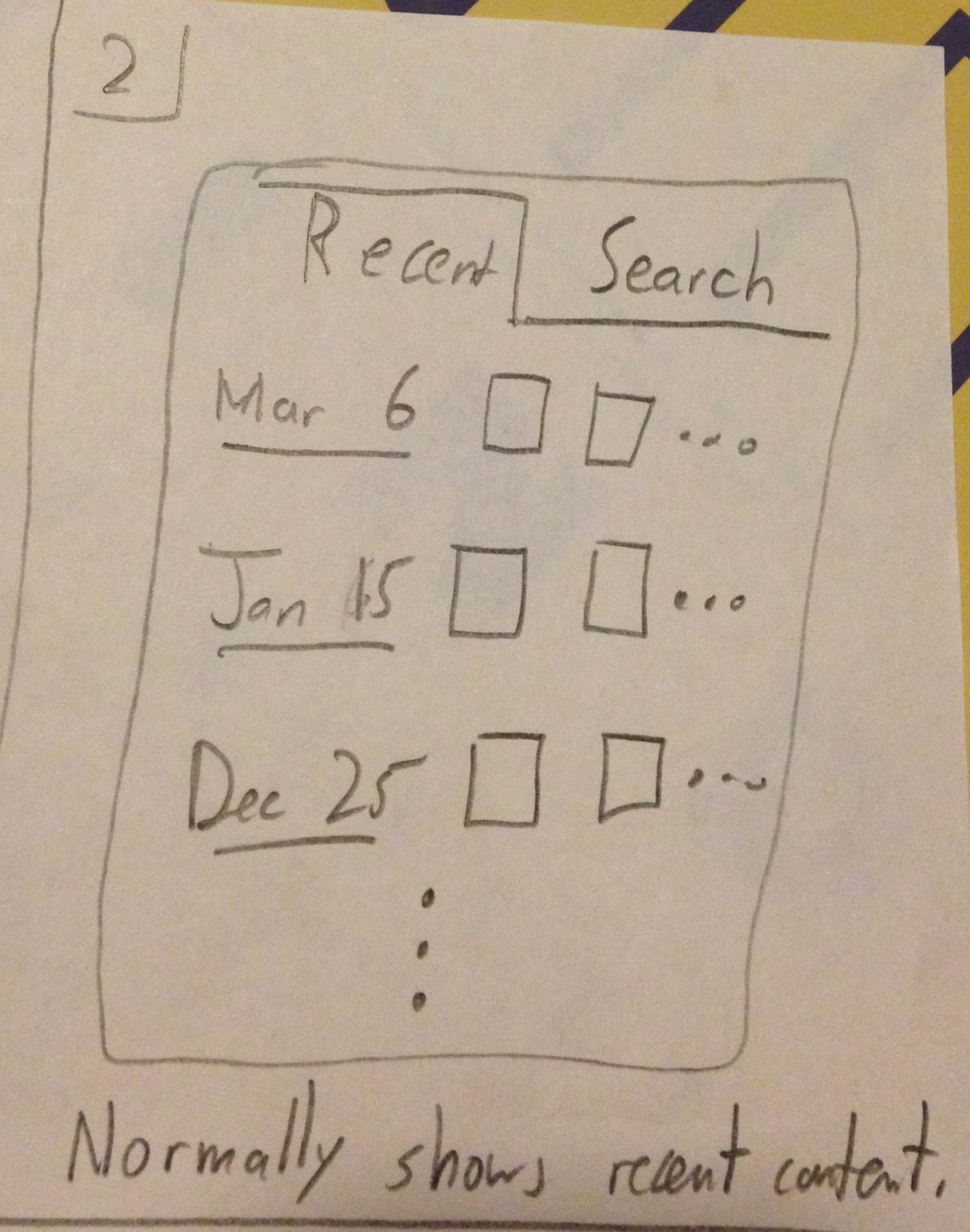
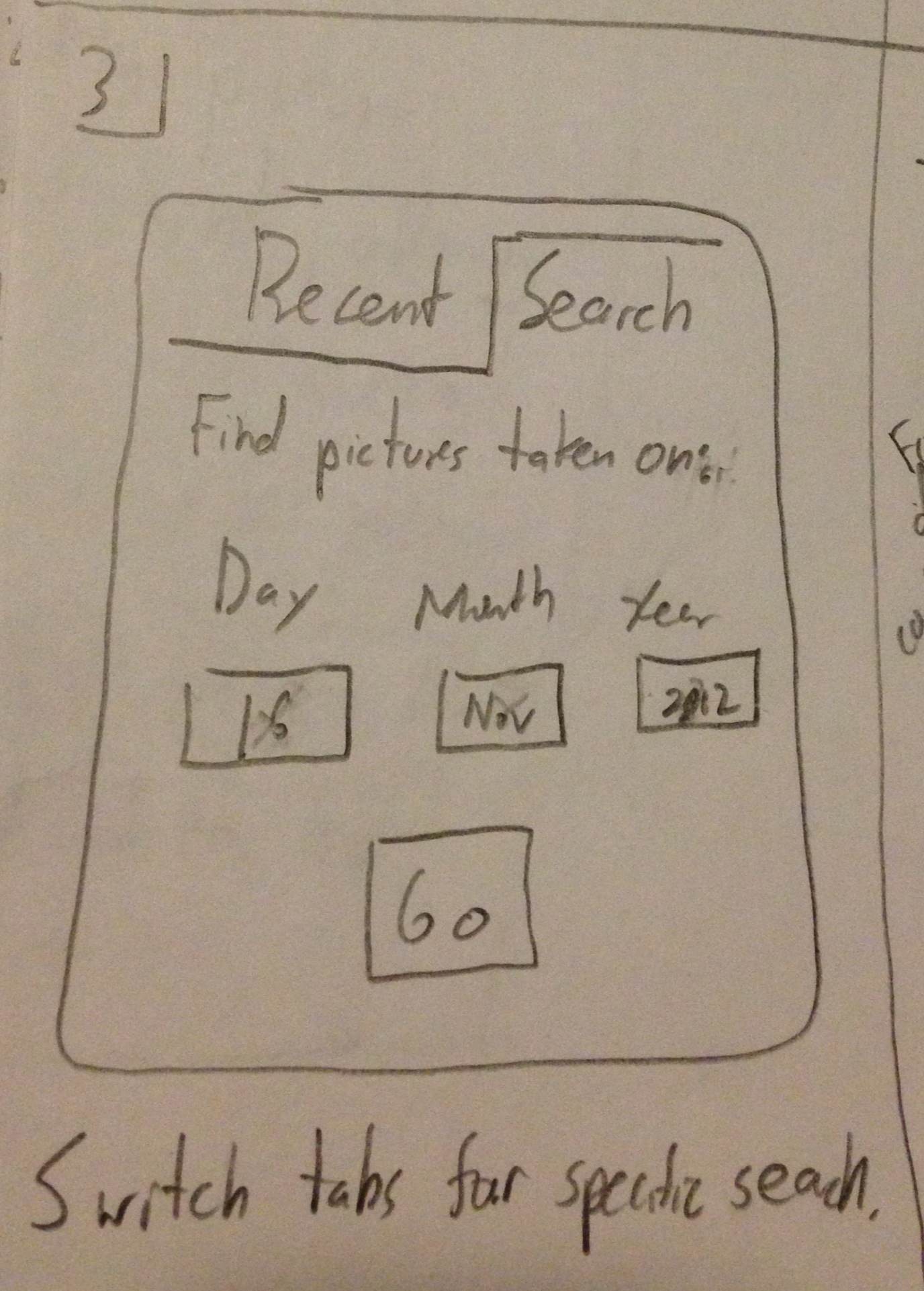
Step 2
- User is able to search for pictures and select the ones they would like to share.
Step 3
- User chooses who they would like to share with.
Usability Analysis
- Learnability
- Pros
- Brings user through a very straightforward progression of finding and sharing content
- Cons
- Does not indicate the possibility for other use cases, which could confuse the user if this is not what they are trying to do.
- Pros
- Efficiency
- Pros
- Brings user through a very straightforward progression of finding and sharing content with no wasted steps
- Cons
- Directly intended for this use case; will not be efficient for browsing and other uses
- Pros
- Safety
- Pros
- Users can progress through steps, but also easily go back steps if they want to make changes.
- The effects of the user's actions on one step are shown on the next.
- Cons
- Needs better indication of search toggling between recent added/uploaded and all content
- Pros
Design 3 - Mobile Screen
Step 1
- User wants to share pictures and has phone to do so.
Step 2
- This version defaults to showing the most recent content.
Step 3
- User can switch to selecting a particular date on which the content was captured.
Step 4
- Once a specific date is set, the User can now see that in fact there are pictures and can choose which one to share.
- Sharing is possible through email or a link to the picture
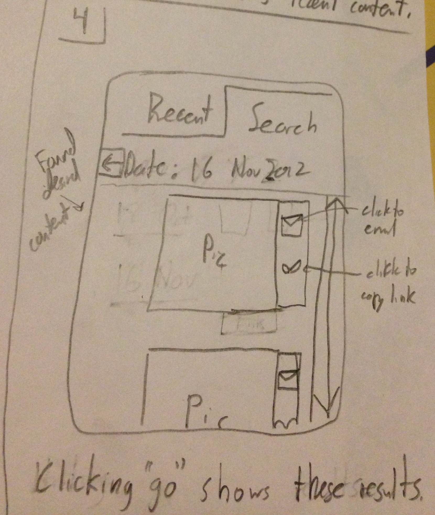
Design Highlights:
- Judicious use of screen space due to smaller size
- This led to less and simpler features i.e. focusing on dates only
Usability Analysis
- Learnability
- Pros
- Text boxes are labeled indicating their function.
- Links and buttons should have the proper affordances to indicate their uses
- Cons
- Depending on the affordances of the pictures in the recent view, it might not be clear what happens when you click either of them. When you click a picture, it might be reasonable to bring up the specific picture or the view of all pictures on that date. How to make that clearer should be considered in future iterations.
- Pros
- Efficiency
- Pros
- The efficiency of this interface stems mostly from the anticipation of user needs. The "Recent" tab provides immediate access to more current content which is presumably used more. Also, the buttons to email or copy or the pictures link are located next to the picture themselves as tasks commonly following viewing a picture or video.
- Cons
- Unfortunately, if many pictures occur on the same day, the user would potentially have to scroll through all of them if searching for something in particular. While this is better than simply searching through all pictures, it is something to improve in future iterations.
- Pros
- Safety
- Pros
- The different modes for simply viewing recent pictures versus those from a specific date are clearly demarcated using the visible tabs at the top, hopefully minimizing mode errors.
- Cons
- If the date you entered is not exactly correct, no content will be showed at all. Perhaps using a date range would be more effective and safer. This, however, presents some ambiguity because when people must confirm the absence of a picture, they might rely on this flexibility and incorrectly interpret it doesn't exist. But this current design is unforgiving in selecting the wrong date.
- Pros
1 Comment
Chong-U Lim
Scenario: The scenario given is good and concrete. It would be good to talk about the different ways, or the more concrete steps that are taken to find the picture (e.g., by name, by date), so as to situate your designs and link them back to the scenario. More detail also should go into 'Sharing with grandparents', is it going to their email? Social networking profile? It's very vague. Also, I feel that this has deviated quite a lot from what we discussed in GR1 in terms of the problem that you are designing this system for.
Individual Designs: There was some unique variation between the designs, and it was great to see some stretch designs from the individual members! (e.g., big picture, efficient, mobile, illiterate) It was good to highlight the tradeoffs between supporting one usability dimension in place of another.
Storyboards: I think the mosaic design was a good touch (and based on the feedback from the class, it was well received and served the purpose of making it appealing to the user and allowing them to feel more inclined to learn by exploring) I think the synthesis is most apparent in design #1. I am a little bit concerned about naming design #2 Safety... it seems that it's more focused on efficiency than safety. Design #3 is a mobile interface, and has challenges that need to be taken into consideration... but currently it seems to very similar to design #2 in terms of functionality, just was a reworked layout. I""m really surprised that after the fantastic designs from the individual sketches, that a lot of the stretch designs didn't make it into the final 3 storyboards. I think there is room for more creativity. The analysis for each design could have benefitted from being very explicit in applying the concepts that we've learnt from class (e.g., learning by exploring, internal consistency and external consistency of widgets used compared to those used in other systems, Fitt's law in some UIs, KLM for those that require combinations of key-presses and clicks, etc.
Wiki Presentation: Some of the images were too small. Try to make it such that when clicking on the thumbnail, the image shows in a modal dialog.