GR2 Analysis
Scenario
Amberlee is a high school freshman looking for a book. She only likes fantasy, but she hates wasting time that she could be reading by looking for a good book.
Individual Design Sketches
Elizabeth:
Design 1

Most complex design, probably the best one I did.
Design 2


Sorted by genre, with a "likes" system for ratings.
Design 3


Super simple, optimized for efficiency but lacking in features
Carlo Mannino (cmannino):
Design 1 (Desktop)
This sketch is designed for a large, horizontally oriented screen, such as a desktop or laptop computer. It keeps a navigation bar open on the left, and allows a different functionality for the librarian, which gives her statistics on book use.


Design 2 (Handheld)
This sketch is tailored to a small, vertically oriented screen, such as for mobile devices. It caters to students more strongly, so they can use the application while browsing books, instead of forcing them to find a computer.


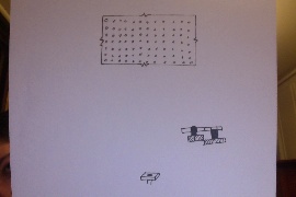
Design 3 (Non-screen display; for vision impaired)
This design is directed to blind users. It uses a different "screen," which is in reality a grid of pistons which rise and sink to create braille letters. The entire grid is covered by a sheet of rubber to form a "page."
Hannah:
Design 1
Straightforward App focused on recommendation. Trying to make that process the fastest. App itself makes recommendations of what you would like based on a book you liked that you search when searching for recommendations. I.e. users can say "if you liked x, you'll probably like y" so anyone that likes x can search it and find the y.

Design 2
Website designed for librarians. Quick access to popular books, can keep track of what they have in stock in their library online. Also can recommend books to their students through online application. Can see the list of books they've recommended. Straightforward design, simplistic although I misdrew the navigation pane that should be on the left.

Design 3
Designed to be ultra safe in the respect of keeping the students and their privacy safe. Only friending people from school and not letting others see books you have read, etc. This was the "extreme" design because I was thinking of students who have super protective parents, and an app they would let their children use. Pretty straightforward design, otherwise.

Paula:
Design 1
Efficient App. Only three options; Recommend, review, and find. Only buttons, except to write a title. Recommend me is the only social aspect.

Design 2
More social than last. Has a "club", where you can see your friends go to their profiles (basically a reading list). Besides looking at your club, you can recommendations from your friends, search, and review. It also stores your recommendations

Design 3
This design includes a librarian and allows for librarian-student interaction,

Storyboard designs and Analysis
Storyboard 1:

Suppose Amberlee wants to find a book. She opens up her application, and sees that she has a few recommendations, but she has read them all. She instead decides she wants to read a vampire romance with her friend Hamberleigh. She goes to "recommend a book" and looks up the genre for vampire romance, and sends the recommendation to her friend. When she checks her Reading List, she can see the books she is reading so that she doesn't forget to whom she has recommended the book. Over the next days, the girls get together and discuss the book.
This design is extremely learnable. It is based on a design similar to Netflix, such that most users will be very comfortable using it, and can quickly and easily get the hang of it. It quite efficient, but its efficiency is a bit affected by its safety. It highly interconnected, such that every title has its options displayed right there to minimize mistakes; however, this costs screen space, lowering efficiency.
Storyboard 2:


This was a super efficient design. In it, Amberlee presses find, picks the fantasy genre, and scrolls to find a book. The idea was that the only typing would be entering the name of a book (possibly writing a summary). That way, users who are in a hurry at a book store would only have to press buttons. In class, it was suggested that a dropdown menu or auto complete would have actually been more efficient.
Storyboard 3:
We chose the Mobile design as one of our three final designs.

Suppose Amberlee wants to borrow a book, but she doesn't know what to read. She opens her shelf to see if she has set a book aside to read. She hasn't, so she sees if one of her friends has. She clicks on "friends," and then finds a friend whose taste in books she likes, Jason. She sees what books he is reading, and sees he is reading Moby Dick. She selects the book and sees what the book is about, likes it, adds it to her shelf, and can now start reading a the book.
Efficiency: I sacrificed a bit of efficiency in order to make it more learnable. Despite this, It is very efficient overall, by alternating between three panels, such that no action requires more than three touches.
Learnability: The application makes use of colors and color coding to maximize learnability. It is very simple and has a UI similar to Facebook. Since most high school students are familiar with Facebook, they can easily figure out how to use the application.
Safety: The design is very safe, since it uses large, color-coded icons, such that mistakes are unlikely, and has an easily accessible navigation panel to give access to every section of the application, such that mistakes are easily recoverable. However, it could make more use of clearly distinguishable colors in order to make it more safe. Furthermore, it includes a "Back" button on every page to revert from any page to the previous.
1 Comment
Unknown User (meelap@mit.edu)
Scenario: You guys have a good start to your scenario but should follow it through with how the user might need to perform the 3 tasks you identified in GR1. Also, some of your sketches are designed for the librarian whose tasks are never mentioned in the scenario. You should clearly describe the user groups and tasks that your sketches are addressing.
Preliminary designs: Good sketches.
Carlo Sketch 3: Really interesting idea for vision impaired people! The common approach is to use screen readers to read the page aloud.
Hannah Sketch 3: Interesting design stretched towards children. Safety in the usability sense refers to prevention and recovery from errors. This is quite different from real life safety, such as privacy.
The learnability and safety of storyboard 2 was not discussed. Good analysis of storyboard 3.
Wiki Presentation: Thanks for laying out your sketches cleanly Carlo!