Paper Prototype
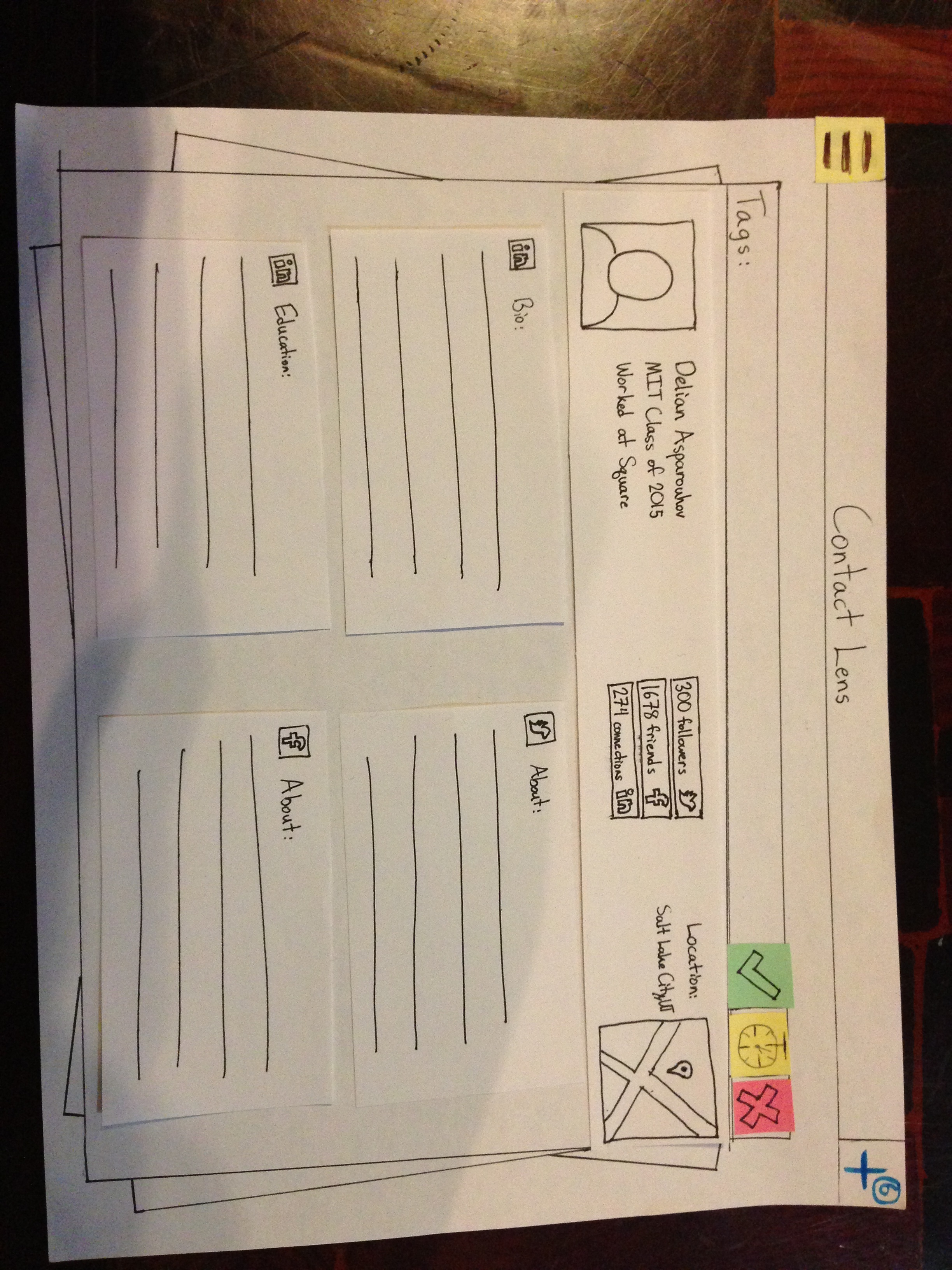
The user sees new requests in a stack
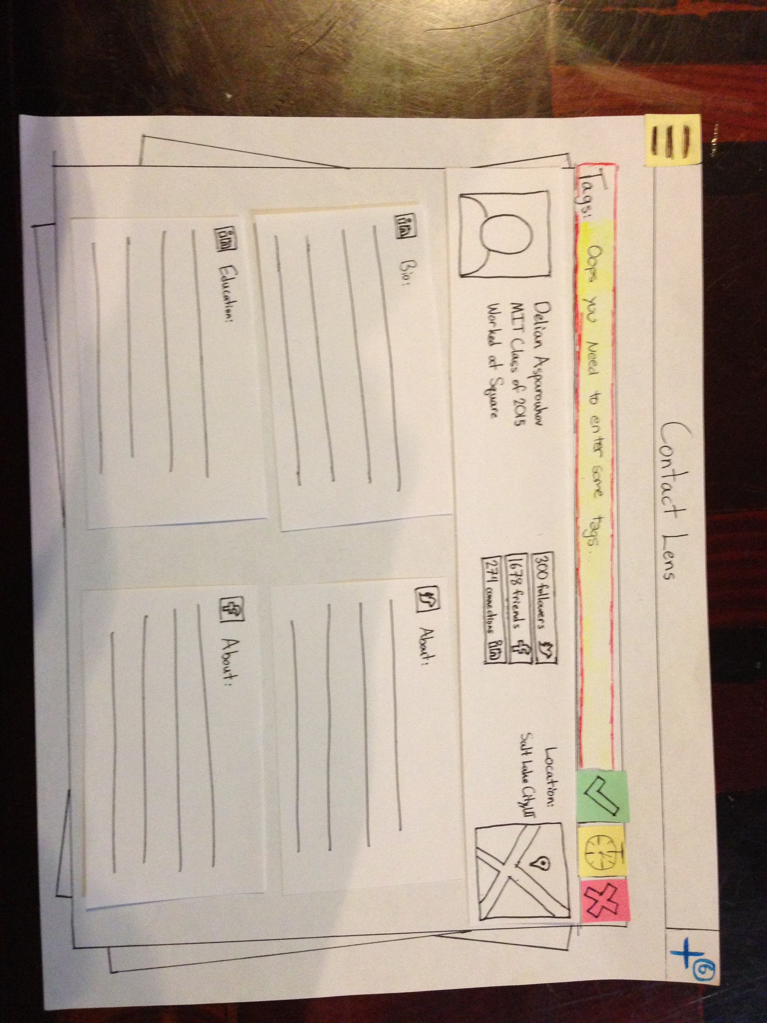
Tries to approve it but needs to add tags first
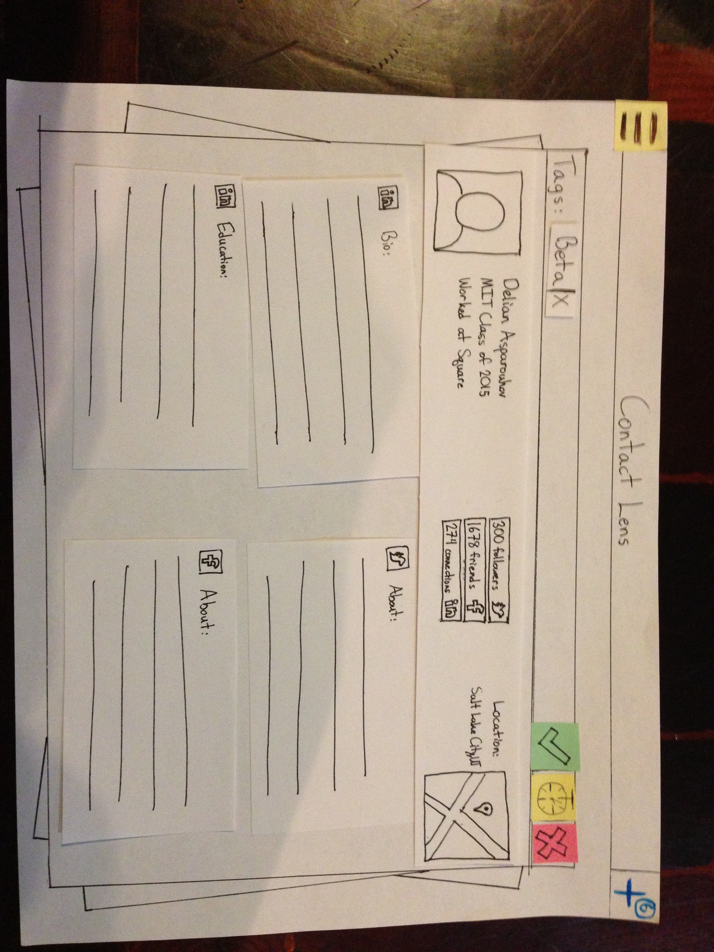
Tags added all set to approve
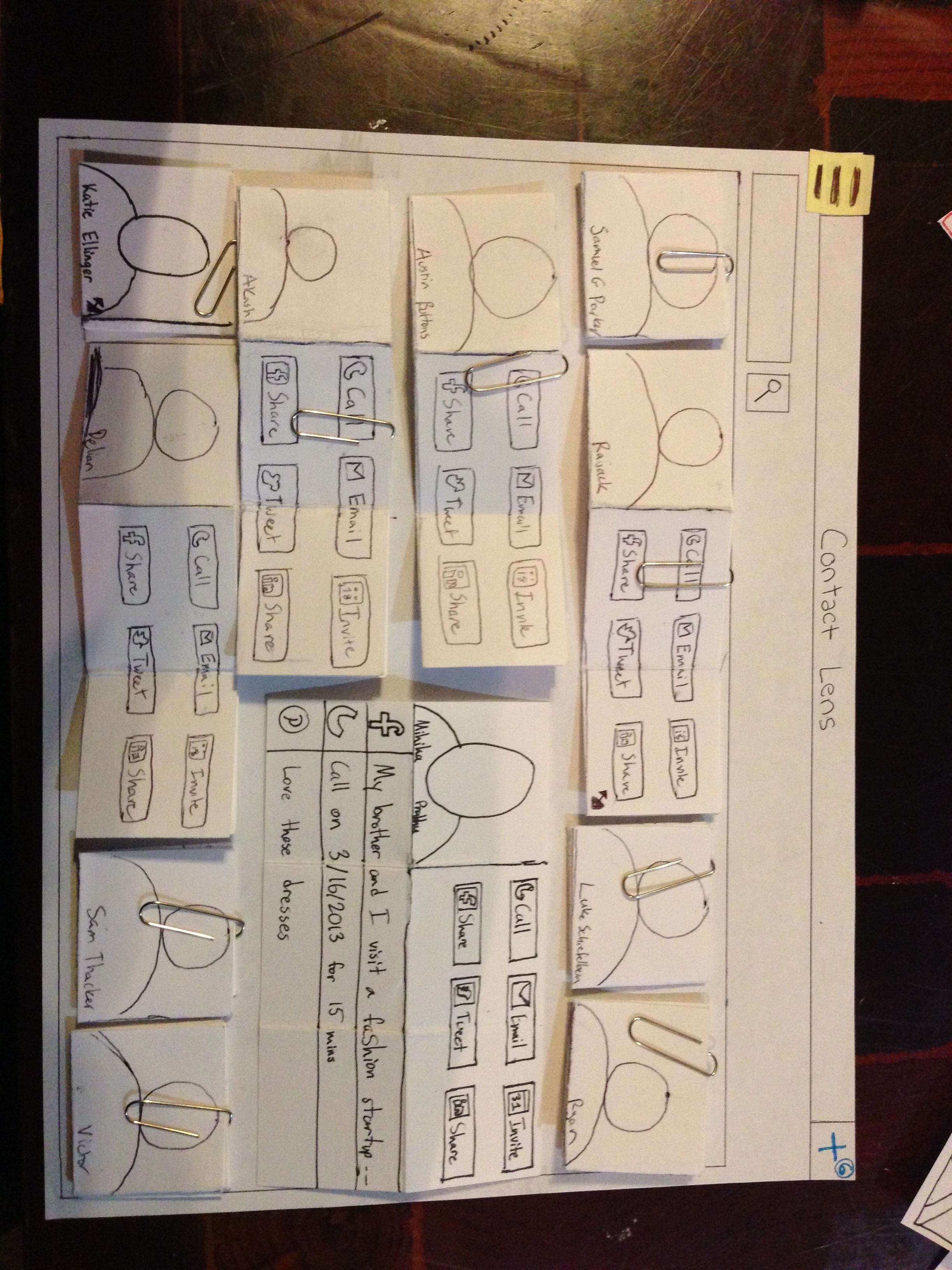
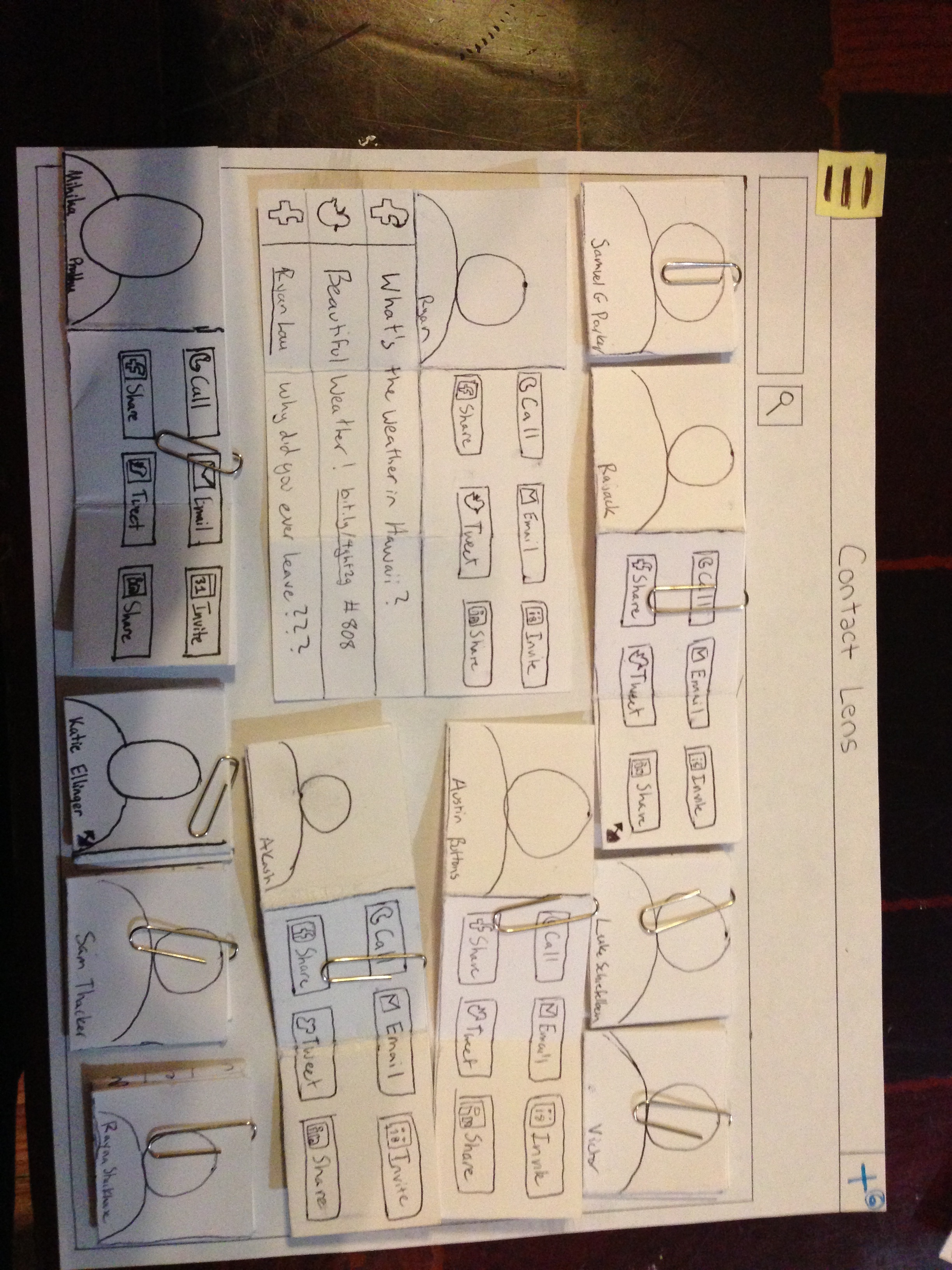
The main all contacts screen, contacts can be different sizes
What happens when "Ryan" is resized
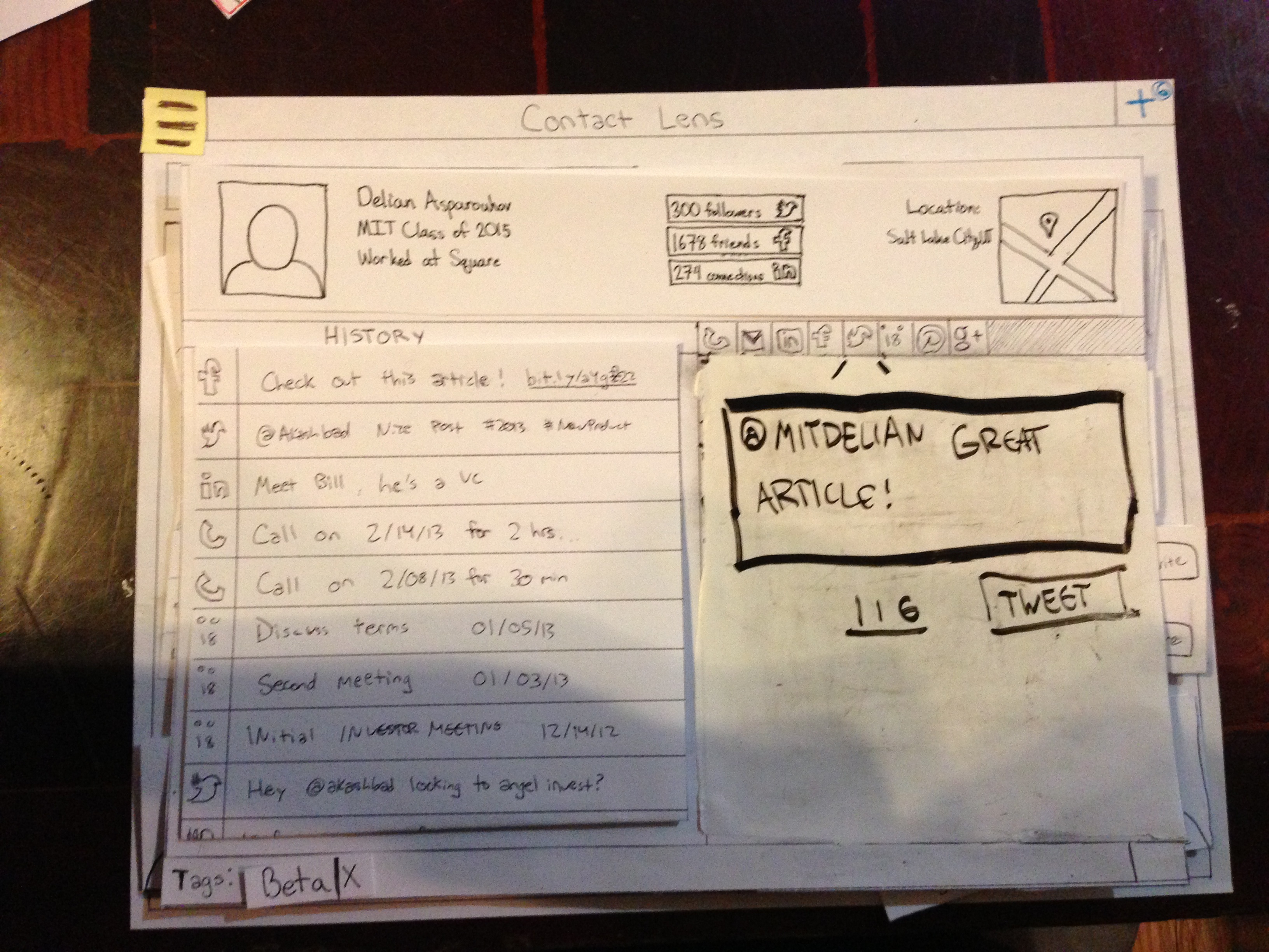
Sending a tweet to Delian
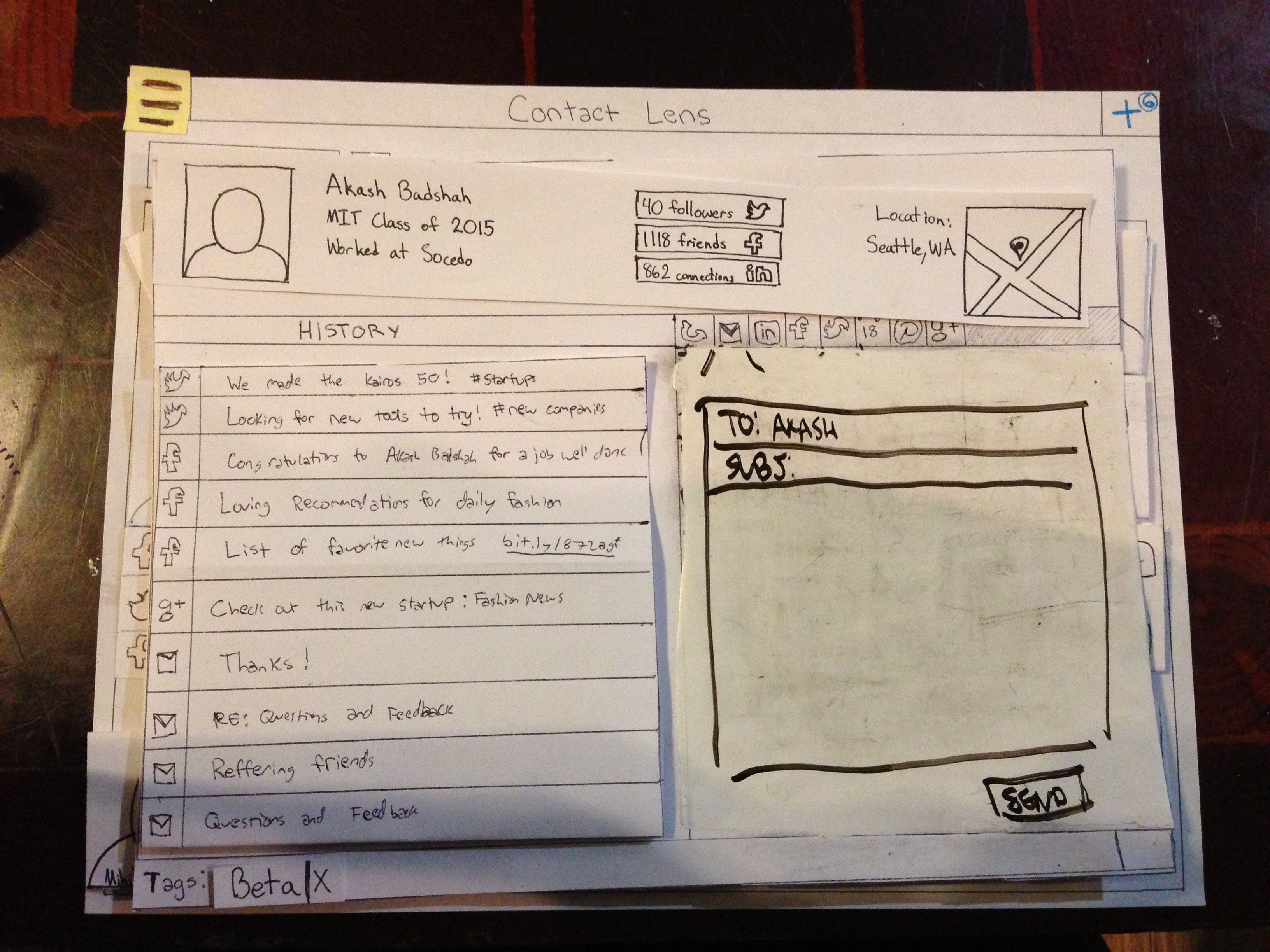
Sending an Email to Akash (responding to Ryan's tweet would bring up a similar dialog)
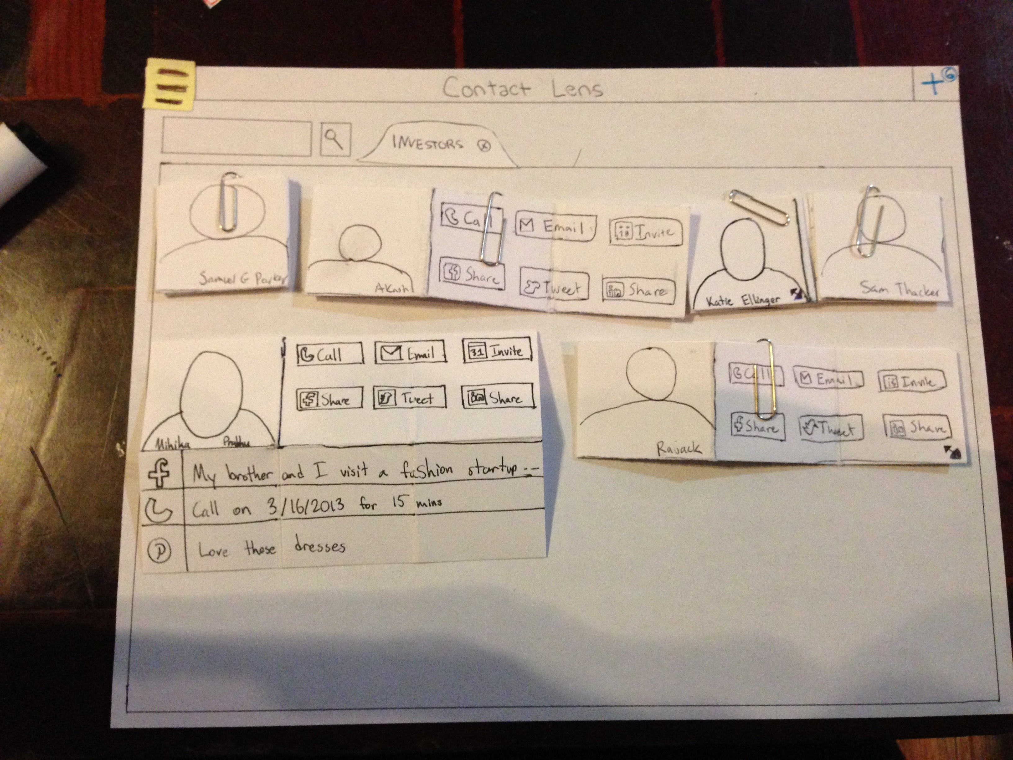
Looking only at the contacts tagged as investor
Briefing
- You are Sam, the CEO of a fashion startup
- You are in private beta, but you have a lot of requests and need to approve or disapprove these requests
- You also need to manage relationships with different people you are selling to (investors, beta users etc.)
- You manage these relationship across a variety of mediums (assume proficiency in all given communication tools)
- Pretend you are logging onto ContactLens for the first thing in the morning to start your day
Scenario Tasks
- You have 6 new requests
- Approve 2 of them
- Reject 2 of them
- You recently started talking to Ryan. Make an adjustment to Ryan to make his information easier to view
- Likewise, your relationship with Delian is fading. Start a new interaction with him
- Akash is one of your lead investors. Check up on him and send him an email.
- He is incorrectly categorized as a beta user. Categorize him as an investor
- You see a new tweet from Ryan. Respond to it.
- You are raising a seed round. Look over just your investors.
Observations
- Testers A, B, and C faced learnability issues with approving users. It was not clear to the testers that creating tags were required when approving new users, even with the “alert” system we put in place. Tester B attempted to click around the page to attempt to resolve the aforementioned tagging issues.
- Tester A expressed safety concerns over disapproving without any sort of confirmation since the disapprove button was right next to the approve button.
- All testers found resizing the various grid rectangles of users to be difficult. Most did not find it clear at all what to select, until we prompted them with the affordance that hovering over the corner symbol changes the pointer. The users that did recognize the corner symbol often tried to simply click on the symbol, rather than click and drag.
- Users B, C, and F found it difficult to initially understand what the respective buttons in the top left and top right did.
- Tester B expressed some efficiency concerns, with interest in the ability to skip between new user requests.
- Tester B did not find it clear that the history in the full details page was interactive, but this is something that can be expressed in an affordance on a webpage that cannot be expressed in paper prototyping
- Testers D and F were unsure about where the initial page comes from, as well as what was interactive.
- Tester E looked for affordances indicative of an Apple OS – pressing and holding an icon leads to the option to move them around in the grid formation, hovering over the top left corner allows a user to close a pop up, and potential to swipe on the first page to move between screens.
Design Iterations
First iteration
After our first iteration, we made several changes:
- Removed the green check-mark from the bottom-right of the modal
- Added a highlight and red border to the tags overlay to indicate that tags were necessary when approving a user
- Added a "later" button
- Changed the grid icon to a three-line icon
- Changed the resize icon to a double-headed arrow
Second iteration
- Changing all icon-buttons to text since we have so much space to work with
- Make one of the resize icons glow until that feature is used
- Allow people to drag contacts around throughout the grid
These are all changes we intend to make
1 Comment
Sarah E Lehmann
Prototype: The photos provided a clear walkthrough of your prototype. However, your design iterations could have used a bit more context/explanation. It would have been nice to see what observations led to each of the changes-some of them seem to come out of nowhere.
Briefing & scenario tasks: Clear briefing, good work rewriting the tasks!
User testing observations: It's obvious that you tested 6 users, but it may have been more effective to group your observations. For example, it's unclear that you did two rounds of testing on two iterations of your prototype (and if you did, you shouldn't be lumping comments from different prototypes together). If you found problems with a certain aspect of your interface in both rounds of testing-that's definitely worth noting in two different places (and putting high on your list of things to address before GR4!).