Prototype V2
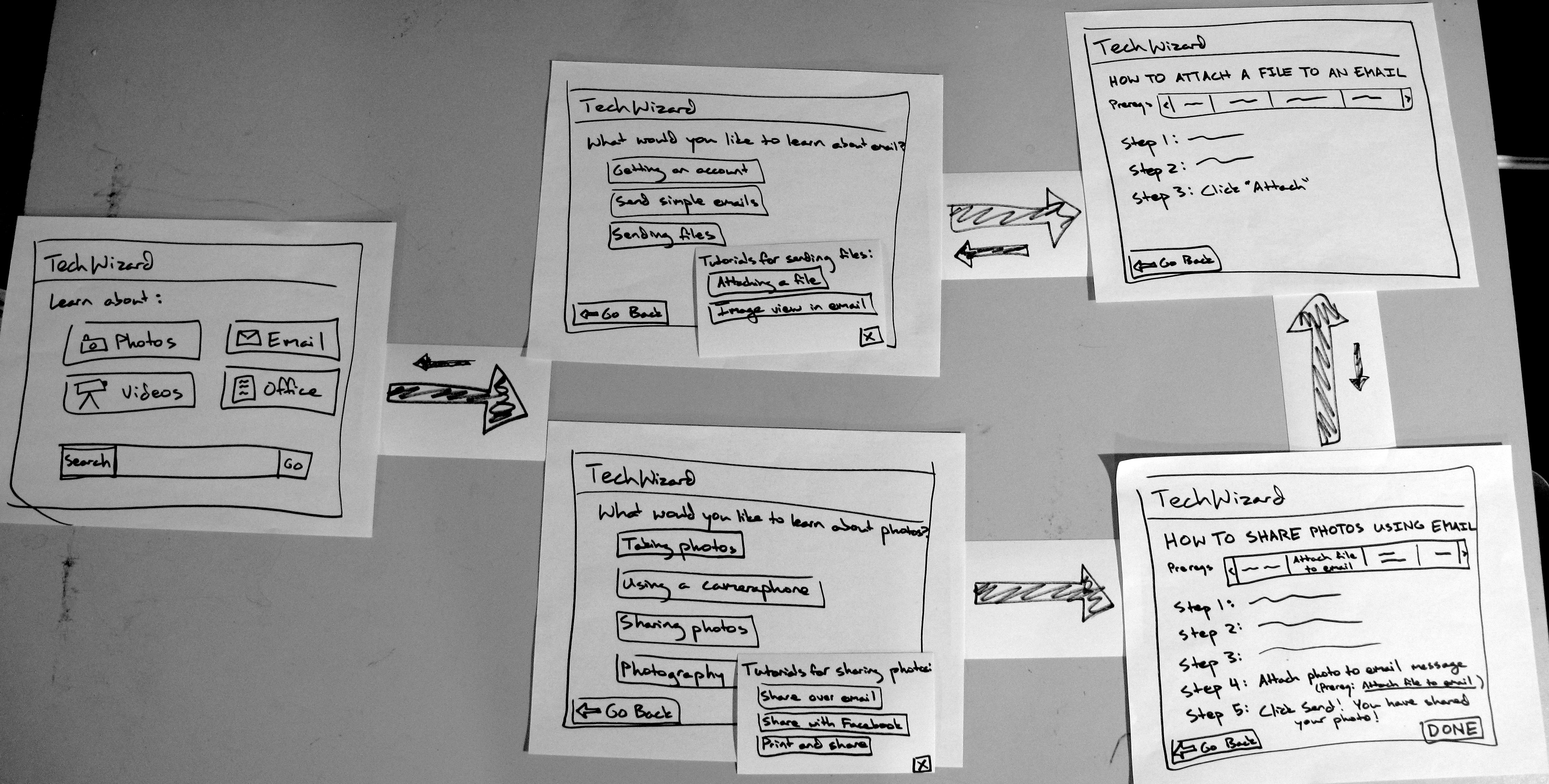
This photo shows all the elements involved in the test we ran, with arrows pointing from pages that link to each other in the test. The index cards on the pages in the middle column represent text content that was shown after users clicked on a category.
Briefing
TechWizard is a site that addresses the fact that a lot of computer illiterate people do not have a good resource to learn from.
You are a user who:
- Doesn’t know how to share photos in any way.
- Doesn’t know how to attach files to an email.
Scenario: You want to send some vacation photos to your friend. S/He’s sent you some via email, but you don’t know how to send your own back!
Tasks
- Find the appropriate tutorial category.
- Select a tutorial that will teach the right things.
- Learn the relevant skills and complete the tutorial.
Observations
During round 1 testing:
- We noticed that internal consistency mattered to our users a lot more than we thought. Buttons for going back had different labels depending on which type of page they were on, but two users (B,C) both thought out loud that the buttons seemed confusing.
- The location and relevance of prerequisites was unintuitive, one user instantly found them (A) and the other two didn't even notice they existed on the page.
- The one user that found them also didn't realize that it was something that they needed to do to complete the task.
- Links lacked the affordance of links - i.e. users hesitated before clicking on things (Users A and C). Possibly an issue with paper prototyping.
During round 2 testing:
- Prereqs still suffered from learn-ability issues - none of the users realized they could click on them! (It looked like an uninteractive status pane.)
- Internal consistency suffered again - Tutorials accessed as a prerequisite to another tutorial lacked a "Done" button, the point of which made sense only to use in our minds. User D hesitated after completing the prerequisite tutorial and made a comment to us after the test that it was puzzling to them.
- No users opted to use the search bar to complete the task (instead using the category buttons to navigate).
Prototype Iteration
For the second iteration, taking into account observations and what we wanted to see:
- Added a search bar to the front page.
- Made links in the middle pages more button-like and clickable.
- Moved the location of prereqs to the top from the right side.
- Changed the style of the prereqs display.
- Made buttons internally consistent ("Go back" everywhere instead of only on some pages).
1 Comment
Unknown User (meelap@mit.edu)
Observations: It's not clear that you tested you tested your prototypes on at least six users. Also, your observations seem pretty thin. I think you would really benefit from observing your users with usability heuristics in mind.