Briefing
Thanks so much for helping us test our website.
This website is designed to improve the efficiency of the election auditing process. This is the process by which ballots are manually recounted to verify election results. Note that most election auditors are retired and elderly.
The way that ballot auditing happens is as follows:
- Ballot auditors work in pairs of people - the reader and the recorder. You will be the recorder
- One of us will serve as your reader. That person takes each ballot and reads out the results to you, the recorder.
- The recorder enters this result into the system. This process continues until all ballots have been entered. In your case, the total number of ballots is five.
The task is for you to enter these five ballots. We will give you the tasks as you go, here is your first one.
Scenario Tasks
Round 1
The users received the following list of tasks as they went along the prototype test:
- Begin entering votes. Go through one full ballot at a time.
- Restart audit.
- Begin entering votes. Go through one full ballot at a time.
- Correct the entry for the previous race to “Obama and Biden".
- Correct the presidential race on the previous ballot to “Stein and Honkala”.
- Finish entering votes.
Round 2
The users received the following list of tasks as they went along the prototype test:
- Begin entering votes. Go through one full ballot at a time.
- Correct the presidential race on the previous ballot to “Stein and Honkala".
- Continue entering votes.
- Correct the entry for the previous race to “Obama and Biden”.
- Restart audit.
Observations
Round 1
For Round 1, we tested our main candidate button interface as well as different error detection. None of the users had difficulty with using the main button entering interface. Entering ballots seemed pretty intuitive and no major critical accidents were recorded with ballots that had names on them. Almost all users were confused by the write-in option. All selected the button correctly but then were confused that they did not have to enter the write-in name.
All of the users were confused with using the error menu. While most easily found the Fix Mistake menu, one tried to click on the candidate names in the sidebar to change them. Almost all of the users spent a very long time reading the menu, and not a single one pressed the help button for further instructions. Multiple users were also very confused by the difference between race and ballot and one user even chose the wrong option and ended up performing the incorrect task. The second user was also confused with what "previous ballot" referred to in the help menu. The first user was also very surprised that there was no confirmation popup when "Restart Audit" was clicked.
Round 2
In Round 2, we focused our testing on the "Fix Mistake" menu, so our critical incidents were centered on that part of the prototype.
Users liked the large "Fix Mistake" button and found it easy to enter that menu. After fixing one mistake, users were generally able to use the menu accurately and efficiently.
Even though the help menu was displayed constantly when the user went to the "Fix Mistake" menu, many users did not read it carefully. There was some confusion about the reset button next to the ballot heading; some users thought they would correct an error and then hit "Reset" to save their changes. Some users clicked the "Reset" button on the whole ballot instead of correcting one individual race. Users were also surprised by the sudden input mechanism on the left. Previously, they had been using the right panel to enter in the ballots. When that panel became informational and the user was expected to click on the left panel, there was some confusion. In addition, the help menu was written vertically and some users read the items sequentially, as if they had to complete every step in order to fix their mistake.
Prototype Iterations
Most users found the main screen easy and intuitive to use, but had lots of trouble understanding the "Fix Mistake" menu. As a result, we focused on changing that menu in our second iteration. The terminology of auditing is confusing, but our testers never chose the "Help" menu. As a result, we now just display the instructions on the right hand-panel to make sure all information is shown from the start. In addition, instead of lots of buttons requiring understanding of auditing terms, the edit button now shows up beside each ballot, and each race/candidate name becomes a clickable button. Now users can just click on what they need to edit without knowing the name for it. The bottom buttons of the left panel include "cancel" and "restart whole audit" to make these two items distinct. We also added a confirmation page so any choice informs the user what proceeding will do the audit, and gives them a chance to cancel. This improves the system safety.
Paper Prototype Photos
Images (Round 1) |
Caption |
|---|---|
|
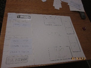
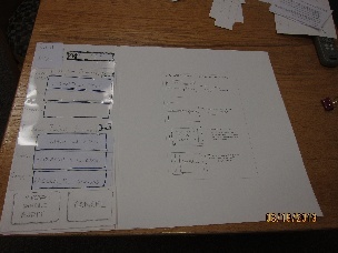
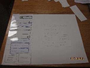
This is the first screen the user was shown - we skipped the log in screens, etc. |
|
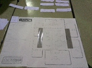
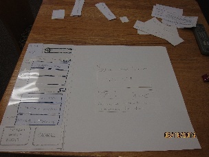
This is the menu that popped up when users selected "Fix Mistake" |
|
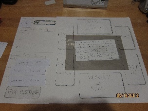
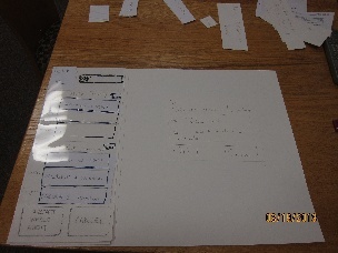
If users chose "Help" on the "Fix Mistake" menu, they would see these instructions. This state was never encountered in user testing. |
Images (Round 2) |
|
|---|---|
|
The main screen didn't change since we got such good user feedback on it. |
|
This is what the users see now when the select "Fix Mistake" |
|
If the user chooses a specific candidate name or race, they get a confirmation screen. The screen confirms the element they selected, and also warns that all information from that point will be reentered (by system design). |
|
There is a similar confirmation page for restarting a ballot. |
|
This is the confirmation for restarting the full audit. Now users are informed that all information will be reentered. |
1 Comment
Sarah E Lehmann
Prototype: Great photos! They clearly show your prototype in all interesting stages. Also, great job focusing on your ""fix mistake"" menu for your iteration-it seemed that that portion of your UI needed a redesign.
User testing observations: Great observations!
Wiki presentation: A lot of your explanations were large blocks of test-try breaking things down into easy-to-read (and possibly easier to write) bulletpoints.
Overall: Well done!