GR3: Paper Prototyping
Briefing
The following briefing was given to our user testers:
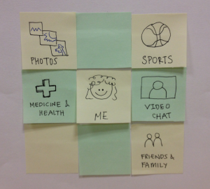
Our website is aimed at the elderly population as a way to connect with each other, foster community, and find information about hobbies and interests. You are an elderly (65+) male, John, who would like to complete a few tasks.
Scenario Tasks
The following scenario tasks were given to our user testers:
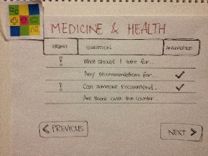
- Answer a new question on Health & Medicine.
- Watch Jose's video chat on Medicine
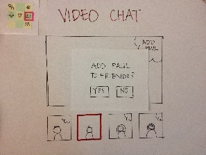
- Add Paul as a friend.
Prototype First Iteration Photos
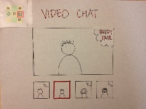
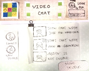
Prototype #1 Screenshot |
Notes |
|---|---|
|
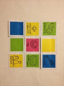
*Navigation Tiles |
|
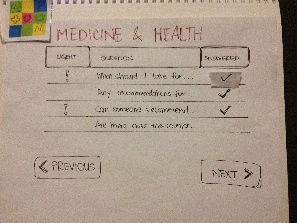
*Answering a question for medicine |
|
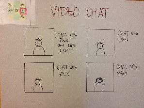
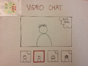
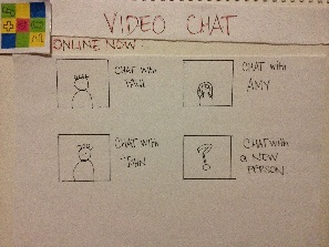
*Choosing a video chat channel or buddy |
|
|
|
*Adding Paul as a friend |
|
|

Prototype First Iteration User Feedback
User 1:
- Originally thought there should just be an edit button (instead of the text with edit button)
- liked big icons versus text on the main/homepage
- wanted feedback/speech feedback i.e. "Paul is now your friend."
- under the Medicine & Health page questioned if a user can re-reply to questions they've already responded to
User 2:
- Is there a way to have visual feedback about the number of unanswered questions?
- possibility to have information about whether or not certain questions are more urgent or not.
- wants more functionality and feedback
- in case users want to look for questions, similar to the ones they have is there a possibility for sorting/search
- wanted more information about how video chats are sorted
- wondered if there is a way to find certain people to chat with
- asked if maybe the video chat might be more conducive to a TV guide style TV set-up instead of a chat style interface
- thought about the possibility of having an overall search bar with "smart rankings" based on the which page the user was currently on
- wondered about ways to classify the video chat portion of the interface, with the potential for topic based/person based channels, or ppl based chats
- also brought up the idea for random group video chat pairings with feedback afterwards ie. "good" vs "bad" to promote meeting new ppl/making new friends
User 3:
- was initially confused about whether or not the header grid icon had individually clickable icons or was just one icon
- wondered about the possibility for an expandable reply textbox
- wondered about "BACK" button functionality vs. just using web browser's back button.
- wondered about what happens to responses (under Medicine and Health page) that were started but not finished and if those replies automatically autosave if go to a new page.
- wanted to be able to the edit a question they already answered and wanted to know how to find their previous response.
- wondered if there was a way to show who had answered a particular question - i.e. thought that memory might not be the best and couldn't necessarily remember which questions they can answered.
- thought that the best way to choose to video chat with someone was through the "Friends and Family" section
- thought it was not immediately clear whether or not the interface was a group chat (and everyone was chatting i.e. google chat or just one person talking) & wondered about functionality such as are the individual boxes clickable.
- wanted some way to have more info about people before chatting with them/ had concerns about safety
Prototype First Iteration Observations
All three users thought it wasn't clear how the questions under Medical and Health are ordered. Two out of three users didn't find editing a previous response easily accessible. Two of of three users thought that it wasn't clear that by clicking on "chat with Paul" will bring them into a group chat as opposed to a paired chat.
Prototype First Iteration Analysis
In summary, feedback from usability tests from the first iteration concluded that the design, although simple, lacked functionality for normal and expert user scenarios, including search, sort and categorization. Hence, we adapted the feedback into our second iteration prototype and added much more functionality and performed another iteration of user testing.
Recitation Feedback
- On the Medical and Health page, there should be a visual cue to let the user know which questions are urgent, and which questions have yet to be answered. We tried to address this concern in the 2nd and 3rd prototype iterations by including visual markers for urgent and unanswered questions.
- It was suggested that we should integrate more feedback into our design. For example, in regards to the visited pages and questions under Medicine and Health we could have the text of the visited pages show up with a different hue or color value than the ones that have not been visited. We also tried to integrate these ideas into the 2nd and 3rd prototype iterations. We also felt that some of the feedback options, were harder to distinguish on a paper prototype and would be more visible and obvious in a computer prototype due to the greater degree of fidelity.
- Another comment from recitation which was also commented on by our user testers was that the video chat aspect of our design was confusing in terms of functionality and how video chats were sorted. We agree with these comments and ultimately tried to simplify the video chat aspect of our interface in order to avoid confusion. We also added in an option to chat with a new random person in order to try to integrate a way to promote making new friends and connections among the users.
Prototype Second Iteration Photos
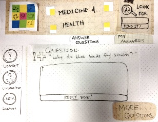
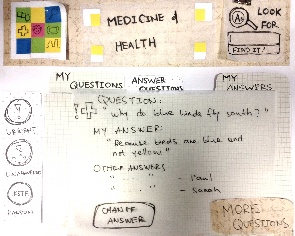
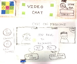
Prototype #2 Screenshot |
Notes |
|---|---|
|
*Navigation Tiles (more contrast) |
|
*Answering a question for medicine |
|
|
|
*Choosing a video chat buddy |
|
|
|
*Adding Paul as a friend |
|
|

Prototype Second Iteration User Feedback
User 1:
- He is confused why there is a "change answer" button.
- When navigating out of the medical questions page, the user tried clicking on one of the navigation tiles in the upper-left hand corner, thinking that it will bring him directly to the video chat page. Then he found out that it just brought him to the home page.
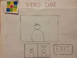
- After the user clicked on the video chat with Jose, he is confused what he can do at that point.
- Even though the user joined a video chat, he still thought that he could type to communicate with others.
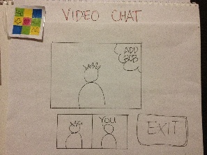
- He didn't see the need to like or dislike the video chat.
- He sees two different ways to add friends, but he eventually chose to add Paul as friend through the video chat screen.
- "Why would multiple people want to video chat with Jose at the same time?"
- The user questions the usefulness of the website as facebook has a very strong networking effect. The elderlies' grandchildren wouldn't want to switch from facebook to AgeToPerfection.
User 2:
- The three filter buttons on the left under Medicine and Health screen is confusing.
- "Does the search bar at the top right only search for content under that specific page?"
- The user wasn't sure if he has to add friends with other participants first in order to see their video chat with Jose.
- "What happens if I 'dislike' the video chat?"
Prototype Second Iteration Observations
One recurring confusion users encounter is what's going on when they enter a video chat. The prototype screen shows a number of faces, but it is unclear what immediate actions the users can take.
The 'like' and 'dislike' buttons on the video chat screen and the filter buttons on each screen added confusions.
Prototype Second Iteration Analysis
We believe that the first critical incident is attributed to the fact that our low-fidelity prototype does not show the participants chatting in real time. Otherwise it would be pretty apparent that the user can just start conversing with the others.
Based on the principle of simplicity and the fact that the 'like' and 'dislike' buttons didn't serve much purpose, we decided to remove it in the 3rd iteration. The filter buttons on the Medical and Health page will be replaced by something more externally consistent with other applications' filter and sort mechanism.
Prototype Third Iteration Photos
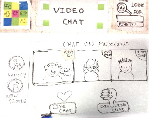
Prototype #3 Screenshot |
Notes |
|---|---|
|
*Navigation Tiles (more contrast) |
|
* Answering a Question on Health and Medicine |
|
|
|
|
|
* Choosing a Video Chat buddy |
|
* Video Chat with Paul (a friend) |
|
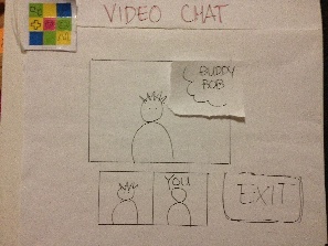
* Video Chat with a new person, Bob |
|
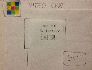
* Add Bob to your friends |
|
|

Prototype Third Iteration User Feedback
User 1:
- Have more text for the question headers
- Wasn't clear that the Answered, Urgent, Questions are buttons
- Feedback needed for buttons for three answered, urgent, questions
- If Paul is a friend, unclear whether to press family and friends icon or video chat icon
- How can I tell if someone is not online?
User 2:
- Are there more unanswered questions if I go to the next page?
- And I have to go through all the pages to make sure there are unanswered buttons?
- Question about button for "Answered", "Urgent" and feedback when the buttons are pressed
- If Paul is a friend, unclear whether to press family and friends icon or video chat icon
Prototype Third Iteration Observations
Users had two main critical issues in this third iteration: ordering/filtering of questions, and wondering why video chat with Paul, a friend, doesn't go through the main friends and family tile. We plan to clarify the ordering and filtering of questions by providing more feedback for buttons and more text, as well as simplifying filtering behavior. In addition, we are planning to update the Family and Friends tiles so each tile represent a discrete task, rather than overlapping areas to minimize confusion.
Prototype Third Iteration Analysis
In summary, feedback from usability tests from the third iteration concluded that the design is more balanced between functionality and ease of use. Although there are two consistent points of confusion for users, this still indicates confusion is greatly reduced from the first and second iterations, where users had questions regarding many aspects of the user scenarios.
1 Comment
Unknown User (meelap@mit.edu)
Great job guys! It's clear that your observations motivated the changes you made at each iteration and I think your design has improved quite a bit.