Design
EasyShop is a website that is meant to make shopping easier for the elderly as well as those with poor eyesight. What makes our website more desirable to elderly people is our emphasis on customer service, our sites ability to change the sizes of search results, and general minimalistic style.Our design is largely based on twitter bootstrap, which makes styling and positioning easy.
What we learned from:
Paper prototyping
- The information scent given by our re-sizing icon and slider was not strong enough => We put a label on the slider and icons to make use of the slider more intuitive.
- Checkout button was hard to find because the icon was too small and it was away from any center of focus => We moved the shopping cart to the area close to the user information drop down
Heuristic evaluation (feedback we got from class)
- The main page was way too busy with the colored images => We replaced those images with simple icons that are consistent and commonly used
- Paypal is too different from our web site and leads to local inconsistency => We implemented Stripe for checkout system which is much simpler and has the same styling as our website
- For your reviews, there is not enough distinction between the review and the review title => Made a bigger distinction by implementing a review system that clearly distinguishes the title from the actual content
- The number system is probably not the best visual variable for reviews => We implemented a system that uses stars which are much more common
Walk-through
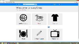
Main page. Consists of big icons for major categories of items in our database. There are not only visuals for the categories but also titles. They somewhat resemble the cards that are used in Google Now which give the affordance of being clickable while also clearly separating all of the icons.
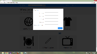
Sign up page. The sign up page is a simple modal that requires the user to enter their first name, last name, email address and password. We decided to make this a modal instead of another page, because it was more simple and also lessens the possibility of mode error.
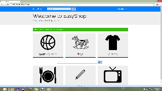
Successful sign up. In order to inform user that they have signed up successfully, we not only prominently show their name in the upper right hand corner, we also show a message with a green background stating that the sign up was successful. While this might be too much feedback for the average user, for our user population, the elderly, we want to make sure they always know what is going on.

Item results page

Items results re-sized.

Shopping cart.

Recurrent purchases.
Implementation
We decided to make our website a ruby-on-rails based system. The site is hosted on Heroku and the best browser for it is Chrome. We use a lot of outside libraries for various reasons including Sunspot(search), Stripe(payment), and Rake(database). Our back-end consists of models for items and users. Items have a name, description, price, brand, brand image, images, and categories which they fall under. Users have a first name, last name, email, password, shopping cart.
Problems
- We lost a lot of crucial time dealing with development issues in the beginning of the implementation process. Computers that were running on Windows could not be used to develop, so we first tried to use the athena cluster to develop. It turns our that any software you install on an athena computer is wiped on log out so we had to re-install everything all over again. Eventually we had to start booting Ubuntu from flash drives connected to our computers.
- Scripts was not working, so we had to host on Heroku and in order for our back-end to work, we had to pay $20.
- While developing, our ".gitignore" file was being buggy and would not ignore certain files making pushing and pulling a hassle. Eventually we got it to work.
Evaluation
Briefing
Thank you for helping us test our shopping site for the elderly. We will be asking you to perform a series of tasks to test the usability of our website. We are not allowed to aid you in the completion of the tasks and we ask you to please think out loud while you are completing these tasks. Sometimes when people concentrate on something they forget to think out loud, so please be aware of this and we will remind you if needed. The more we know about what you want to do and what you think something should do, the better off we are. Remember that you can stop at any time and feel free to ask us any questions after you the test.
Scenario
You are an elderly person that is buying a basketball for your grandson for his birthday.
Tasks
Please do the following tasks:
- Make an account
- Search for basketball
- Re-size search results to "small", then "big"
- Pick Spalding basketball
- Check reviews
- Add to cart
- Checkout
- Pay with following fake information:
- Card number: 4242 4242 4242 4242
- Expiration: 07/17
- Name on card: "your_name"
- CVC: 123
- Got to your profile page
- Under purchase history, select the basketball you purchased
- Give this item a review
User 1
User with bad eyesight.
- MAJOR: There was complaints of the pictures not being big enough => We were unable to implement bigger pictures because of a re-sizing issue with the carousel we were using.
- MINOR: The re-sizing was not that obvious and a "little too obnoxious" => The way it is setup, there is a drop down menu that has different sizes and they thought this was too cluttered. In retrospect it probably wasn't a good idea to have to UI elements controlling a single mechanic. We should have either kept the slider or the drop down and not both. The slider with proper information scent (icons representing the different sizes) would have probably been the best option.

Re-size module.
- POSITIVE: The liked how simple our modals made things. They were straight forward and required no over-thinking.
User 2
We asked one of our grandfathers to be our second test user. He usually buys presents for his grandchildren online, but due to the difficulties of finding specific items, he often opts to simply buy gift cards. When he used EasyShop, he found the product re-sizing to be a great feature for him, but he said he wished the product titles and images in the product page would have been re-sized as well.
- MAJOR: resizing of elements on the product page would be useful => We did make an attempt to make elements on this page as large as possible without hindering efficiency, but it is understandable that some users would wan't smaller or larger text than the default
- MAJOR: Sort button hit area is actually only on the word sort not the whole button => This was accidental in development and was not the intended behavior. This is clearly a poor UI element, and the fix is trivial
- POSITIVE: resizing was genuinely useful
User 3
Our third user was a friend’s elderly aunt. She did not have any trouble using the site, but she said that the product detail page could be clearer. However, despite this, she proceeded through all the user tests without any major issues.
- MINOR: Product page layout could be more clear => Perhaps instead of using just white space as separators between areas of content we could have used lightly shaded rectangles for easy visual delineation.
- POSITIVE: User thought website was easy and navigation flowed well.
- This user also pointed out the issue with the sort button (mentioned in User 2's details)
Reflection
What we learned
Over the iteration process, we learned the following:
- Keeping in mind the feasibility of any given feature during brainstorming. A voice interface might be awesome idea, but implementing it might be too much to ask for, given the time we had.
- Everybody is not going to agree on everything, but disagreement can sometimes be a good thing. Discussion has to be a delicate balance between not disagreeing too much that nothing gets done and agreeing too much that an environment of group think fosters which leads to the implementation of bad ideas.
- Things that might seem simple because you see them everywhere in your daily life might not be so simple. For example, a simple shopping cart can be very difficult to implement depending on your website's back-end.
- Don't bite off more than you can chew. We severly underestimated the amount of work that a fully working shopping site requires.
If we could do it again
Looking back, we might have chosen a better user population than the elderly. In the city, it is difficult to user test the elderly. We would have also started using ruby-on-rails since the computer prototype. We ended up implementing everything for the computer prototype using javascript, css and html, and eventually had to scrap all of that code and start over for our ruby-on-rails implementation.
Meta Decisions
When making design decisions we usually tried to focus on the features that made our product different to the typical shopping site. For the paper prototype, we made the re-sizing feature a priority and also had users test our voice interface. The voice interface testing was just a simple Wizard of Oz testing scenario. The voice interface proved to be very difficult to implement and we unfortunately could not incorporate it in our final design. Had we known this earlier on, we would have focused on other features like our improved customer service and recurrent purchases. For the computer prototype, a problem we faced was deciding how deep (level of back-end implementation) to make the site. In being a prototype we wanted it to be pretty shallow, but choosing the correct amount became tricky.