Prototype photos
Initial screen
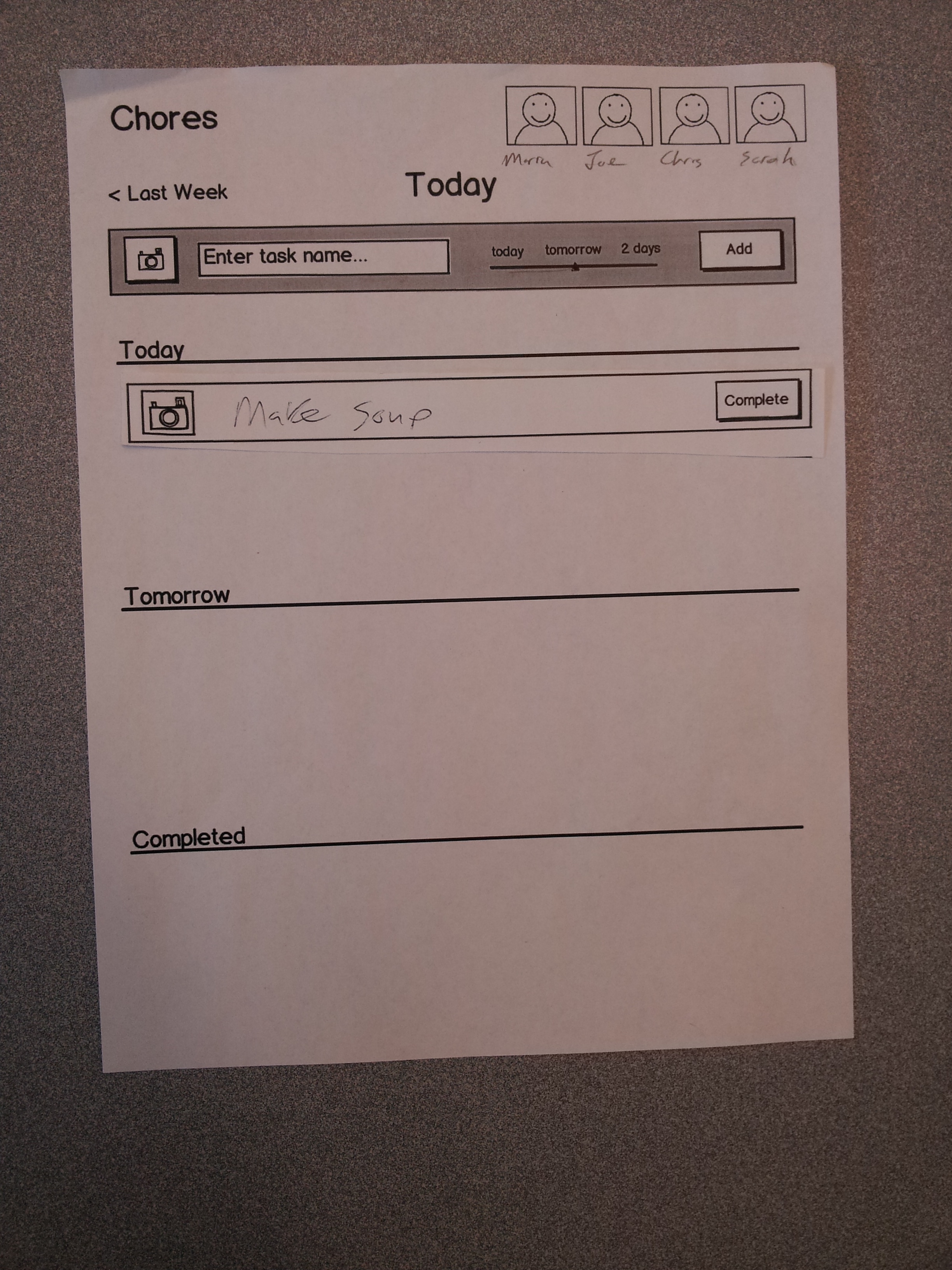
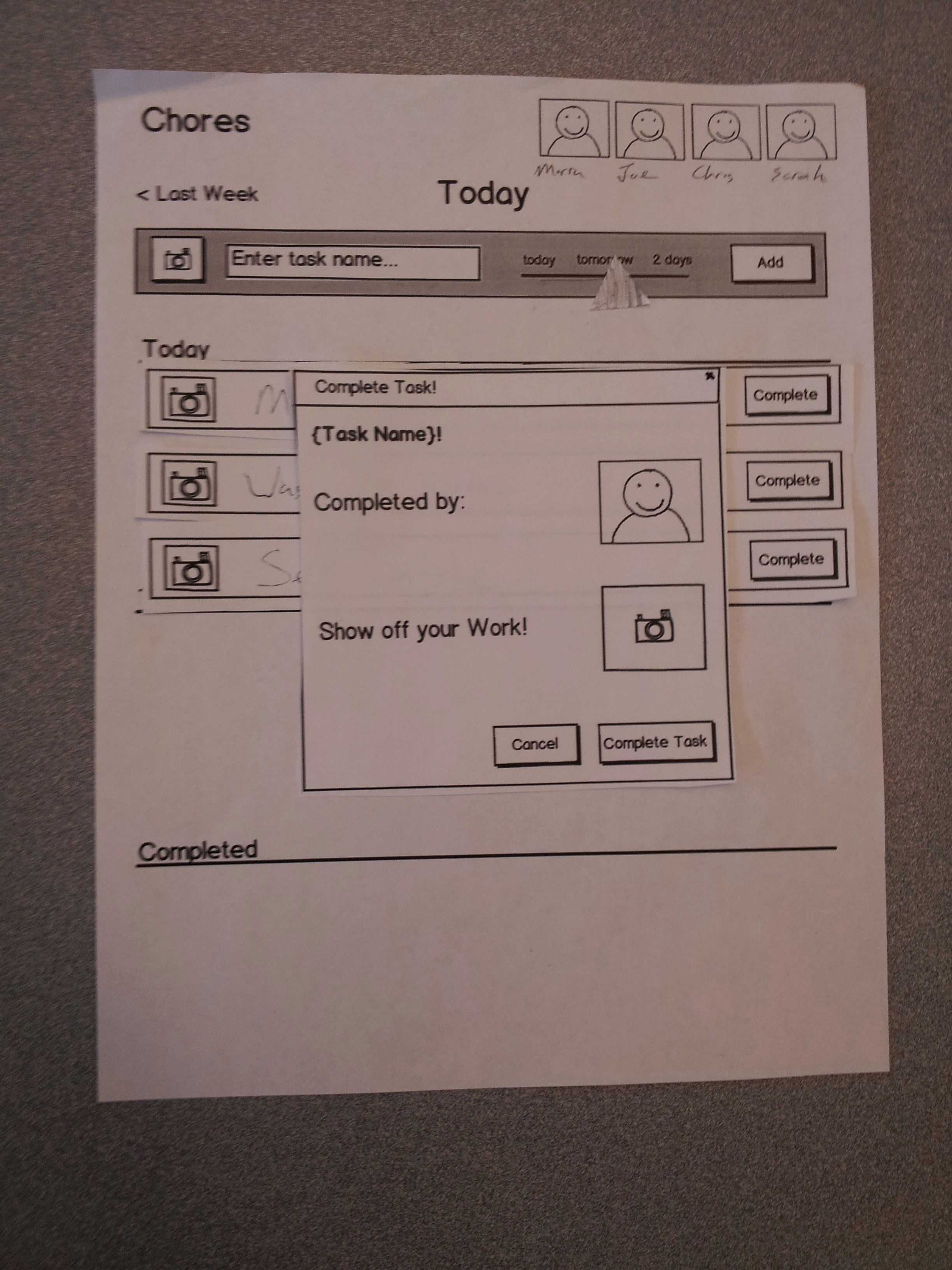
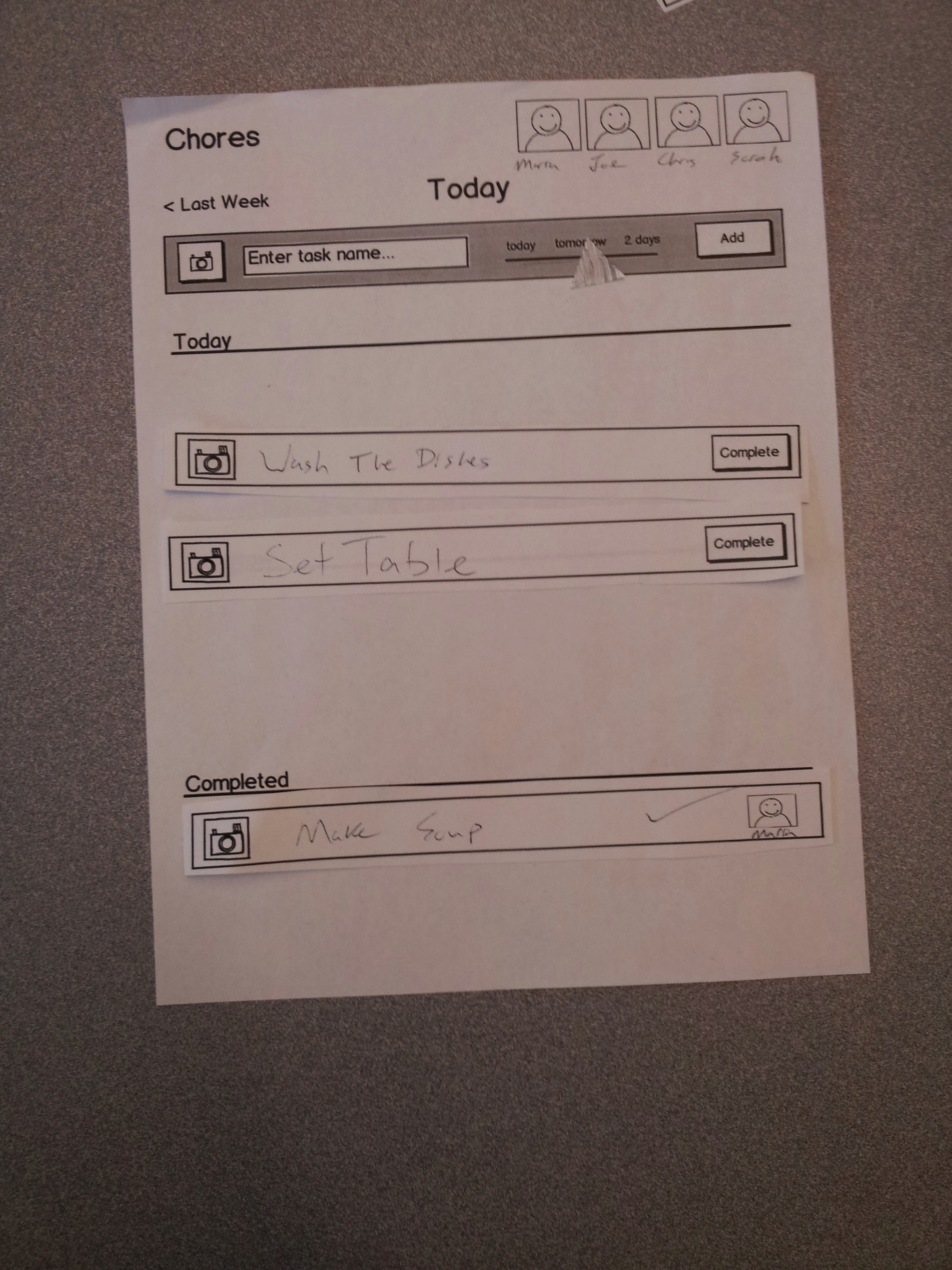
Two tasks added

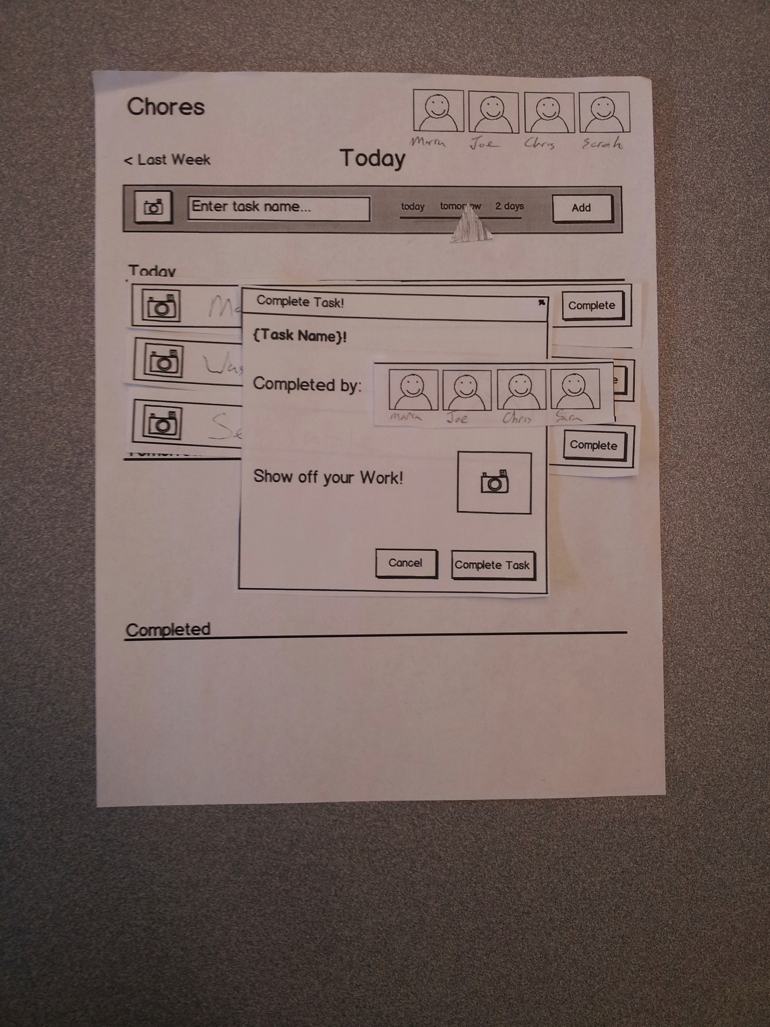
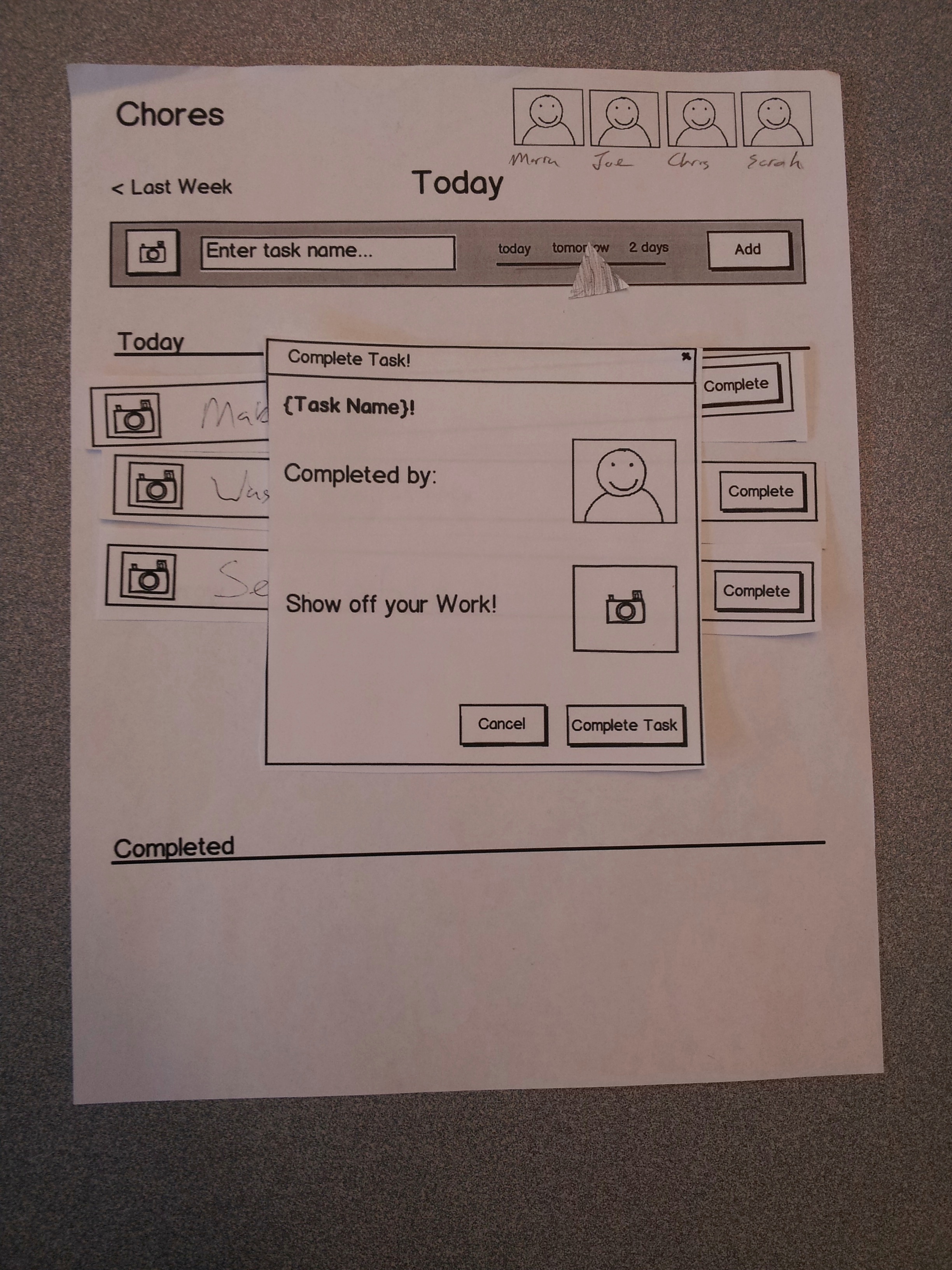
Dialog after clicking "complete" button
Selecting who you are in the completion dialog
Dialog after clicking "show off your work" button
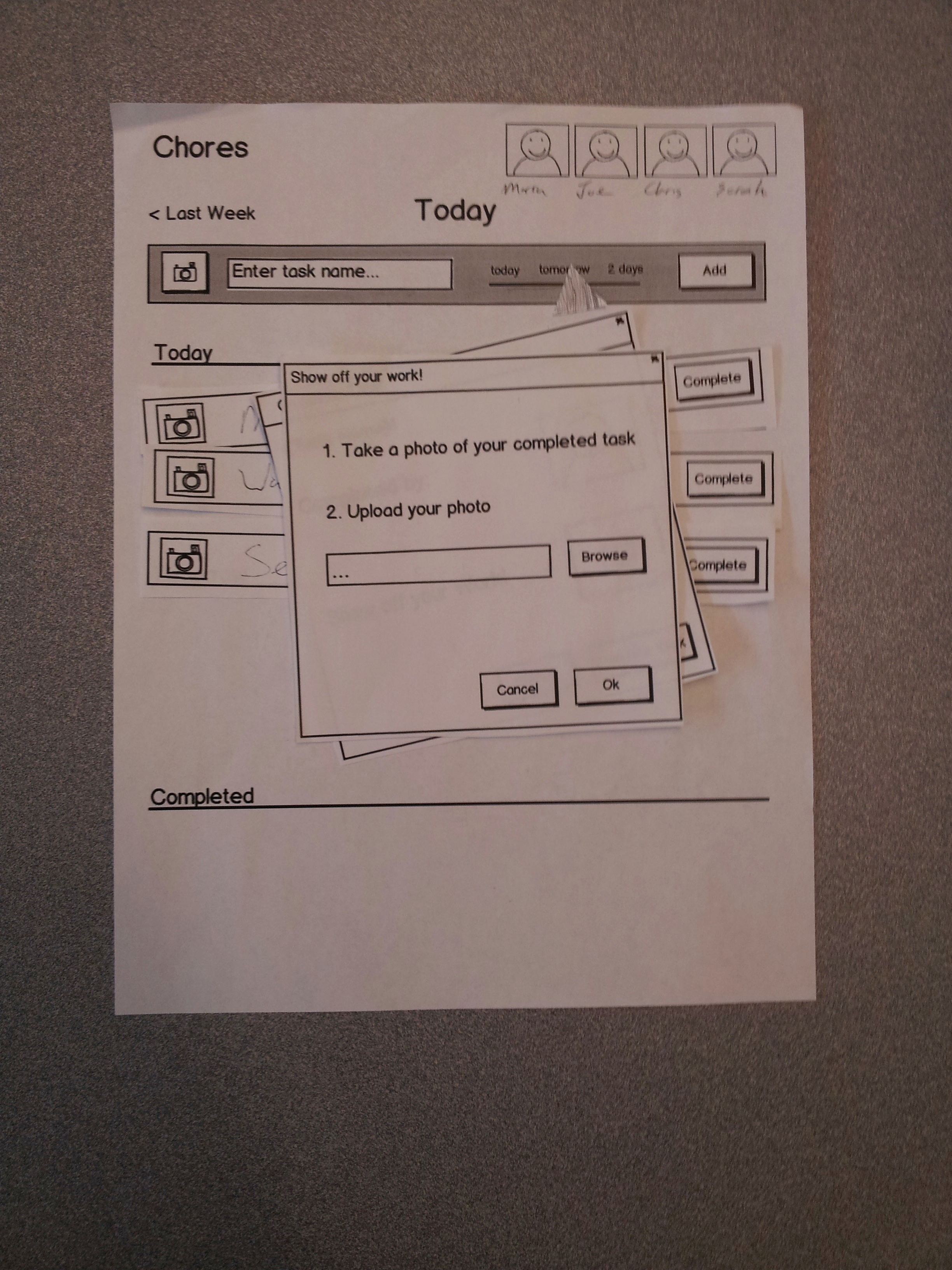
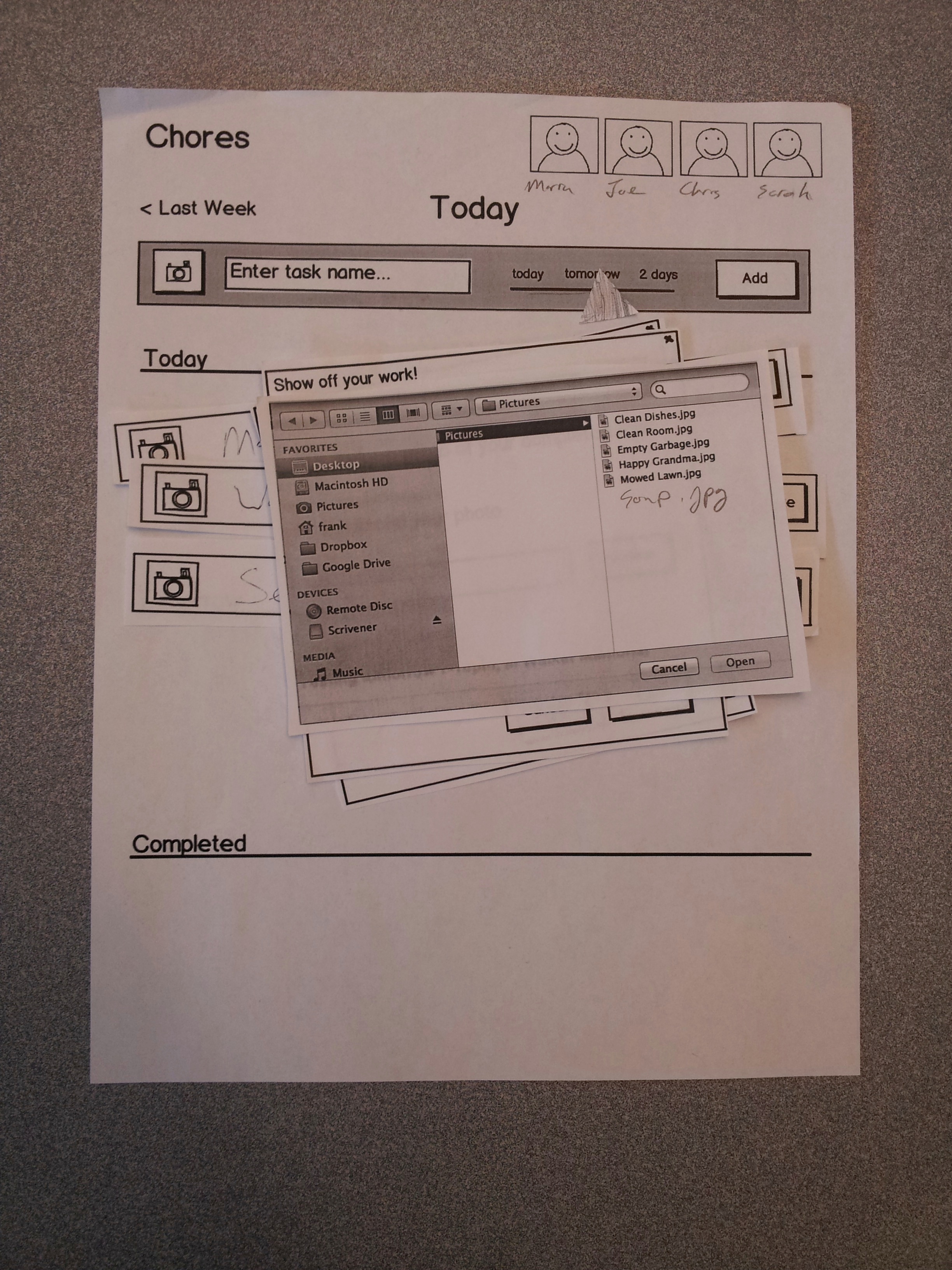
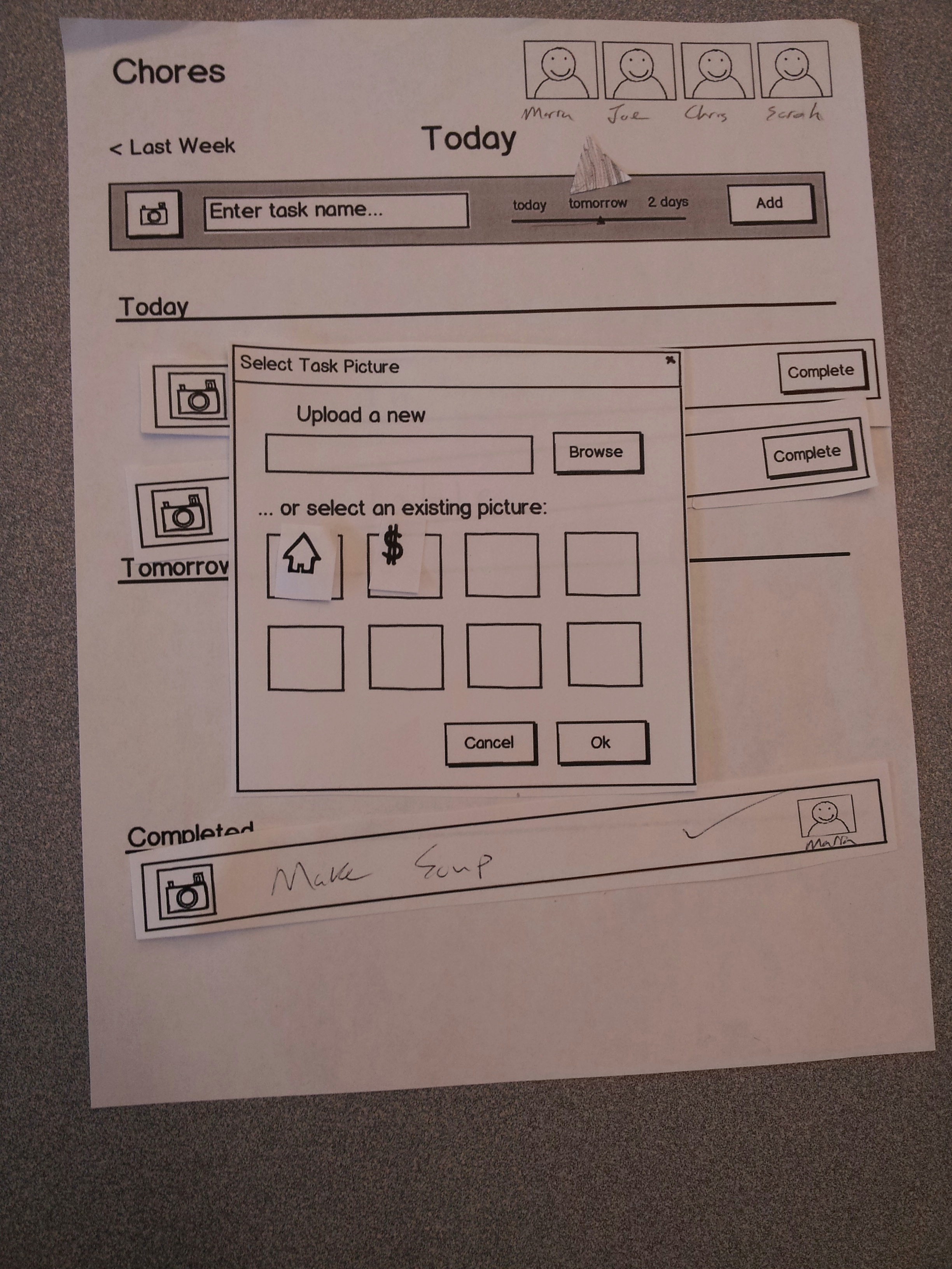
File picker dialog for selecting a "show off your work" picture
After selecting a "show off your work" picture.
After completing a task
After clicking someone's face on the top right corner. Shows you what that chores that person did.
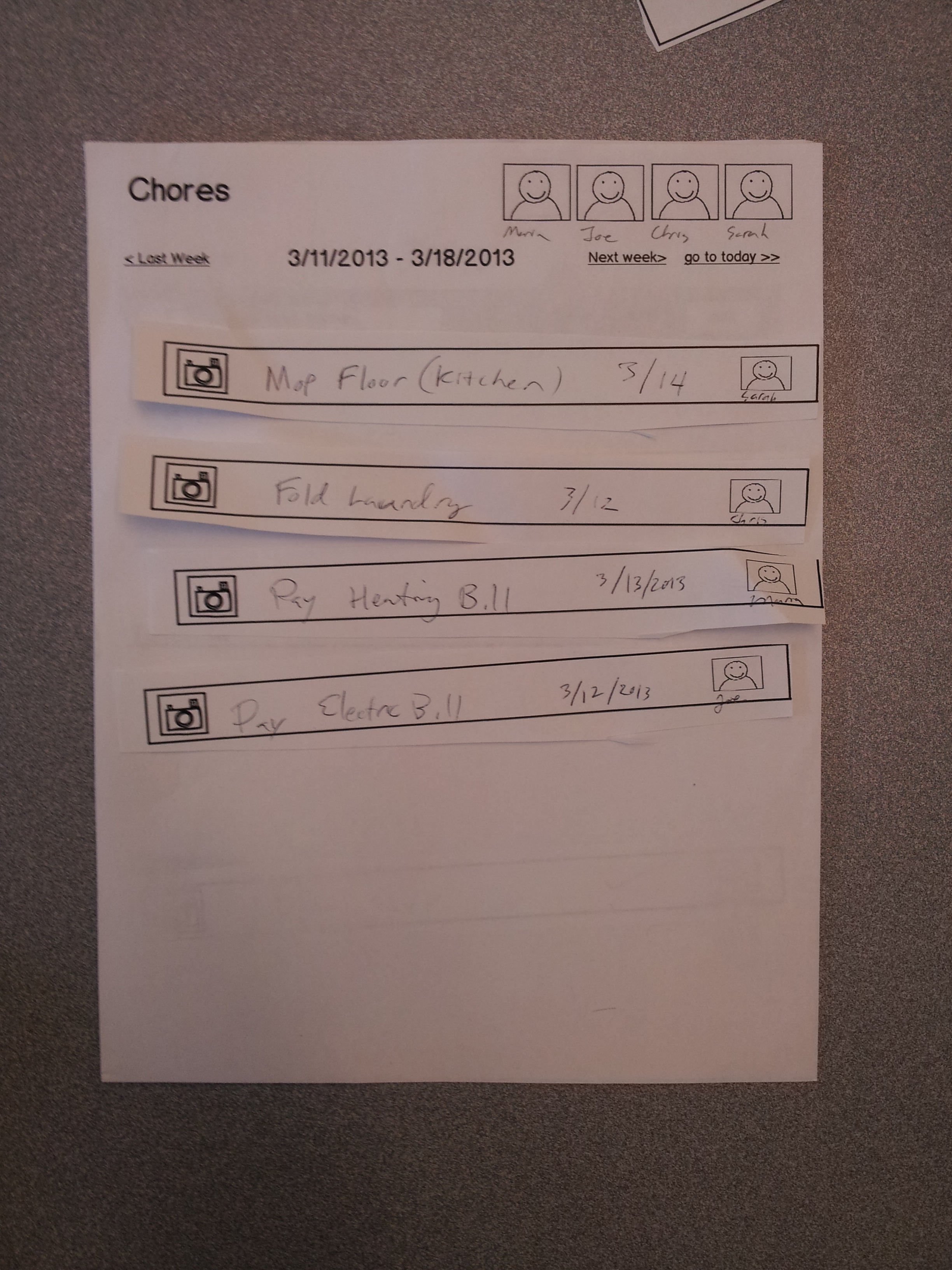
After clicking the "last week" button. Shows you the tasks that were completed last week.
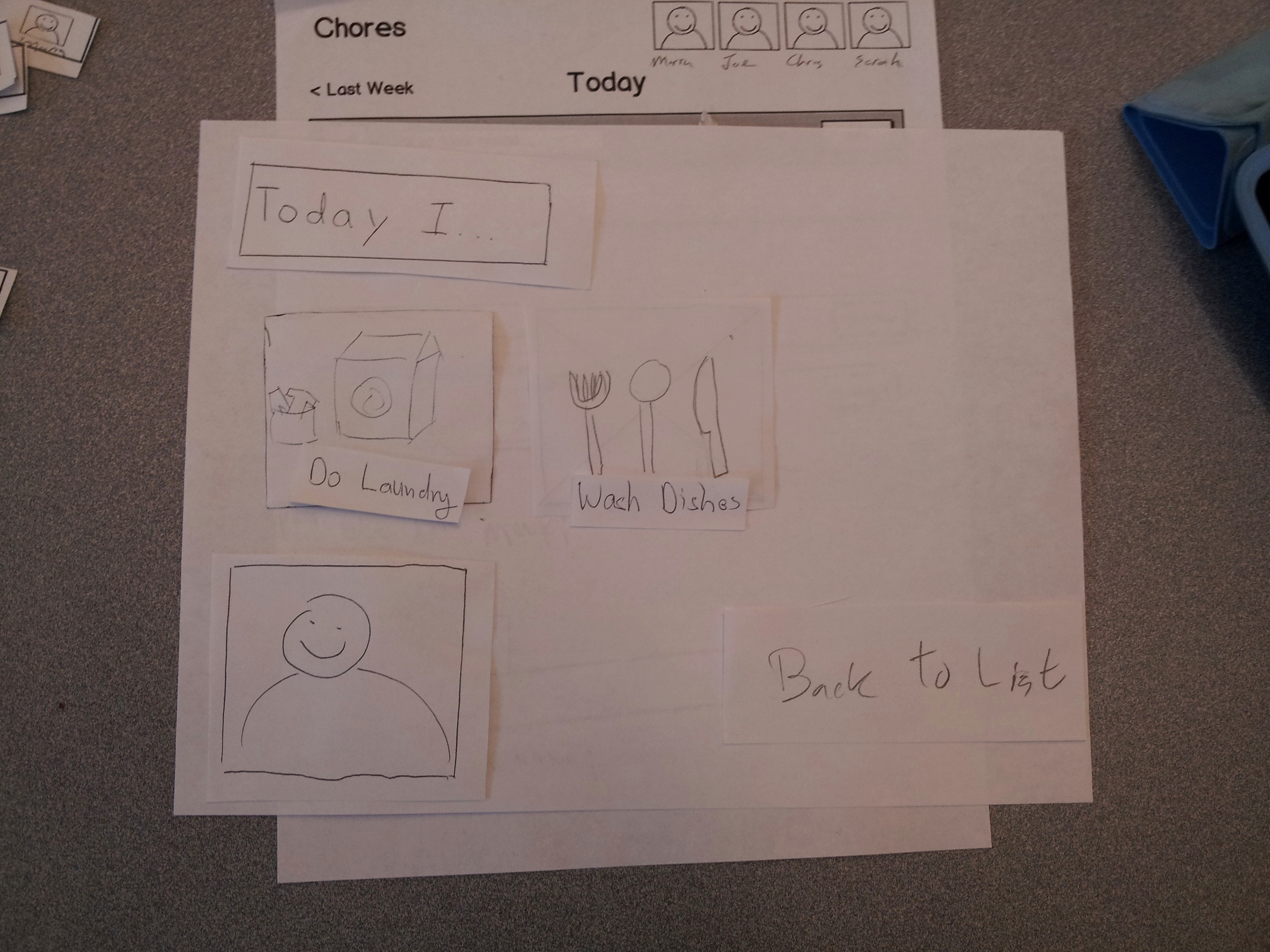
Picking an icon for your task
Briefing.
We are building a tool that helps families fairly distribute household chores. Our hope is that usage of this tool will lead to happier families by letting parents avoid nagging their kids.
In this user test you will take the role of several family members as they try to prepare for a family dinner. You'll play the role of the parents and the children in different scenarios.
Scenario Tasks
Task 1
You're Joe/Maria and you're having a dinner party tonight. Your kids Chris and Sara have nothing to do, so you'd like them to help out. To do so, you'll use our family to-do list.
- Add "Set the table" to the to-do list.
- Add "Wash the dishes" to the to-do list.
- Complete the task "Make soup"
Task 2
You're Chris/Sara and you want to help your mom/dad with the dinner party preparation. Your mom/dad is busy cooking, so he/she tells you to look at the to-do list. Pick a task, do it, and mark it completed.
Task 3
You think your brother/sister is slacking. Check what he/she's done for the dinner tonight.
Task 4
You're Maria/Joe and you're away on business. You want to check on how the family has been doing.
Observations
User 1
Task 1
This user tried to assign a task to a child, which isn’t possible in our system. He also tried to click on his own picture to log in. In our system, there isn’t a login system, since you only specify who you are when you complete a task. User also mentioned that the “Complete” label in each task row was confusing, since he didn’t know if it meant that the task was already completed.
Task 2
As a kid, the user didn’t feel particularly motivated to use this system. He also didn’t know when to interact with the page. He clicked on a task before even starting it. With our prototype, you only interact with the system after finishing a task. The user stated that it’s not clear how this is motivational for children. What is the positive feedback?
Task 3
The user completed the task correctly, but he was wondering if there was a way to say “good job” when looking at his sister’s task completion page.
Task 4
The task wasn’t very well defined and the user didn’t know what to do. We were hoping this task would lead to discovery of the “previous week” feature, but it didn’t happen.
User 2
Task 1
When completing the task, this user didn’t know what our camera icon did. He also wanted to add a task deadline but there is no way of doing that. He also didn’t think it was convenient to upload a task completion picture. He’d have to get a phone, somehow get the picture to the computer, and upload.
Task 2
The user wanted to start a task by clicking on it. In that prototype, you only interact with the task once it’s completed. Clicking on a task and seeing the completion dialog was a surprise to him. He actually noticed that adding a task completion picture is a three dialog process, which is annoying.
Task 3
User tried to click on a completed task to see who did it. Completed task rows should have a photo of who completed that task.
The user didn’t discover the ability to click on a person’s face to see what tasks they’ve done. User mentioned that the face pictures in the top right didn’t feel like sections to him..
Task 4
Wanted to see yesterday, but unable to view just yesterday. In our system, you see previous tasks group by week. He also didn’t know how the completed tasks were sorted. He wasn’t sure how to go back to the first page after reviewing the previous week.
In the end, the user liked the prospect of using this tool for managing a rebellious teenager. He mentioned the concept of task completion pictures was valuable, but that it wasn’t obvious from the user interface. The user interface didn’t convey any sense of importance, or an indication of how a user would get credit for work done.
User 3
Task 1
User wasn’t sure if the todo list was for him or for everybody. There is also no editing interface, so if there’s a typo in a task there’s no way to correct it. When completing a task, it wasn’t clear that the “who am i” section of the completion dialog was a button for him to indicate himself.
Task 2
The user wanted to pick a specific task before working on it. The prototype didn’t have that functionality. He also had trouble figuring out where to click the task in order to mark it complete. It seemed like clicking on the entire row would bring up the completion dialog.
Task 3
The user discovered the top right face buttons to check on his sister.
Task 4
User didn’t discover the feature to look at previous weeks.
In the end, the user wasn’t clear on what needed to happen when you wanted to help the family out. Does somebody just look at the list? click anywhere?
Prototype iteration
Lessons from first iteration
From our first user test, we learned:
- Users want to be able to click on a task and indicate they’re going to work on it before actually doing it.
- The fact that you don’t start out by choosing who you are is confusing.
- There need to be actual motivators for children, such as points or a “top helper” ranking list. The ability for a parent to indicate “good job” would be nice too.
- Reviewing previous weeks isn’t very discoverable, or interesting.
- Uploading a task completion picture is too cumbersome, with too many dialogs.
- The feature of adding an icon to a task isn’t discoverable at all.
- Overall the users liked the deadline slider.
Second iteration photos
To Do Page

Family Page

Second iteration tests
User 1
Task 1
Hitting the background closes the popups user rapidly checkboxes
Time slider snap back
Assumes photo tap on popup, completed button successfully
Task 2
User asserts already washed dishes.
User declined completion photo
Task 3
Family screen intuitive!
What was helpful/useful/cool?
What was useless, dumb?
Claimed thing changes task?
Understands what Claiming means
Claimed/completed task list history want to see everything on the task list at a glance
Confusing?
Tabs look like tabs, see family has family on it, add task has plus
Goal not relevant
User 2
Task 1
Edit button clicked to add event
Who are you button not obvious its a button, user unable to claim or complete
Task 2
when something claimed it moves off of todo list
Task 3
user found family tab great
Clicked on individual family member
What was confusing?
Edit button
What was good? What was bad?
Family time layout
Claim/Complete?
On the claim complete dialog, each button's meaning was clear
When person missing Have claim/complete button pop up the pictures, start with pictures popped up, or visually disable the claim/complete buttons.
User 3
Task 1
Family tab hit, ToDo tab hit to go back
Complete button pressed
In popup, complete button pressed opened people
Task 2
Claim -> Sarah -> Claim
Must press claimed tab
Task 3
Press Family
See all tasks, including pending tasks - current day is pending
Alternatively search claimed or completed lists to see what he's done.
Icons are like locations
Trash icon is bad
House looks like arrow
Question mark = help button, contact help for assistance
Was anything confusing?
Nope!
What did you like?
Like that you can take a picture! I did my job!
What did you not like?
"Claimed"
Consider alternatives for claim: choose, tag, select,
1 Comment
Katrina Marie Panovich
I appreciate all the hard work you put into this. I think you still have a bit of work left to do to get the most out of the paper prototyping stage, but I think most of it can be handled by just thinking critically about the feedback you got already.
Your feedback from grading is below:
Prototype: You guys did a nice job making a legible prototype with computer stuff that still has all of the affordances of paper. :)
User testing observations: Would have been great to see some higher-level observations here that take advantage of the usability heuristics that we've learned.
A few things to note, going forward: keep an eye on the requirements in the assignment. Make sure you really stick with the feedback you've gotten so far. Keep in mind what makes this assignment interesting (the user population), and really focus the implementation on those parts.
Please let me know if anything is unclear.
Best,
kp