School Finding Scenario
Mrs. Black has a daughter (Rebecca) who is currently a junior in high school and is thinking about applying to colleges. Rebecca has decided that she would like to go to be a doctor or a nurse some day and would like to go to medical school or get her nursing degree. Mrs. Black and Rebecca live in Washington D.C., but Rebecca has heard that Northeastern has a really great nursing program and wants to visit that school. Mrs. Black is excited to take Rebecca to Boston to visit Northeastern, but while they are there she would like to make the trip even more worthwhile and visit other schools in the New England area that Rebecca might be interested in attending. However, Mrs. Miller doesn't yet know of any other schools that fit Rebecca's criteria near Boston.
To make matters more complex, Mrs. Black wants to consider Rebecca's activities and qualifications:
- GPA: 3.63 SATs: Math: 730 Critical Reading: 710 Writing: 620
- Premed or nursing program
- Soccer (either varsity, club or intramural)
- In or near the city
- Greek life on campus
Therefore in order to make the most of the trip she must:
- Find schools of similar caliber to Northeastern in Boston that also have premed or nursing programs
- Find the tour times and information session times for each school on the visit
- Plan an itinerary that allows them to efficiently visit schools and get a little bit of sightseeing in
Walking Through Storyboards
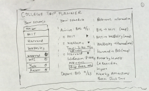
In response to our scenario, we would like each of the designs we created to walk Mrs. Black through the process and generate the following list: Northeastern, Boston University, Boston College, and Tufts (all have nursing or premed programs, and are feasible for Rebecca's GPA/SAT range, some might be good fit and some might be slight reach schools). The idea of our final interface will probably be a combination of these three designs because we will want it to focus on the two major tasks:
- Find similar fit schools in a certain geographic region (either have one school in mind, or generate a list of schools based on expected criteria)
- Create an itinerary that would allow Mrs. Black and Rebecca to visit all of the schools (attending all of the tours and information sessions), and then allow this itinerary to be customizable.
"Amazon" Interface
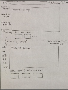
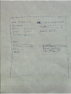
For this model, Mrs. Black will begin with an Amazon-like shopping cart interface that gives her the opportunity to search by the features of Rebecca's requirements that seem to hold the most weight, and will generate a list of similar schools (analogous to websites that have suggestions like "people who liked this also liked..."). By using these search filters and recommendations, Mrs. Black will be able to begin adding schools to her "shopping cart" or list of places that she will visit with Rebecca.
In this scenario, Mrs. Black begins her search by selecting the "Search by State" option, because she knows she will want to visit schools in the Boston area, and maybe Massachusetts as a whole.
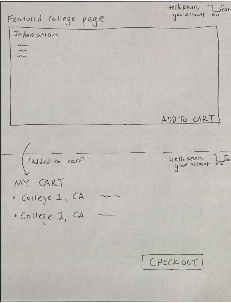
Now Mrs. Black can begin selecting schools and adding them to her shopping cart (and eventually her itinerary). Specific school details will appear as she searches through the schools and she can find matches similar to her other choices. She begins by adding Northeastern to her shopping cart, and then eventually is able to include Boston University, Boston College, and Tufts in her shopping cart.
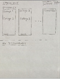
Once Mrs. Black is satisfied with the schools she has selected, she is able to "check out" from the system and generate a series of possible itineraries that will allow her to visit all of the schools on her list without the tour times conflicting, and will allow for some customizability in the final itinerary as they plan their trip to visit all of the schools.
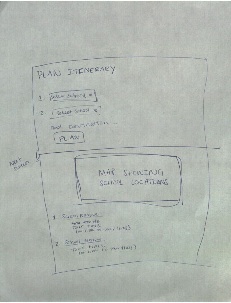
Interactive Map
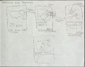
This interface is much more visual and allows Mrs. Black to immediately zoom in to the specific areas that she is interested in, while filtering for Rebecca's interests and qualifications for the college process. The first map allows Mrs. Black to begin selecting important features and zoom and select a region of interest. Once she has selected the New England area as her first area of interest, she could zoom further or begin to see schools represented as pins in the map. When clicked on each of these colleges a description will be pulled up with important statistics (e.g. average SAT scores/GPA of admitted students) and key tour times that might be necessary for planning to a visit. As she inspects schools Mrs. Black can decide to add those schools to her current selections or go back to searching other schools and clicking on other pins in the map. Since Rebecca is particularly interested in urban schools, eventually Mrs. Black can zoom in to the city level and just look closely at the Boston schools she as selected on a map. In the final screen Mrs. Black can see the generated itinerary with a map view showing the route from one school to the next (to stay consistent with the overall map interpretation of the problem).
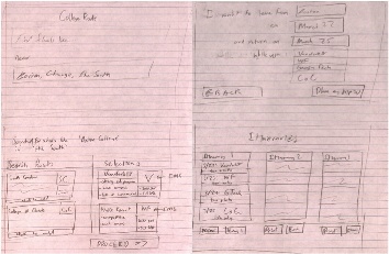
Hybrid Design (travel site + map)
In this design, Mrs. Black would log on and immediately begin to filter her search by the criteria that Rebecca finds most important. By having an interface similar to other travel websites, it will allow her to quickly begin searching for schools fitting into certain categories. Once she selects the criteria a list of schools will be generated ("Results" in the second panel) and all of the schools will be put onto a map so Mrs. Black can see relative locations and make selections of schools that she would like to visit. Like in the interactive map design presented above, Mrs. Black would be able to click on schools on the map and see more specific information about them and then add them to the list of schools she would like to visit.
After making her selections Mrs. Black will be brought to a screen showing all of the possible itineraries that she could use to get to visit all of the colleges and go on tours and information sessions. There will also be a list of activities happening at each school that fit within her criteria (e.g. varsity soccer games this weekend) so that they can see if there is something they would like to attend and add it to their itinerary. Then she can select an itinerary or components of the schedule and add them to a Google-Calendar type interface where the whole trip can be laid out. She can save multiple itineraries and thus plan all of her college tours through this website.
Preliminary Designs
These are some of the designs that we created while brainstorming and components of each of them were combined into the above storyboarded designs. Some features of these may also be present in our final design, as we refine our interface further.
Sharon
This design was primarily focused on finding a route that made the most sense logistically. The most emphasis was put on finding an efficient route, and making sure events at each campus were scheduled appropriately. While the map (which shows after a preliminary filter based on location) gives a selection of schools and allows the user to choose which ones are of interest, the app should have a larger focus on each school so that the user can make a more informed choice. Our main storyboard designs took a lot of the map concept with them, and also complemented it with more school information.
We believe the map is a really important part to the design, since planning a college trip efficiently requires a lot of geographic knowledge.
This design was a stretch condition where it was for a mobile interface. I think this is actually a pretty serious design because itinerary planning is for people that are on the go, probably doing a lot of traveling - it would be very convenient to be able to access the school route remotely. The goal of this is to make the itinerary very adjustable, even when you're on the road. This way, the user can adjust easily to anything that may come up. The main goal of this is to allow the user to access information about colleges and the itinerary quickly, without having to navigate through the clutter that a larger-screened website can afford.
This idea behind this design was to give the user a step by step navigation as they proceeded through the page. The left panel is the list of schools that the user can choose from, and as they filter down their schools, they can start planning their schedule. The right-most panel is the final itinerary that is generated from the user's planning. I originally felt that including other information such as hotels, attractions, and restaurants was useful, but after some discussion my group decided that it made more sense to focus on just the college picking and trip planning.
Kevin
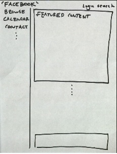
This design emulates the social-networking website Facebook. Primarily, the focus is on a menu bar that populates the left side with different aspects of the college search. Ideally this menu system is configurable. The main window composing of the rest of the horizontal region is devoted to content that is generated specifically for the user that can span from specific colleges, events, or even other known itineraries for similar trips that the user is searching for. The central theme of this design revolves around the community aspect of college planning. The information available to the user is similar to the other designs and provides a clean and simple interface to manipulate and extract vital times or locations from each college. Similar to the previous designs, there is a search option to specifically find colleges. Planning itineraries will be in the main content area.
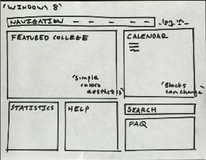
This interface is inspired by the new Windows 8 operating system. The primary goal of this design is aesthetic: clean, simple, well defined sections that pertain to the various aspects of college trip planning. There is a central navigation bar, with various other rectangles that are brightly colored that have different content. The primary boxes will focus on a featured college, a calendar featuring different events from either suggested or previously researched colleges. A configurable system based on user preferences can feature college statistics or an FAQ section; various applications can be implemented here and added. A log in system will allow a user to search for colleges and customize what they are interested in. The goal here would be to maintain a very simple, aesthetically-pleasing appearance, that's easily navigate and predictable.
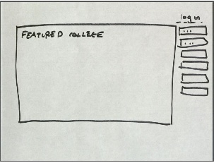
This interface would simply be composed of a landing page that had the majority of the screen devoted to a featured college. The main panel would be an image with a short discussion, that would periodically change to another suggested college. The idea is to remain as simple and minimalist as possible, with the options on the right of the main panel allowing for navigation. This main page would be the focus of the design, and choosing colleges would be similar to an art-viewing website that scrolled through search results or suggested options.
Alex
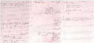
This design was primarily focused on the "find the right school" task, and provided a series of ways to select criteria for the desired type of college and then would generate the list of similar schools. The screen would be divided into 3 panels, the first (top left) would be a list of criteria (similar to yelp or other check box interfaces) where you can select all of the qualities you're looking for, pick a geographic area, and a radius within that area and then generate a list of schools. This section would be for people who had no idea about a school to generate similar schools to. The top right panel would generate a list of schools similar to a base school i.e. tell the system to "find schools like..." and have a school in mind (in our scenario this is like knowing Northeastern is a school you want to visit, but not knowing other schools in Boston). This finding technique would be primarily based on average GPA and SAT scores, and then could be filtered by other criteria later. Finally in the bottom right, if you already have a series of schools selected that you want to visit you can just simply "Start Planning a Trip," and start inputting the schools you would like to visit and then the tool would generate the itineraries based on the tour/info session times of those schools.
This interface is primarily for people who already know what schools they want to visit but don't want to go through the hassle of visiting each school website and finding the tour and info session times and putting the schools on the map separately. this primarily focuses on the itinerary planning task that we identified as a major user problem. The interface allows you to add schools to your list and then shows those schools on a map and beneath the map is a description of the schools on the map, including tour/info session time and maybe other key information like GPA/SAT scores and maybe major activities or something.

This design was my "extreme design," which I tried to make possible to use on a small screen like mobile (and I had a little bit of influence of making it useable by illiterate users, but then decided that most people who would be applying to colleges and using our app would be literate). However both of these influences meant that I did not want much text in the design because it is hard to read on a small screen and difficult to select small things. Therefore this design is based primarily on visualizations, in particular it is a map based interface. This allows the user to select regions of the country and zoom in, generating a map of schools in a particular region. There is also the option to select a school, which would then zoom in to the area of that school on the map and additional schools in the area would be displayed on the map.
Zach
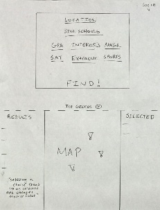
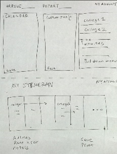
This is a process-oriented, mostly textual interface, in which each separate screen plays a specific role in the process of identifying similar schools and planning a trip. The homepage screen asks the user to input a school that he or she is interested in, along with a region in which the user would like to search for colleges. The next screen allows the user to view schools in the specified region that are seen as "good fits". The left-hand side of the page displays results that have not yet been selected by the user, and the right-hand side of the page displays results that the user has added to his or her "selections" list; these are the schools that the user would like to visit. In both the results and the selections sections, schools are represented by small preview boxes. Each preview box contains the name of the school, the average GPA and SAT scores of admitted students, and a bulleted list of reasons why that school was chosen as a potential match. The third screen is a basic screen where the user can input the dates that he or she intends to visit the schools chosen in the previous screen. Finally, the fourth screen shows suggested itineraries, with options for printing and e-mailing.
The simple homepage design is perhaps the most appealing part of this interface; typing in the name of a representative college can be much easier than the onerous process of typing in every detail of one's academic record. Throughout our interviews, the "similar schools" feature of college books (e.g. Barron's or Fiske's) was consistently mentioned as being extremely helpful in the college discovery process. This design brings that to the forefront. However, our other designs do a much better job of giving the user other exploratory tools, whether that be through other input criteria or through an interactive map. Finally, the print/email feature on the suggested itineraries page is another positive that should be incorporated into our design. Parents and other adults guiding students through the search process may have paper-based filing systems for organizing the endeavors of their children or students, and as such, it can be helpful to make print-friendly versions of the itineraries.
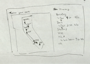
This map-based solution allows users to navigate through the same process, but with more explicit freedom to explore and choose schools. The search bar from the first design by Zach persists in this design, but now, search results appear on a map of the United States and are represented by pins with colors that depend on the goodness of fit of the associated college. Clicking on a map pin offers information about the reason why the school was chosen as a good match. This design allows users to discover regions of the country that might have higher concentrations of colleges that match their interests and academic profile. The user progresses through the trip-planning process largely through interactions with the sidebar; here, they can see their selected schools and itinerary previews. The user can select an itinerary and view the associated trip on the map.
The major disadvantage of this design is that the user would then have to leave the map-based interface to view the full itinerary details (as opposed to the preview shown on the fourth screen). As the e-commerce integration associated with the fifth screen is no longer part of our intended plans, this design could be modified so that the me map is a consistent component of the interface.
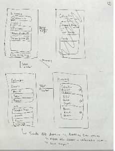
This is an interface designed for an extremely small screen. Due to the difficulty of displaying and interacting with lots of information on an interactive map, the small screen interface is purely textual. In contrast to the first design, the user must step through the planning process one college or itinerary at a time, as there is not sufficient space available to view details about multiple colleges or multiple itineraries on one screen.
1 Comment
Unknown User (jks@mit.edu)
You guys have done a great job of narrowing down your problem, and the scenario was well written. Your designs also have some really good ideas about filtering search results and offering pre-built, but customizable itineraries (although the customization wasn't well illustrated in your sketches). However, you failed to perform a usability analysis of your designs, which was a big part of GR2! This is where you lost points.