Design and Task Description:
User Interface Design 1.5
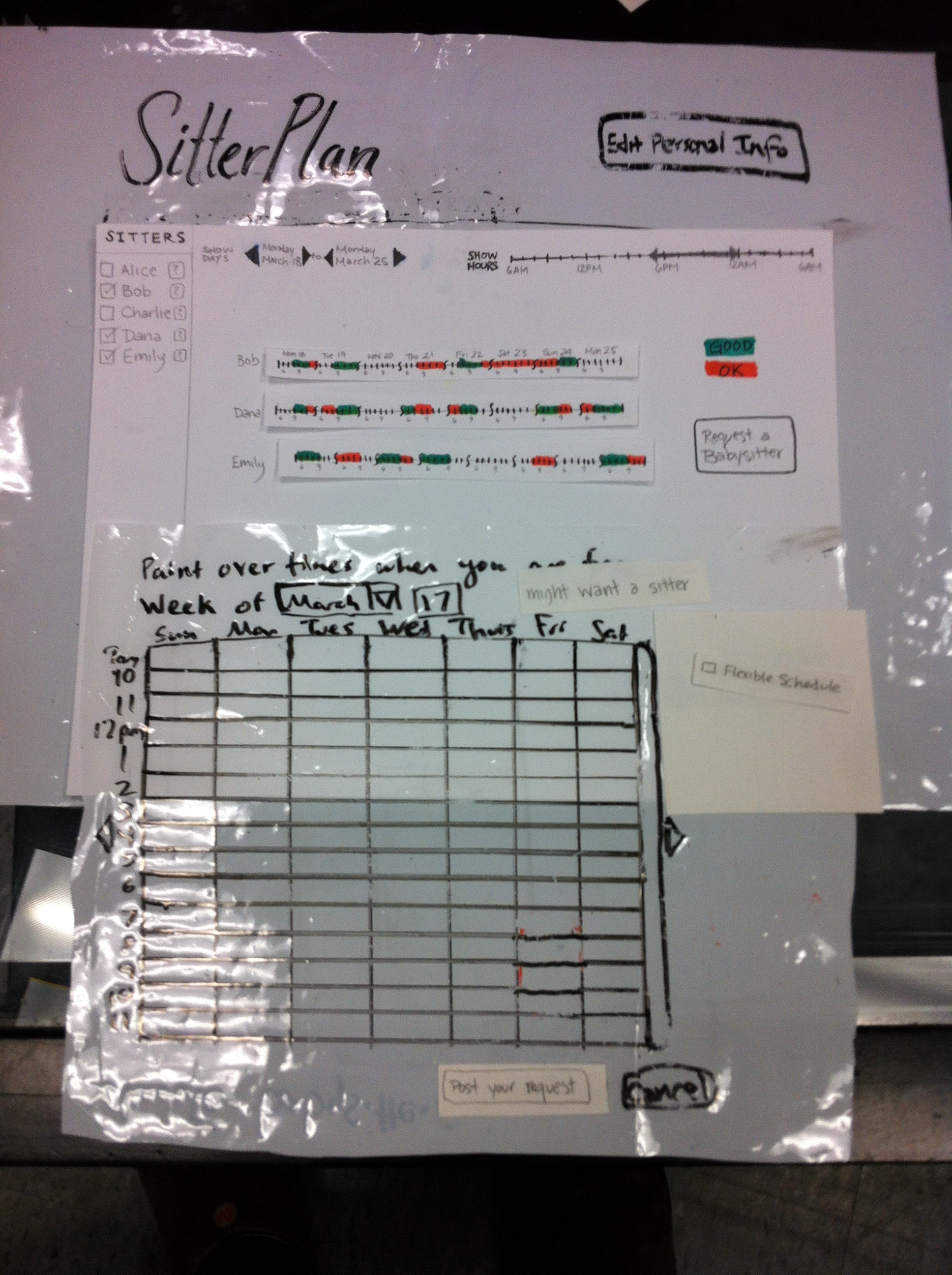

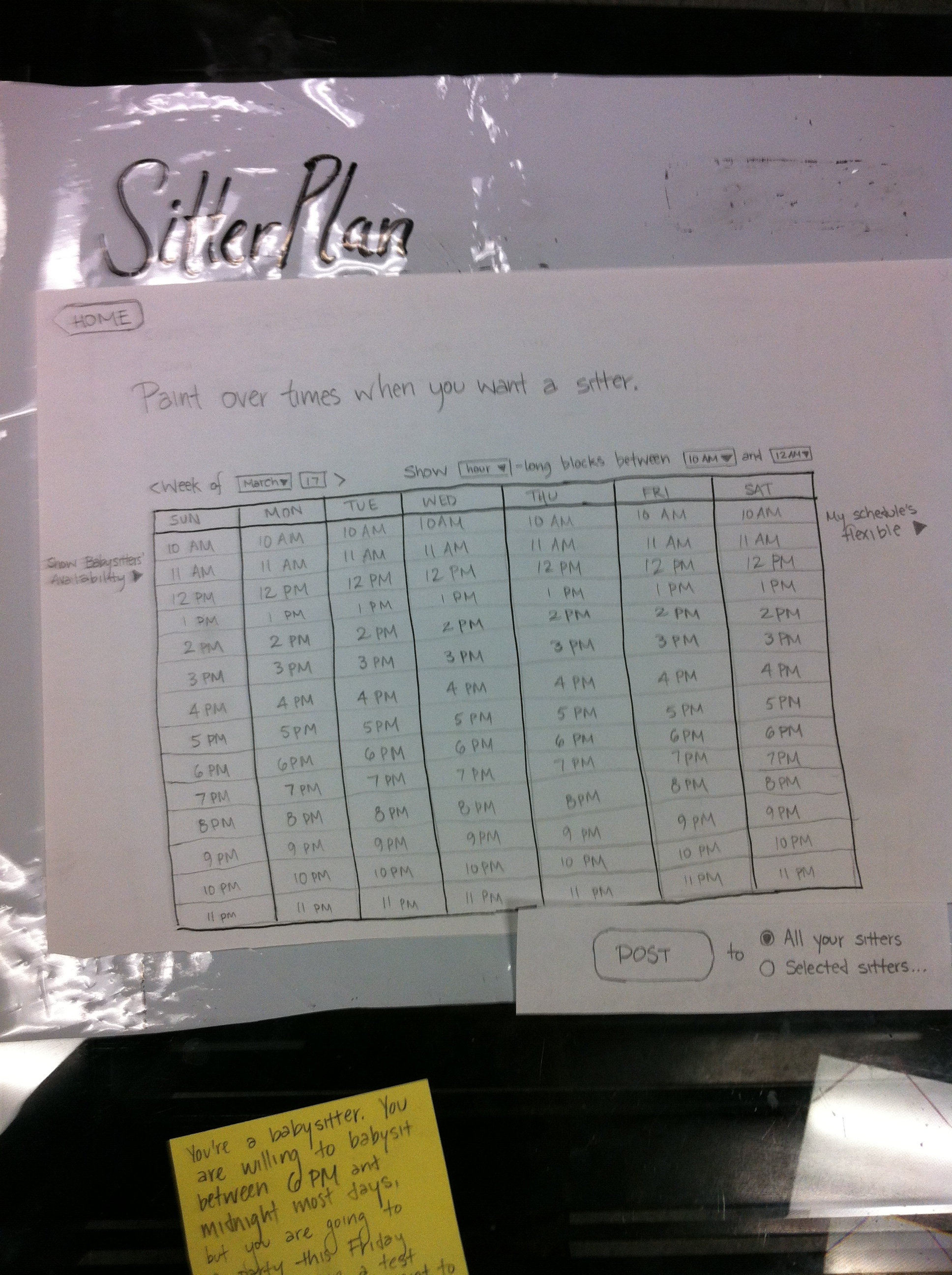
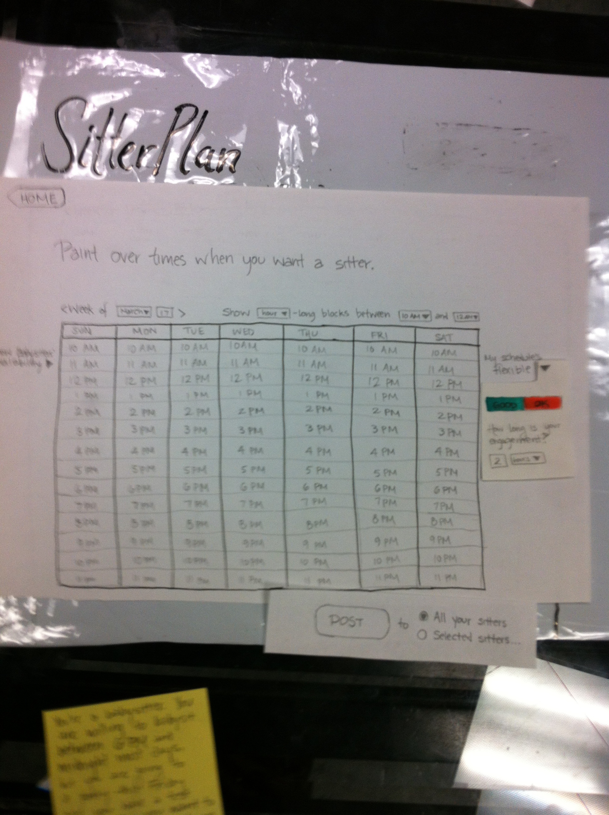
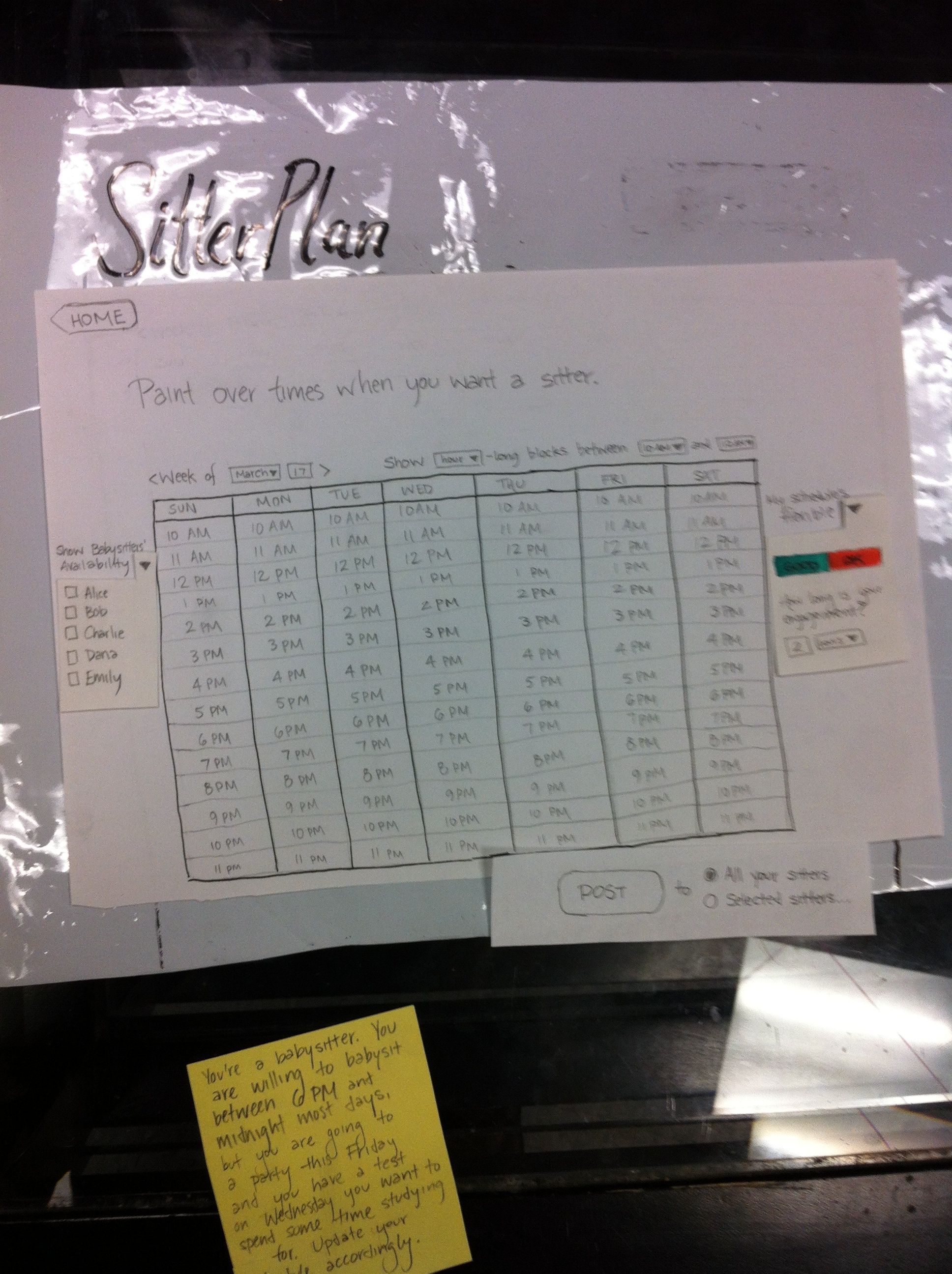
(pictures and some description go here)
Briefing:
We're SitterPlan and our goal is to help babysitters and parents coordinate their schedules to find optimal times for babysitting jobs. Our site allows for two type of users - parents and babysitters - who will each see a different view of the site. Parents can use the site to specify times that they'd like a sitter, and babysitters can use the site to advertise their schedule and look for jobs.
Tasks:
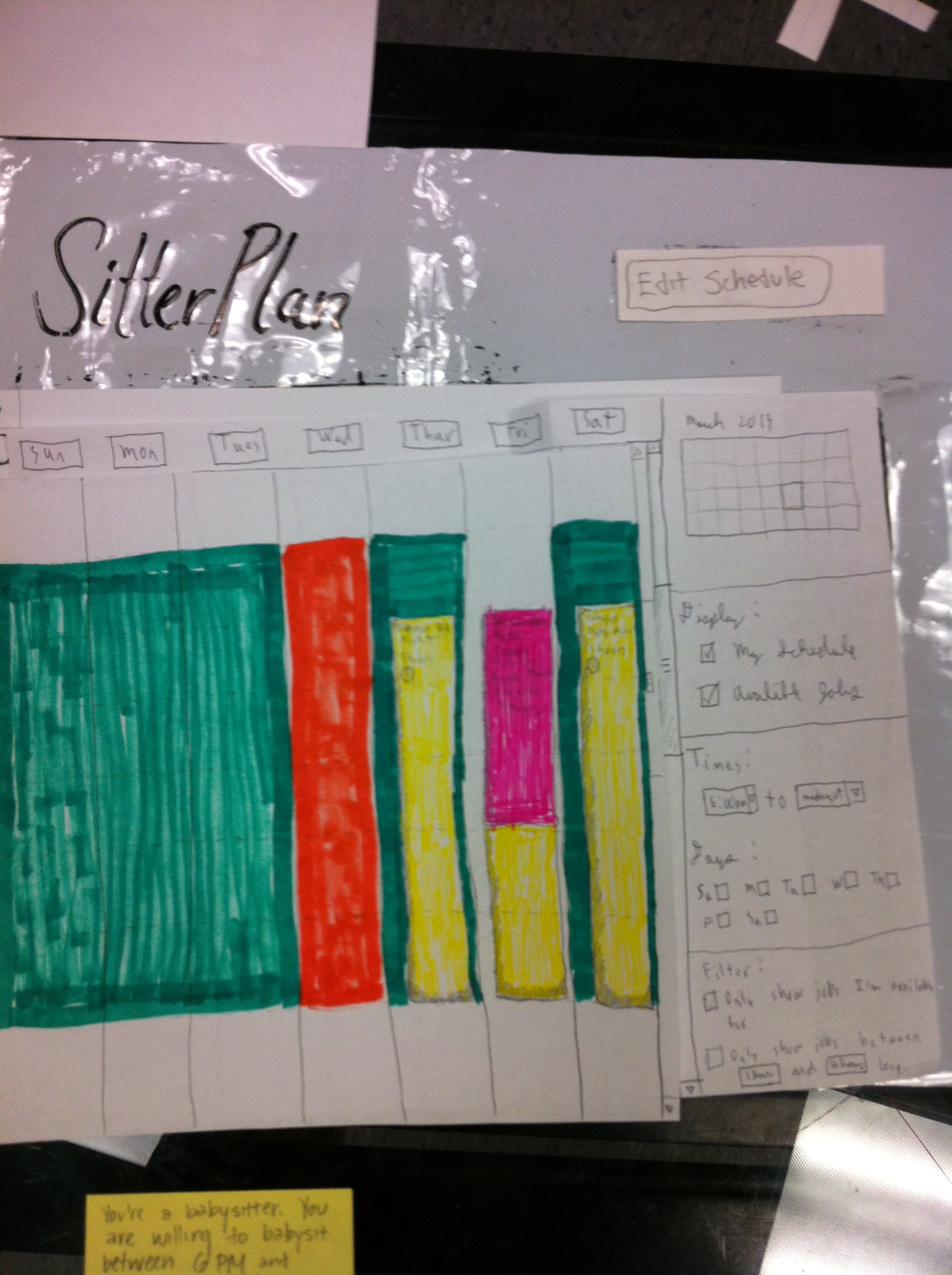
- You're a babysitter. You are willing to babysit between 6pm and midnight most days, but you are going to a party this Friday and you have a test on Wednesday you want to spend some time studying for. Update your schedule accordingly.
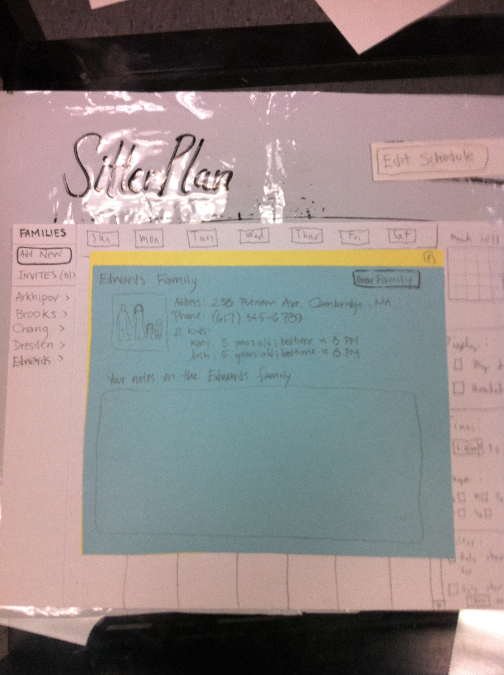
- You're a babysitter for the Edwards family. You've forgotten when their daughter Katy is supposed to go to sleep. Look up this information.
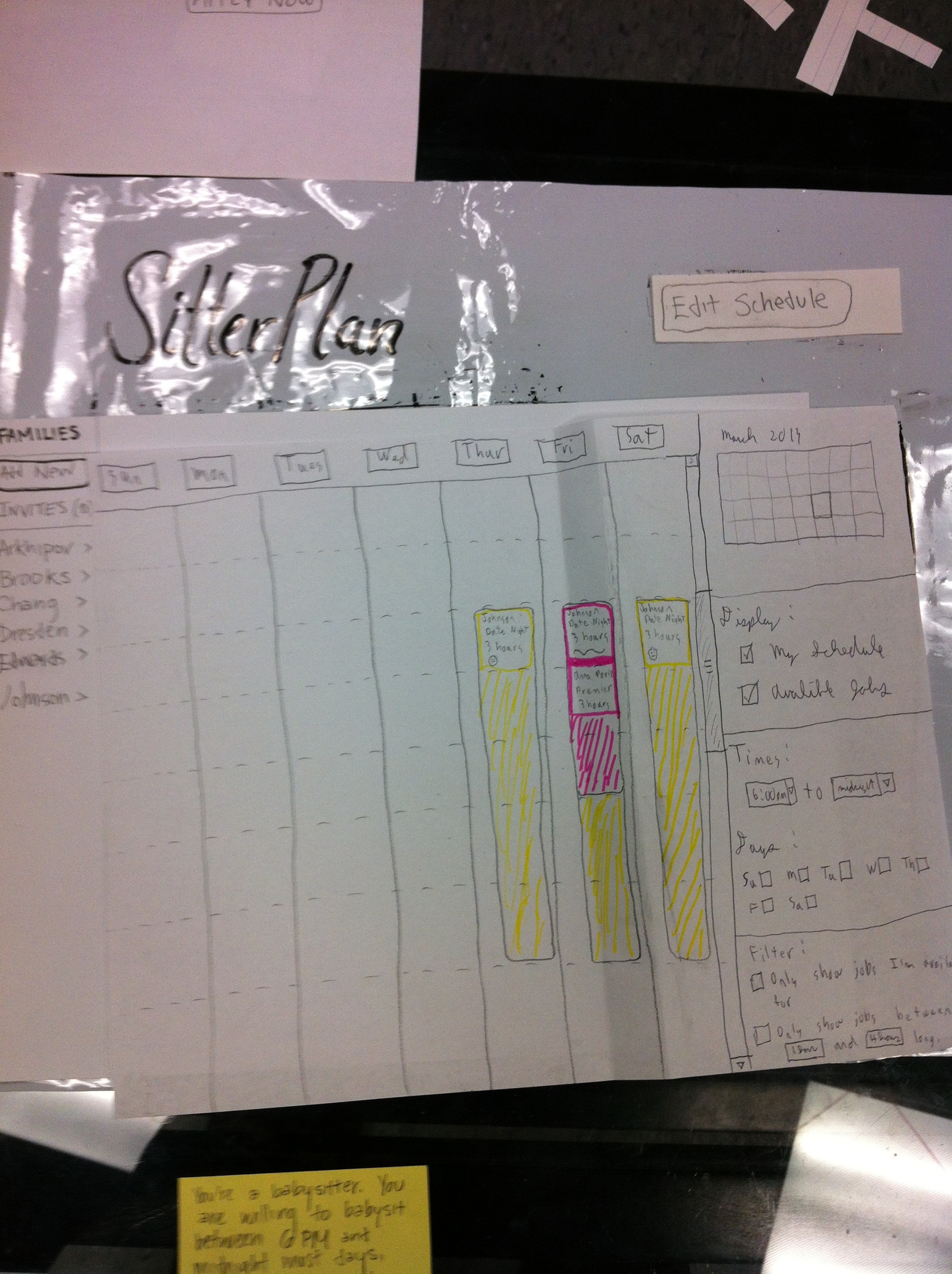
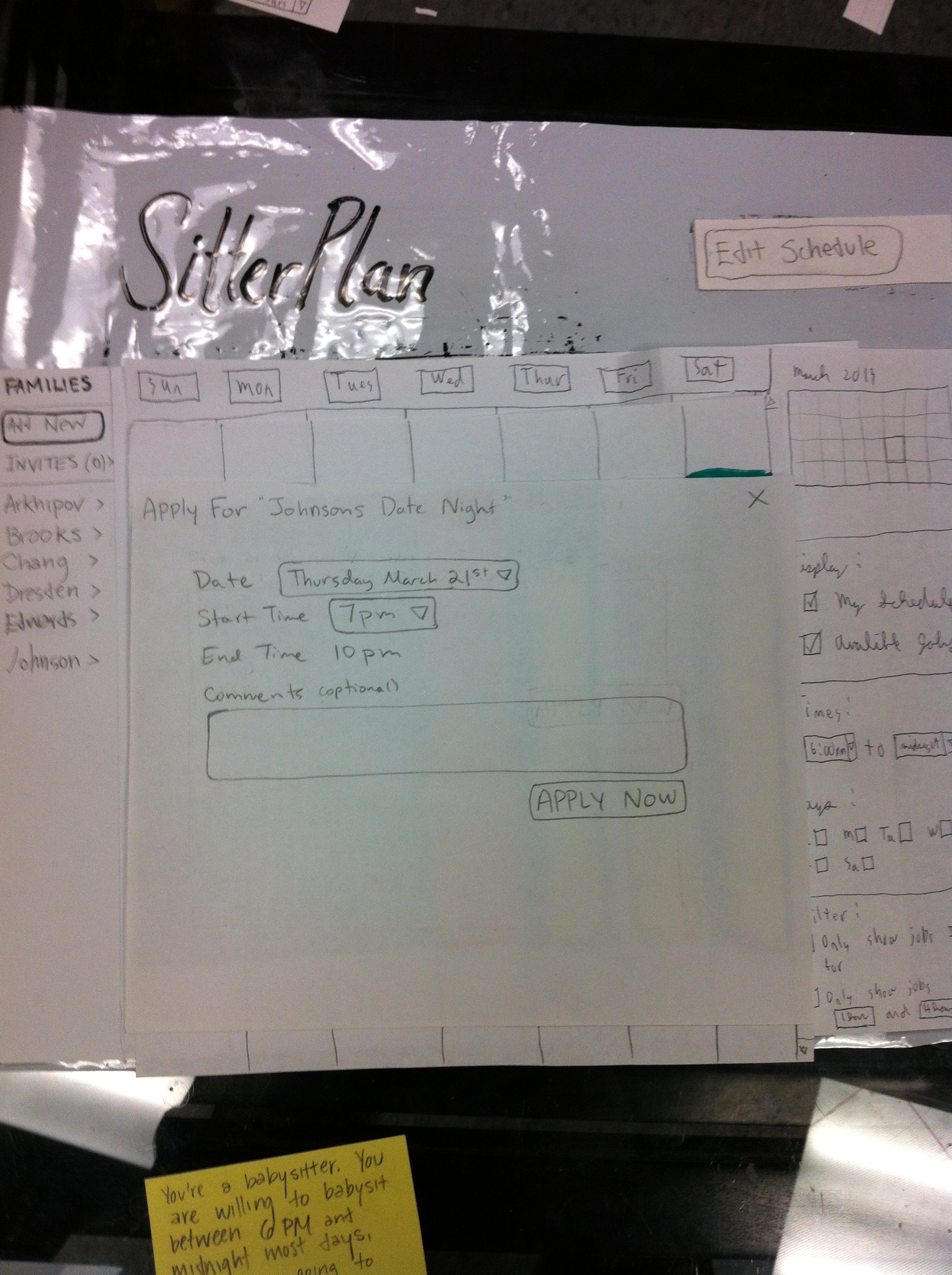
- You want to hire a sitter for Friday 7-10PM. Find out if any of your babysitters are free for that timeblock and make a job posting for it.
- You want to hire a stieer for Friday March 22, 7-10PM. Your preference order for Sitters is Dana>Bob>Emily>Alice>Charlie. Find out if a sitter you like is free for that timeblock.
User Interface Design 1.0
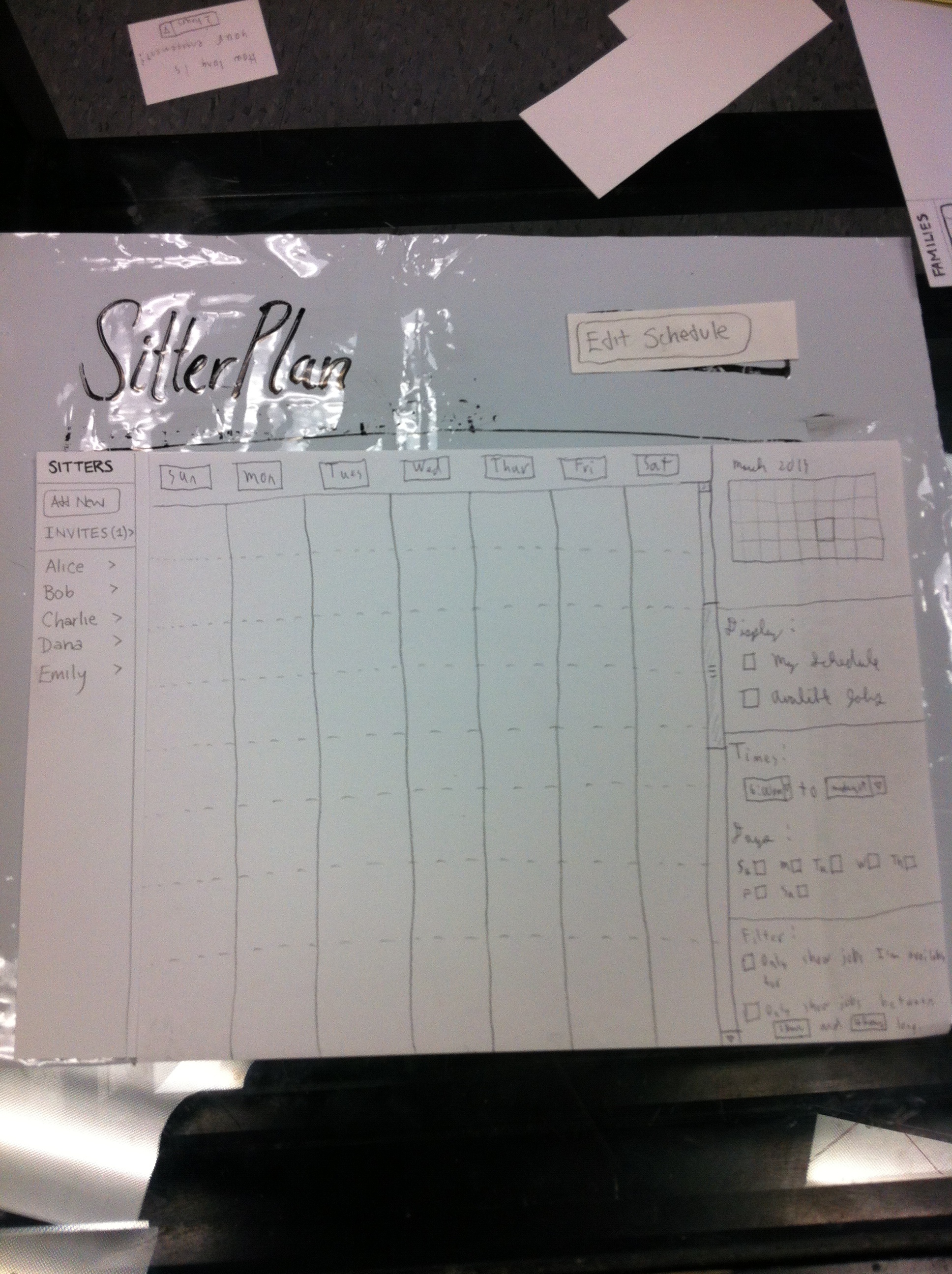
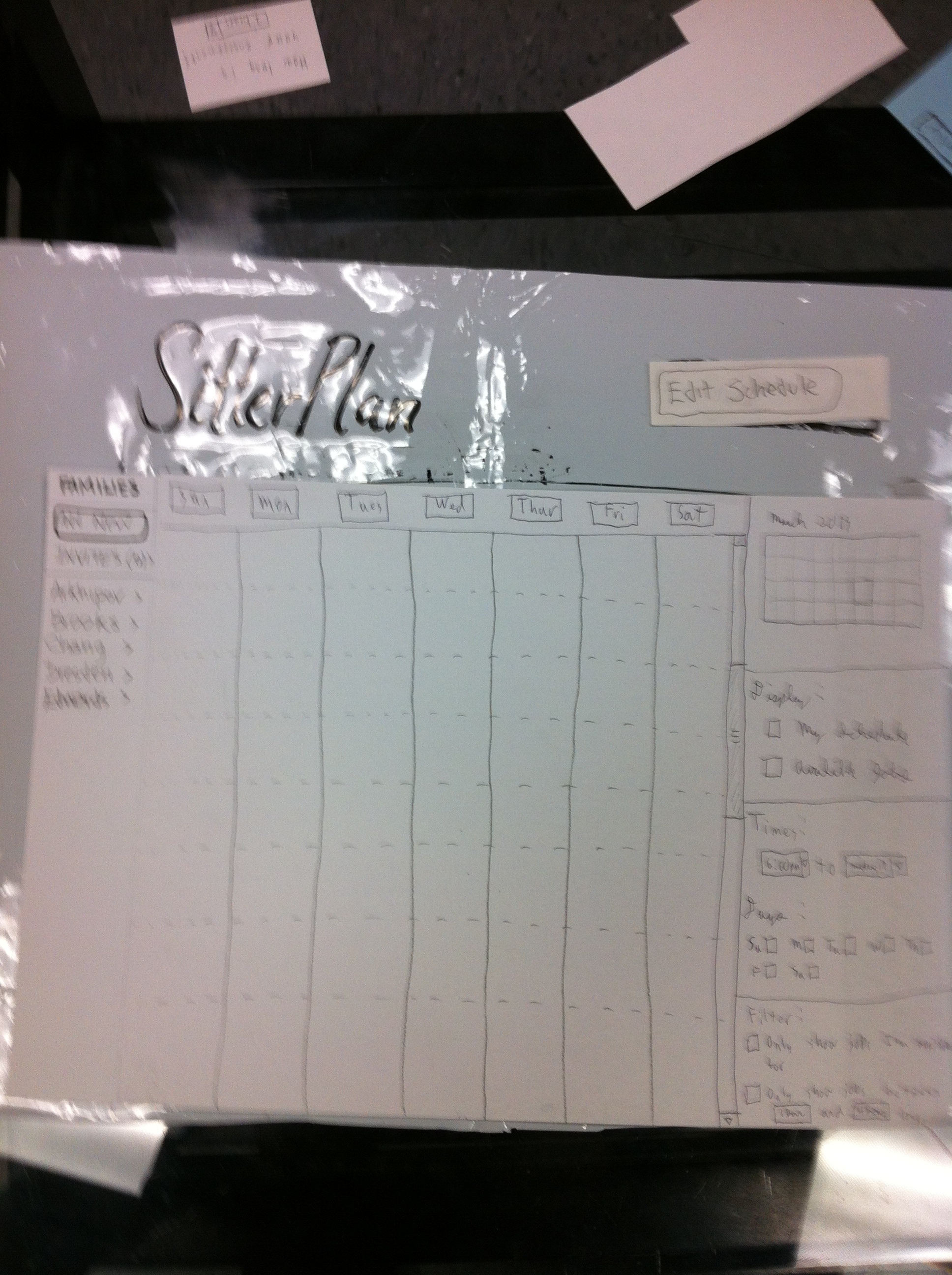
In the original design we had four tabs at the top: Profile, Jobs, Schedule, and Contacts. These swapped between screens. The names were confusing and not sufficiently self-descriptive. After an initial user test, we made the change to design 1.5.The only changes were the removal of the tabs, adding a button in the upper right to allow schedule/profile editing, and having clicking on families or babysitters bring up contact information.
User Interface Design 2.0
(pictures and some description go here)
Tasks:
- You want to hire a sitter for a date night sometime in the next two weeks. which will last 3 hours. You prefer Friday nights anytime between 7-12. but would also be willing ot do Thursdays or Saturdays 7-12.
- You're a babysitter. You are willing to babysit between 6pm and midnight most days, but you are going to a party this Friday and you have a test on Wednesday you want to spend some time studying for. Update your schedule accordingly.
- You're a babysitter and you want to find some work for this week. Find a job which fits your schedule and apply for it.
User Testing Notes:
Round 1:
User 1:
Task 1 - post your availability
- Completed without issue
Task 2 - look up bedtime
- Went to 'jobs' tab
- Went to 'profile' tab; commented "this isn't useful either"
- After some thought, went to 'contacts' tab and completed the task.
Task 3 - schedule a babysitter
- Went to 'contacts' tab; seems confused
- Went to 'jobs' tab
- Examines the timelines closely and intensely for a while before completing the task; timelines appear to be hard to read in their current form.
Comments
- Tabs are not self descriptive
- From the parent's perspective, it seems strange to call them 'jobs'
User 2:
Task 1
- While viewing the contacts pop-up, asks "Can I just click on the background to make this go away?" (instead of clicking the small exit button)
Task 2
- Took a while to find the 'request a sitter' button
- Didn't know what sitter timelines were. It might be good to have a title.
- Suggested that times pop up on the side, so that the user knows the 9pm block includes all times from 9pm-10pm
- Suggested an explicit 'delete mode' instead of a second click clearing the previous selection. "It's not explicitly clear that clicking on a painted square unpaints it"
- Confused about the state of the pop-up after clicking 'post your request'. Perhaps the pop-up should disappear
- Suggested reversing babysitter's schedules and your calender, because you might not care when they are free if you have constraints on when your commitments occur.
- Suggested explicitly stating 'send to selected babysitters'
Task 3
- Had trouble realizing he had to click 'edit schedule'. Tried clicking 'display schedule'.
- Wasn't sure what, if any, the default color to paint is. If we want it to be 'good' we may wish to highlight this.
- "Every week I have to come enter/reenter my schedule?"
- Suggested log in/out button.
User 3:
Task 2
- Clicks on family name and completes the task
Task 1
- Clicks 'edit schedule'
- Drags down over available calender squares (once again misunderstanding our metaphor but it will result in the correct behavior).
- Only fills in 'good' times - assumes that they do not want to babysit before their test.
- Questions what the initial paining status will be ('good' vs 'ok')
- Seemed initially confused by the 'ok' setting, but ends up using it correctly.
Task 3
- Checks displayed babysitter availability; does not notice checked/unchecked babysitters
- Completes the task with the schedule
- Wants to know why they couldn't just contact one of the babysitters directly
Task 4
- Tries to click on the names in the middle to bring up more information.
- Successfully checks schedules with preference.
Comments
- Wanted to contact the babysitter directly
- Babysitter interface was very usable; but parent's was confusing.
- Couldn't figure out how to navigate to the profile/contact info of a babysitter.
Round 2:
User 4:
Task 1 - as parent, create job:
- Clicks "manage contacts"; we are confused, but get her one; clicks X
- Clicks "create job".
- paints over all the times, clicks post; liz says that's an error
- paints over only friday, clicks post; liz says that's wrong too
- clicks to show babysitters' availability, clicks post
- after much prompting clicks my schedule's flexible and uses it as intended
Comments: "Doesn't it make more sense that I'd post friday first and wait to see if anyone responds to that before worrying about thursday or saturday?"
Task 2 - as babysitter, update schedule:
"I click all my green buttons and all my okay buttons and press save" (this task got somewhat confused because we gave her the "apply" task first and then told her she should be editing her schedule.)
Task 3 - as babysitter, apply for job:
- Clicks to filter out jobs she's not available for; those ones disappear
- Clicks on the family associated with the job I want; their profile comes up
- Calls them on the phone
(We tell her the expected behavior that you click on the job on the schedule; she immediately finds the apply button. In response to this, we color our jobs on the schedule to make them look more like buttons)
Comments: "I'm not sure what you're trying to do with the good and okay thing - for flexible jobs maybe, but for a babysitter you will have times when you are available and times when you aren't"
User 5:
Task 1 - as parent, create job:
- Clicks Create a Job
- Selects the Friday time and posts job
- We ask about multiple times - doesn't immediately see how to do so, wants a rank order preference
- Finally finds Flexible schedule button (we should make this big and obvious)
- Clicks 'ok' thinking it will confirm this schedule - not obvious
- Does want the interface to give range and time, is not intuitively convinced of what our representation means
Task 2 - as babysitter, update schedule:
- Attempts to use the calender filters to make the schedule
- Thinks the displayed schedule represents her schedule
- Doesn't notice the 'edit schedule' button
- When prompted, opens the schedule and paints over everything in green
- Is confused by the 'good'/'ok' difference
- Is confused by the paining metaphor (clicking 'ok' to change color and then interacting in a different state)
Task 3 - as babysitter, apply for job:
- Completes successfully without issue
Comments
- 'seems pretty good and simple, but might be hard for non-digital natives like me'
- good and okay are probably confusing, maybe first choice / second choice or preferred / acceptable, maybe go up to three choices for parents
User 6:
Task 1 - as parent, create job:
- clicks "create job"
- paints everything
- clicks "show babysitters' availability"
- "I wonder if I have any preferences between them; I pick Alice and Charlie as my favorites." Shows availability of Alice and Charlie. Posts job to those two. "Selection should propagate from 'show availability' to 'post'."
Comments:
- View your jobs is kind of confusing; I'd be curious whether it's from a babysitter point of view or what.
- My schedule isn't flexible - it's 7-12 always - so 'flexible schedule' didn't seem like an option I should use.
- Also I would handle a flexible schedule by checking availability for each of my preferred times in order, and posting the possible one that works best for me.
Task 2 - as babysitter, update schedule:
- "Babysitter schedule needs times - I have no idea what I'm doing because there are no times"
- Tries clicking job on Friday, xs out of the job-application window
- Clicks job on Saturday, applies for that one
- Finds edit schedule button, clicks
- Paints over stuff; understands WhenIsGood; hits save
Task 3 - as babysitter, apply for job:
(she's already done this while trying to edit schedule, so we don't make her do it over)
Comments:
- Try to combine babysitter schedule editing / jobviewing calendar screen
- Make it pretty
Feedback from presentation and our responses
- Is there a feature to look up the job you're currently working?
- It would be useful to have more labels on the columns
- We are already planning to add times along the side
- We should label the colors we're using - on the paper prototype it's difficult to to tell which colors mean what
- Maybe we could make the colors of the babysitter's schedule pastel to differentiate them from jobs
- We could color-code the family names on the side to match
1 Comment
Katrina Marie Panovich
I appreciate all the hard work you put into this. I think you still have a bit of work left to do to get the most out of the paper prototyping stage, but I think most of it can be handled by just thinking critically about the feedback you got already.
Your feedback from grading is below:
User testing observations: Your observations need to be synthesized into higher level points that you can come back and reference later. Thinking about it in terms of the heuristics we learned in class would be a good way to frame it. :)
Wiki presentation: You're missing some explanations for your images (though you have a placeholder for them!).
A few things to note, going forward: keep an eye on the requirements in the assignment. Make sure you really stick with the feedback you've gotten so far. Keep in mind what makes this assignment interesting (the user population), and really focus the implementation on those parts.
Please let me know if anything is unclear.
Best,
kp