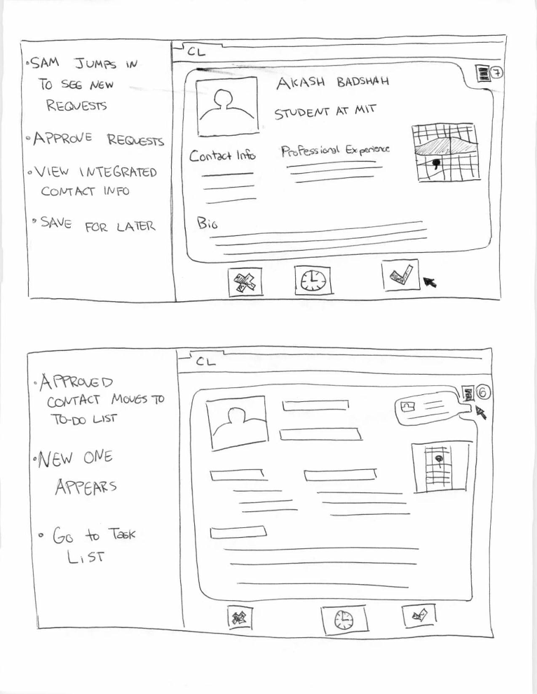
Sam spends the first part of his day looking at new requests. He opens ContactLens and is immediately looking at contact cards from new requests. He can approve them, save them for later, or deny them. He approves this one. After approving this one it flies to the top right, to indicate that's where other contacts are.
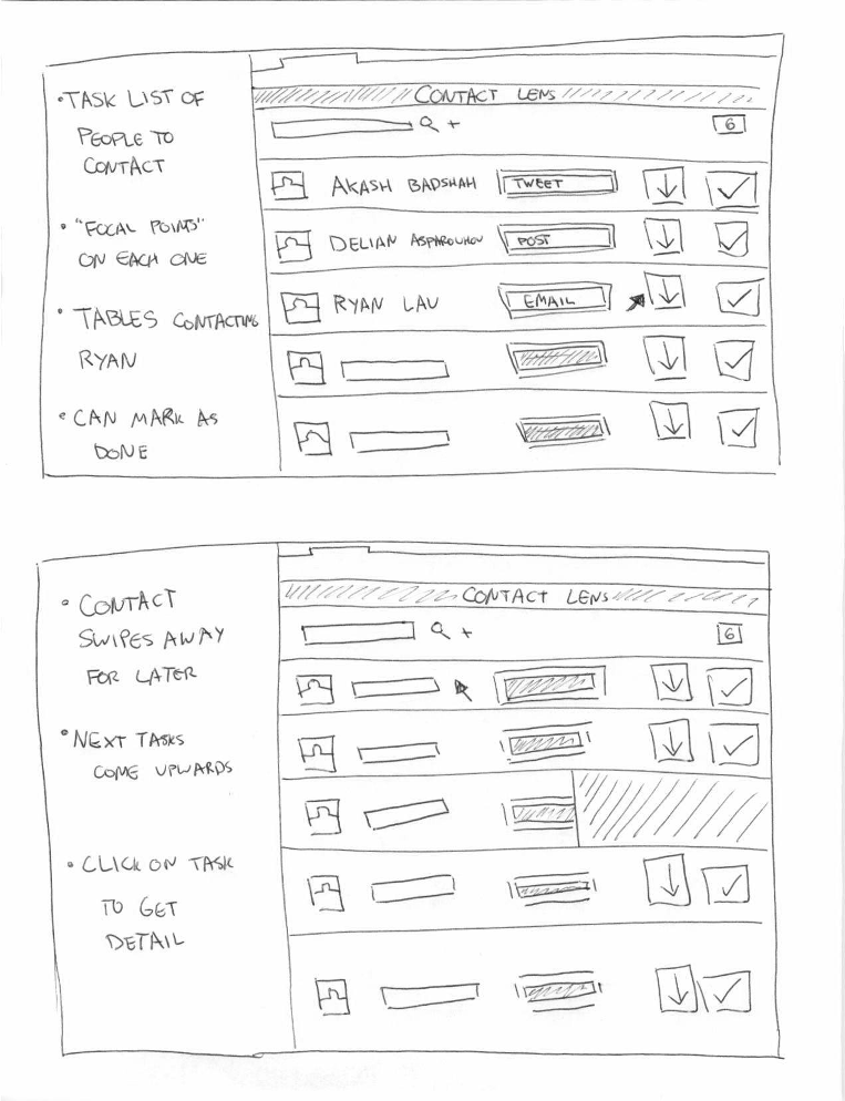
He then clicks on the list icon to go to the task list page. Here Sam sees all the people he needs to contact with a quick link "focal point" which is the best way to contact that person at this time (given the history of the relationship). He can click the down arrow to push the task until later so it slides away.
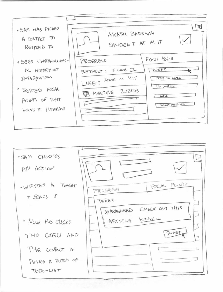
He then clicks on a specific task item to engage with that contact. Here he sees a condensed history (just a text and icon based list) of their previous interactions. On the right he sees his focal points for that customer (the best ways to engage with them) in a sorted order. He clicks on the tweet one, writes a tweet, and clicks the check button to mark the task as completed.
Design Highlights
- Streamlined and iconographic, task oriented to help salespeople do the specific tasks they need to do today
- Integrated contact information in one place redundant information removed
- Focal points: The best way to contact this person given your history and stage of the relationship, sorted in decreasing order
- Options to save things for later so you can easily have them brought back again
Usability Analysis
- Learnability
- Pros
- Interface is simple at any given step, only a few actions a user can take
- Animations of elements give visual cues about where to go next
- Task list is externally consistent with many other task list apps
- Follows an "email inbox" like metaphor, reading messages, then resolving them sequentially
- Cons
- Very iconographic style requires some preconception
- Notion of focal point is novel and requires introduction
- Pros
- Efficiency
- Pros
- Built for efficiency, accepting, saving for later, and declining requests is one click
- Information integrated into one place to prevent redundancy
- Focal points are hot links to where you want to go most
- Progress history is stripped of interactivity to allow denser material (more history in one glance)
- Easy to move through tasks sequentially and quickly
- Cons
- Streamlined for one process, difficult to do other things (ie respond to a specific thread)
- No affordance for a self-tagging process
- Pros
- Safety
- Pros
- Task tabling is impermanent so it will still come back later
- Very simple set of tasks, low possibility of confusion
- Cons
- Streamlining makes it quick to make mistakes
- Low visibility on where to fix mistakes
- Easy to confuse where information might have come from because of integration
- Pros