-
Created by Unknown User (tanyaliu@mit.edu), last modified by Unknown User (cdville@mit.edu) on Mar 10, 2013 16:29
Design 2: Student Rankings.
This Design focuses on being able to compare students, and choose which requirements are the most important. Anyone looking for a student to fill a position can enter in as many requirements as they like, and order those requirements from most important to least important. They can then search for students that satisfy all of their criteria, with students who have the most experience in their most important requirement shown first. They can then pick which students to email about their positions.
Storyboard:


Analysis:
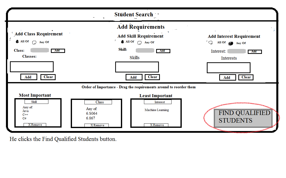
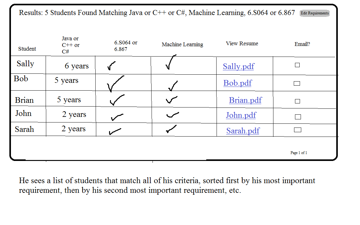
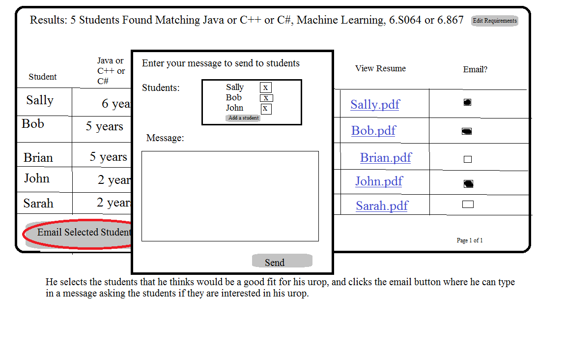
Learnability: This interface is pretty learnable and self explanatory. The home page to enter in requirements clearly tell the user to add either a class, an interest, or a skill, and once they click the add button the item immediately shows up in the box below. The interface clearly tells the user to drag around the requirement boxes to order them from most important, and it is fairly obvious that clicking the"Find Qualified Students" button will take them to the student results page. The results page is very learnable since it clearly displays students sorted by the most important requirements and the links to view resume's and checkboxes determining whether you will email a student is pretty self explanatory. There is good feedback since clicking the "Email Selected students" button pops up a window with the selected students already in the "to" field of the email.
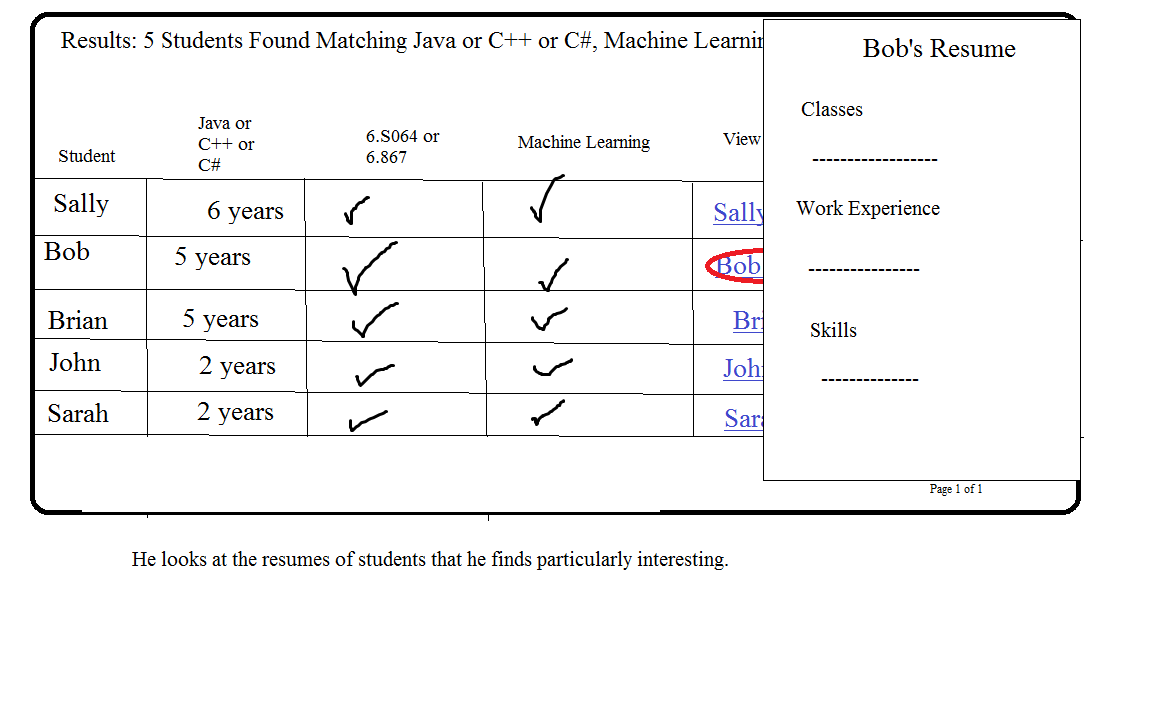
Efficiency: This design allows a team leader to entere in all the requirements on a single page without having to navigate elsewhere. However, they have to both enter in a requirement and then order all their requirements by dragging around the requirement boxes which may be slightly efficient unless they automatically enter in the requirements in order of most importance in which case they will be correctly ordered initially. To create a requirement they also have to click the add button at least twice (one or more to enter in a list of classes, interests or skills, and then once to add the requiement box to the bottom of the screen to be ordered by importance). The student results page is pretty efficient because it allows team leaders to be able to see students ranked by their preferences and not have to make difficult decisions about which students are most qualified. The team leaders can easily view each student resume through a popup, so they never have to navigate elsewhere to see more information about a student. They can also select the students they wish to email straight from the results page and enter in the email directly from a popup window, so there doesn't need to be any navigation to external pages.
Safety: Creating a requirement is pretty safe since if the team leader enters in a requirement incorrectly or changes his mine he can easily click the remove button on the bottom of the requirement to get rid of it, and he can re-enter in the requirement on the top part of the page without ever having to press the back button or navigate to another page. Once he clicks the "search for qualified students" button, if he has made a mistake he can click the "edit requirements" button on the top right of the page to go back to the requirements page with all the data still intact, and he can add or remove certain requirements without actually having to redo everything. He will have to go back a page, but he won't have to redo everything and so a single error can be recovered in just a few steps. On the student result page, if he accidentally selects a student he doesn't actually want to email, he can remove that student from his recipient list even after he has clicked the "email students" button, and if he finds he accidentally forgot a student, he can add a student directly form the popup window. Everything is very safe and recoverable until he presses the "send" button on his email, in which case he can't unsend an email. We think this is acceptable because this is the way most email clients work; once you send an email it is out there and can't be recovered.
{"serverDuration": 133, "requestCorrelationId": "299abcd265b51f57"}