Briefing
Hello, you are testing Taste Twister, a mobile web application designed to help parents plan meals for their kids.
Background
As kids, we know we made our parents suffer as they tried to plan meals for us and our siblings. Kids can be picky eaters, and siblings often don’t agree on foods. Parents have a difficult time remembering what their kids like, and end up cooking the same dishes over and over. We want to make it easier for parents to find new meals to cook that their kids will actually like. Taste Twister makes the entire process of choosing meals based on what kids like fun and interactive for parents and kids.
Your role:
You are a parent of three kids, Ricky (age 6), Bobby (age 8), Alice (age 11). Your kids have very different food preferences, which you have trouble keeping track of. You’ve been cycling through the same meals for the past few weeks, and really want to try something new. After hearing about Taste Twister from one of your friends, you visited the mobile site and put in all of your kids’ information. You are about to head out of work and want to pick a dish for tonight before you head to the grocery store.
Your new role:
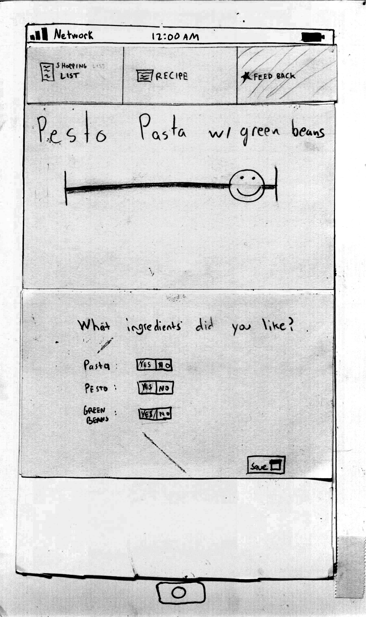
You are a Ricky, a 6-year-old child. You’re a pretty picky eater, and generally don’t like things that are green. You are interested in trying new foods, but only within reason. Your mom just made pesto pasta, and since pesto is green, you were skeptical about eating it. After dinner, your mom hands you her phone and asks you to rate the dinner.
Tasks
Task 1: Cook a meal with pasta that you think your kids will like the most.
Task 2: Cook a meal that Ricky and Bobby are sure to like.
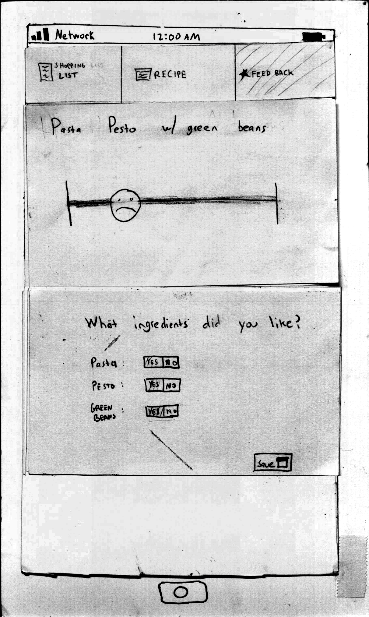
Task 3: Provide feedback on the meal you just ate.
Prototype Photos
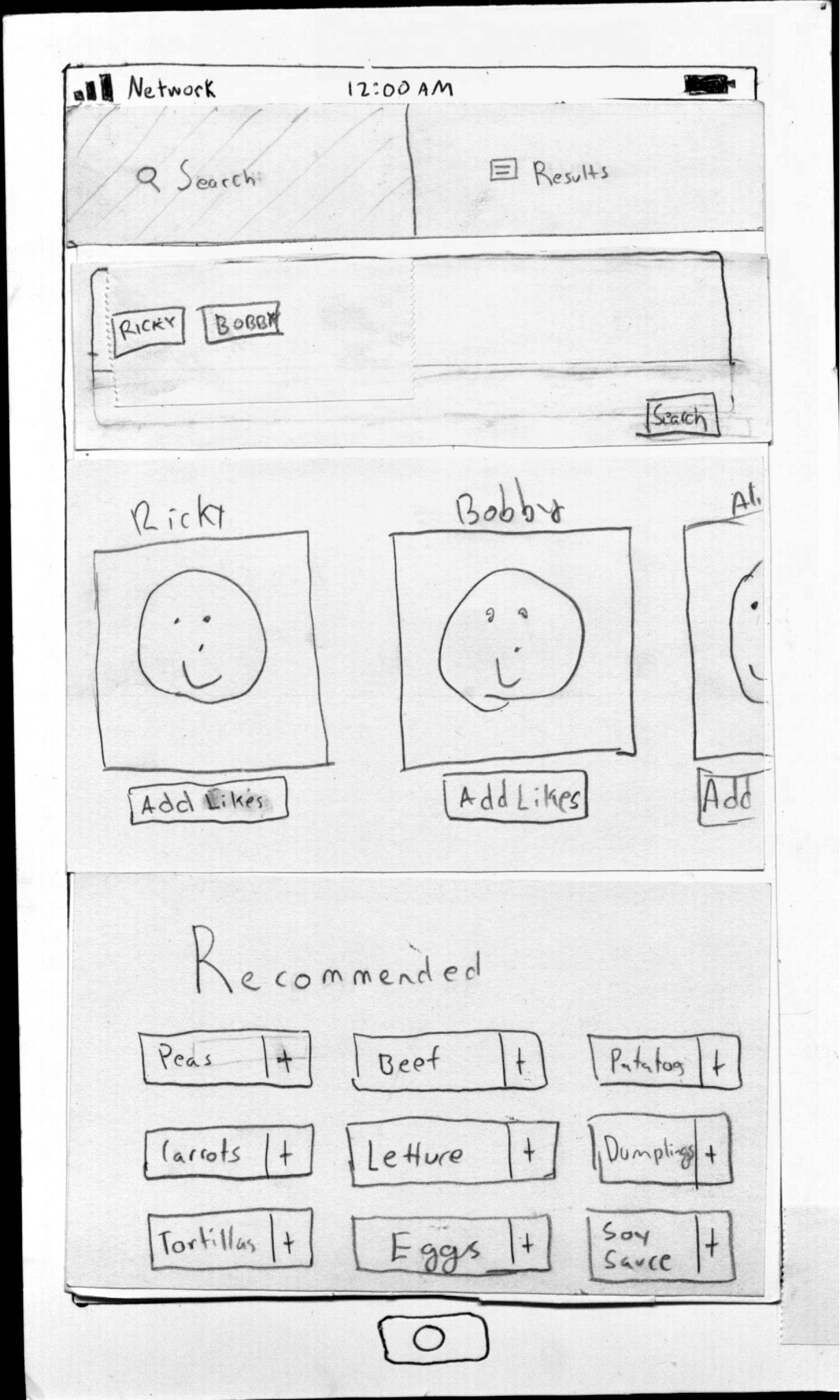
Search Query: Find meals by selecting a child and searching by their likes or selecting recommended ingredients.
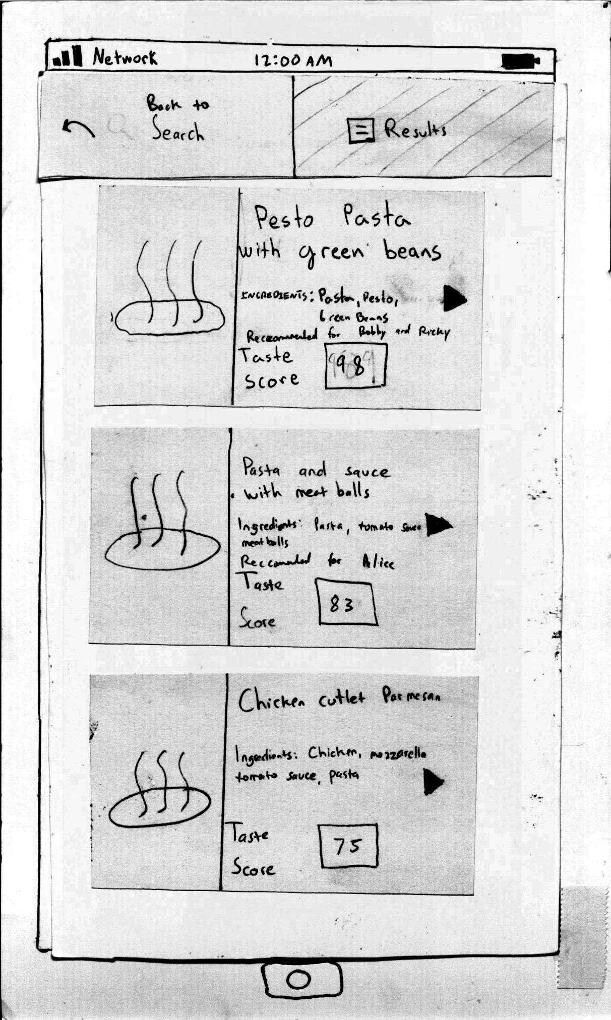
Search Results: Results with Taste Score and recommendations for each dish.
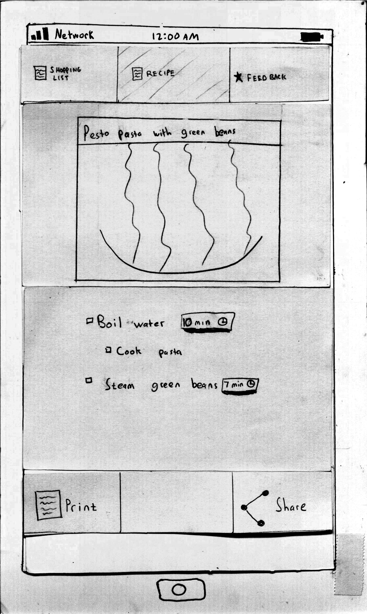
Recipe List: Directions to cook meal with built in timers for convenience.
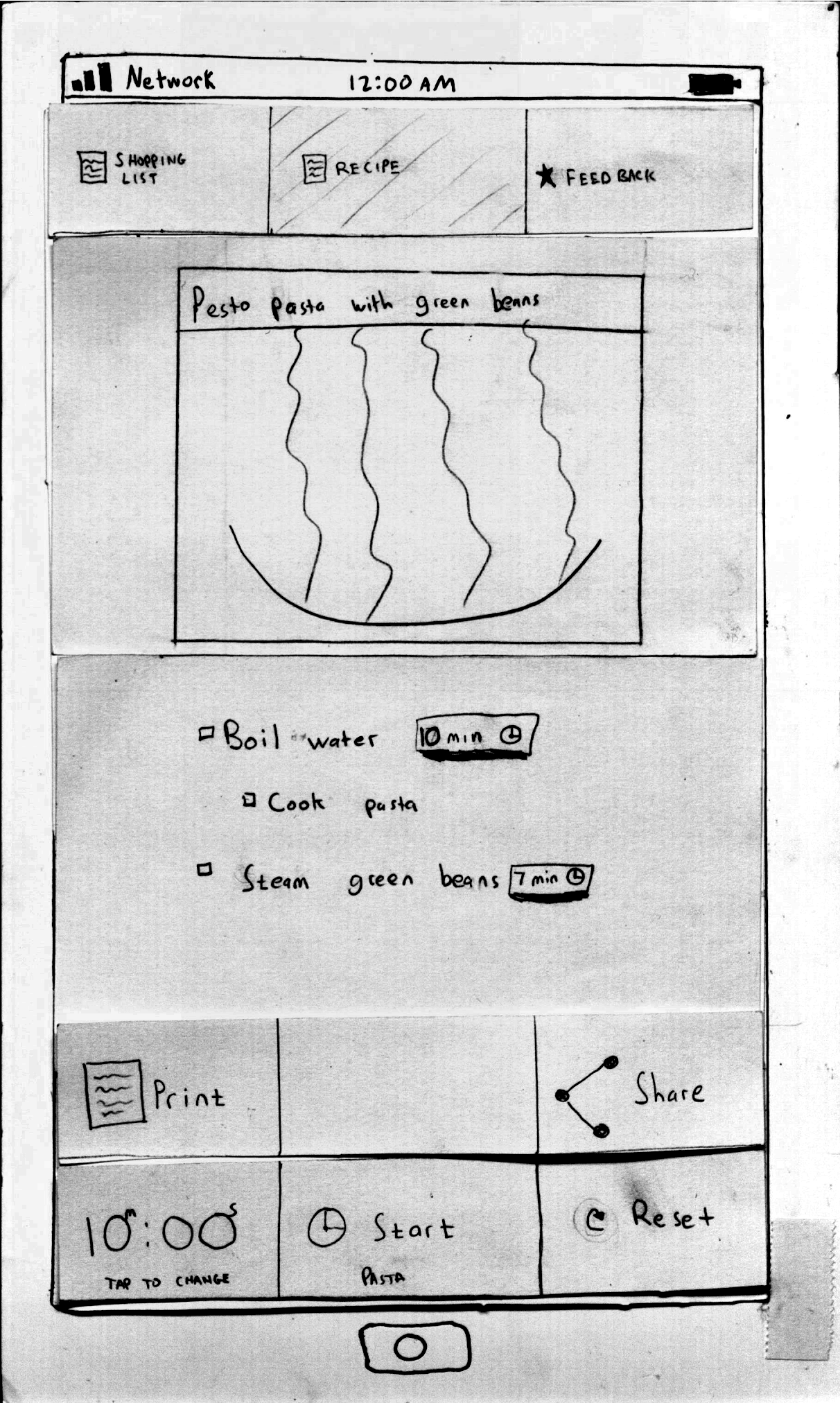
Recipe List: Recipe list with a timer already started to boil the water for the pasta.
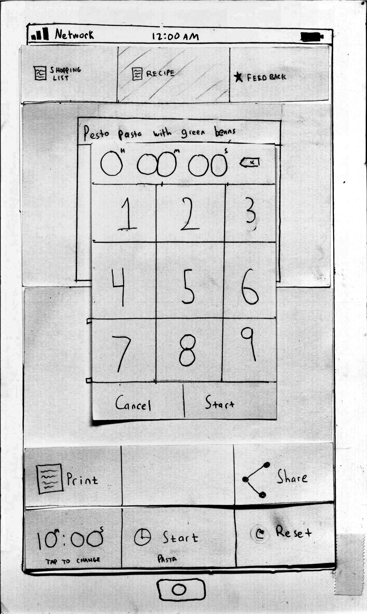
Recipe List: Modal to manually change stopwatch time.
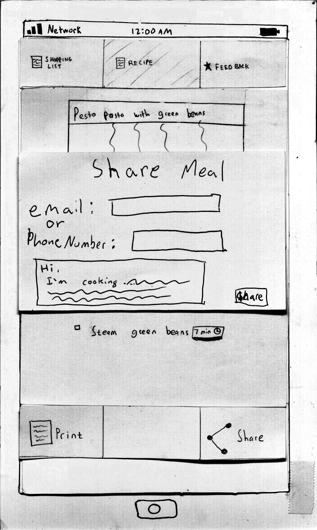
Recipe List: Modal to share the recipe with another caregiver.
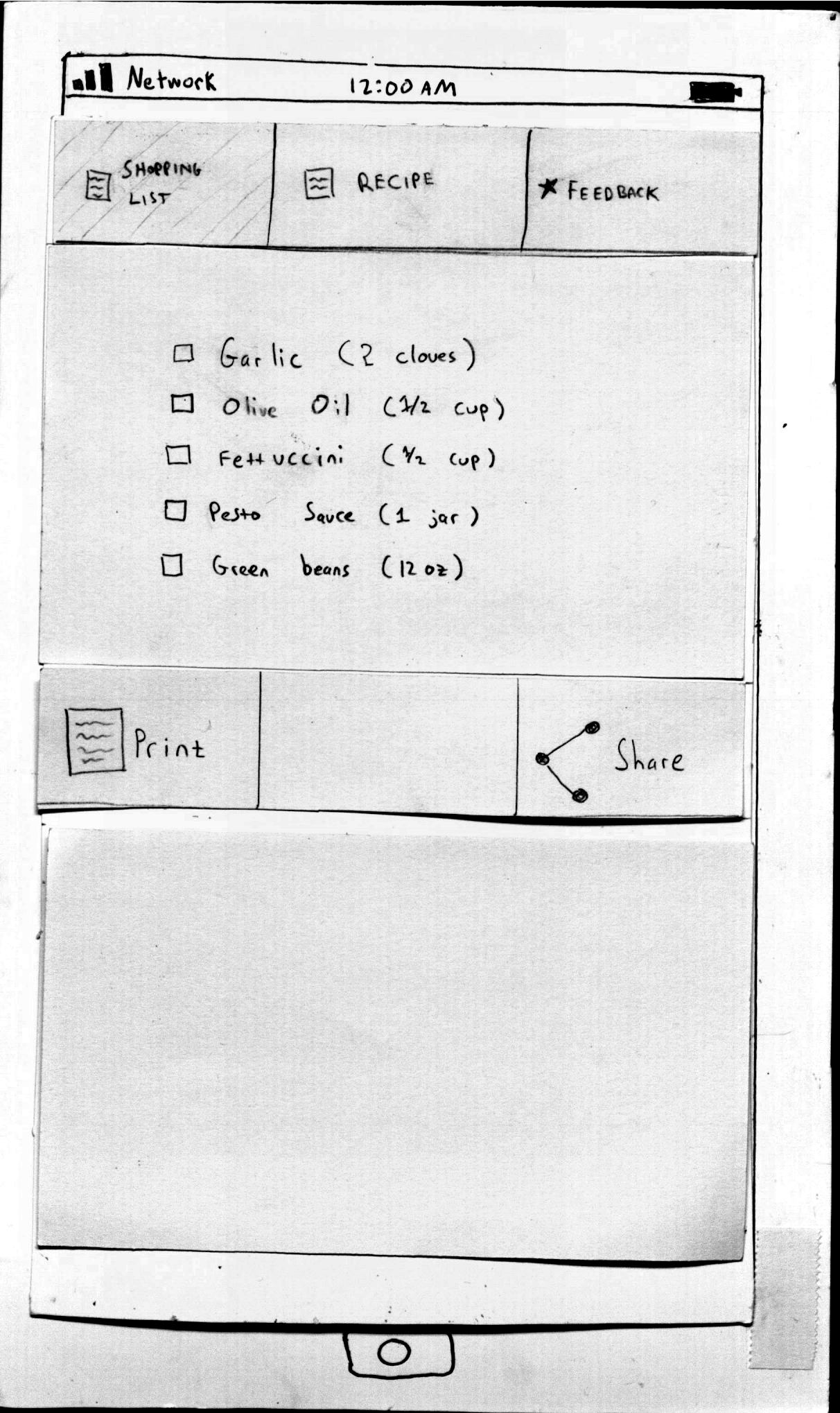
Shopping List: List of ingredients needed for the dish.
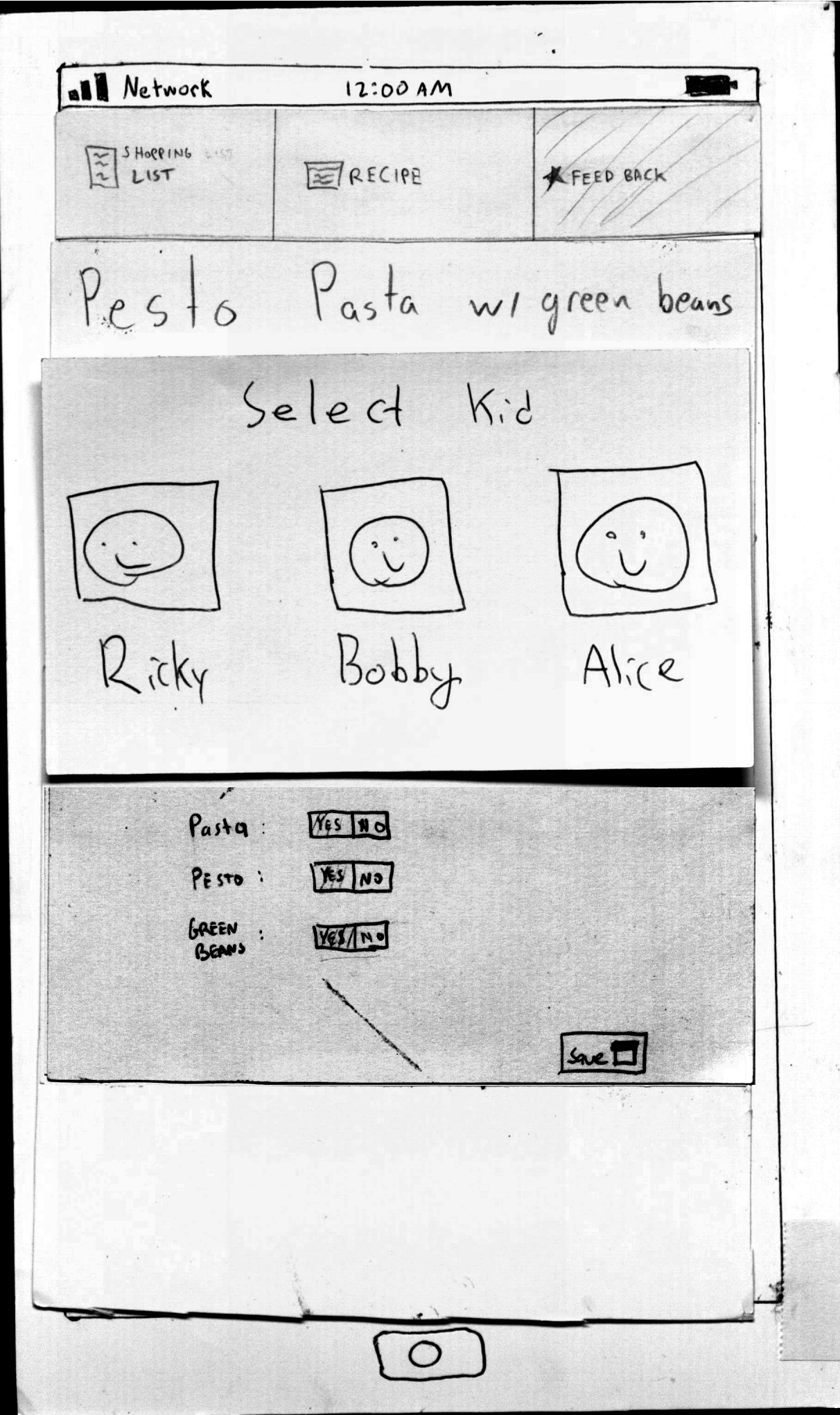
Feedback: Modal to select a child to rate the meal.
Feedback: Child gives positive feedback for the meal.
Feedback: Child gives negative feedback for the meal.
Prototype Iterations: Changes made
Homepage
The homepage needed to be changed to make it more efficient to search by a given child's preference.
- We added faces of kids that, when clicked, search by all of that kid's ingredient preferences. Originally we listed all the ingredient preferences for a kid by ingredient. Users found it easier to complete tasks when they could add all these ingredients at once.
- We notably increased the size of the search button to make it easier to locate. Many users had difficulty learning how to initiate a search during the first iteration.
Search Results page
Our search page was modified to include more information to aid selecting a meal to cook.
- Changed the range of values taste score could take. The score was still out of 100 but we wanted to see the effect that a larger difference in the scores had.
- For each meal result, we added a line that said “Recommended for <kid's name>”. User's wanted feedback like this to explain the ranking of of a given meal.
- We added tags to meals like “healthy”, “quick”, “unique” to each result. This give a users a quick way to get a high level overview a meal option and help differentiate between results.
- We added an explicit back button to the search page to modify a search. This is a safety measure because users often wanted a method to go back and modify the query, but thought our current mechanism would clear their previous search.
Feedback Page
- We added a select kid modal before being able to give feedback. Users were confused that they didn't tell the application who they were when giving feedback.
- We experimented with a scoring system that only allowed positive ratings. We thought this might help users make scoring decision, but we found this actually confused them.
User Testing Feedback
First Iteration Feedback
User 1
Task 1:
Successes:
- User looked for pasta, and pressed the pasta button on the Ricky button instead of typing it himself.
- Used the “Print button” for the recipe.
- Used the timer and hoped that it would ring/notify when time was up.
Difficulties:
- It was hard for the user to figure out which dish the kids would like the most – the user didn’t trust the Taste Score or know what it was based on.
- User was unclear on where the search results came from-- “Does it take into account what I made yesterday?”
Task 2:
Successes:
- Successfully made it through to cooking a recipe.
- Clicked on the children buttons to add their preferences.
Difficulties:
- User was confused if clicking on the children buttons would add the ingredients to the search box or the kid itself.
- Unclear if the recipe results were based on food items that the kids liked. Was it an intersection between the choices of both children?
- User couldn’t see how to go back to the search screen. Eventually, found the search button on the top menu, and tried to see how to find what both would like.
- Unclear as to ordering of recipes on the results page – they hoped that the first result was the one they would like
Task 3:
Successes:
- Liked the screen and the slider.
General Comments:
- User thought clicking on the search button will be a new search, and not a go back button.
- User thought the print button will print it directly to the printer.
- User did not want to bring his phone into the kitchen.
- Pondered whether the search button is “or” or “and” of the ingredients listed in the search box.
Inferences:
- May need to rethink the search results screen.
- Clicking on children buttons should write the name of the kid, not specific ingredients
User 2
Task 1:
Difficulties:
- User had no idea what to do on the front page, and how to search for pasta.
- Eventually clicked on the search button on top.
- The user didn’t seem to notice that the textbox is a textbox to search things.
- User tried to understand what happens after he wrote pasta in the textbox, and seemed utterly confused about it.
- “The recipe shows how I should cook it?” User couldn’t see the recipe button, and did not understand the top bar is a menu bar, and could go back.
- Thought the task ended with him printing the recipe.
Task 2:
Successes:
- Writes hamburgers, and searches, and thinks that will suffice for both.
Difficulties:
- Not clear what the intersection is for both kids.
Task 3:
Successes:
- Liked the screen, slider and yes/no options.
General Comments:
- Not obvious that the user needs to click on the search button below the search text box instead of the search button on the top bar.
- Didn’t use recommendations at all, because other ingredients appeared under the kids.
- Would have liked affordances for yes/no in feedback form.
Inferences:
- May need a way to erase text fields.
- Search bar should be more obvious.
- Recommended ingredients may be unnecessary.
- Should have a more obvious way of choosing ingredients for specific kids.
User 3
Task 1:
Successes:
- Chose the first recipe because it has the highest Taste Score.
- Naturally curious, so clicked on ‘recipe’ in the menu bar.
- Looked at and printed shopping list, then checkmarks things as he buys them.
Difficulties:
- Doesn’t really know which recipe to pick.
- Forgot which things they liked on the recipe page and assumes that the recipes chosen already takes that into account.
Task 2:
Successes:
- Picked a recipe to suit both kids by clicking on an ingredient from Ricky and an ingredient from Bobby (only the ones listed below the picture).
Difficulties:
- Clicked on another ingredient from the recommended list because the ones from the kids didn’t seem to go together, even though the source of the recommended list is unclear.
- Didn’t really look at the recipe itself.
Task 3:
Successes:
- Ranks it low based on given role.
Difficulties:
- Unclear as to whether toggling ingredients will also change the slider.
- Was unsure if it actually knew that he was the user.
General Comments:
- Nowhere does it mention the kids’ dislikes.
- Would be good to know which kids liked which portion of the meal (before you decide on a recipe), and to be warned if a kid doesn’t like a certain ingredient.
- Thinks the taste score is a combination of general ranking and scaled by what kids have like previously.
- Would also use the pictures to judge the recipe.
- Thinking as a kid, he would assume that his Mom wouldn’t reveal all of the ingredients, so he clicked on the shopping list to see them all.
Inferences:
- Make it obvious what the kids liked/disliked.
- Maybe kids shouldn’t have access to shopping list/recipe.
- Make sure pictures are equally appealing.
Summary of first iteration
Successes:
- Feedback page was intuitive.
- Users tended to use the taste score to pick recipes, although they did not necessarily understand what it meant.
Difficulties:
- Search box was confusing- users didn’t know what they could search for specifically, or even what the search was for.
- Unclear how the list of recipes was formed and what the Taste Score was.
- Users didn’t get the idea of choosing kids as a whole instead of just ingredients.
- Users didn’t know what their kids didn’t like/liked within the different suggested recipes.
- Unclear who each feedback page was for.
- Only having positive feedback ratings actually made it confusing.
Second Iteration Feedback
User 1
Task 1:
Successes:
- Wrote pasta in the text box and chose the first option.
- First wants to go shopping, and will checkmark all of the ingredients when she’s done.
- First clicks on boil water and is surprised by the timer, but hits start and waits for it to be done.
Task 2:
Successes:
- Clicks on Ricky’s and Bobby’s faces to choose their preferences.
- Goes for the first recipe because it was at the top.
- Checks off ingredients; is ready to cook.
Task 3:
Successes:
- Clicks on Ricky.
- Didn’t really like it (so moves the slider).
General Comments:
- Beginning was confusing on how to cook a meal think your kids will like.
- Didn’t really know what recommended ingredients were and didn’t use it.
- Search bar implied that to should search for a kid, didn’t realize it meant to search for a meal.
- Liked that something went into the search bar when she clicked on a kid.
- Recipe page was confusing: What does check box do? Shouldn’t it mean that I’m done?
- Would have liked a comment box on the feedback page.
Inferences:
- Think about having a comment box on feedback.
- Recommended ingredients might not be necessary.
- The search box on the first page was confusing – somehow make it obvious that you can search for ingredients or kids.
User 2
Task 1:
Successes:
- Types pasta and clicks on search.
- Checks off all the ingredients.
- Clicks on recipe.
Difficulties:
- Unclear as to whether closing the app would bring him back to the same page, or if she would have to repeat the search.
Task 2:
Successes:
- Recognizes that she should click on a face to select the kid’s preferences.
Difficulties:
- Unclear as to what is allowed in the text box-- writes “and Bobby” after the search box displayed “Ricky”.
Task 3:
Successes:
- Clicks on Ricky’s face to select him to give feedback.
- Slides the feedback bar.
- Likes the pasta.
General Comments:
- “If search with Ricky and Bobby, will it give the same results each time?”
- “If I don’t know what know what to make them, will it show the same thing?”
- Doesn’t want to check each box in the recipe off because seems too much work.
- Weird that the feedback page only lets you say when you like something.
Inferences:
- Provide new recipes at the top!
- Make the purpose of the recipe page more obvious.
User 3
Task 1:
Successes:
- She goes with recommended ingredients; assumes they are prepopulated.
- Goes with the top taste score.
Difficulties:
- Looks at recommended ingredients; decides to click on each kid.
- Clicks on peas to see what happens.
- Max points out the input box, but she doesn’t do anything.
- She had no idea what search was going to give her when she clicked search, she thought a list of stores to buy the ingredients from might be returned.
- Confused about whether she’s in a grocery store when the shopping list comes up.
Task 2:
Successes:
- Clicks on Ricky’s and Bobby’s heads to select their preferences, and then searches.
- Picks the one with the top taste score.
Task 3:
Successes:
- Clicks on Ricky.
- Didn’t like the meal, so moves the slider down.
- Clicks the preferences, and then hits save.
General Comments:
- Didn’t realize that the kids; faces during the search were clickable at first.
- Was distracted by recommended ingredients.
- Would have tried to enter the word pasta, but forgot about that during the first task.
- Would have just clicked on the text box to see what happened.
- Feedback screen is intuitive.
Inferences:
- Maybe all the kids should be selected at the beginning.
- Search bar is confusing since the destination isn’t obvious.
- Make the search box say “Search for meals”.
- Get rid of recommended ingredients because they are confusing.
Summary of second iteration
Successes:
- Users understood that they could click on the kids’ faces to choose their preferences.
- Users understood the modal window that let them choose which kid to give feedback for.
- Checkmarks on the shopping list.
- Slider is intuitive.
Difficulties:
- Recommended ingredients wasn’t used.
- Users didn’t understand the functionality on the recipe page.
- Search bar is still slightly confusing, especially because you can add kids.
Moving forward
- Work on making sure there are obvious affordances for the kids’ faces being buttons.
- Evaluate whether the “recommended ingredients” list is really necessary.
- Make sure the search box’s function is obvious.
- Figure out what most users do and tailor the pre-selections accordingly.
- Make sure kids only have the option to give feedback on the feedback page (no room to really explore around).
- Figure out a way to rank the recipe selections (and make it obvious). Do we want to have a new recipe at the top always? Or the one that they make the most?
- Work on a page that will show the kids’ preferences (could be useful in future tasks)
1 Comment
Chong-U Lim
Prototype: Photos: Good job! (Cam-scanner?) But they are clear and the descriptions/annotations for each also helped. All photographs showcased interesting states.
Briefing & scenario tasks:
Briefing: Good and clear.
Tasks: Goal-oriented and high-level.
User testing observations:
No. of users: 6.
Observations: Very thorough observations and thoughtful inferences made. It would have been better if you could have identified the type of usability problem encountered (learnability/efficiency/safety),, which often helps to ensure that you've covered all dimensions of usability in your observations. Nonetheless, the observations were clearly presented and the comments and inferences helped to make things clear and explicit
Wiki presentation: Good, clear wiki.
Overall: Well done! The system is really starting to look streamlined, and catered for the various user-groups. It is great to see all the feedback and iteration influencing the designs