Design
Describe the final design of your interface. Illustrate with screenshots. Point out important design decisions and discuss the design alternatives that you considered. Particularly, discuss design decisions that were motivated by the three evaluations you did (paper prototyping, heuristic evaluation, and user testing).
|
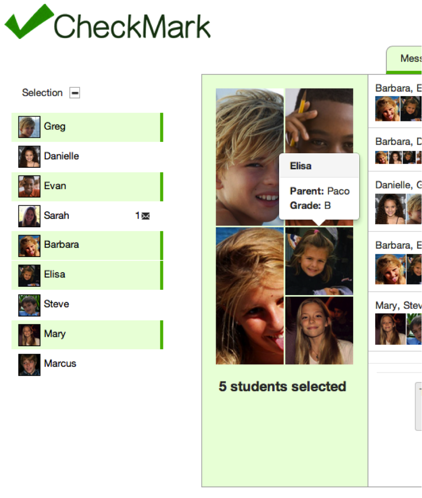
Selecting Students
|
|
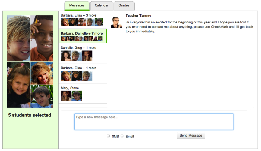
Messages
|
|
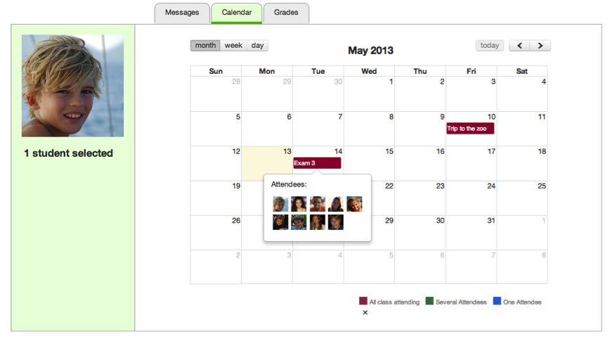
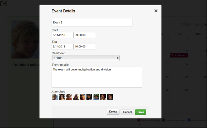
Calendar
|
|
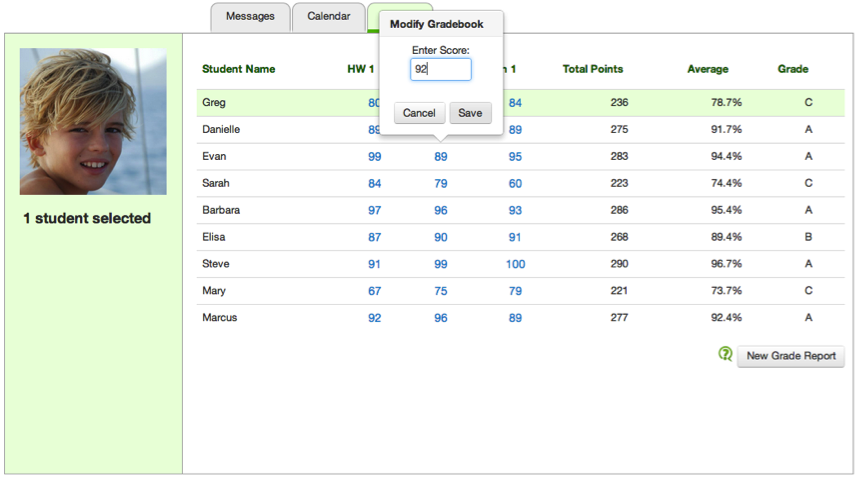
Grades
|
Implementation
Implementation:
The implementation of check mark is based on a few key technologies that help string everything together. The backend is deployed on top of node.js. We use socket.io for a web sockets transport layer and the jade templating language to dynamically render html. On the client side, our javascript code is built ontop of the jQuery framework and we bring in a couple of other libraries. The calendar is primarily implemented through the FullCalendar library and there is an additional DatePicker library that we use to help with event creation and editing. The entire interface is supported by Twitter's Bootstrap which we use to establish the layout, a lot of the styling and iconography, and some small javascript based animations. Our server is hosted on the AppFog platform.
The implementation of data transportation is slightly peculiar. All objects are stored as javascript classes which are utilized by both the front end and the backend. However, to transport the classes from the backend to the front end, we convert the classes to json objects--which strips all function calls. This JSON representation is then passed to the frontend and the frontend parses this and adds all of the data back to the new classes on the front end. Although unconventional, the advantages of this are obvious. We have 1 easy to use class file for each type of object used in our implementation, both for the backend and the front end. Updates to this one file are seen on both sides. We simply had to write very general data parsing -> class creation functionality and the rest worked seemlessly.
The implementation of CheckMark is based on a few key technologies that help string everything together. The backend is deployed on top of node.js. We use socket.io for a web sockets transport layer and the jade templating language to dynamically render html. On the client side, our javascript code is built on top of the jQuery framework and we bring in a couple of other libraries. The calendar is primarily implemented through the FullCalendar library and there is an additional DatePicker library that we use to help with event creation and editing. The entire interface is supported by Twitter's Bootstrap which we use to establish the layout, a lot of the styling and iconography, and some small javascript based animations. Our server is hosted on the AppFog platform.
The implementation of data transportation is slightly peculiar. All objects are stored as javascript classes which are utilized by both the front end and the backend. However, to transport the classes from the backend to the front end, we convert the classes to json objects--which strips all function calls. This JSON representation is then passed to the frontend and the frontend parses this and adds all of the data back to the new classes on the front end. Although unconventional, the advantages of this are obvious. We have 1 easy to use class file for each type of object used in our implementation, both for the backend and the front end. Updates to this one file are seen on both sides. We simply had to write very general data parsing -> class creation functionality and the rest worked seamlessly.
Evaluation
We conducted user testing with the following users:
- Sophia Teacher: A teacher for middle school students with special needs in a low-income community in Philadelphia (sister of group member)
- Tricia Teacher: An elementary school teacher at a school in Barcelona (aunt of group member)
- Emily Teacher: An educational coordinator at the Stata Childcare Center (visited in-person)
Prior to user testing we introduced our users to our problem statement, told them they would be testing our website as teachers - which is their profession - and provided users with a website briefing (below). We then presented them user tasks (below) to complete, one at a time. We encouraged them to talk out loud and explain what they were doing & provide feedback during testing, which we took notes of. This helped us identify usability problems with our interface and suggest potential solutions in an evaluation (below).
Website Briefing:
Selecting Students
Users can dynamically select groups of students, by toggling the icon box on the far left for a particular student
Sending Messages
Users can select the text input, type a message, and click send (or hit enter) to send a message to all the currently selected students.
Creating Events
The user can create an event by clicking on a day, with the student attendees selected in the left menu.
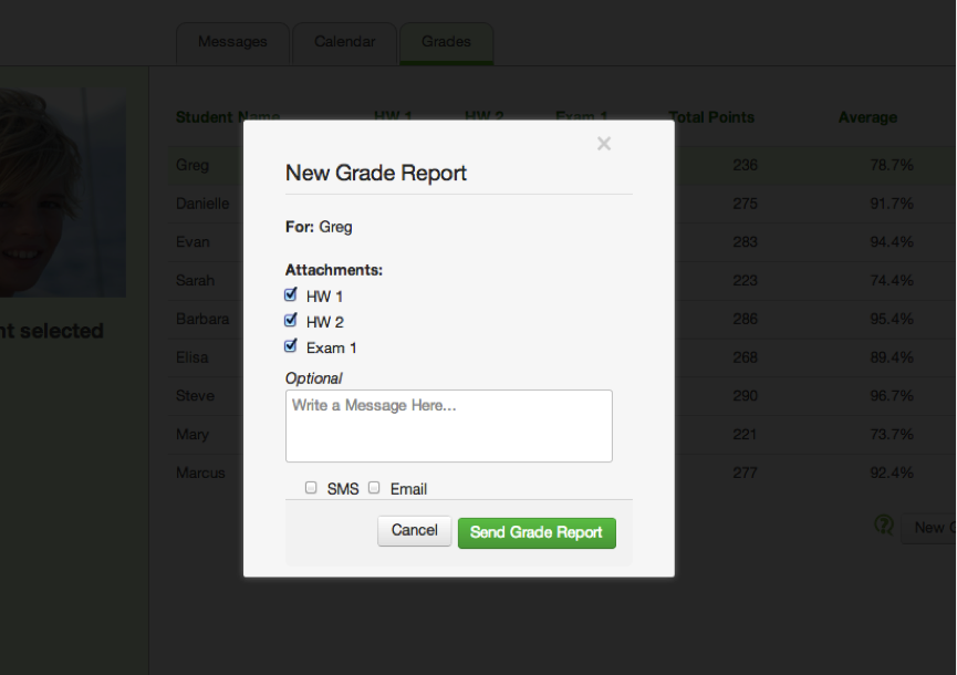
Sending A Grade Report
Users can send grade reports to the parents of the students selected by clicking on "New Grade Report". They can also edit the grade book in line by clicking on the score they want to change.
User Tasks:
You are the fourth grade elementary teacher, Tammy. As a teacher, you have many things to do before the weekend. Please, complete the following tasks:
1. Greg, Elisa, and Barbara have a group project on ancient empires. You found the following webpage link: http://en.wikipedia.org/wiki/List_of_largest_empires and you thought it might be useful to share this link with (the parents of) Greg, Elisa, and Barbara. Your task it to share this website with their group.
2. Sarah and several other students recently failed your math midterm. As a usually high performing student, Sarah's mom, Brenda is concerned and messaged your about Sarah's performance. You want to schedule a study session for the students who have C's in the class and respond to Brenda's message.
Your task is to:
A. Schedule a study session on May 17th at 4 pm for Greg, Sarah, and Mary
B. Respond to Sarah's mom, Brenda, letting her know about the study session.
3. You've finished preparing grades for all but a couple of students. You still want to send out grades but also want to let the parents who receive no reports that their children's grades will come soon.
Your task is to:
A. Send out grades to all students except Steve and Mary.
B. Send a message to Steve and Mary telling them that they will receive their final grades soon.
Evaluation:
Heuristic |
Severity Rating |
Problem |
Solution |
|---|---|---|---|
Learnability & Efficiency |
Minor |
In our Messages tab, users are required to select a conversation before writing a new message. Although a grey banner with "Select a conversation to the left" is displayed to inform users of this requirement, during testing, two of our users tried to click inside the message text area box to begin writing their message before they realized they first had to choose a conversation. One user commented that this threw her off a bit, and she felt like this may derail some teachers attempting to get their tasks done very quickly. |
Although we attempted to provide instructions by placing a simple grey banner inside the message content pane, this was not sufficient for the users we observed in testing. Rather than requiring users to select a conversation themselves, a solution would be to have the top conversation (which contains all of the users that are selected on the left contact menu) automatically selected would indicate to users that a conversation must be selected to send a message. Because selecting a conversation selection causes it to be highlighted, this would give the affordance to users that they have to highlight a different conversation to select it. A negative effect of this solution may be decreased safety in sending messages, since users do not have to intentionally pick their conversation. |
Safety & Learnability |
Major |
Pressing enter in the text area for messages causes the message to be sent rather than creates a new line. While trying to complete a task, one user accidentally pasted the link she was instructed to send to the parents of several students and then pressed the enter key, which sent her message. She commented that she was trying to include some context with the link and the behavior of the enter key in our UI was not externally consistent with most other message UI's (e.g.: Gmail). |
A solution to this problem would be to make the text area for messages more externally consistent by making the enter key create a new line rather than send the message. Although the original intention of making the enter key send the message automatically was to make messaging more efficient, we realized that some users who are familiar with other messaging UI's would also make these slips which decreases safety. |
Learnability |
Major |
The new message icon that is displayed on a user's row in the contact selection menu gives the affordance that clicking on it will direct the user to that new message. Two of our users tried to click on the message icon itself within a different context (i.e.: calendar, grades) to see the message. They said it was confusing that the message icon immediately went away after clicking on the corresponding row but the conversation was not selected, leaving users bewildered about what happened to the message. |
The obvious solution to this problem would be to cause the new message icon to automatically direct users to the message context (despite what context they are currently in) and select the corresponding conversation, which would display the new message that the icon corresponded to. This would prevent users from getting confused over whether or not they missed or lost a message, and it would also make reading new messages much simpler and safer. |
Learnability |
Minor |
Conversations in the Message tab are displayed in groups according to the contacts that are included in that conversation. All conversations that a selected contact has been involved in (individually or in different groups) display in the conversation tab when that contact is selected. One user commented that displaying all of these conversations at once is being confusing. When more than a couple users are selected, the label of a conversation says the first couple of student names, then "+ X more" (with X being the additional number of selected students). All conversations also contain the icons of all the students selected. We received feedback that these icons are too small to identify who is in the conversation, and names would be less helpful than subject lines or some other label. |
One solution would be to allow users to include a subject for each new conversation that is created. This would be helpful for more efficient idenfication of which group of students displayed in the conversation pane corresponds to which task. However, one negative aspect of this solution would be to cause additional clutter in the conversations pane by allowing for multiple subjects for the same group of contacts, which would remove a limit from how many conversations would belong to the same group or individual contact selected. A better solution might be to allow for group creation, giving users a way to give names to groups of students that a user needed to frequenty communicate about (e.g.: Greg, Steve, and Sarah belong to Reading Group A). |
Efficiency |
Minor |
One user commented that she worked alongside other teachers in one classroom, as it was her job to work with a specific subset of students at once, and not all of them. Another user provided feedback that although she teaches an entire class, she often organizes lesson plans around different groupings of students according to their level and behavior. These users suggested that having a way to create and select groups of students under labels or titles would be more efficient than having to select all of the users in a group every time they need to be contacted, which could introduce more errors (e.g.: including the wrong student, leaving a student out). |
As mentioned in the previous solution, a way to solve this problem would be to allow for group creation, giving users a way to give names to groups of students that a user needed to frequenty communicate about (e.g.: Greg, Steve, and Sarah belong to Reading Group A). |
Learnability |
Major |
All of our users commented that the way conversations are displayed, labeled, and scaled (height of a conversation's box) was not intuitive and was hard to figure out. Conversations are sorted by people, which users commented was useful after we explained it to them, but all of them said they were expected it to sort by recency, which would be externally consistent with other messaging UI's. |
To make the way messages are sorted more externally consistent, we could simply order the conversations (beneath the dynamic one that displays all currently selected users at the top) in descending order by the most recent message that was sent/received. This would not remove the diplay of conversations by people involved, but it would order them in a way that was more relevant and intuitive. |
Reflection
As our group completed our development of CheckMark, we had to make significant choices that changed the outcome of our project. Over the course of the iterative process, we learned getting through each iteration cycle as quickly as possible allowed us to move quickly and incorporate the maximum number of important changes into our design. By continually and constantly challenging our design, we improved it in look and functionality as well as developed a thorough understanding of why every piece of our design existed and was placed where it is. Although we are extremely happy with our finished product, in hindsight, we may have done a few things that made our lives a little bit tougher when it came to the implementation. Below are a few sections on how we made decisions with regard to aspects of this project, and what we would've done differently.
Paper Prototyping:
When it came time to paper prototype CheckMark, our philosophy was to make our prototype as realistic as possible to ensure that the testing provided maximum insight into the usability problems and features of the future CheckMark. During testing, we received a lot of good feedback (and some contradictory feedback) and incorporated the most common criticisms into our big design changes. Making design changes on smaller, less significant issues did pose a problem because as a test, it was hard to understand how some specific features would translate to the computer medium.
Things we would've done differently:
- Although we did this with small features, we could have tested more effectively if we had included several different versions of the prototype. This was difficult to do partly because of the time constraints, but testing may have given us more insights if we tested a few different designs at once.
- We created our paper prototype to be as realistic as possible but this made it difficult to change our prototype during the actual testing. Our paper prototyping may have benefited from modifications after each individual test, but we would have had to lower the authenticity of our prototype.
Computer Implementation and Testing:
When we implemented CheckMark and began testing it with users, our goal was to ensure testing of realistic use cases and to design for the most difficult aspects of the parent-teacher communication problem. For example, we explicitly decided not to include functionalities like creating users with preferences and settings because such design aspects are well researched and non-unique to the problems addressed by CheckMark. We also did very well planning our implementation so that we didn't have to change too many of our data structures when we added that back end.
Things we would've done differently:
- We met often and communicated frequently, but it was difficult assigning different big parts of the interface to different people and just letting them lose on it. It might have been more efficient and things might have fitted together better if we had instead wrote out all the tasks needed to implement the interface on a lower level and assigned tasks to each person. Explicit enumeration of the tasks may have also made it easier for us all to be on the same page at all times without having to meet constantly.
- Explicit enumeration and assignment of the tasks may have also made it easier for us all to be on the same page at all times without having to meet constantly.
Conclusion:
Despite a few small changes to the way our group approached this project, we are extremely happy working with each other. We made a few mistakes, but did an extremely good job of planning so that we had to do minimal work to add a backend and could focus on incorporating feedback from the heuristic evaluations. We also did very well incorporating large necessary design changes at every stage of development, sometimes radically altering the functionality and appearance of CheckMark. We all put it a large amount of time to ensure the success of the CheckMark and are happy with the outcome.