Design 3
This is designed for small screens (ie mobile devices).
|
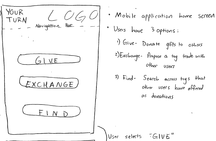
HOME PAGE
Pros
* Simple navigation page that let's users know right off the bat what their options are.
Cons
* Users not familiar with the purpose of the site may not know what the appropriate action is.
|
|
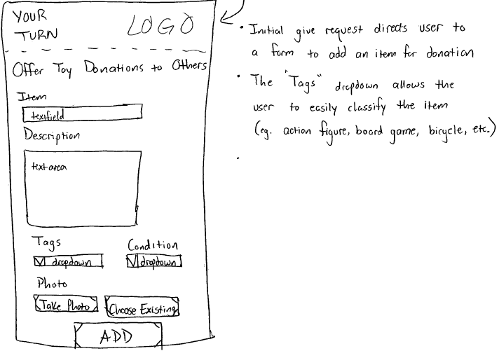
GIVE PAGE
Pros
* Requires enough information so that items can be efficiently searched for.
* Forms and combo boxes are familiar input mediums that work well on mobile.
Cons
* If the device is being used on mobile, then typing can be a chore.
* Possibly too many fields, buttons, etc for a small mobile screen. |
|
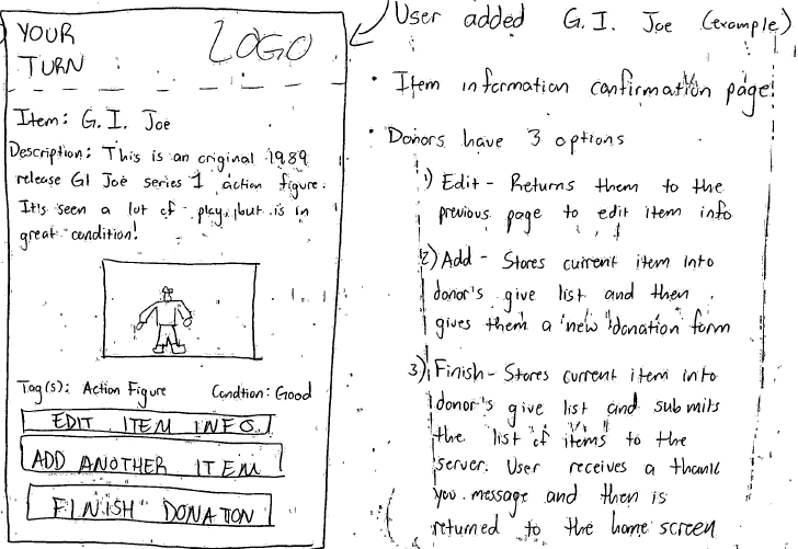
DONATION CONFIRMATION PAGE
Pros
* Safety - allows users to go back and edit any errors they made have made.
Cons
* Users may grow tired of having to confirm each item that they list for donation. |