Design
Screenshots
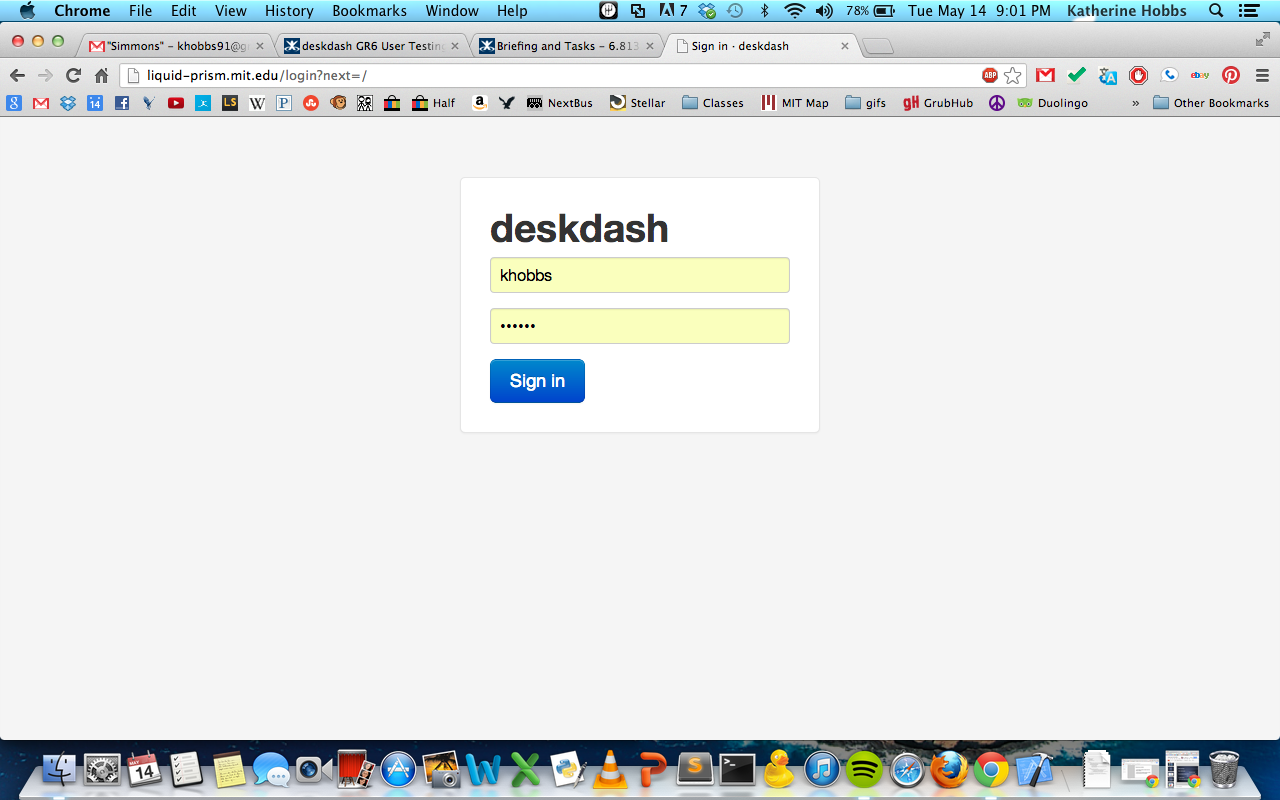
Figure 1. Login Page.
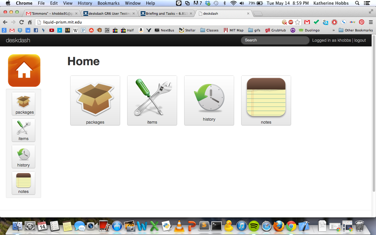
Figure 2. Home page. Users can access any page on the site by clicking the large center buttons or the smaller sidebar buttons.
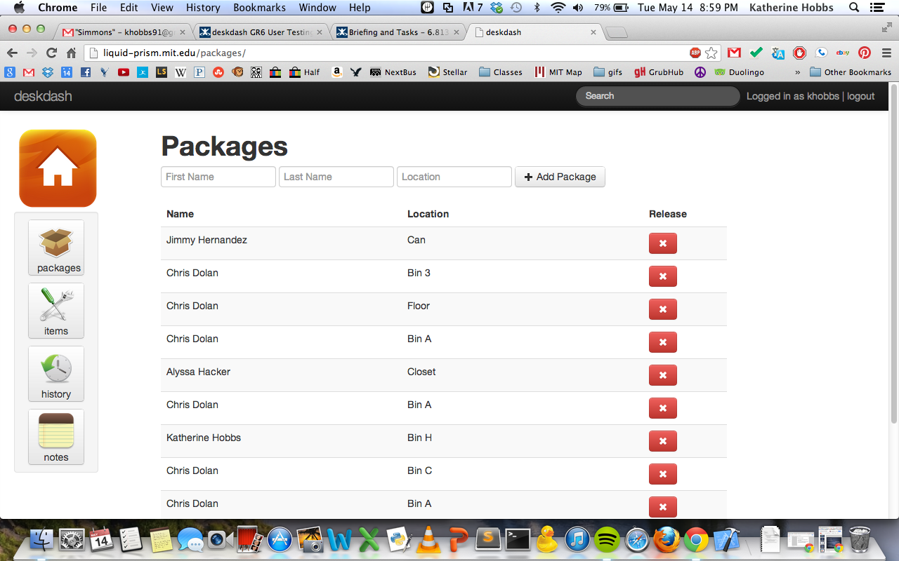
Figure 3. Packages page. Users can add, release, and edit packages on this page using the form at the top and the red release buttons on the right.
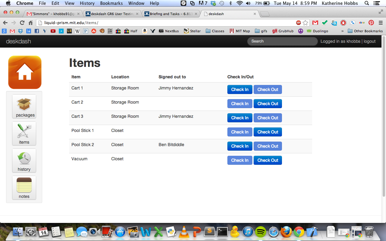
Figure 4. Items page. Users can check in/out and edit lendable items on this page by clicking on the "signed out to" field and check in/out buttons.
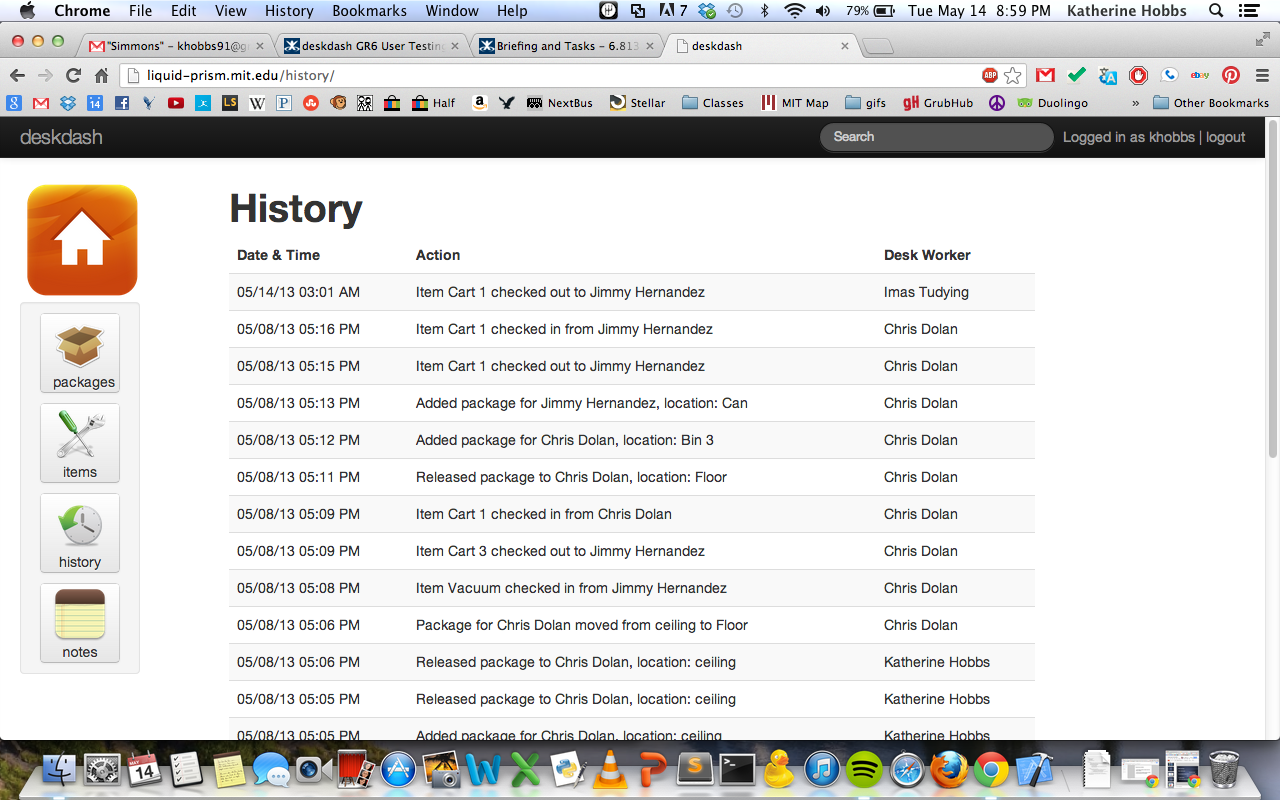
Figure 5. History page. This page contains a list of all the actions ever performed by any desk worker in chronological order. Users cannot edit this page.
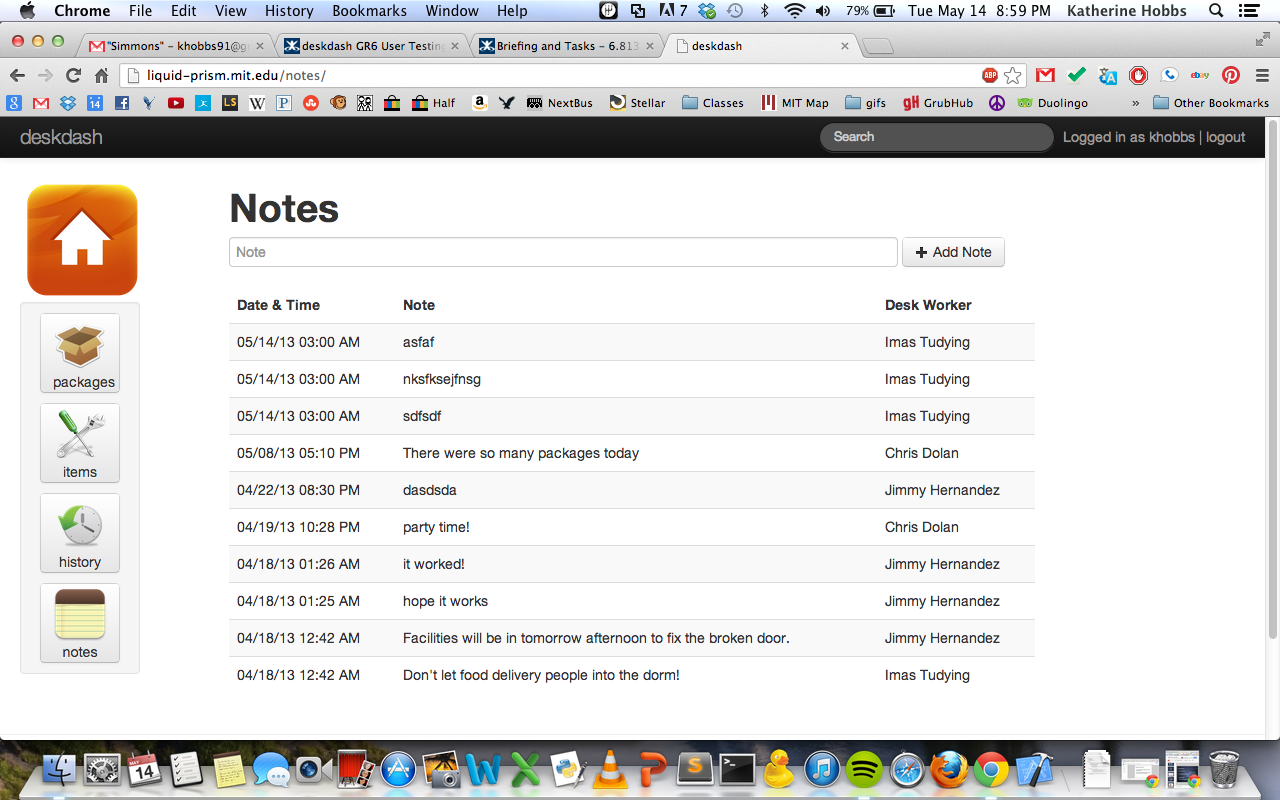
Figure 6. Notes page. Users can leave notes for other desk workers to let them know about anomalies during the job that don't fit into the packages or items categories. Users can only delete notes they created.
Important Design Decisions
- consistency - we tried to make every page as similar as possible so once a desk worker learns how to use the packages page, they know how to use all the pages (based on findings from paper prototyping)
- simplicity/minimalist design - we eliminated unnecessary information and text (in tables and on buttons). Only pertinent information is displayed on each page. (based on findings from paper prototyping)
- lots of whitespace
- text labels on buttons - we initially removed most text from buttons, but we added it back to increase learnability. (based on findings from the heuristic evaluation and user testing).
- notes page - we chose to add the notes page because when we tested actual dorm desk workers, the most common complaint was the inability to handle abnormal situations that would require writing a special note and leaving it somewhere for other desk workers to find. (based on findings from paper prototyping)
- check in/out buttons for items - we initially used red x's and checks to indicate the status of an item as checked in or out, but we switched to using two separate buttons labeled "check in" and "check out" (based on findings from the heuristic evaluation)
- editable fields - initially we made package and item entries uneditable, but we added editing capabilities and full CRUD support (based on findings from paper prototyping)
- notes are only editable by author - we disallowed desk workers to edit notes they did not create (based on findings from user testing)
Design Alternatives
- more informative tables - we considered including a lot more information for each package or item like the desk worker that added it/checked it in, the time it was checked in, the last person who checked out an item, etc. But we chose simplicity and whitespace over overly informative tables. (based on findings from paper prototyping, heuristic evaluation, and user testing)
- sticky notes - we considered making the notes page contain more realistic sticky notes (like the sticky note feature on Windows), but decided against this idea in favor of the ability to sort and filter notes
- sticky notes - we considered allowing users to add sticky notes to any page on the site instead of having a separate notes page. However, we decided against this idea because it's simpler for users to only have to look in one place to see all the notes
Implementation
The Backend of our system is based on Django, an easy-to-use Python web server framework. We've backed the server with a SQLite database for storing all of our app's information since Django has built in support for it. The Frontend of our system uses Twitter Bootstrap for HTML and CSS and jQuery for client side computation. Thankfully, the tools we decided to use for implementing our interface were robust and flexible and did not hinder us from adding all the functionality that we wanted in our interface.
Evaluation
Our test users consisted of three actual dormitory desk workers and one student who had never worked as a desk worker. Other than the student, our users were very representative of our target population as they are our target population.
Here is a link to the briefing and tasks we used in our user tests.
Usability problems found:
- Catastrophic - usability/error handling - names entered in the package/items forms must be exact--many users added whitespace before or after names and the form would not accept them. We should strip all whitespace from forms before they're submitted.
- Major - shortcuts/safety/error handling - package and item editability is not intuitive--users said they were looking for an edit button to switch into edit mode. We should add an edit button that when clicked clearly makes fields editable.
- Minor - efficiency - users expected autocomplete to help them fill in residents' names. We should add autocomplete to forms.
- Minor - consistency/match the real world - the icon for items is confusing because it is a picture of tools. We should use a picture of more commonly lent items--movies, pool equipment, ping pong paddles, broom, etc.
- Minor - consistency/match the real world -instead of "checking in/out" items, users preferred the term "lend". We should change the buttons to be labeled "lend" and "return".
- Minor - consistency/match the real world -instead of "adding" or "releasing" packages, users preferred the terms "receive" and "deliver". We should change the buttons to be labeled "receive" and "deliver".
- Major - visibility of system status/put the user in control - users said they wanted notifications for new notes so they would know to check the notes page. We should add iphone-style push notifications.
Additional features requested:
- users wished they could leave sticky notes on any page and view them all on the notes page. We should consider implementing site-wide stickies.
- users wanted to be able to add packages for non-residents (which our system does not allow) because dorm desk workers often hold packages for non-residents. We should add another page for non-resident pick-ups or find a way to incorporate it into the packages page.
- users wanted a "received by" field for packages, so they would know which desk worker performed the action. We should add this field.
- users wanted a date field for items so they would know when an item was last checked out. This was so they could contact residents who kept an item for too long. We should add this field. We should also have the system automatically e-mail people who borrow items for longer than a week, reminding them to return the item.
Reflection
What we learned/What we would do differently:
- it's really hard to get users to try out a new interface if someone who knows and understands it is standing nearby. You have to refuse to help them or else you'll miss important usability issues.
- We didn't prototype CRUD at first, but it definitely ended up being the most important aspect of the website.
- We didn't consider the risk (safety hazard) of giving all users full CRUD support for everything on the website. In retrospect, this was a poor choice. We have since limited CRUD for users.
- We chose to use multiple paper copies of our website pages to initially prototype our site because they were easy to interchange and overlay during user tests.
- We grouped our observations into categories and recorded a few select quotes from users for each category. We then looked at similar user comments to determine how to best change the UI to make it more usable.
- We would focus more on feedback from actual desk workers if we did this project again. Actual desk workers gave the best, most detailed feedback and really knew what they were talking about.
