GR6 - User Testing
Design
Homepage
- Comment style of news

From the heuristic evaluation feedback, people like the comment style of news. They think it is “very clear as to what items are related or not”. “Visibility is good, and minimalist aesthetic is good”.
We are keeping the comment style of news as the homepage with deadlines displayed in a list on the right.
- Simplified drop-down menus
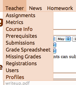
One problem mentioned by everyone and was evident from the HW2 feedback was the packed drop-down menu under “Teacher”. The final design hides optional features (homework surveys, recitation section management, and student team management). This streamlines the experience for administrators of simpler classes, and focuses on the most important features.
Grading
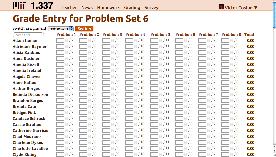
In the paper prototype phase, we focused on testing the grading interface. We had two iterations. The first one only displays students whose grades have been entered. Whenever a new grade is entered, a new row with a blank name box will appear at the bottom of the page. The second iteration displays all names in a table. Our final design follows the second iteration, since it is more visible..
- Auto-filter name search results
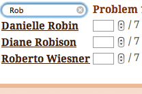
From the paper prototyping, we got the feedback from the TA - "make sure your name searching box does incremental search, which every keystroke of name letters will filter out the name lists." We took the advice, and made the response more instantaneous, and the status of the system more visible.
- Auto-save grades

We decided to make the system auto-save the grades, since it can prevent errors and save time of hitting an extra key for TAs. However, during the second iteration of the paper prototyping, a very common question from users is where to save grades. In our final version, whenever users finish entering a grade (either by hitting tab or clicking somewhere else on the page), a small saving icon would appear behind the grade box for couple seconds. To prevent errors, if users enter something invalid, such as letters, the system would not save the input.
- Switching between problem sets
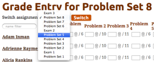
Many users forgot to switch to the right problem set during the paper prototyping user testing. We tried to solve the problem by giving the button "Switch" a different color, and making the header with assignment or exam name appearing bold and big on the top of the page. During our final user testing, forgetting to switch to the right pset continued to be a problem. We might solve the problem by change the button name to "Switch Pset/Exam" and only highlighting the assignment and exam names in the title.
Forms (including posting a new assignment)
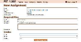
In the heuristic evaluation, we got many feedback about our long forms. People also mentioned that they do not know what some fields are for in the form. In the final design, we simplified our forms, and added placeholder information in many fields as a sample.
Implementation
We decided to build a Web application, so we didn’t have to worry about users installing software, but this exposed our UI to the limitations of CSS. For example, we initially designed the grade entry form as a full-screen sheet that has horizontal and vertical scroll-bars, and the first row and first column are fixed to offer context. CSS made this hard enough that we didn’t have time for it.
We built upon a pre-existing code base, which allowed us to focus on front-end improvements, but might have subconsciously biased us towards preserving existing functionality and interactions.
The site’s stylesheets are written in SCSS, and make heavy use of variables, mixins, and nested rules to reduce selector complexity, and to separate generally useful rules from page-specific and site-specific rules. The generic rules have been extracted into a Rails plug-in, so that they can be reused in other applications, and so that bug fixes and enhancements can be easily back-ported into the course management site. We preferred CSS3 features to JavaScript (for example we used CSS3 Transitions instead of the fade jQuery UI effect) so that we can benefit from hardware acceleration on desktop and mobile devices, at the expense of Internet Explorer users.
The JavaScript is driven by markup, using the HTML5 data- attributes. This approach makes it easy to keep widget behavior consistent across the different features, because the JavaScript for an interaction is in one place, and because the easiness of adding a behavior greatly reduces the danger of developer laziness. However, the developing the JavaScript behavior library had a toll on development speed, and in turn on the UI’s polish.
We make liberal use of AJAX, because our Rails application will be deployed on a 4-core server where each core can respond to most requests in less than 10ms, so overloading the server is not an issue. This will need to be revisited if the site grows to Stellar’s size.
Evaluation
Users
- User 1: Course 6 PhD
- Has TA experience with an undergraduate EECS course
- Friends with a group member
- Course 6 Undergraduate
- Didn't have a TA experience
- Friends with a group member
- Course 7 Undergraduate
- Has TA experience with an undergraduate biology course
- Lives in the same fraternity house as a group member
Briefing
We are working on a course management site, something along the lines of Stellar. Students submit psets, TAs get them, grade them, enter the grades, and then students see their grades. Today, we want to test the UI for entering grades. You are a TA, and your tasks will all revolve around posting psets and entering grades for psets.
Tasks
- Log in as a TA with
username: costan@mit.edu
password: mit
- Task 1: Change the grade for one student, Chad Medrano, for Problem Set 1
Chad got the following grades:- Problem 1: 8
- Problem 2: 4
- Problem 3: 5
- Task 2: You have many students (30+) whose grades for Problem Set 6 you need to enter into the system. Please note that ordinarily, when faced with this quantity of grades, the user would naturally discover that he or she can use the keyboard to increase efficiency. We can make this assumption since we have data confirmation of this behavior based on the system prior to the UI improvements that we're working on now.
- The header labels are: Name, Problem 1, Problem 2, Problem 3, Problem 4, Problem 5, Problem 6, Problem 7, Problem 8
- Samuel Miner: 7, 8, 6, 3, 11, 6, 6, 6
- Amelia Ireland: 5, 8, 9, 10, 0, 5, 7, 8
- Task 3: Post a new problem set - Problem Set 9.
- It is due on May 12th at 23:00.
- A pdf write-up named User Testing is required. The filename should be testing.pdf
- It is worth 10 pts with weight 1.0.
Observations
- User 1:
- Task 1: Immediately got attracted to the home news page. He scrolled down to the bottom of the page, and selected Problem Set 1. He didn’t see the place to post grades. After couple seconds, clicked on Grading. Used Ctrl+F to search for Chad. Forgot to switch to Problem Set 1, but since the maximum grade was less than the point to enter, he soon found out, and switched to Problem Set 1. He used tabs to switch between blanks. He asked about whether there is a submit/save grade button. The facilitator explained that the system does auto-save.
- Task 2: Before Task 2, he tried on his own to type in the textbox, and found the system does filter. Task 2 went very smoothly. He searched the names in the box, and used tabs to switch between blanks.
- Task 3: He first clicked the dropdown menu for switching problem sets on the grading page, then searched under Grading dropdown menu. Quickly he clicked on Homework, and clicked on “+ Homework”. The rest of the task went smoothly except he got confused about Name and Filename, but soon he corrected that.
- User 2:
- Task 1: The user directly found "Post Grades". He forgot to change the problem set number, but later found out. He clicked on the row of the student, and entered the grades.
- Task 2: He didn't notice the name search box; instead he used Ctrl-F to find students. Then he used the tab key to switch between blank fields. After the test, we mentioned to him about the search box, and he said that Ctrl-F could be more efficient in this case.
- Taks 3: He completed the task with no difficulty.
- User 3:
- Task 1: The user was able to complete the task with some difficulties. He went up to teacher, chose the grades spreadsheet, and chose the appropriate parameters, but couldn’t enter the grades. He then noticed the grading menu and completed the task without difficulties from there.
- Task 2: He didn’t have any problems with this. Having seen the page from the previous task, he just started entering the grades, using the return key to advance between fields.
- Task 3: Immediately found the +Homework menu and added the homework without any difficulties.
Reflection
Because we already had a functioning product, we thought that we could focus more on coding the front-end features that we wanted to perfect through this course. Unfortunately, we didn’t take into our risk consideration the fact that our back-end would have to change, which turned out to be a bad decision. Our back-end had to change considerably to accommodate the features that arose from the user interface design process, which took a lot of our time away.
We decided at the very beginning to focus on a few core features: assignment creation, grading, and submitting. We wanted to focus our attention on this small set of very important features to perfect the user interaction with them. Having said that, we feel happy with the way the features turned out, and plan to work on the UIs of the other features, as this website will be in use next semester in 6.006.
The feedback from the paper prototype, from HW2, and from Anh has helped us tremendously, although there is a lot of overlap among the different feedback. This overlap helped us decide which problems to tackle first, because multiple people complaining about the same thing means that it’s a problem that is noticeable.
We evaluated the results through this GR6 and through our own interactions with the final product. We learned that we still need to tweak a few small things from the user studies we conducted for GR6, like, for example, allowing the TA to enter grades from the “Teacher” menu as well as the “Grading” menu. We feel that the product is leaps and bounds ahead of our initial prototype, and that it is ready to be used in production with an MIT algorithms class. The class will provide a lot more feedback for the next iteration of the project.
1 Comment
Anh Dang Viet Nguyen
- In user testing, should list out clearly issues, their severity and suggestions.
- In reflection, since the prototypes confused users with too many features, I suggest in the future, you may want to divide your projects down logically first, then perfect each of them. I think given a design problem, you already know how to handle them. For example, specific feature like batch grading was done very well with fast keyboard control and immediate feedback (autosaved). However, I still find the overall organization of the product somewhat neglected by the team. As this project is a sophisticated one with many features, simply listing out all menus and fields don't cut it. I hope you will consider dividing them into few categories and seriously think more about user flows.
- One last design comment, the font sizes on news page are very disproportional. Headline texts were oversized and distracting (think someone screams to your face with louder than necessary voice).
- I'm looking forward to seeing the projects improving and got more user testing to become a great product for MIT!