GR6 - User Testing
Design
Login Page
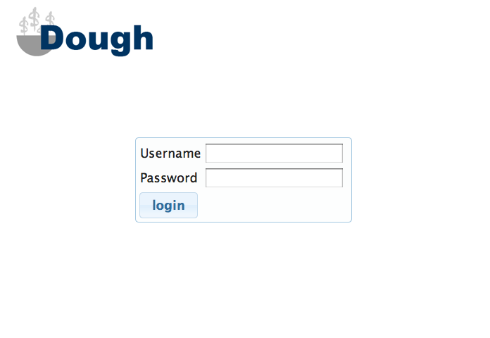
For the purposes of this class, we designed our login page to be minimalistic and efficient. This way, returning users would be able to log into the page and view information as quickly as possible. However, had this been a project we were trying to market to a wider audience, it would've been a good idea to include more information about what Dough is and how it works. Nothing on this page (except maybe the symbolism in the logo) says what services the website offers or entices new users to sign up. In fact, we did not even include a "sign up" function because it is common for new websites to only allow sign-ups through email for beta testing.
Home Page
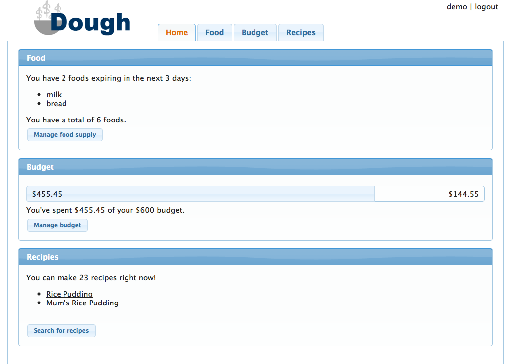
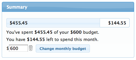
The layout of our homepage has not changed much through the different iterations of our design. We wanted to include a brief summary of each of the three areas of the website (food, budget, and recipes) to the user to improve efficiency. After reading evaluations of our computer prototype, we decided to reduce the width of the page content (on the homepage and all of the other content pages as well) to a specific number of pixels, and we centered this content on the page. This ensured that on high resolution screens, important information would still be easy to read (not stretched across the full span of the screen). As a result, the budget progress bar on the home page is much easier for the user to parse. Also as a result of our computer prototype, we made sure to turn the recipes listed under the "recipes" section into hyperlinks. This reduced the cognitive load on the user when trying to look for recipes because they did not have to remember the recipe name and then search for it on the recipe page. It was also suggested during paper prototyping to list both foods that are expiring and the total number of foods in the "food" section. We also decided to clarify what we mean by "expiring soon" by listing the actual time frame (3 days). This increases visibility.
Foods Page
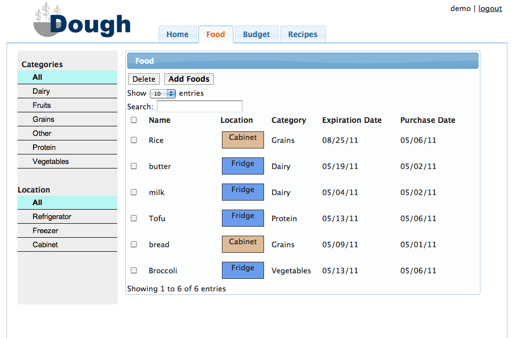
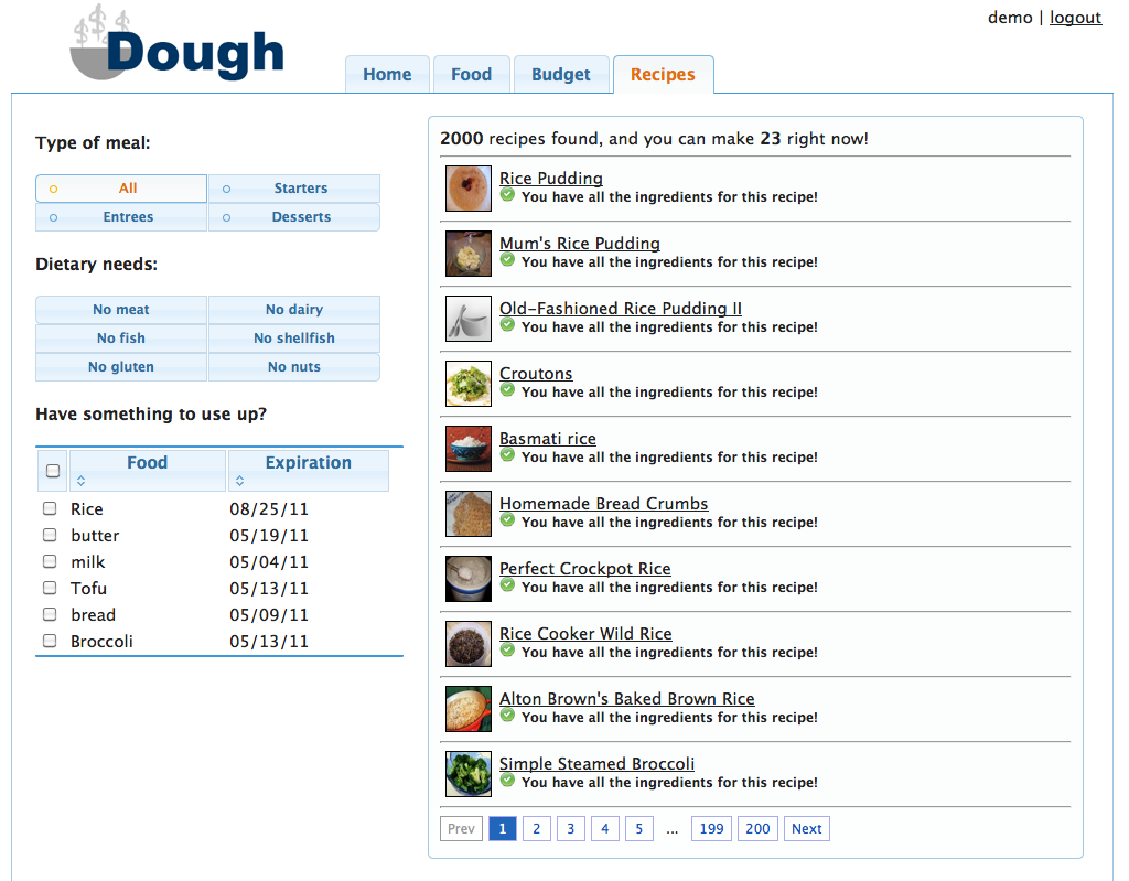
The foods page was the most difficult to design due to the amount of information we wanted to display to the user. In contrast with our previous design iterations, we removed a lot of the buttons at the top of the food list panel (recipe search, tags, select). We did this to either simplify the design (by keeping recipe search functionality entirely on the recipe page) or eliminating confusing/unintuitive operations (tags and select). We also decided to make the list of foods sortable by all of the categories, but we were unable to include proper icons to indicate that the list is sortable. Hence, the functionality is there, but the affordance is not.

In our final implementation, we made several alterations to the "add food" modal dialogue box. We changed the "tags" section to a more explicit "location" section and included icons for each of the possible locations. We also included a default purchase amount of $0.
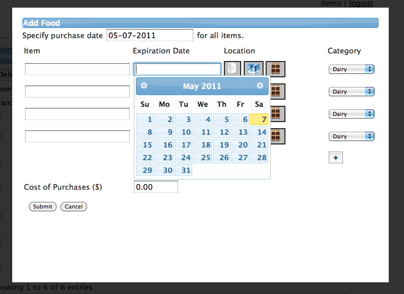
We felt that calendars for date entry, a feature we included in the computer prototype, was a critical design decision for both efficiency and error prevention. It allows the user to quickly view dates in a way that they are familiar with looking at them (consistency with real world) and pick them out quickly. They are also less likely to make an error because there is more visual feedback about their date choice. For all of these reasons, we opted to include this in the final implementation.
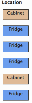
We decided to color-code the various food locations in our final implementation. We feel that the use of a visual variable here (color) makes the page easier to interpret.
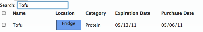
We included a search bar for quickly finding food. This improve efficiency when a user is looking for a very specific food item.
Budget Page
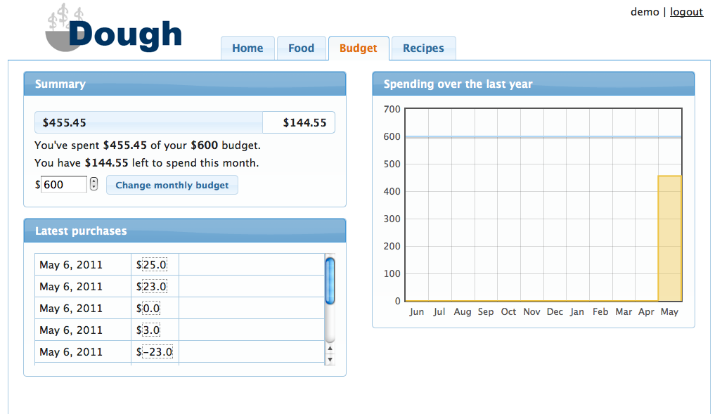
Due to suggestions from computer prototyping, we redesigned our budget page to no longer contain nested tabs. All information is immediately visible to the user but still separated conceptually by the different subsections (summary, latest purchases, spending over the last year). This makes it more apparent to the user what information is contained where.
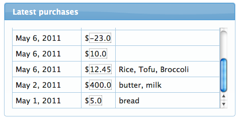
Through paper prototyping, we learned that it is important to make previous purchases editable, so we included this functionality in our final design. We tried to give the values the affordance of being editable by putting a dotted box around them. We also included a summary of foods that were in the purchase. This makes the system more visible and reduces the cognitive load on the user because remembering which purchase is which is now recognition rather than recall.
We included the functionality to change the budget right on the budget page rather than in a modal dialog box. This is very beneficial for efficiency reasons, but it allows the user to very easily change goals they have made. For instance, if they find that they're going over the food budget, they can very easily just up the budget to account for it. Hence, in this case, it is arguable that efficiency here is not exactly the best thing.
Recipe Page
The overall look of the recipe changed was changed quite a bit from the computer prototype to make efficient use of the available space. We increased the span of the portion displaying the recipes and reduced the clutter of the search options portion by grouping options more effectively. We also used jquery UI buttons instead of standard radio buttons/check boxes to improve the overall look and increase the area a user can click to select an option.
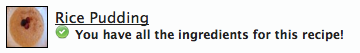
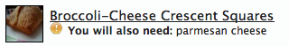
While our computer prototype only included links to recipes, our final implementation also has pictures of recipes to improve visibility. We also included a list of additional necessary ingredients so that the system can make a wider variety of suggestions to the user. We achieve visibility here through the use of icons (shape and color visual variables).
Implementation
Overall
Dough is a web-based application that makes use of HTML, javascript, css, ajax, and django. The majority of our implementation was made up of Jquery UI components. We chose this route because they allowed us to easily implement an attractive, unified theme throughout the website. We opted to use ajax to populate the content portion of the site. We believed that this implementation decision would help to load the various pages (home, foods, budget, and recipes) much faster, but it actually lead to quite a few headaches. For instance, we used a piece of javascript to do cross-domain ajax calls through a proxy server. Including this code interfered with the ajax calls for changing pages and lead to unexpected behavior when changing pages (pages wouldn't load properly with all their content). Given a chance to redo the system, we would make the pages more modular to avoid this interference.
Home Page
The homepage uses a simple django template with some javascript (for the progress bar and jquery ui buttons). The server side gives it a list of foods expiring in the next 3 days, the total number of food items, the budget progress, and recipe information.
Foods Page
The server send the contents of the user's kitchen (from the database) and they are displayed in a table using the DataTable plugin, which provides live search are re-ordering of the table. The table can be filtered (selecting various locations and categories) using the left hand menu. Clicking any item on this menu send an ajax request to the server, which then refreshes the page with only the filtered items shown. These multiple methods of sorting/finding help users deal with large amount of food and where mostly intuitive to users (the exception being ordering the table, because no arrow affordance showed up). The Add Food button opens up a dialog and dims the rest of the screen. We choose a dialog over a new page for better loading time and learnability. In the dialog box, date input box use jquery UI's datepicker to provide a calendar display to the use upon clicking. Location is selected by clicking on images that act as radio buttons, which we thought would be less tedious then a drop down menu. Upon submitting, and ajax request is made to the server. The server inserts these new items into the database. The delete button (after a dialog confirmation) sends an ajax request for the server to delete any checked items in the table. This balanced error making with performance (since deletes happen as one consumes food). All actions that calls the server also causes a refresh client side, so that results are updated immediately.
This system generally worked well, however, our database model was not perfect. We did not distinguish between consumed food and deleted food in the database, which was confusing to users.
Budget Page
Here we used flot, a javascript plotting library for jQuery. The server side sends the names of the last 12 months, along with the total spending for each month. We also needed server side functions to edit the budget and individual purchases, and we call those with ajax. This page makes use of a hidden checkbox that when checked, the budget tab reloads. This is so that with every change to the budget or purchases, the progress bar and plot are updated quickly, without having to reload the entire page.
Recipes Page
To populate the recipes page with recipes containing the user's ingredients, we piggyback off of an external recipe search site (www.supercook.com). We analyzed their site's code and learned to formulate a query to their server. As mentioned above, we then used a cross-domain ajax query to get the list of recipes from the website. The refinement choices for the query, displayed on the side of the page, were all options available on the eternal site. Whenever a choice is clicked, Dough records all the options that are chose (meal type, special requirements, and focus foods) as well as the list of foods current in the user's collection (stored in a database and retrieved with django). It translates these criteria into a query string as dictated by the external site and performs the cross-domain ajax query. Once the website responds, it converts the result into a javascript object containing information about the current page, the number of found recipes, and the recipe details themselves (URL, name, ingredients, etc.). It iterates through these recipes and adds HTML to the recipe list panel accordingly.
Evaluation
We found individuals for testing by talking to people within our dorms. We felt that this was a good strategy because we originally built our interface for busy, college students. In a dorm setting, it is difficult to manage one's food supply, so we felt that the users we chose fit with the ultimate goal of Dough. The three users all cook (although varying in the number of hours per week) and also all live in different dorms.
Briefing
Dough is a web application that helps you manage your food and your food budget. You can track foods you've purchased, see when your foods are about to expire, look at how much you've spend on food, and find recipes tailored to your food supply. It is built to help you get the most out of your food purchases.
Tasks
We felt that most of our tasks from paper prototyping were still applicable to our final user testing. However, we added a few additional tasks to test a larger breadth of functionality. We did not demo the site to users.
- It's Wednesday, March 16th. Your vegan friend Bobby is coming over tonight for dinner. You log in to Dough to check what you can make.#* Go to the Dough website and check what food you currently have.
- Your face falls and you sigh dramatically when you realize you don't have anything Bobby can eat. Looks like you need to make a trip to Shaws.
- Check your budget to see how much you have left to spend on your trip to Shaws.
- While checking your budget, you remember that you received a large tax refund in the mail and can afford to spend more money on food this month.
- Increase your food budget to $300.
- Your remaining money supply seems really low.
- Check your previous purchases for any strange-looking entries.
- You find an erroneous entry of $500 when you meant to enter $50.
- Correct the purchase amount to read $50 instead of $500
- Wandering joyously up and down the aisles at Shaws you find broccoli, whole grain rice, and tofu. You buy the three items for $12.45.
- Add your food on the Dough site, recording when you bought it, where you're putting it (broccoli + tofu go in the fridge and rice goes in the cabinet), and how much the total purchase cost.
- As dinner approaches, you realize you can't just serve Bobby raw broccoli and rice.You need a recipe for some dish.
- Use Dough to search for dinner recipes you can make with your new foods that Bobby can eat. Since your carrots are going to expire soon, make sure the recipe contains carrots.
Notes
User 1:
- Good: Used tabs for navigation but commented "I guess I could've also used the other link", referring to the links in the various sections of the home/splash page. The user quickly understood how to navigate around the website.
- Good: When viewing the food page, the user commented "I like the color coding" (the color-coded location tags). They were able to parse the information on the page quickly.
- Major: The user did not understand some of the food classifications (protein vs. vegetables... "what is a chick pea?")
- Solution: include more food categories that describe food types more clearly (meat instead of protein for example)
- Good: When playing with sorting options, the user stated, "This is convenient! I can look at the stuff I have in my freezer!" Different sorting option allowed the user to fine-tune the display to exactly what she wanted to view.
- Catastrophic: The user could not figure out how to change a food item once it was created - this is because the website does not really allow for this functionality (an item must be deleted and recreated).
- Solution: implement the ability to change food properties and add affordances for being alterable (dashed box, add a dedicated button for changed food items, etc.)
- Major: The user said, while looking at food, "I would like to be able to sort these...". The sorting function is there, but there is no affordance for it (icons and clickable category titles).
- Solution: add icons and a button-like appearance to the category titles - this way users will know to click on them in order to sort by the different headings.
- Good: When viewing the budget page, the user said "This makes sense" (referring to the progress bar). They were able to easily point out how much money they had left in their food budget.
- Major: When editing a previous purchase amount in task 5, pressing enter causes a new line to appear in the text box rather than causing the new value to take effect. They were not able to determine how to enter the value.
- Solution: pressing enter should submit the new value rather than entering a new line
- Major: Due to bugs with the ajax code, updating the budget did not immediately refresh the different views on the budget page. This decreased system visibility and left the user rather confused.
- Solution: make sure that all changes that occur on the website immediately update the displayed information
- Major: When entering rice into the add food dialog box, the user commented that there is no "never expires" or "expires in a very, very long time" option.
- Solution: not all foods expire in an amount of time that is easy to enter with a calendar, so we should include some options for quickly selecting longer time periods (a month, a year, never, etc.)
- Minor: When entering information into the add food dialog box, the user was not interested in entering categories and locations.
- Solution: better defaults should be offered for the categories and locations so that ignoring these areas has very little effect on the system (other for food type, fridge or some other default tag for location)
- Good: When searching for recipes, the user commented "This is so neat! I can make them!" and "This is actually really convenient...". The visual variables (icon: shape, color) indicating which recipes could be made right now where easily visibile to the user.
- Minor: The user did not immediately notice the search options available to them and did not always know exactly what criteria were being used to perform the recipe query.
- Solution: The recipe list pane should list what search refinements are currently being used (like "Currently searching for entrees with no meat and a focus on asparagus...")
User 2:
- Good: The user used link on splash page to access food page and remarked that it was cool that the tabs at the top updated as well. User felt this provided good visibilty about the page change.
- Good: User enjoyed sorting using the columns on the left and the live search. Commented that this would make a long list of food accessible.
- Good: User had no trouble navigating to the food page and finding the budget. Commented that the graph would be a great visual representation of progress over months.
- Good: The User found the input box for changing the budget in no time.
- Minor: The user tried to click return to submit the form after editing the budget. After a few seconds the user noticed this had no effect and clicked the button to the side of the input box.
- Solution: Implement a key listener to allow for form submission using return.
- Good: User liked that the budget graph was immediately updated to reflect the change in the budget.
- Minor: Editing model is not consistent on the budget page. For updating the budget, you have to click a button to submit the form, while when editing purchases the new amount is saved automatically after clicking outside the input box. The user said this was a bit strange. In neither case, does clicking return submit the form.
- Solution: Again, allow for submission on return key click
- Catastrophic: The user found entering foods (with category, location, etc) tedious, commenting that "I couldn't imagine doing this for every food I buy at Shaws."
- Solution: Include AI to guess category + location or perhaps only show those fields if the user clicks on a button etc. Another possibility is to add food by category (aka enter all the dairy, then all the fruit, so the category only has to be specified once. )
- Minor: The graphics representing location puzzled the user, since names were used in the list displaying food. The user did however understand what they represented.
- Solution: Consider justing using text, or at least having a legion on the add food dialog linking the two representations. (aka, ice cube is freezer . .)
- Minor: The user wanted to set the rice expiration date for a year later, but didn't like clicking through 12 months.
- Solution: Include buttons the calendar that got to a month/6 months/year/never
- Good: User liked that added food was immediately visible, verifying that the add form worked.
- Major: User had to refresh to see recipes page. Had we not been there/had a message, the user probably would have left the site, thinking it was broken.
- Solution: Insure that all content, especially that from external sites, appears relatively quickly.
- Good: The user loved the graphics near each recipe. Without ever reading the name, the user had some idea of what each was for.
- Minor: We display all recipes that our query returns (up to 200 pages). User mentioned that this seemed excessive.
- Solution:Cap the pages of recipe results
- Good: User loved how the search results pointed out ingredients that you would also need to complete the recipe.
- Good: User was impressed by the sorting option on the recipe page and found it easy to specify certain foods and constraints.
- Major: User is not actually able to specify vegan in sorting recipes. The closest you can get is selecting no fish, no shellfish, no meat, and no dairy. Eggs are still included.
- Solution:Use a different external search site, or build a extension that filters out eggs (and allows users to vegan food without having to select so many buttons)
User 3:
- Major: "Problem due to invalid search results" alert pops up at home page
- Good: User noticed right away from the home page how many foods she had, and how much she spent on her budget
- Good: Used food tab to navigate to food page.
- Good: On budget page, it was obvious to her that she'd spent too much already.
- Good: Began using arrows to change budget, but realized after going up 1 or 2 that she should type it in.
- Good: Noticed right away how to edit purchase, edited, and clicked out of screen with no problem
- Good: Understood icons on add foods page with no instruction
- Major: Still need to refresh recipes page
- Good: Thought recipes pages was cool
- Good: At the end, asked if it was going to be up for real, and said that it was very intuitive and she would use it
Reflection
Throughout the semester, we learned that the iterative design process is very useful. Every step along the way (paper prototype, computer prototype), we learned about things we needed to change before actually spending lots of time implementing them. One thing we could have done differently is to have shifted some work from our implementation to our computer prototype. This would not only have spread our work out more between the two stages, it would have helped us to get more useful feedback earlier on. Our computer prototype was essentially the same as our paper prototype, so the feedback we got was similar.
At both prototypes, we took the feedback (from user testing and heuristic evaluation) and incorporated it into our project. Although we didn't use the proposed solutions every time, we did always address the problems, finding a way to fix them. One place where it was difficult to find design errors was in the scale of the paper prototype. Because handwriting is larger than typing, our layout, which looked good on paper, looked very empty and stretched out on the computer. If we had used bigger paper, this might have been avoided.
The paper prototype test we did in the classroom setting were useful, but only touched on the more important features due to time. When creating the computer implementation, we realized that we weren't sure how to sort/filter food on the food page because it hadn't been tested. Sorting/filtering also wasn't tested much on the computer prototype because of it's high-fidelity nature. If we were to do this again, we would do a second paper prototype that was longer and covered these tasks. These tests would also have included more realist sized sets of food items. We often tested with 5-10 items, while sets of 20-40 would also be common and would bring up new problems in usability.
Initially, we worried a lot about the recipe component to our site. We didn't know was external databases existed and to what degree we could specify queries to such sites. This was a somewhat risky component, but also made our site unique, so we pushed forward. This was the correct choice. While it took a lot of tinkering, our recipe page is elegant and functions handsomely. Selecting milk and asparagus brings up soup recipes, and even returns nothing when those two ingredients are selected with the no dairy option.
Due to our recipe struggles early on, we didn't focus as much on food item entry, when in fact is somewhat risky too. A tedious entry process would keep people from using the site. While the category and location labels aid greatly in viewing the food, they almost double the time it takes to enter items. Doing more testing on that area would have been good. In addition our tests didn't cover all uses. A user's reaction to entering 10+ foods is very different that that when entering 3, like in our tests. We simplified the food entry scenario, leading to an inappropriate risk assessment.