GR3 - Paper Prototyping
Prototype photos.
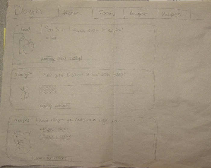
The splash screen, which summarizes food about to expire, budget progress, and recipe suggestions is shown up on logging in. Users can click through to other portions of the site in the boxes in the slash screen or using the tab navigation that is at the top of every page.
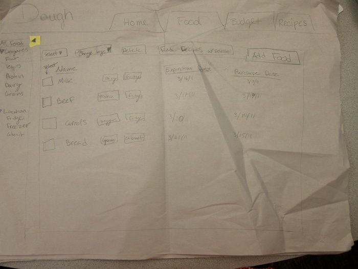
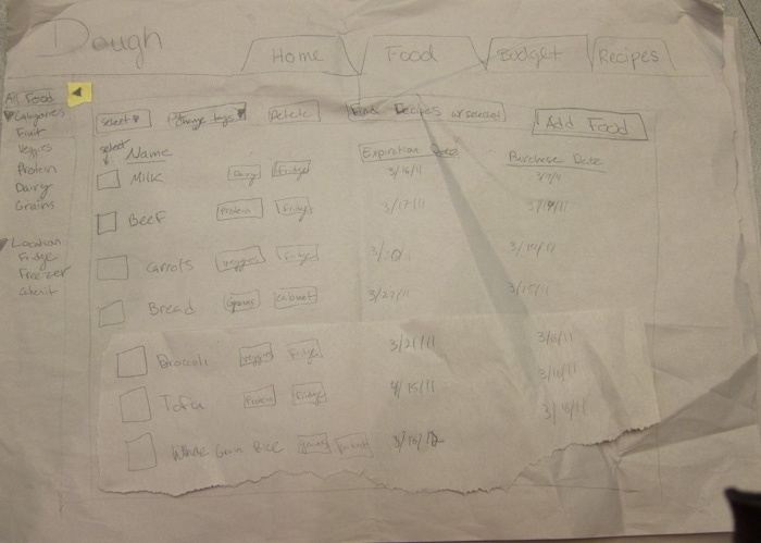
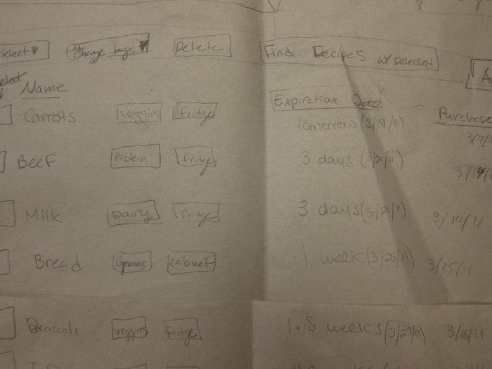
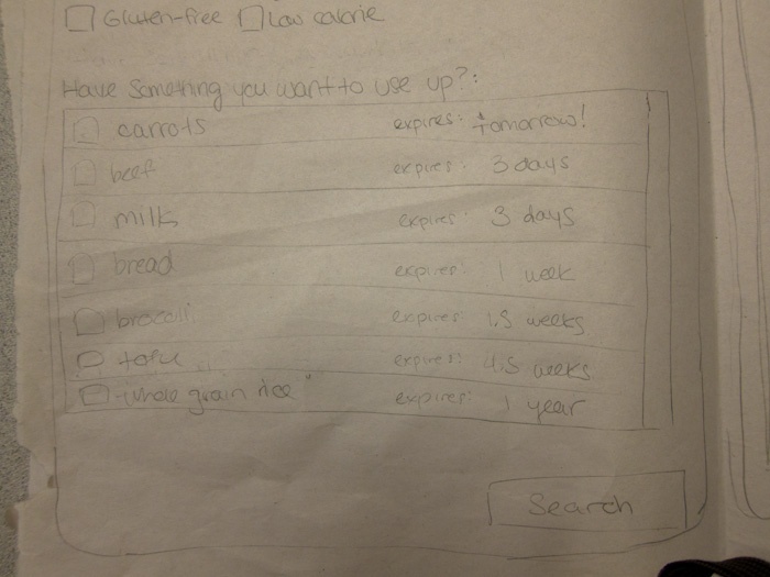
The first task asks the user to see what food they have. This is accomplished on the food page. The food is displayed in a list, initially organized by soonest expiration date. This list can be placed in different orders, and searched. On this page food can be deleted or it's location/expiration dates can be changed. Food is also added on this page by clicking the "Add Food" button on the upper right.
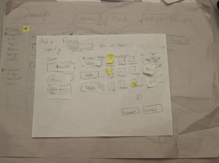
After clicking the "Add Food" button, a box appears over the window where users can enter the food they bought. The system tries to complete expiration date, location and category. In the event of a mistake, users can overwrite the system's choices (in a text box, check box, and drop down box respectively).
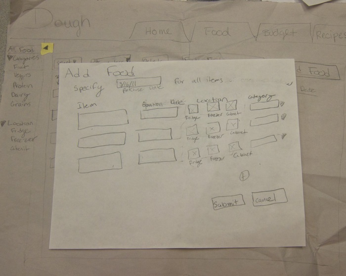
The Add Food Dialog after information is entered. The user clicks Submit when he/she is satisfied.
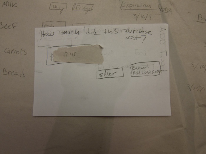
After clicking submit, a new dialog box appears for the user to add the cost of this purchase. The user can choose not to add the cost.
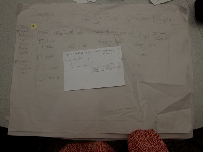
Close up on the adding cost dialog.
After clicking submit, the user will see his or her new items added to Dough.
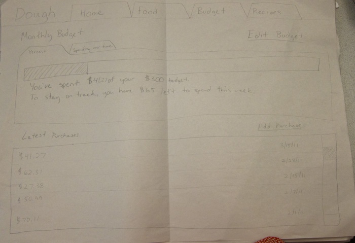
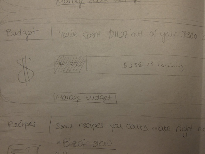
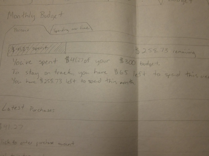
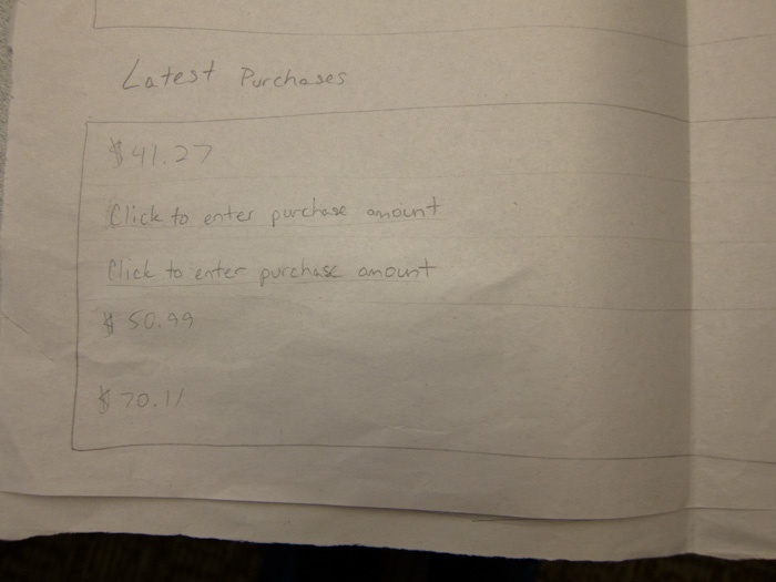
Users can manage and track their budget on the Budget page. The page graphically shows progress on the month's budget and also tells you how much to spend that week to stay on track. Below are lists of purchases (by date) and amounts.
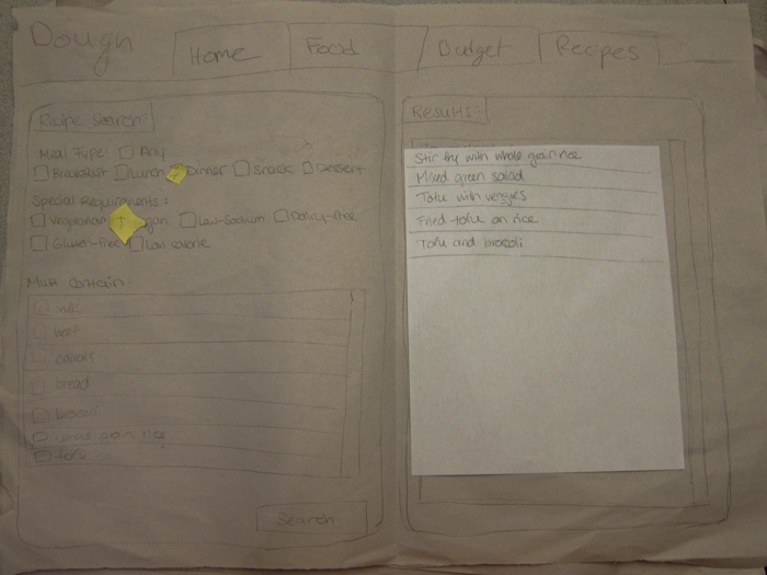
The final page is the recipe page, where users can find recipes for specific ingredients. Meal type and special requirements are specified with checkboxes, and l food to be contained in the recipe can be selected from the list below. After making any specifications, the user clicks submit.
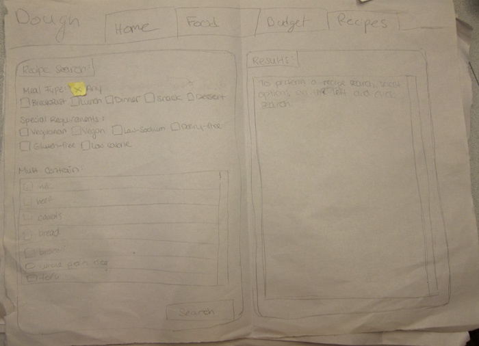
On the right, the window is filled with links to recipes that match the search criteria.
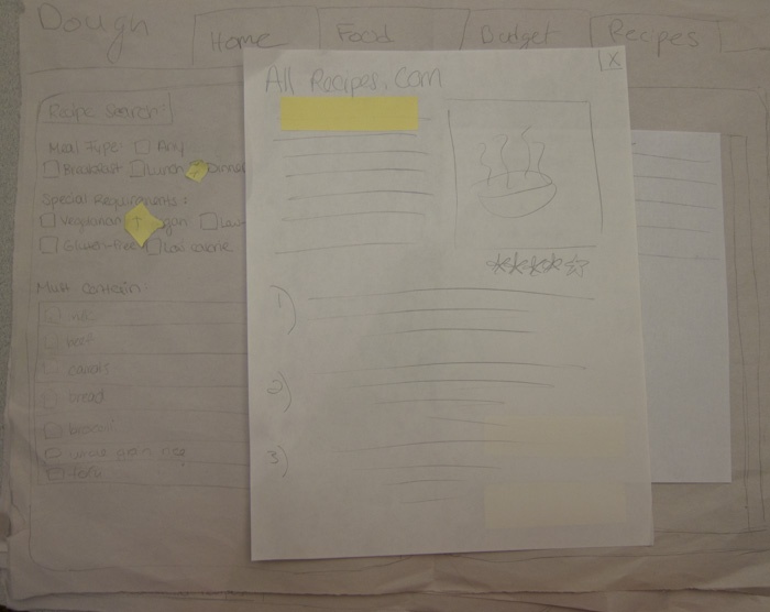
Clicking on any of the recipe links brings up the full recipe.
Briefing.
Dough is a web application that helps you manage your food and your food budget. You can track foods you've purchased, see when your foods are about to expire, look at how much you've spend on food, and find recipes tailored to your food supply. It is built to help you get the most out of your food purchases.
Scenario Tasks.
- It's Wednesday, March 16th. Your vegan friend Bobby is coming over tonight for dinner. You log in to Dough to check what you can make.
- Go to the Dough website and check what food you currently have.
- Your face falls and you sigh dramatically when you realize you don't have anything Bobby can eat. Looks like you need to make a trip to Shaws.
- Check your budget to see how much you have left to spend on your trip to Shaws.
- Wandering joyously up and down the aisles at Shaws you find broccoli, whole grain rice, and tofu. You buy the three items for $12.45.
- Add your food on the Dough site, recording when you bought it, where you're putting it (broccoli + tofu go in the fridge and rice goes in the cabinet), and how much the total purchase cost.
- As dinner approaches, you realize you can't just serve Bobby raw broccoli and rice.You need a recipe for some dish.
- Use Dough to search for dinner recipes you can make with your new foods that Bobby can eat. Since your carrots are going to expire soon, make sure the recipe contains carrots.
Observations.
User 1:
- Used splash page for navigation at first but then switched to tabs at the top of the page
- Carefully scanned pages before acting (studied the pages for quite a long time - other users might not be so deliberate)
- Did not notice that milk was expiring soon (should emphasize this more somehow)
- Found it difficult to calculate the amount of food left to spend this month (This was just shown as a progress bar and "you've spend $41.27/$300 monthly budget". Having to calculate $300-$41.27 puts too much of a cognitive load on the user.)
- Understood very quickly how to enter new foods but struggled a bit with "category" field. The drop down menu helped her with this distinction.
- Seemed happy that fields were filled in automatically with autocomplete even when a few errors were made.
- Changed autocomplete errors quickly
- Seemed happy about feedback of food showing up on the food page after entering purchases
- Did not pick a specific food when searching for a recipe
User 2:
- Noticed that foods were expiring
- Relied entirely on tabs for navigation
- Had trouble calculating the amount of food left to spend this month just like the first user
- Tried to add purchases on the budget page. The "add purchase" button is confusing (this is more for editing purchases - purchases should be added on the food page).
- Wanted to add purchases separately (for each food), but this may be too tedious for some users. Maybe we should find a way to do both?
- Did not pay attention to auto-complete errors (some users may rely too much on the computer's best guess)
- Confused about the "must contain" section on the recipe search page - wasn't sure what it meant
User 3:
- Very quickly scans the page and does not pay attention to details and phrasing (unlike the first user)
- Believes that milk is the only food he has (this is the only food displayed on the splash page because it's about to expire). The food section of the splash page should be rephrased so users get a better idea of their entire food supply.
- Uses tabs to navigate to the budget page but remarks, "I guess I could've clicked on food". He notices that there are multiple ways to get around the website (via splash page or via tabs).
- Available budget was not clear once again.
- Tries to add the purchase on the budget page just like the last user - this process requires clarification.
- Is happy about auto-population: "It auto-populates? Nice!"
- Did not check boxes before performing the search. He seemed to be rushing through the task.
Prototype iteration.
On the second iteration, we refined the information about food on the splash page. We made it apparent that food is about to expire but there are also more foods that the user has (milk and 2 more).
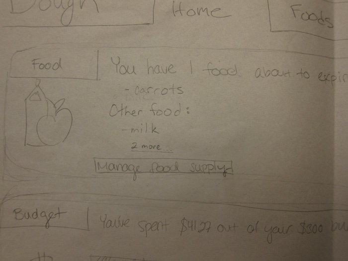
We added more information about the available budget to the budget progress bar representation on the splash page. It displays the amount of money spent already and the money left in the white space.
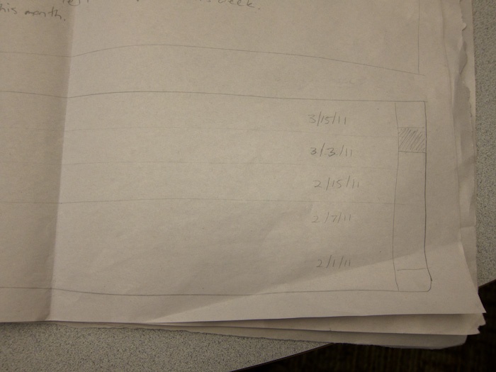
We tweaked the way that expiration dates are represented. Instead of just displaying a date it also has a string that represents the day in easily understood terms (tomorrow, in a week, etc.). This is not directly involved in any of our tasks, but we felt that this would be easier for the user to understand in general.
We altered the budget page to match the changes made to the budget section of the splash page. It displays the amount remaining to the user so they don't have to calculate it.
We removed the "add purchase" option from the budget page as to not confuse users. Instead, prior purchases (entered through the food page) could be changed on the budget page but not added.
We added expiration dates to the foods on the recipe page. We also changed the phrasing to "Have something you want to use up". This gives a clearer indication of the purpose of this field.
As explained above, we decided to only allow users to edit previous purchases on the budget page rather than adding new ones. If they enter in foods on the food page and opt out of entering a purchase amount for them, a placeholder is included on the budget page. Users can click to change this amount to the dollar value that was spent on the foods that day.
Observations on Second Iteration:
User 1:
- Clicked food tab quickly and determined what foods she had (did not use splash page) - we should test how important the splash page actually is to users during computer prototyping
- Was able to quickly determine how much money she had left in her budget (the addition of the numerical value was helpful and lightened the cognitive load)
- Easily determined that "add food" needed to be pressed to add food
- Noticed that auto-population was not correct and changed it right away - this may be more evident because the paper prototype does auto-population slowly. We need to verify that this works during later stages of prototyping.
- Was confused that there was not a way to enter in prices of food individually. This may be a feature we need to add.
- Found the recipe search intuitive and performed the task quickly.
- Understood the "have something to use up?" phrasing on the recipe page.
User 2:
- Didn't use tabs to access food page, used manage food link from splash screen.
- Had some confusion analyzing information on the budget page. "I have $258 dollars for a week?... month?". When asked to find their weekly allowance (stated in text below the progress bar), it took them quite a bit of time. When they finally found it they said, "Oh... I didn't read that". It may be good to represent both the weekly and monthly budget visually.
- No hesitation when going to the food page to add food.
- Not enough categories of food for user.
- Comment about auto-complete: "That's very complicated".
- Didn't specify dinner when searching for food.
User 3:
- Didn't use tabs to access food page - used manage food link from splash screen
- Tried to click on all food
- Was able to read the text on the budget page without a problem and knows she can spend $65 this week.
- Confusion about adding cost of purchase. User thought it should be on the add food window, but kept going anyway and then saw it. There should be more visibility about how purchase costs are added.
- User remembered to check dinner as one of the options for searching for recipe. Overall seemed to find the recipe search page intuitive.
1 Comment
Tsung-Hsiang Chang