GR3 - Paper Prototyping
Prototype photos
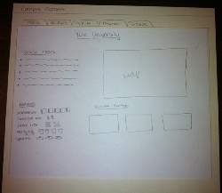
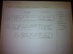
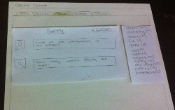
Prototype 1:
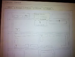
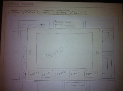

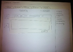
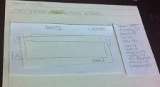
Prototype 2:
Briefing
Campus Connect is a website that helps high school students get more detailed and accurate information about the colleges they are considering through reviews, ratings, photos and videos posted by students currently at the university. High school students can also post questions to ask for specific information they can't find anywhere on the website.
Today we'll be testing our design and we need your help to find the problems with it! We have some small tasks for your to complete written on index cards. Think out loud as you're completing the tasks so that we can understand your thought process. Also keep in mind, that we're testing our application, not you! If you are ok with it we will be also be filming you go through the tasks to help us remember what happened, but don't worry it will be completely confidential.
I'm Gaia and I'll giving you the tasks one at a time. You can "click" anywhere on the paper as though it were a computer screen. I will be changing the papers and moving things around, pretending to be the computer. This is Grafton, and he'll be writing down some notes about the test. Finally this is Kimberly, and she'll be filming.
Scenario Tasks
1. You are a high school student applying to Yale, and you're interested in finding out what the student center looks like.
2. You want to know what the current students think about the party life at Yale.
3. You are very interested in knowing how many Hispanic groups and organizations there are on campus. You already looked through the reviews and you didn't find anything related to this topic, however you really want to know the answer to your question.
Observations
Prototype 1
User 1
- Confused about the difference between the words "culture" and "diversity"
- Tried to click on one of the ratings when looking for information about the party life.
- Confused about the difference between the Forum and the Reviews pages.
User 2
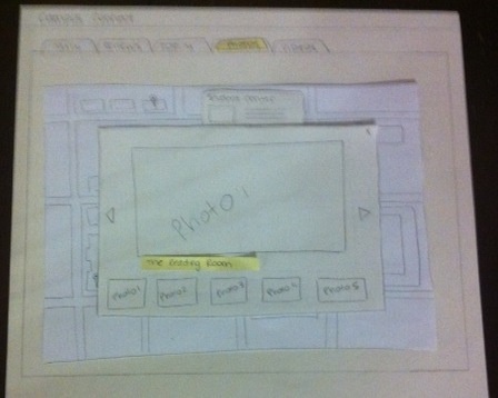
- Really liked how the photo panel resembles the new Facebook one and said ours was better since it shows previous of the other photos at the bottom.
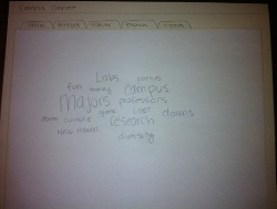
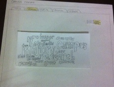
- Said it was fun to have the word cloud to show the different topics. However, she pointed out that the more topics there are, the harder it is to find the one you are looking for.
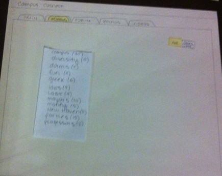
- Asked whether the words in the word cloud were clickable and whether they would be different colors. She also didn't realize that the height of the words corresponded to the frequency of the words.
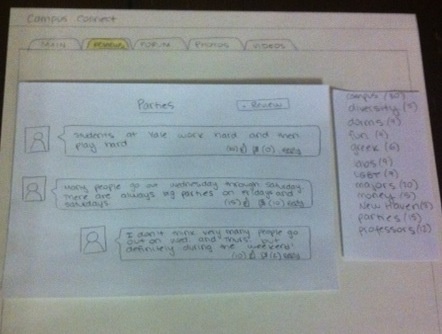
- She commented that the word "Review" had administrative, very official connotation associated with it. Therefore, if she was looking for something not official like information about the party life, she would think to go to the Forum and not the Reviews page.
User 3
- Initially clicked on "Recent Photos" when looking for a photo of the student center.
- Confused about the difference between the Forum and the Reviews pages.
- When looking for a topic in the word cloud, she went through all the words starting from the top left until she found the right one. This is inefficient when looking for a specific topic.
Prototype 2
User 1
- Was wondering whether she could click on the ratings to find out more information about the topic (parties).
- Was an "explorer" type of user. She clicked around the website and kept coming back to the main page to see what information was available.
- Said that the toggle button to change between the alphabetical list and the word cloud was not very clear.
User 2
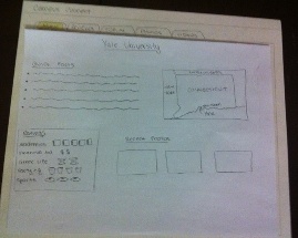
- Mentioned that it could be useful to have SAT scores, admission rates and other official statistics on the main page.
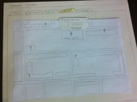
- Got confused when she saw a map appear in the Photos tab. She said it would be helpful to see pictures when you open the map or if the tab's title were "Map".
- Was not very clear about the difference between the Reviews page and the Forum page. She said that the forum was probably open to everyone, while the reviews could only be written by the students currently at the college.
User 3
- Wasn't sure how he could add a comment to the reviews.
- Was interested in knowing what the ratings were based on.
- Mentioned that it would be cool if the ratings on the main page would link to the corresponding section in the reviews tab.
Prototype iteration
After Prototype 1:
- On the Main page, we made it clearer that the map was showing where Yale was in Connecticut and not a campus map.
- We realized that the word cloud is not effective when you have a specific topic in mind, but it's very effective when you're just browsing. Therefore, we added a toggle button to the Forum and Reviews page to change between two different visualizations: the word cloud and an alphabetical list of topics.
- We also added the text "Ask Anything!" to the Forum tab to make it more clear what this section was for.
- In the photo panel, we added captions to the photos.
After Prototype 2:
- We learned that the Main page is very important to users. Many of them kept going back to the Main page to see what information was displayed in it.
- The map in the Photos tab is confusing because the photos aren't being immediately displayed and it's not clear how the map is related to the photos. For the next iteration we should find a way of incorporating more photos onto the map so that it is more intuitive for new users.
- We repeatedly saw that users were confused about the differences between the Reviews and the Forum pages. There also seemed to be a strong connotation with the term "review" indicating that it referred to administrative/official reviews. Our intention was for the reviews to be written by students currently at the college and that these reviews would be unofficial. As a result, in the next iteration we will most likely change the name of the reviews tab to something like "Student Reviews". We might also decide to change the forum tab to something involving the word "questions".
1 Comment
Vijay Umapathy
Good setup with briefing and tasks. I'd like to have seen more reflection on the user tests (especially the first) regarding what you felt were the core problems with the UI (with regards to learnability, efficiency, errors, visibility) based on the overall comments from users and how this led to the specific changes that you later outlined. Writing down that logic is an important part of the design process. Other than that, really nice work!