TrackIt - Paper Prototyping
Prototype Photos
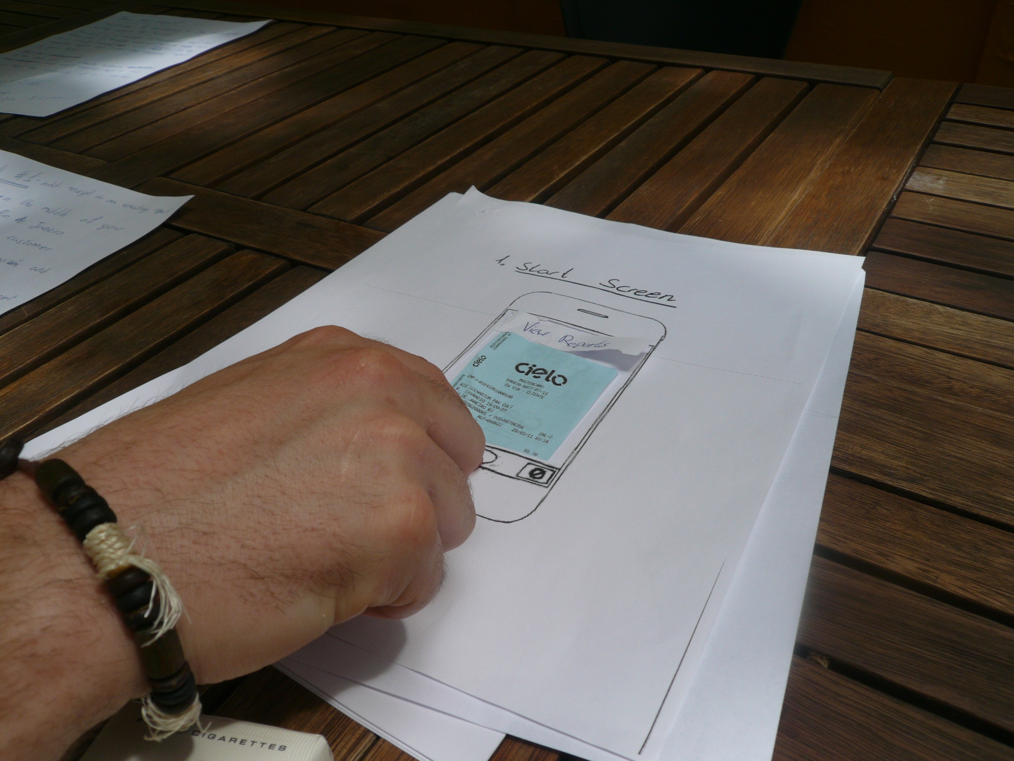
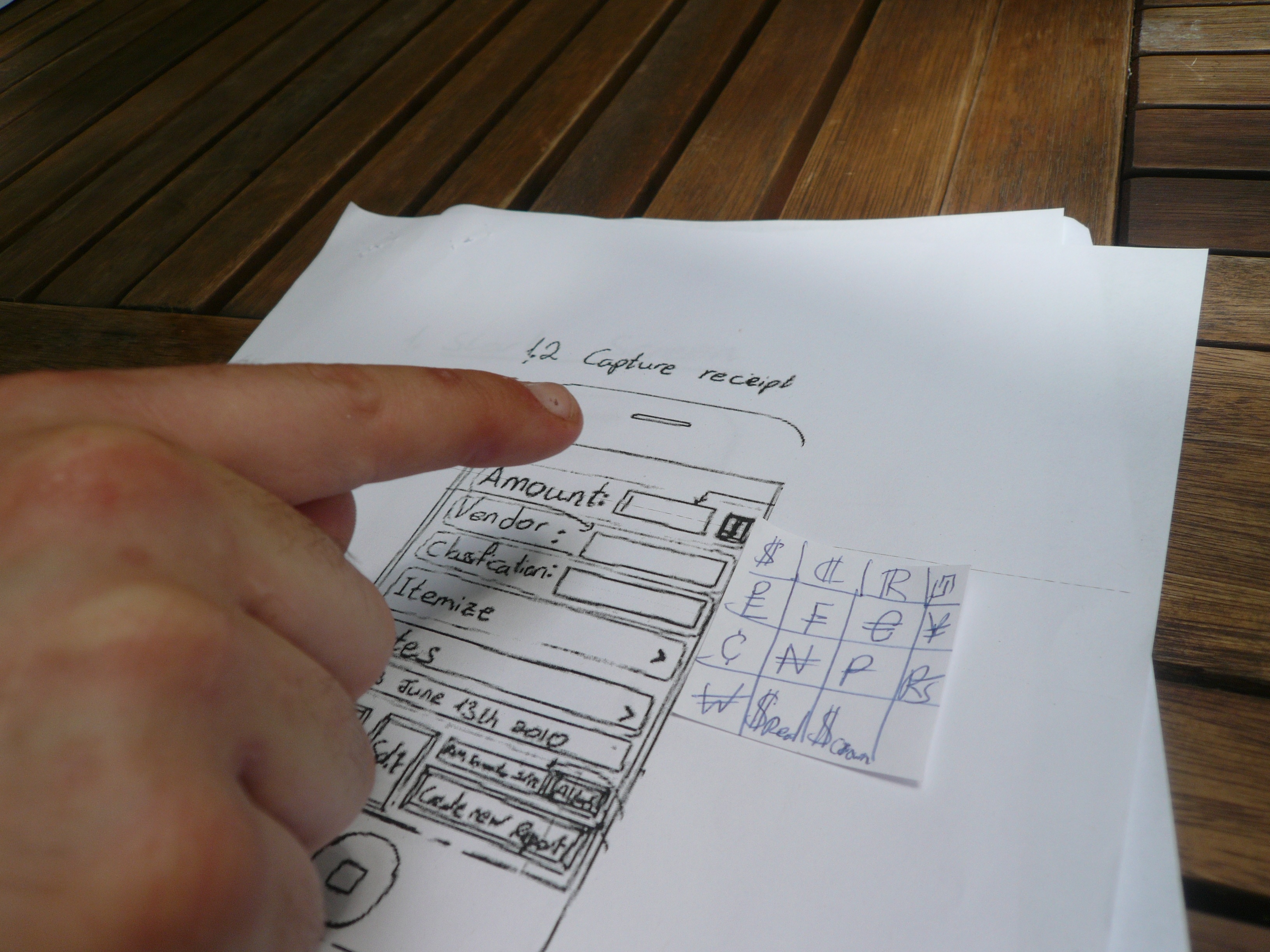
First prototype:
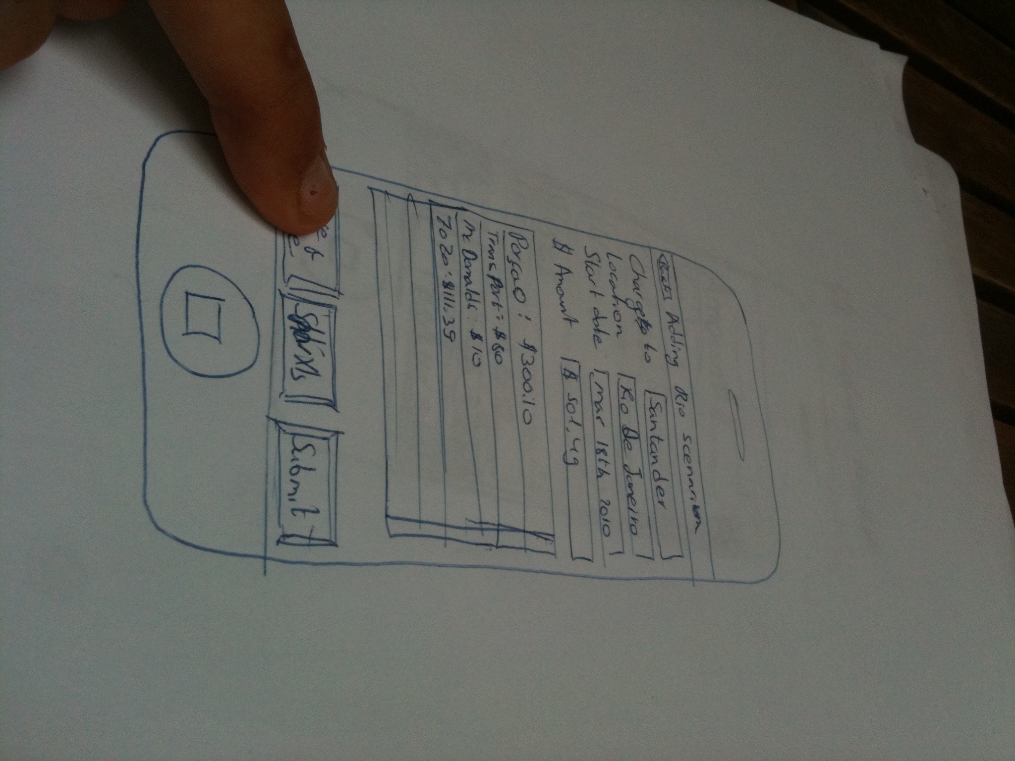
Second prototype:
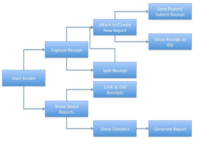
Interface logic
Briefing
Below is the briefing text that was given to a test user of TrackIt:
Dear test subject!
Thank you for participating in the prototyping testing session for TrackIt.
TrackIt is a receipt management tool that allows you to create expense reports, scan and classify receipts, add receipts to the expense reports and submit expense reports to your boss.
In this test you will create and edit expense report and help us test the usability of our interface.
Thanks!
Our UI group – Bryan, Eddie and Liron.
Scenario Tasks
Below are the 4 tasks that we wrote on the index cards for our test users (each sub-bullet illustrates a subtask that was not written on the index cards):
- Task 1 - Add receipt to an existing report
- You are in the middle of your business trip to Rio de Janeiro. Last night you took a client to “Rio Scenarium” and paid for drinks.
- This morning you want to add your receipt to your expense report of the Rio trip.
- Scan (take a picture), classify and add your receipt to your Rio expense report. Then save and close the report.
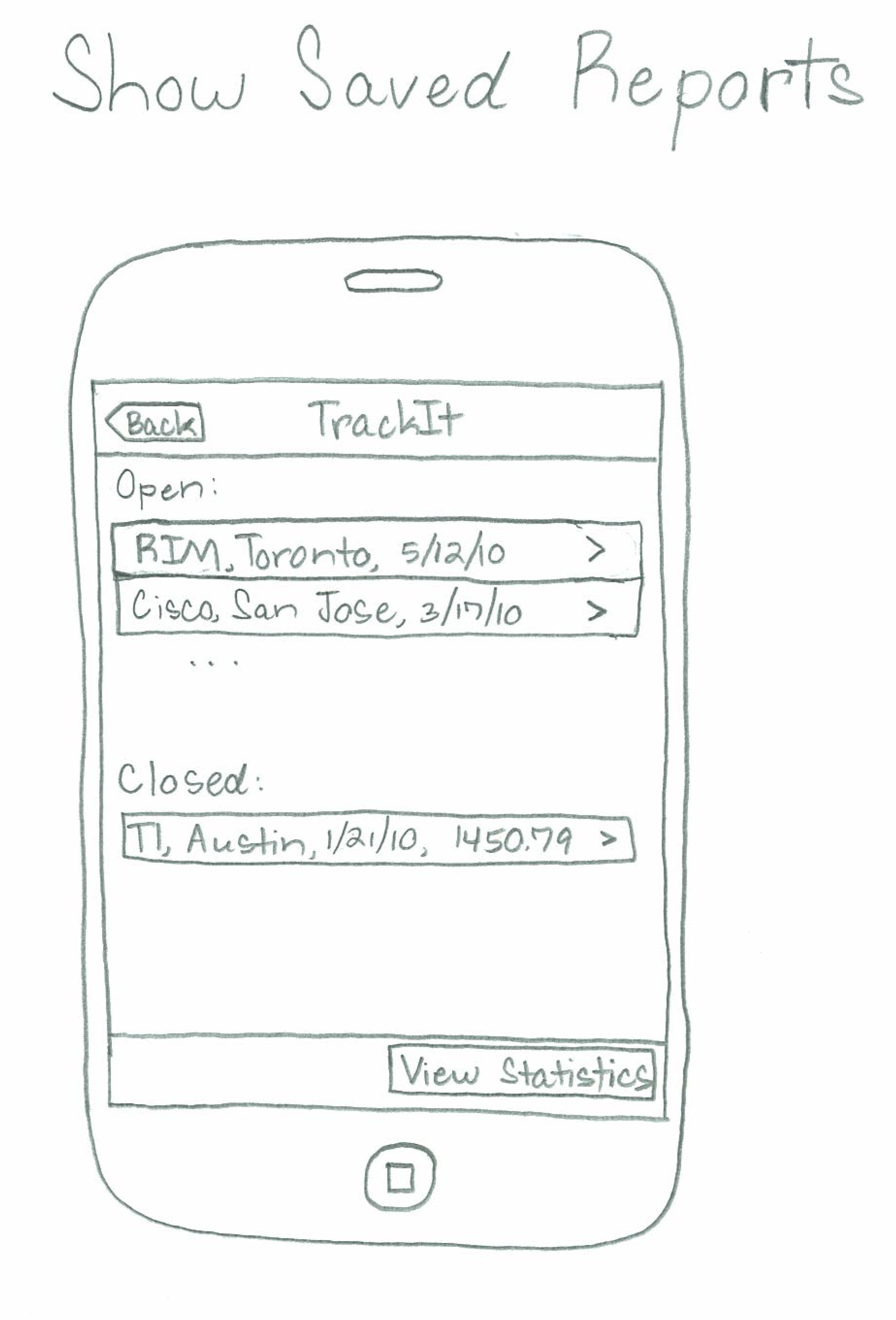
- Task 2 - Submit expense report
- Your last trip to Toronto, Canada, is over, and now you wish to submit your expense report to your boss.
- Find your old “RIM Toronto” report and submit it.
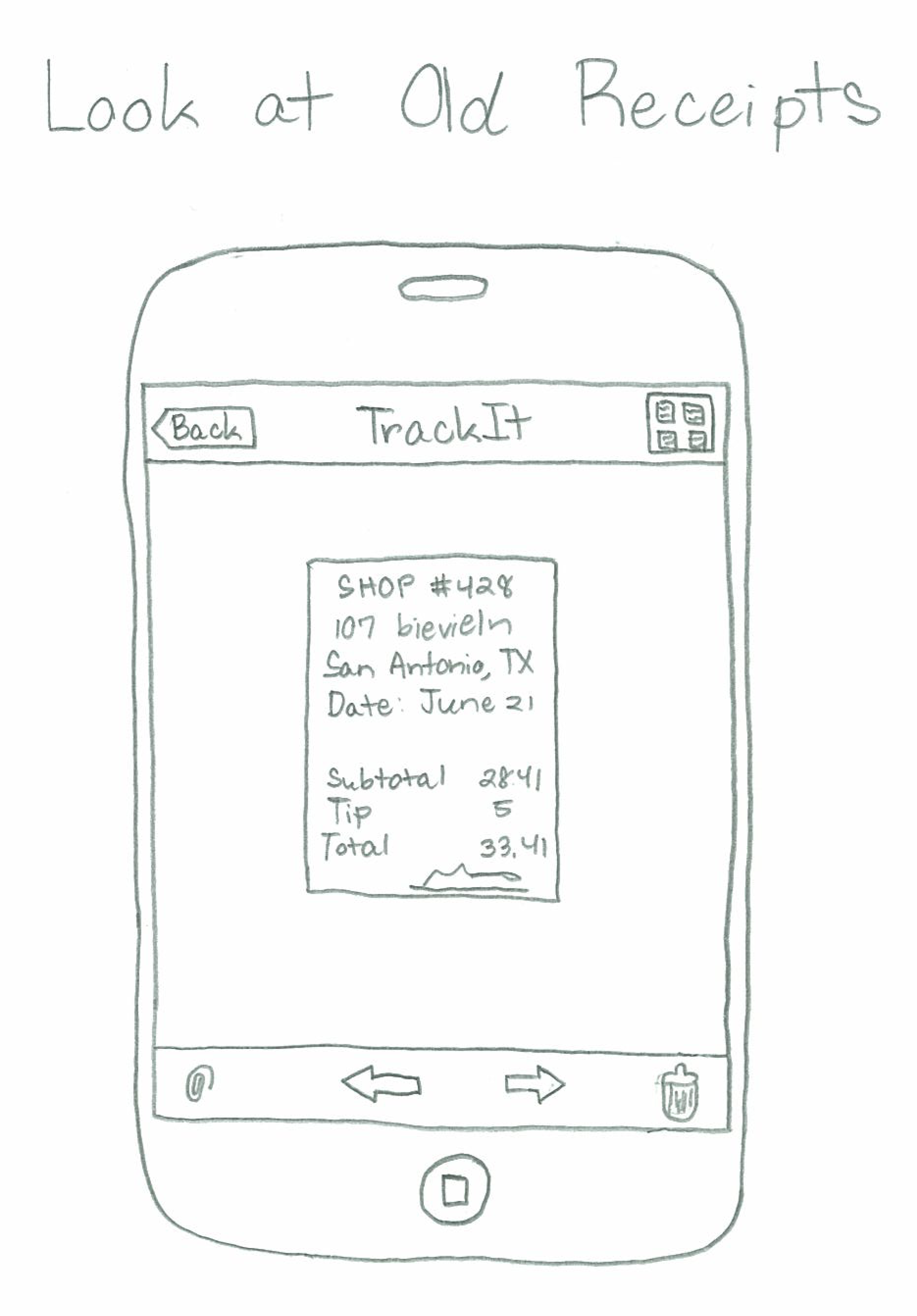
- Task 3 - Edit amount on old receipt
- You just realized you classified the wrong amount on your last purchase trip to Toronto.
- Find the old purchase and edit the amount.
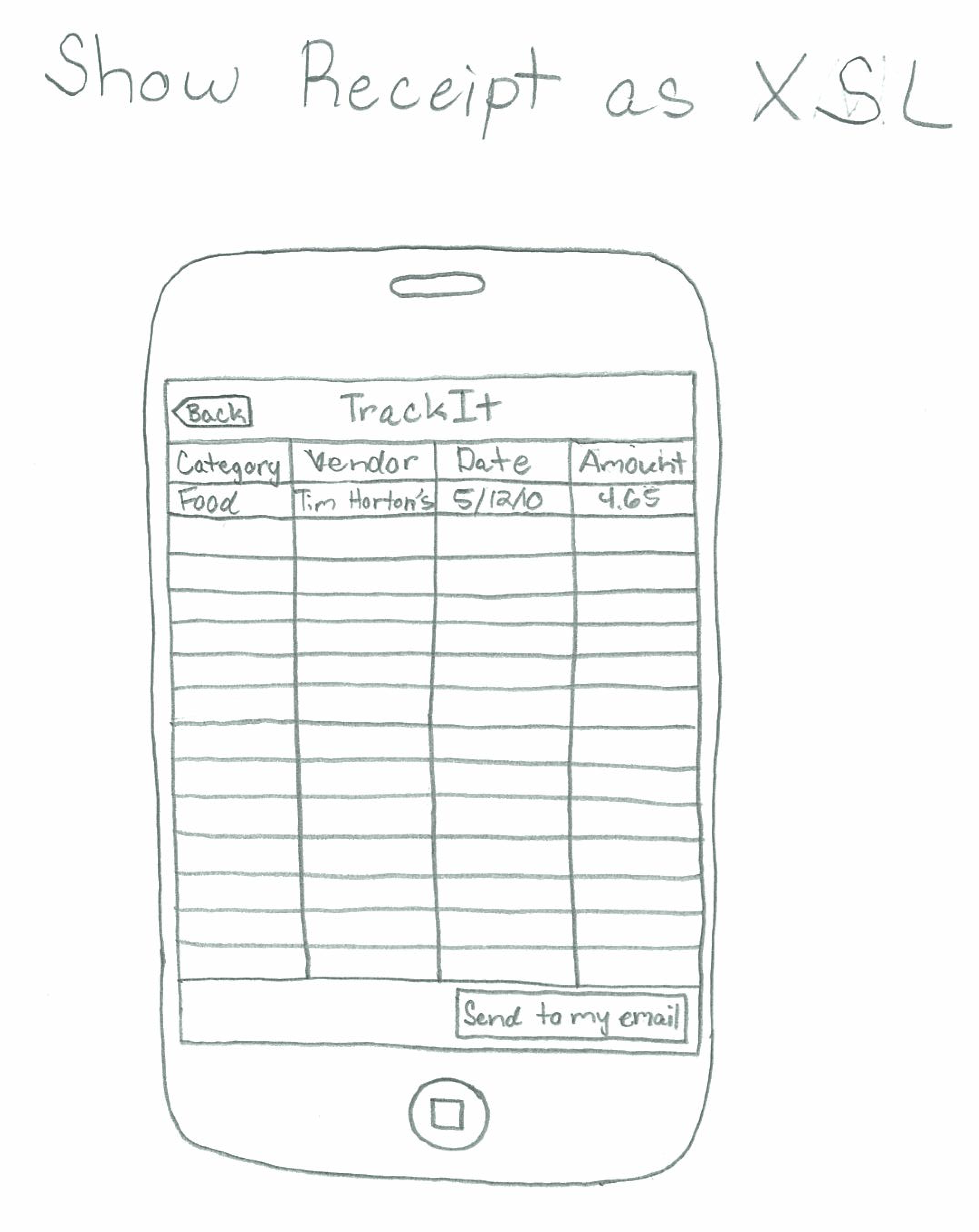
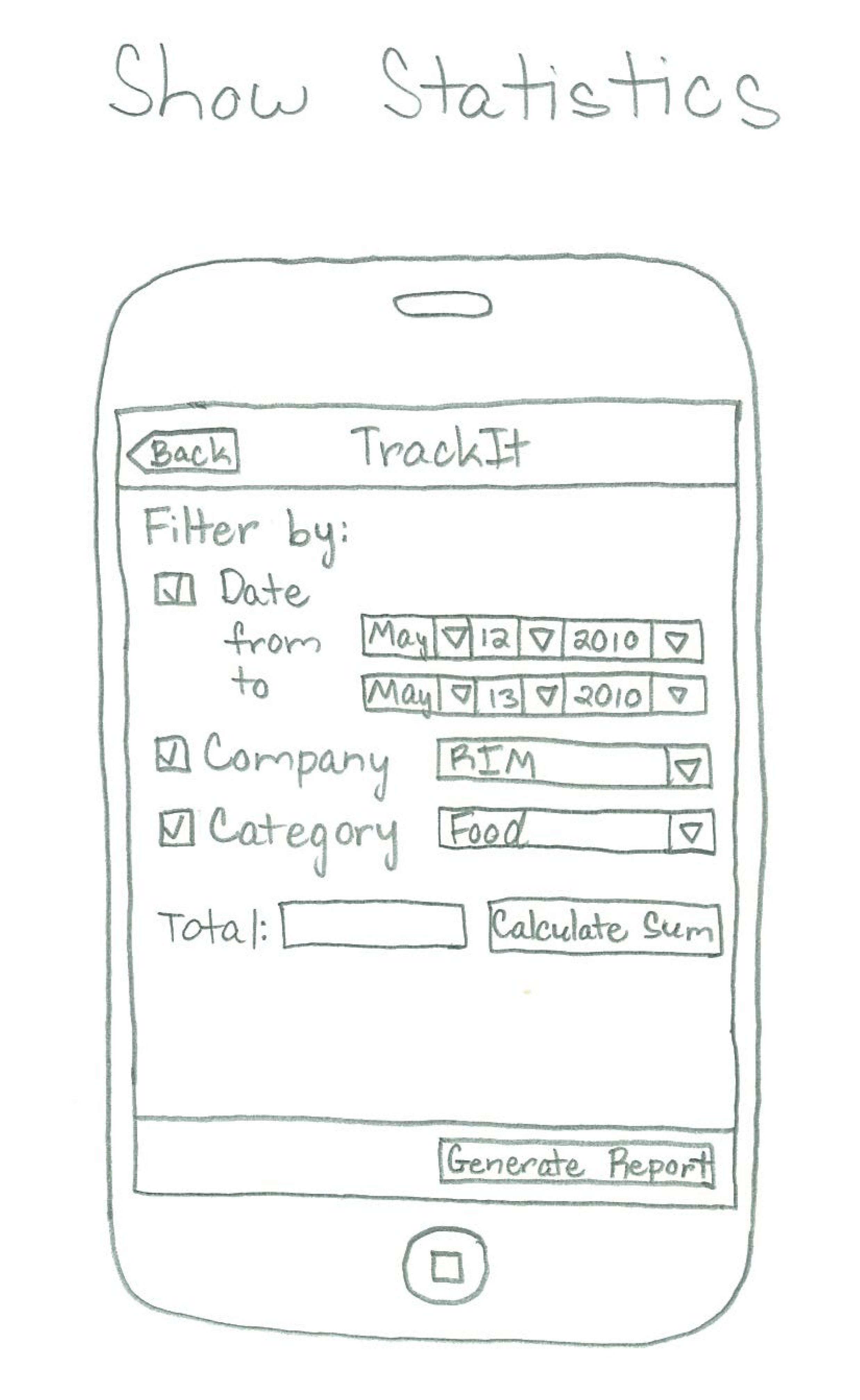
- Task 4 - Show statistics
- Find how much you spent on food on business trips to RIM locations this year. Generate a report and send it to yourself.
Observations
Below are the main observations from each round of testing (each round dealt with a different prototype):
First Test Round/Prototype
Task 1
- “What does vendor mean? The client company or the receipt issuer?” Wording was unclear on screen 1.2.
- “What does classification means?” The user only understood classification after clicking it and seeing the drop down menu with the different classifications (“Food”, “Transport”, “Accommodation” etc). Consider changing the wording.
- User clicked on “Itemize” because he didn’t understand what “Itemize” means. Even after looking at the itemization screen he didn’t understand. I needed to explain to him that some receipts might require itemization if there are multiple items on them that requires different categories.
- User accidently clicked on Submit instead of “Save and Close”. This could be a problem with the task description and not a problem with the UI.
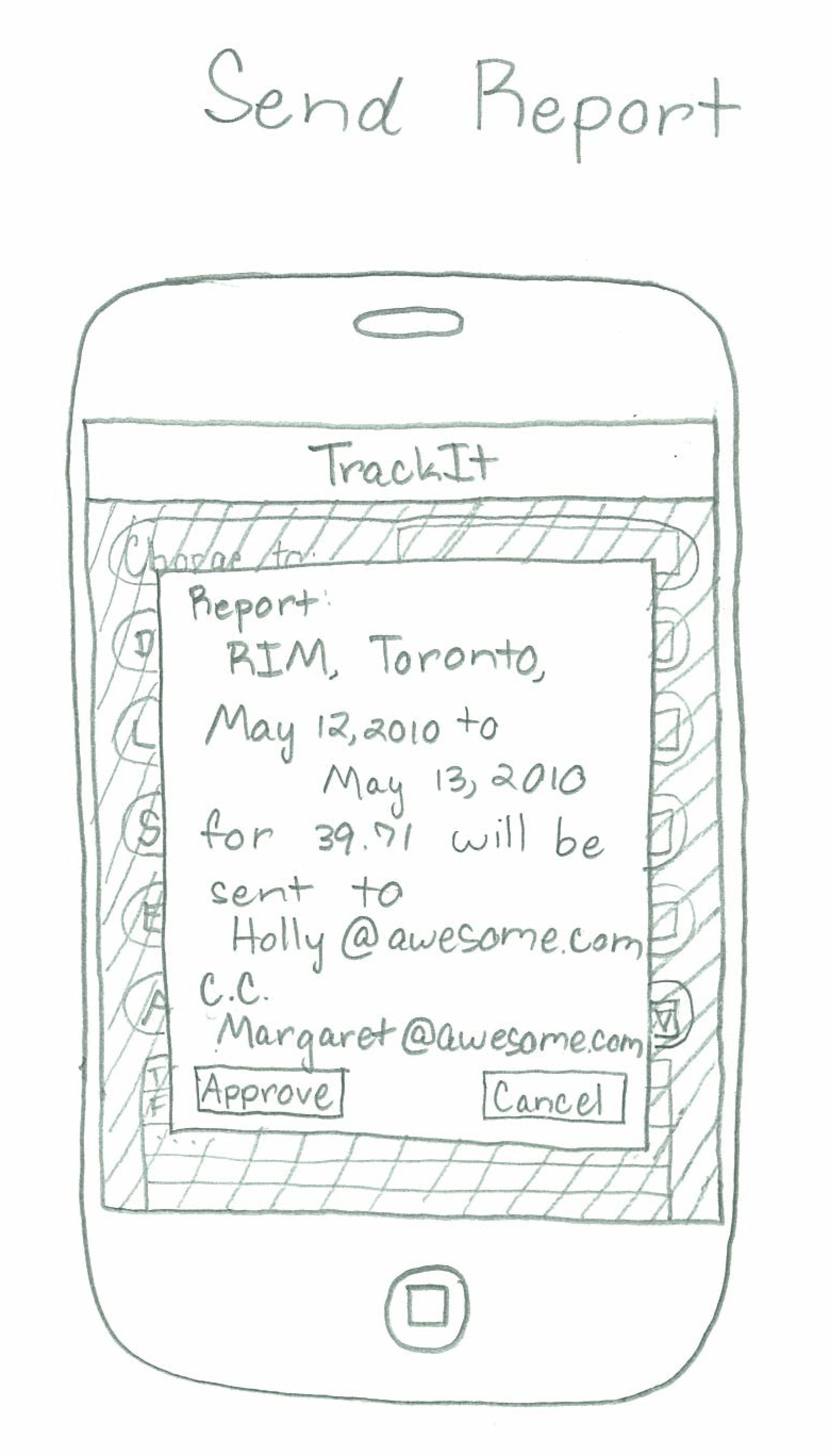
- On screen 1.2.2.1, when sending the report, user asked “What if I want to send the report to someone else?” I explained the user that the reports are only supposed to be sent to your boss and financial departments, but the user commented that sometimes different reports would go to different divisions.
- “Approve and Cancel should be switched”
- “I need to look back at the receipt to itemize, but it does not appear in the next 1.2”. Maybe worth considering showing a thumbnail of the receipt on the classify receipt screen.
- User could not find the right currency to use. Currency icons are confusing and require prior knowledge.
- “I like it” when looking at screen 1.2.
- User made an error when trying to type in the date. He mistook the calendar for a numerical keyboard and tried to type “3” for March.
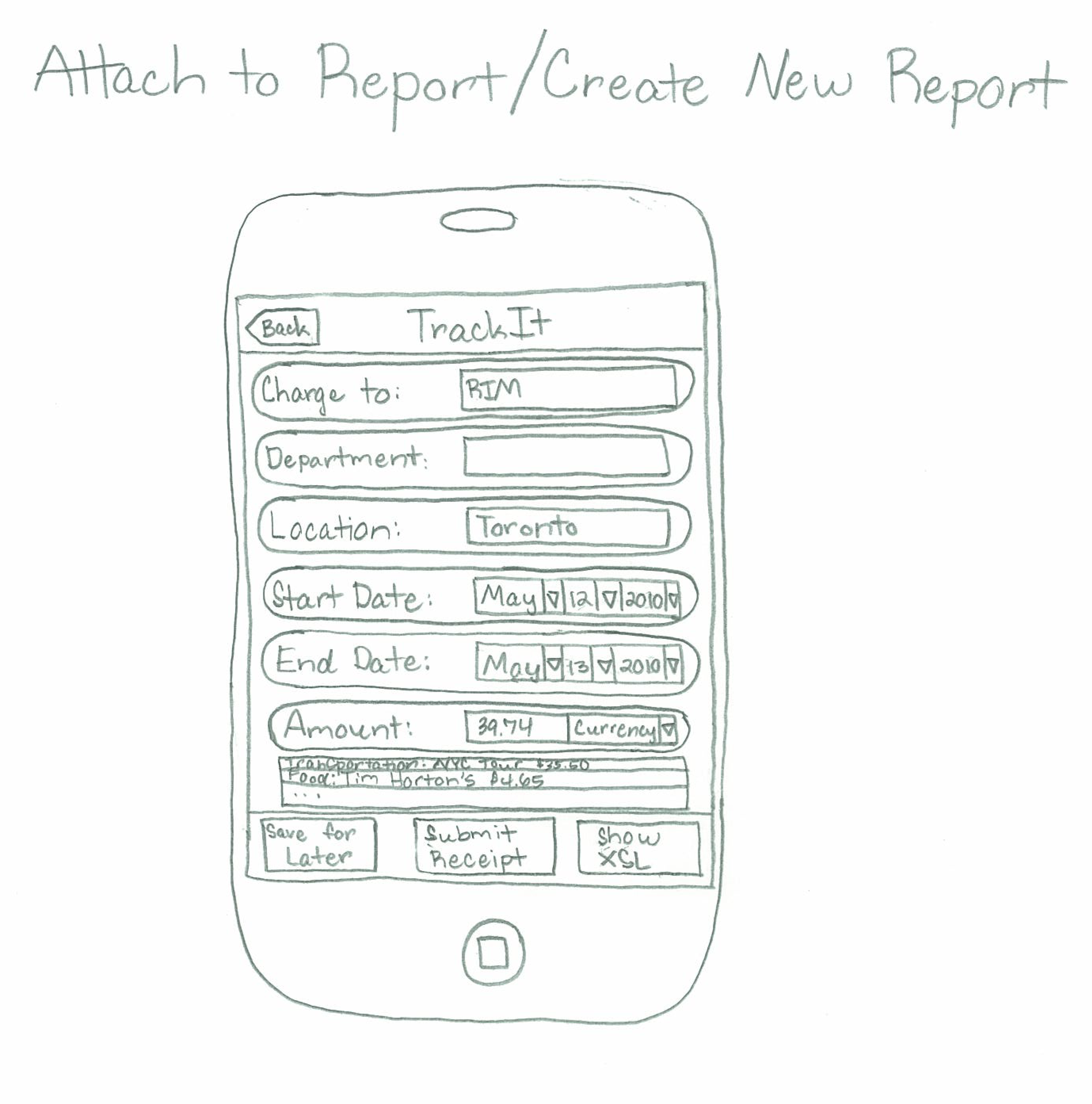
- “’Attach to report’ is hard to find”. Being the most common action, the button should be much bigger and centered.
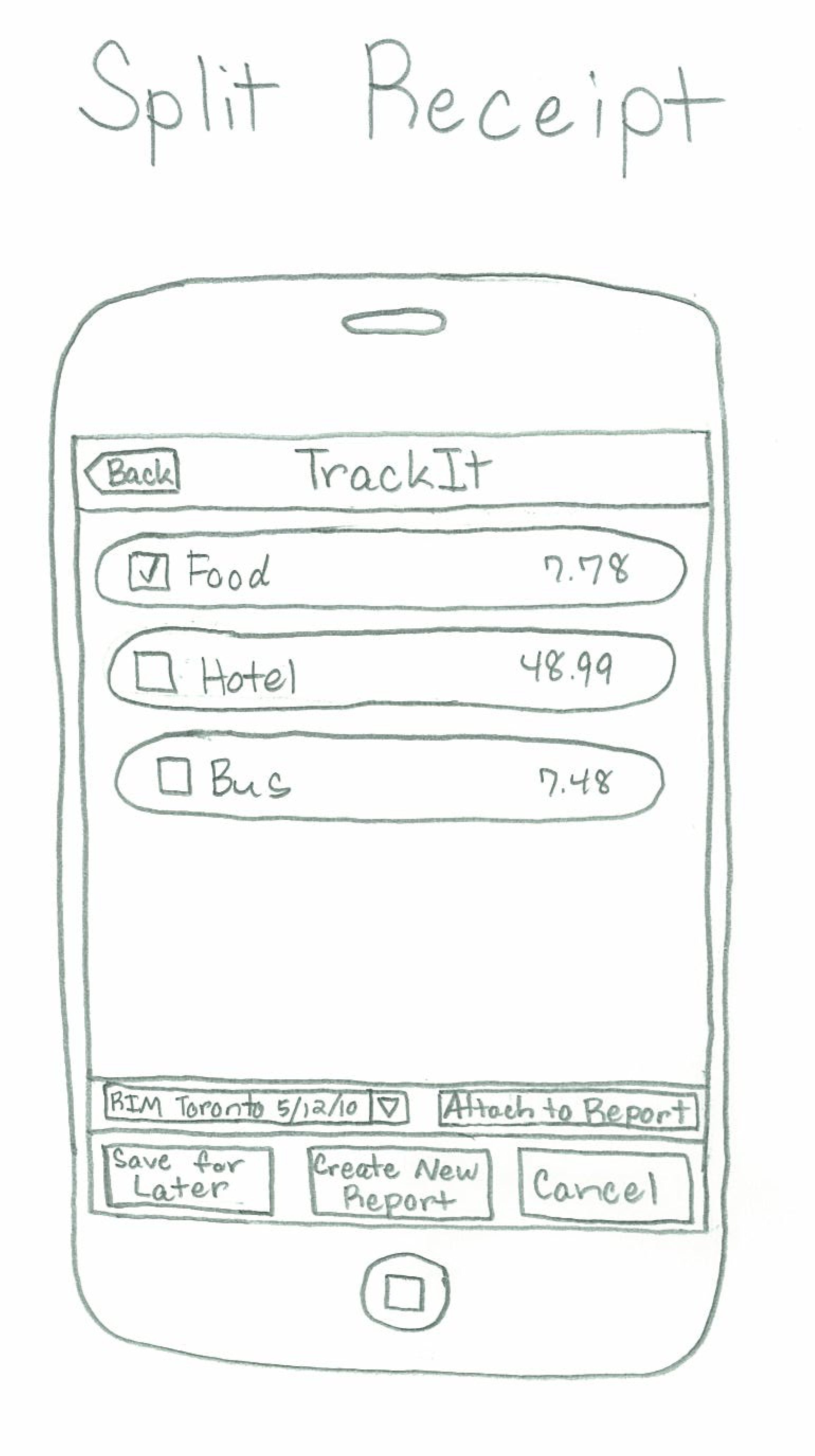
- “What is ‘Split’" Since “split” only makes sense for itemized receipts, shouldn’t that option be on the “itemize” screen?
- Need better indication of which report I am adding the receipt to. Maybe have that be the first choice made by the user, and then have text indicating the report at the top of the screen.
- User added receipts to the wrong report! This error would also be hard to recover from, requiring the user to delete receipt from old report and then recapture it.
Task 2
- User made an error, clicking on the receipt icon at the button of the screen instead of on “view old reports” while trying to recover from that error. User did not notice the “done” button on the top right side of screen 1.1 and chose to close and re-open the application.
- Second user also didn’t notice “view old reports” button and attempted to click the camera icon.
- “Shouldn’t it say ‘view/submit old reports’?”
- User wasn’t clear on when he is looking at a specific report or a specific receipt.
- User commented that the “camera roll” icon is confusing, because in other screens, the same location is saved for “back”.
- User took a long time to find submit; buttons are too small and submit should be bigger and in the center.
- User chose “Save and Close” instead of submit and wasn’t sure what was the difference.
- On screen 1.3, one user commented that he would prefer having all reports on one list with color indicators of which are open and which are closed; other users didn’t mention that.
Task 3
- Most users had no issue.
- One user hit “Submit” after editing the receipt instead of “save and close", accidently submitting the report.
Task 4
- One user hit the camera icon instead of “view old reports”. After understanding his mistake he managed to find the right screen.
- Another user clicked “view old reports” but missed “view statistics”. Thus the user went back to his old RIM report, and this only showed the expense from the last trip. When asked to show only food expenses from the entire year he appeared confused and couldn’t find the right button. Only after being directed to “show statistics” he had managed to complete the task.
Second Test Round/Prototype
Task 1
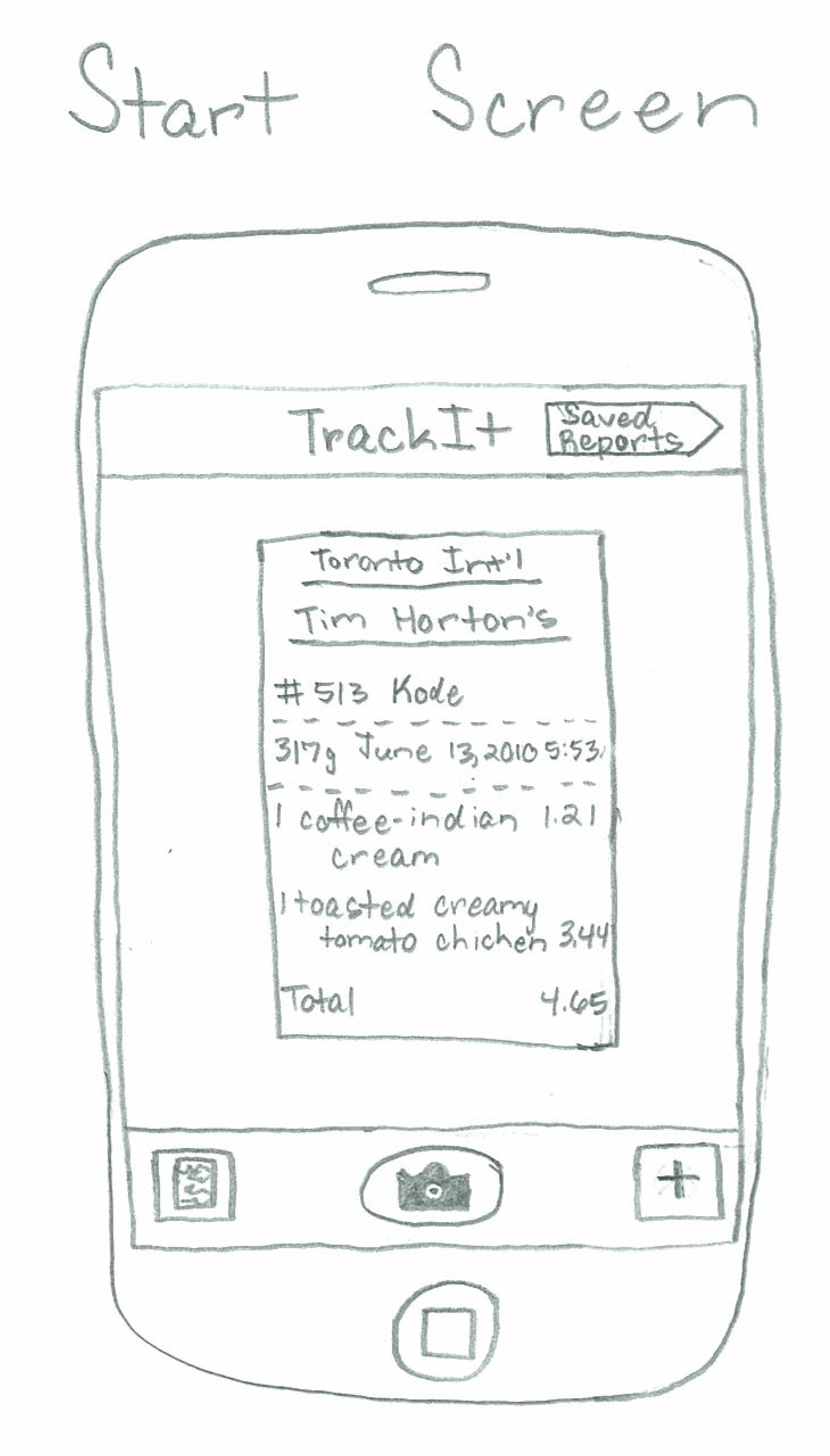
Start Screen:
- User was not sure which button to hit to enter the receipt details
- Icons are unclear
- Footer is not consistent with the remainder
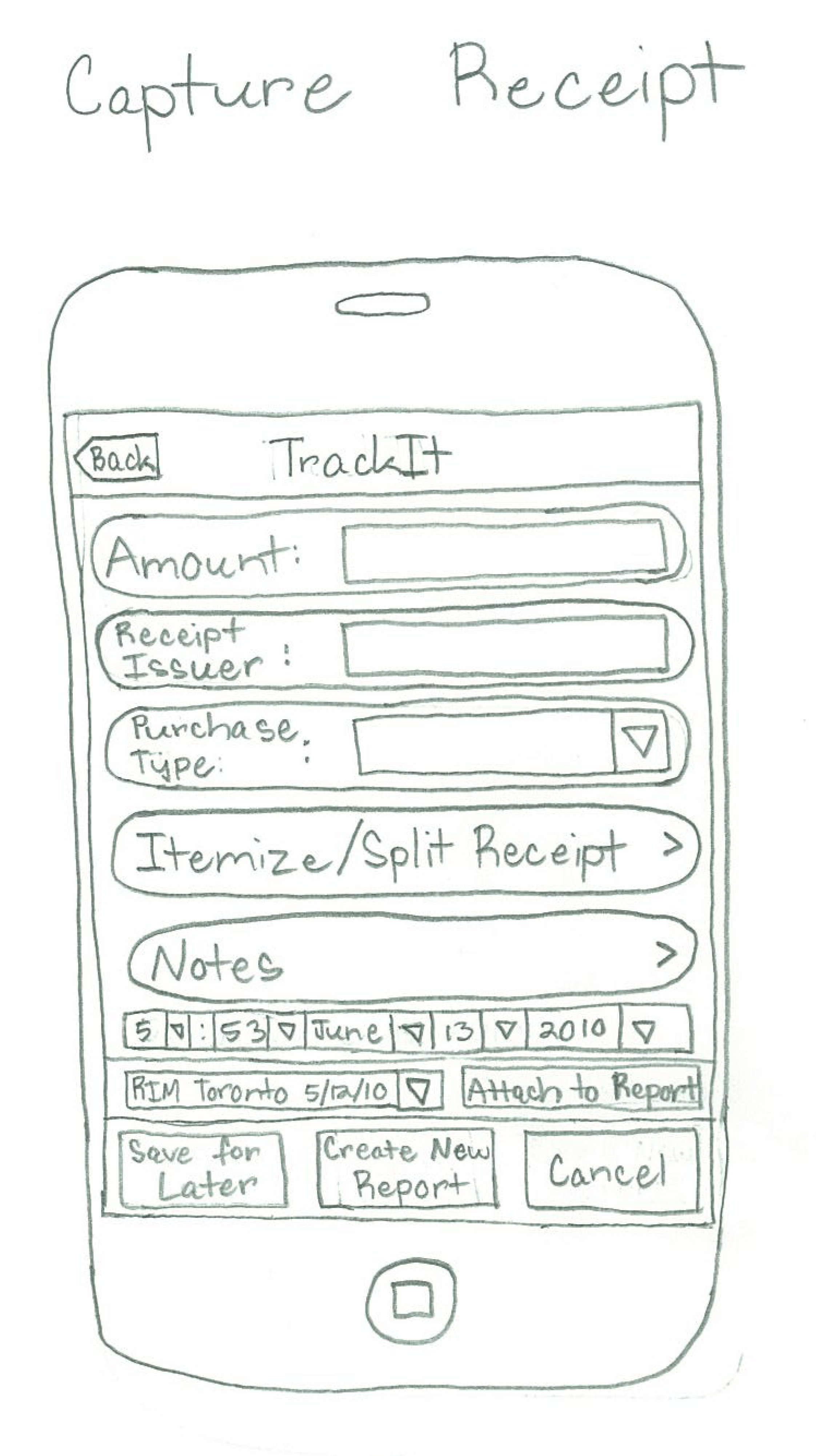
Capture Receipt:
- Not sure how user should know if or when user has to itemize/split
- User can save receipt for later without attaching, but is unsure how to access that receipt image later on
Split Receipt:
- Into the depth of this screen, users become confused and often lose track of their task.
- One user was confused by lack of a confirmation dialog when attaching the receipt.
Task 2
Start Screen
- Saved reports button is not immediately visible
Show Saved Reports
- User suggested showing the amounts in the saved report view
Send Report
- Users would like to be able to access saved receipts
- User would like to be able to get more information about the report easily
Task 3
Look at Old Receipts
- Unclear which button opens the receipt for editing
- The interface should display the amount actually recorded on system for the receipt
Edit Receipt
- Users would like to see the receipt as they edit the amounts. They don't have the physical receipts available to them easily anymore.
Task 4
Show Statistics
- User is unsure why calculate sum button exists; thinks this should just be calculated automatically
Generate Report
- Generate Report should give the option to display on mobile or send to email.
- User suggested wording on buttons in modal dialog could be clearer
Prototype Iteration Changes
Here are the changes between the first and second iterations of our prototype:
- Added a title bar to each screen. The title bar will contain the name of the application and any other buttons expressing functionality.
- Added the "Back" button to all screens where it is applicable to have such a button.
- Changed the "View Old Reports" button to "Saved Reports" and moved the button to the title bar.
- Modify the look of the bottom right button icon on the "Start Screen" screen.
- Rearranged the "Save for Later", "Create New Report", and "Cancel" buttons to be in the bottom title bar on the appropriate screens.
- Added an "Attach to Report" button with an accompanying drop-down box on the appropriate screens.
- Put together the Itemize and Split Receipt actions into one screen.
- Added the Department text field to the Attach/Create Report screen.
- Forced all date fields to be drop-down menus.
- Changed all "Save and Close" buttons to be labeled as "Save for Later."
- Added a button for a thumbnail viewer for the "Look at Old Receipts" button.
- Switched around the Approve and Cancel buttons on the "Send Repot" screen.
- Changed the text on the "Capture Receipt" screen to be more clear for the user to understand.
1 Comment
Anh Dang Viet Nguyen