Prototype Photos
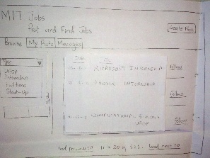
The user is a MIT affiliated and thus chooses to sign in using his MIT Certificate
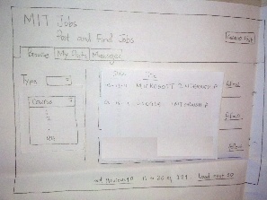
He then selects the type and chooses Internship.
After choosing the type, he then selects the course 6.
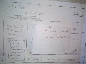
After choosing the course, he then selects the Job Group to be software. And then he chooses the Microsoft interview.
Then an overlaid window appears and the user choose to follow the job group.
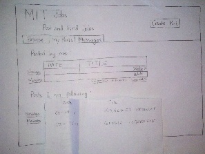
After following, then he chooses the tab "Posts"
He then sees the posts that he is following.
He chooses to message the Microsoft Internship post creator.
He is redirected to the "Message" tab, he writes some message and sends it. And he is done for the day.
Briefing
MIT Jobs is a website that will replace Anne Hunter's mailing list. A recruiter will be able to create an account an directly advertise internship or fulltime positions on the site. An MIT student with a start-up idea can find students to work with by advertising his/her idea on the site. A professor or grad student seeking a UROP can advertise their available position on the site. On the other hand, an MIT affiliate can browse all posts on the site by different categories if interested in finding something to do that meets some criterion. With this in mind, we will give you some tasks, try to accomplish them, giving us as much feedback as possible in the process.
Scenario Tasks
- You are an undergraduate Student in Course 6 looking for a summer internship. Search for a relevant posting and send a message to the creator of the post to inquire about the details of the Position
- Browse for internship in Course 6 and select one that you like. Follow that job post to get regular updates on the position.
- Create a post to recruit a technical partner for a start-up you have been working on.
- For the post you just created, write a message to all users following the post.
Observations
Day 1
- User 1 tried to sign up even though the briefing we gave said “You are an MIT student..” and the home page says “Sign in with MIT Certificate”.
- User 1 was looking for a link to message followers of a post he had created directly from “My Posts”.
- On the post pop-up two users noticed it was not clear who was allowed what actions on a post. Clear distinction needs to be made such that creators of a post know they can save/edit/message followers of a post and viewers of a post know they can follow/unfollow/message creators.
- User 2 did not realize that when he added a filter, posts would be dynamically updated. He was looking for a “Search” button while adding filters.
- User 3 was looking for ways to follow a post or message creator directly from the browse page.
Day 2
- User 1 mentioned it would be useful to have a search bar to search on company, location etc.
- User 1 raised the concern that he could not save a message for later sending, so we need to be able to save messages as “Drafts”.
- User 3 accidentally deleted a post, and wanted to be able to undo the delete. We need more undo’s for actions.
- User 2 mentioned that while creating a message usually the “To” is already populated with either followers of a post, or creator of a post. We need to have a drop down for the “To” with separate headings for “Followers of my posts” containing names of posts you have created and “Creators of posts I’m following” containing names of posts you are following.
- User 3 was given a task that he is a recruiter and has to create a post, but he tried to go for the “browse” tab, which was disabled for non-MIT people. Instead of disabling the tab, we should not display it altogether.
Prototype Iteration
Changes after the first round:
- We added the ability follow/unfollow a Job post directly from the browsing page.
- We added the ability for the creator of a post to message the followers of that post from his/her "My Posts" tab.
- A creator of a post can also delete that post directly from his "My Posts" tab. On deleting a post, a message will be automatically sent to all the followers of the post notifying them that the post is no longer available.
Changes after the second round:
- Allow browsing by company, location or start date.
- For the specification of recipients of a message, we enable both the messaging of a user and a post. On messaging a post, the followers of that post are messaged.
- We will enable the undoing of deletions (of messages and posts) by displaying a message at the top "The post/message has been deleted. UNDO." Where the UNDO is a link to revert the deletion.
- The "Browse" tab will not be displayed for all non MIT-affiliates.


1 Comment
Vijay Umapathy
Solid briefing and screenshots - nice work. Tasks look concrete, short, and relevant to your UI. I'd like to see a bit more reflection on the specifics of your observations from the testing rounds - how did they pertain to the UI principles and your UI in particular (visibility, efficiency, errors, learnability)? What were core takeaways from your first iteration and WHY did you make the changes you made for subsequent iterations? These should be in your reflections after any user test.