GR3 - Paper Prototyping
Prototype photos
Iteration #1
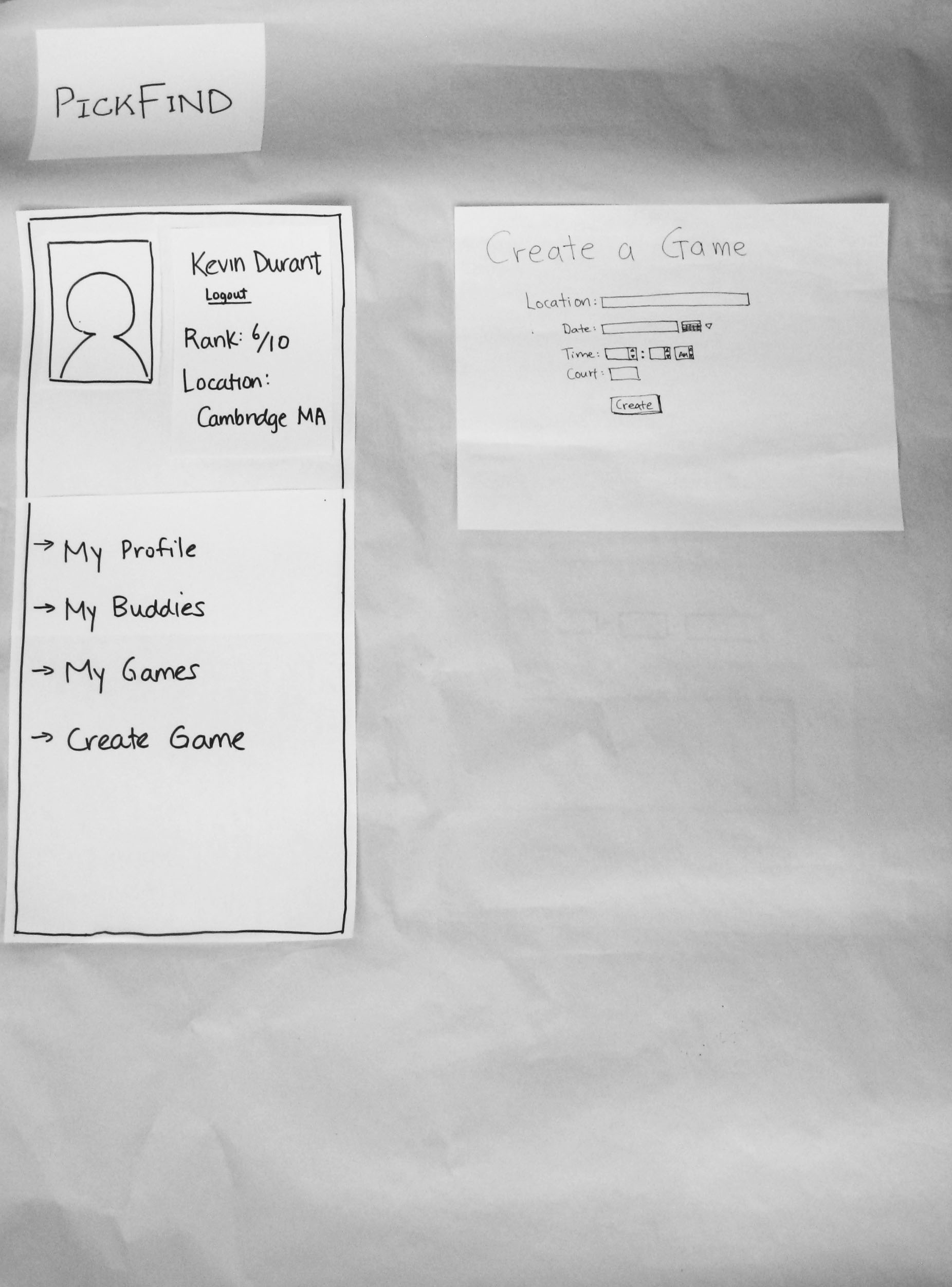
The "Profile Page" is displayed when the user clicks "My Profile" on the left menu. User is asked to edit/update their profile information here. After saving changes, the user is returned to the main page (see below).

The "Create Game" page, displayed when the user clicks the "Create Game" link on the left menu. User is asked to create a new game by filling in this form. After saving changes, the user is returned to the main page (see below).
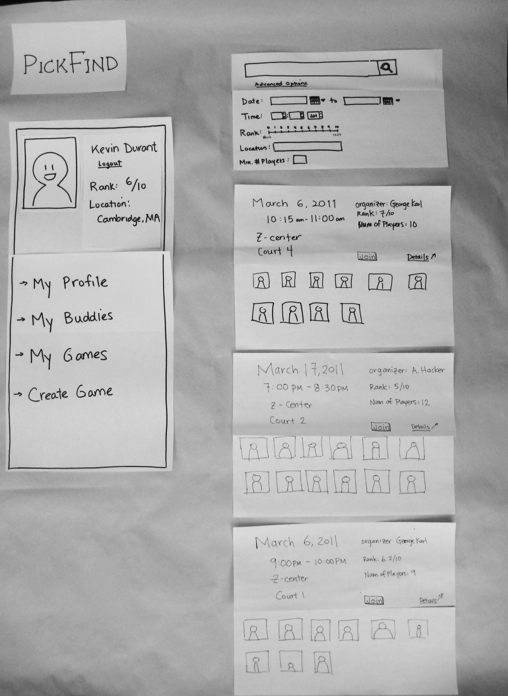
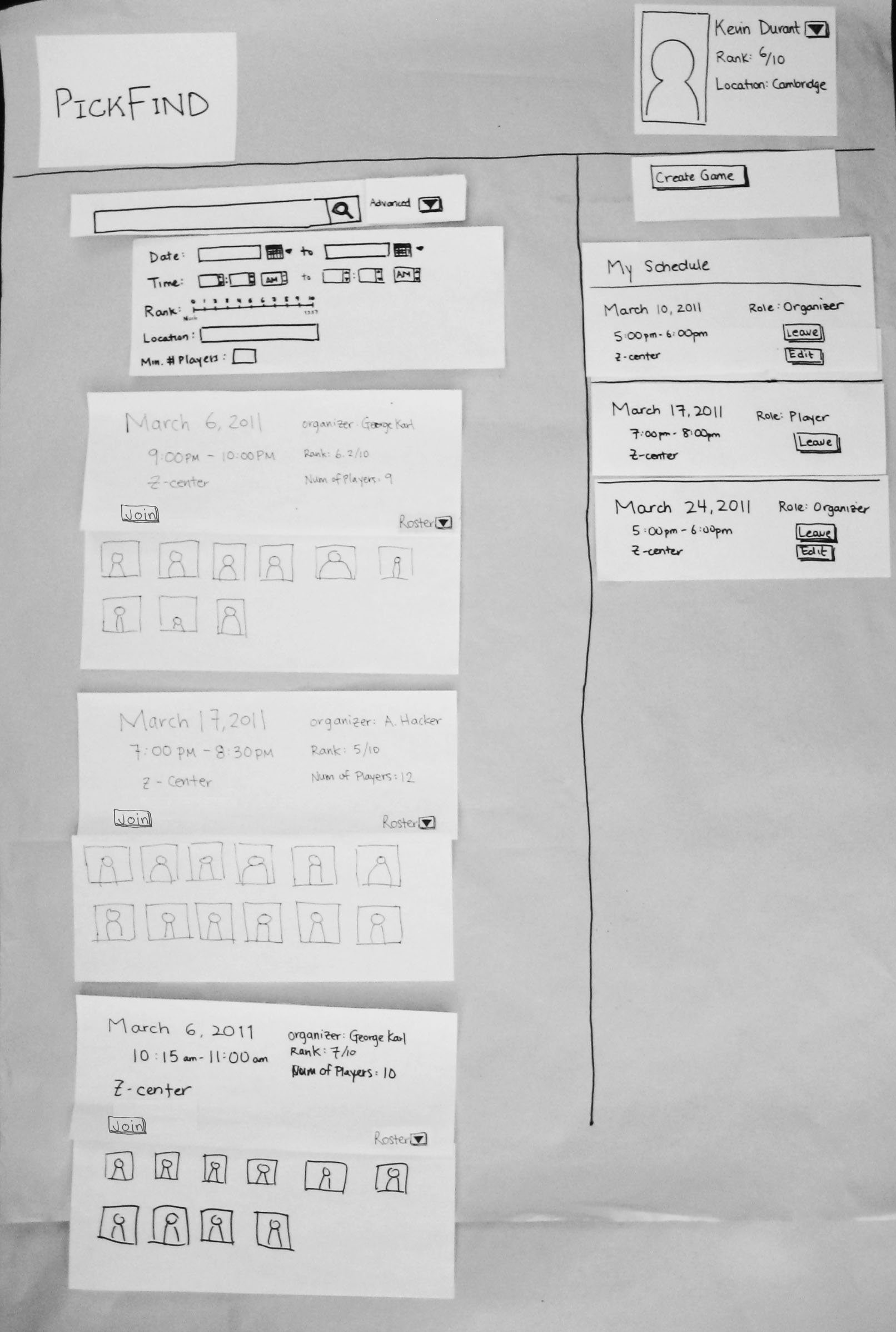
This is the main page of PickFind. Here the user can see a list of all games that have been created. They can click on advanced search to use the search filters drop-down frame. It will filter the list of games to find ones that match their preferences. Clicking on game details slides down a list of participants to the game. Clicking on the join button slides open options for the user to join as either player, observer, casual interloper, or referee.
Iteration #2
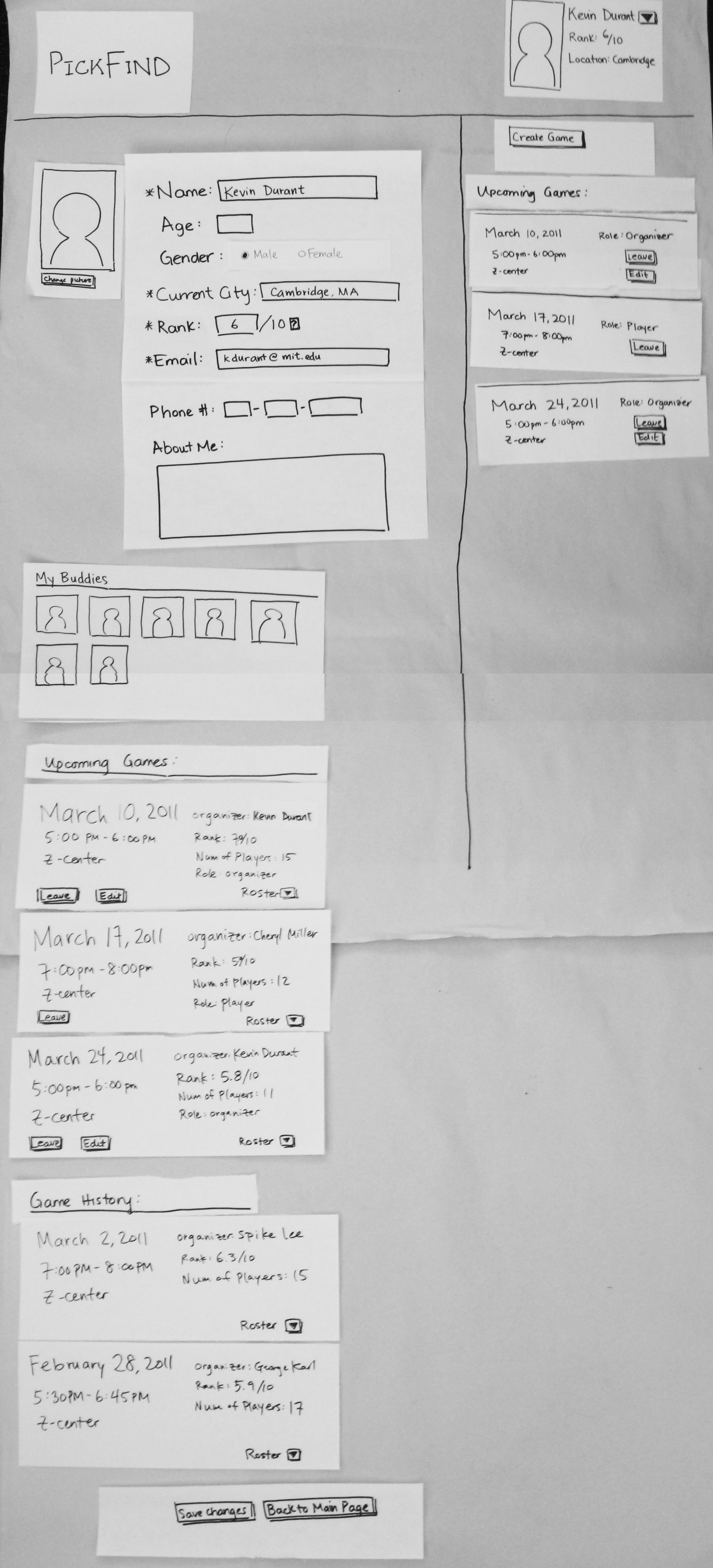
The "Profile Page" was improved to include the user's buddy list as well has a list of upcoming games and a game history. The bulk of the information is now on the left, with static information about upcoming games on the right.
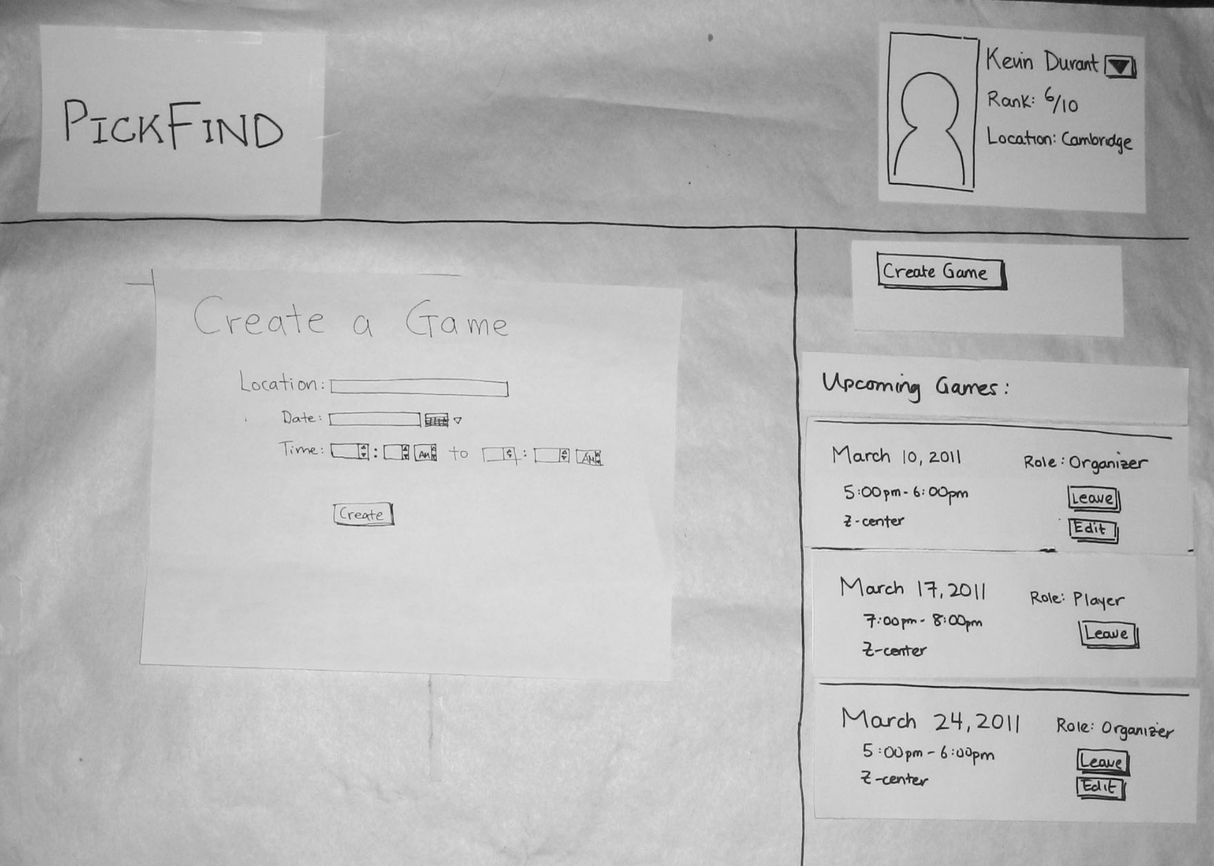
Similar to the original "Create Game" page, except the form is now on the left.
And once again, with the main page, the information is now on the left pane. Also, the search filter for time was updated to allow the user to enter a time range.
Briefing
PickFind is a web application that facilitates the process of finding enjoyable pickup basketball games to participate in. Currently, the process of finding pickup games is variable and uncertain. A player is typically uncertain of whether or not there will be a game to participate in when he or she shows up at the court. This can lead to discomfort and even discourage players from heading to the court at all. Players have trouble finding sufficient others to play with and they tend to prefer to play with people at their skill level and people whom they know.
PickFind was created to collate and organize all of the information regarding players and games so that like-minded players could come together to play pickup basketball. Active games are created with a series of game details specifying logistics. Players seeking games create public profiles on the site. And then search for games that appeal to them. In order to find the best fits, they can search through games based on criteria that are important to them.
We hope that PickFInd will help pickup basketball players to find more and better games to partake in -- thus improving the physical health of the universe.
Scenario Tasks
- Edit Profile: Update personal information for your profile page. Your profile page will contain information that identifies yourself to others. In the context of this site, your profile will provide the necessary information for other users to identify for the purpose of playing pickup basketball together.
- update your location to your current location
- update your rank from 5 to 6
- update email to kdurant@gmail.com
- Create Game: Initiate a game by providing the necessary details. Use the game creation page to establish a landing point for all players interested in playing at the time, location, and skill level that you establish. Potential players will be able to view all of the game parameters you set to determine whether or not they would like to join. As they join, they will be added to the game page. Since you are the game creator you have admin power to edit the game parameters as needed.
- set a date in April
- set a location near you
- set a time during the night
- Find Game: Search for a game that best fits your criteria and decide whether or not to join. Use PickFind to filter all active games based on the specific details that are important to you. Choose a time that is convenient for your schedule. Choose a location that you would ordinarily frequent. Choose a skill level that would be within a competitive range for your abilities.
- filter for March games
- filter for Z-Center games
- filter for games equal to or below your own rank
- look through results to find a game that fits your criteria
- join a game as player
Observations
First Iteration of User Testing
- User 1
- user wants to scroll the single column list of available games
- doesn't know which courts are available for playing basketball
- misses search functionality at the top of the page
- gender choice - should change from a selection box to a pair of radio buttons (either/or)
- user doesn't understand rank
- user has difficulty finding navigation for the main page
- user wonders how to close out of game details drop down
- User 2
- user would rather not specify an exact time. Instead, wants to select something such as "evening"
- user wants to select Z-Center (i.e. from a drop down menu)
- user wonders what to do if there is nothing to join on the day selected
- clicks on myprofile - finds relatively intuitive
- finds rank to be confusing
- doesn't want to give out personal information such as phone number, or even email address
- clicks on create game
- user wants a more general time range (ex. afternoon, or evening)
- confused about court number
- User 3
- user likes the layout of the start page
- user expected more to be shown when clicking on details of a game
- wonders how to create a profile - register with the site
- would like to scroll through available games
- doesn't notice the button for viewing additional games (button adds more games using javascript to the end of the column list)
- user is engaged in filling out the profile information
- wonders how to set a profile picture - does it need to be a personal photo?
- estimates a ranking for himself, but is unsure of whether it is accurate
- creates game fairly easily - wants to know if it can be modified
- searches through games, and adds himself to two games on the same day
Second Iteration of User Testing
- User 1
- user sees profile information in the top right, tries to click their username instead of the arrow.
- tries arrow next, and sees the drop down menu.
- no problems updating fields in Profile
- when looking through upcoming games on Profile page, was wondering why the game information displayed was different from those listed in the static right pane.
- tries to put Cambridge for game location when creating a game instead of gym name
- User 2
- likes the "newsfeed"-like design on the right showing upcoming games
- easily reaches profile page
- after reading the description for rank, thinks it's weird that it's called "rank" because the user saw it more as a grading/rating system
- asks to clarify whether the stars on the create profile page mean the fields are required fields
- tries to edit buddies on profile page
- thinks the save button is too far from the editing of profile
- wishes there was a location lookup when creating games
- User 3
- puts Z-Center when updating location field of profile
- wonders what syntax to use for location field of profile
- took a while looking for how to save profile
- wonders what syntax to use for location when creating game
- wasn't sure if roster closes if "mouse" stops hovering over the arrow
- wants to use a drop-down menu for location when filtering
Prototype iteration
Several changes were made after the first iteration of testing:
- Confusing fields in our Profile page and Create Game page were fixed.
- The gender field was changed from text box to a pair of radio buttons.
- A help ‘?’ was placed next to the “Rank” field. Clicking the “?” button would pop out a message explaining how a user should rank themselves and how the rank is used.
- Added “*” to identify fields that must be filled out by a user
- In each game, the "Details" button, was changed to "Roster" to more accurately represent what the button actually does: slides out a list of participants in the game.
- In the search filter, instead of searching for a game at a specific time, an option was added to allow the user to search for games within a time range (start to end range)
- Specifying a "Court" number was confusing to users, so that field was removed.
- Space Usage issues were addressed. We noticed that the user was focused on the right side of the screen for the majority of the tasks so the space along the left profile area was not effectively utilized. One major change in the paper prototype was to rearrange the layout so that more useful information would be displayed. This was accomplished by moving the main page information (ex. the list of all games on the Main page, the profile information on the Profile page, etc) to the left. A new section to the right would continuously display information about the user’s upcoming games as a news feed. Since this is the most important piece of information for users of PickFind, it seems fitting to have this information always visible. The profile information was moved to the top right corner. It is still continuously visible, but takes up less window space. The option to view/edit ones profile, can be selected from the drop down menu by clicking the arrow next to the username.
Overall, paper prototyping was useful for getting rapid user feedback on our site design. We were able to immediately recognize what was lacking in terms of visibility, learnability, and usability. Users were quick to point out when they were confused and what was unintuitive. Even beyond our two major design iterations, the paper prototyping enabled our team to make quick adjustments from one user to the next.
1 Comment
Anh Dang Viet Nguyen
- Excellent prototyping and iteration. The changes you made after first batch of user feedback are very valid. I'm sure you also found naming a field well matter a lot for users.
Here are some my personal comments:
+ I really like how you showing people avatars who signed up for each game in the news feed. Not only pretty but also make users feel the liveliness of your users community.
+ When viewing upcoming games, maybe you want to bold or highlight some fields with color such as "Role". So that users can quickly scan their eyes through.
+ As lots of users think ranking is confusing. Try to use something easier to understand, maybe like just text level: "beginner", "intermediate", or "expert", or even in experience time: have played for "0-3 months", "3-12 month" , "more than 1 year", etc. You can look at youtube for example as they found out their stars system isn't effective (most people put 4 or 5 stars) so they changed to ratio between "like" and "dislike" now.