Designs


Far View (day 1)
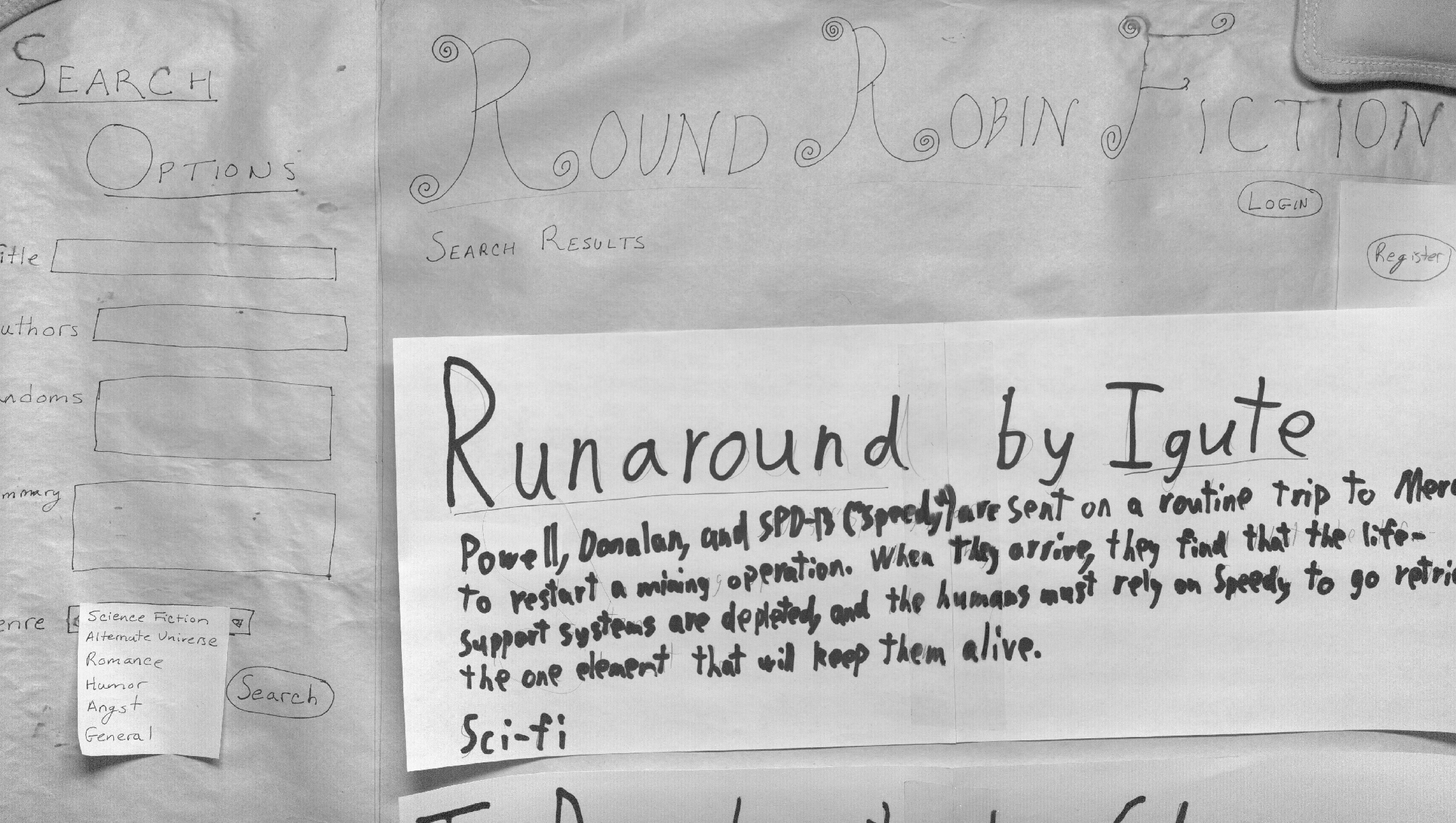
Home Page, close up (day 2)
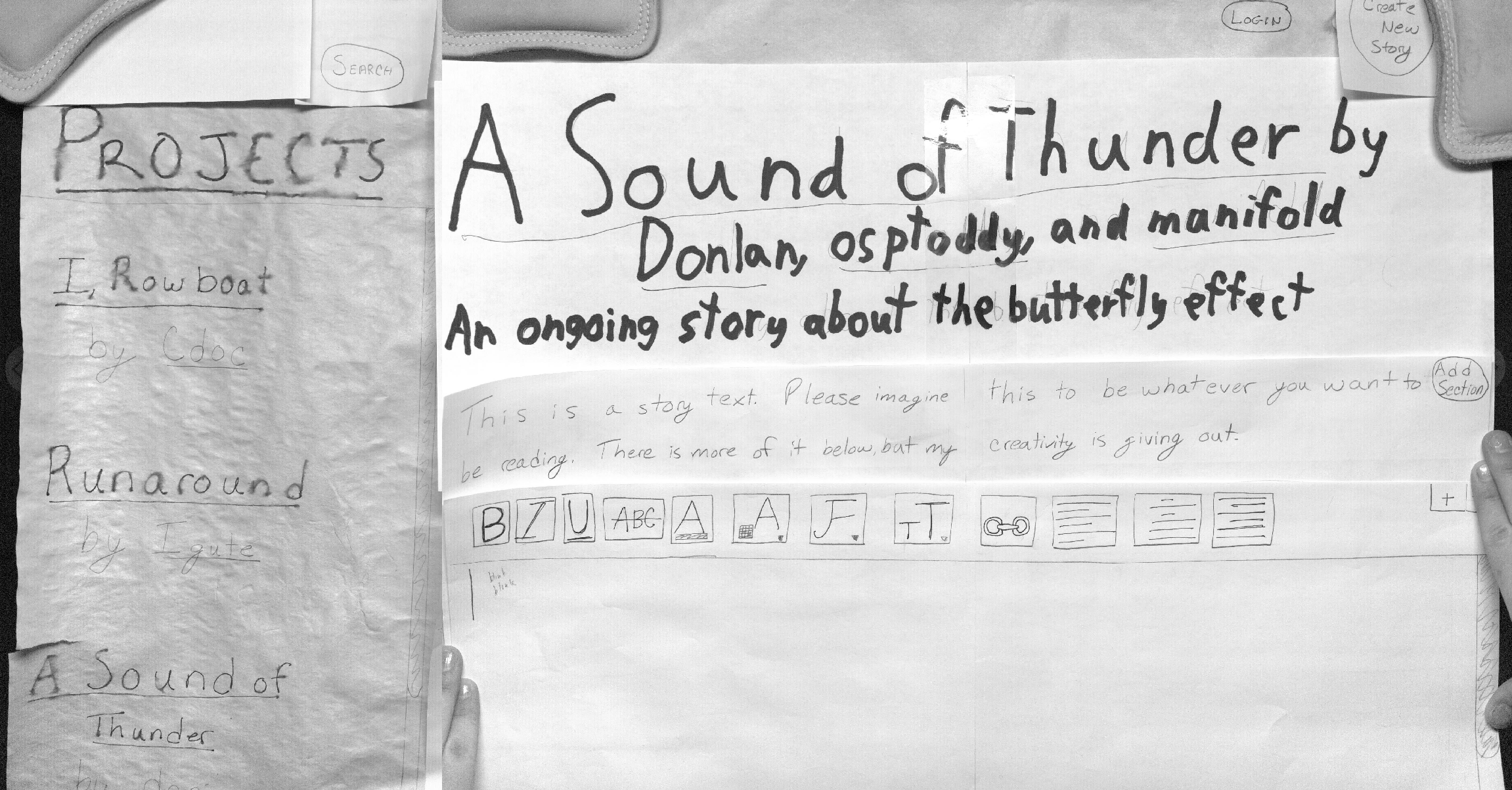
Story Page, with user logged in, close up (day 2)
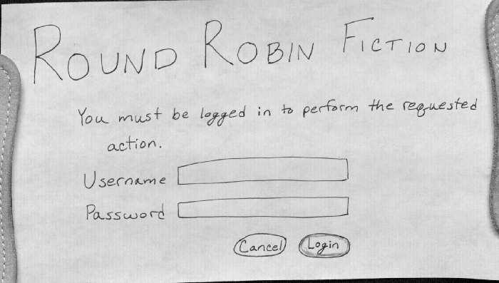
Login Dialog (days 1 and 2)
We choose to use a design similar to that presented third in GR2. However, following our TA's advice, we attempted to simplify the design as much as possible. The first day of testing indicated that our design had button placed and labeled in a confusing manner. Believing that that was the main concern, our second design was very similar, but with altered names and placement of the buttons. The second day's feedback caused us to realize that while the previous problems had been fixed, the layout was not intuitive to the users, and we now believe that a sidebar may not be the best design for our site. As such, we will be reworking our design thoroughly for the computer prototype. Our new ideas are described briefly in the last section of the page.
Briefing
We aim to construct an online interface for authors to easily collaborate on and share original and fan fiction. The target users are amateur writers who want to work together, mostly for fun, but sometimes also to improve their writing. Collaboration is a major component of the site, with various authors having the ability to append sections to a single story. Each story has one or more moderators, who are responsible for adding and removing authors, and deleting any abusive comments.
We would like you to pretend to be the user ‘manifold,’ and are going to ask you to do tasks that will require you to log in as such. Please assume you know the password.
Tasks
- Find and read the story A Sound of Thunder.
- Add a section to A Sound of Thunder.
- Create a new story that you and the user 'cthulhu' can edit.
Observations
From the first iterations of testing:
- No one knows how to add a section if they’re not already logged in. Many tried clicking the text, or the story title. One user tried the Create New button, which did eventually allow him to edit, but emphasized the possible misconstruction of that label.
- 'Create New' is NOT an intuitive title for a button – many people think it refers to create new user or new section, not new story. Having it next to the login/logout button adds to this confusion.
- 'Save' (for creating new story) should be at the bottom, not up by login information.
From the second day of testing:
- Even if the text box for editing was visible, users did not realize that it was for adding a section. In general, they would try to click the (newly created) add section button, or again the story text. When those actions changed the focus to the text box, they realized that they should type in it.
- One user commented that the change in the sidebar surprised him, and was a little disorienting.
- Users found the layout of the page unnatural – they would often make comments like, "I am looking for this button, and I don't see it up, here, so..."
Iterations
- We added several 'Add Section' buttons to the prototype (in the upper left, away from login in the upper right, and at the bottom of the story), changed the 'Create New' button label to 'Create New Story' and moved it to the upper left, putting the story editing buttons together, and separate from the login button.
- We moved the 'Save' button to the bottom of the new story creation screen.
New Design
Based on the feedback we received from users, and our own difficulties with the use of tabs or other breadcrumbs, we decided that since our site has two basic tasks (finding stories and reading/writing stories), that sort of continuous search functionality was not well suited to Round Robin Fiction. We instead are considering a simple horizontal split screen, with the small top section remaining unchanged throughout the entire website, giving easy access to the home page by clicking on the title/logo or searching for a new story.
We also considered that while some stories and authors will be best served by being restricted to the ability to only append to the story, others will want to have access to the entire work. With that in mind, we provide two options for users with power to do both: "Append" and "Edit". In the case of "Edit," the entire story page will become editable. In the case of "Append," a text box will be provided floating about the text, as tested with the paper prototype. The user can then see all of the previous text as she composes the newest section.
Below are new design sketches of the home page and the story page:


1 Comment
Unknown User (glittle@mit.edu)
Great! It would be nice to see specific notes about different users, though I like the consolidated observations you have.
In a paper prototype, I wouldn't worry about testing login. Logins are quite common, and not very risky (though you did find a confusion between the "Create New" button being next to the login.. still, worth considering ;)