GR3 - Paper Prototyping
Prototype photos
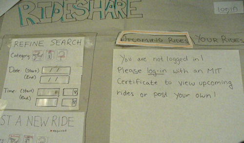
When the user first navigates to the RideShare page, they are asked to login with an mit certificate, but can still see the functionalities available for logged in users.
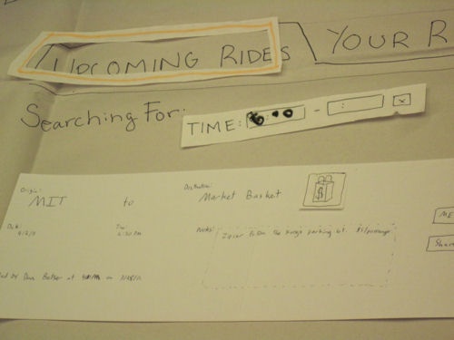
Once logged in, the user can see listed rides. This image shows one listing, where the user has refined the listing results to those starting at 6:00.
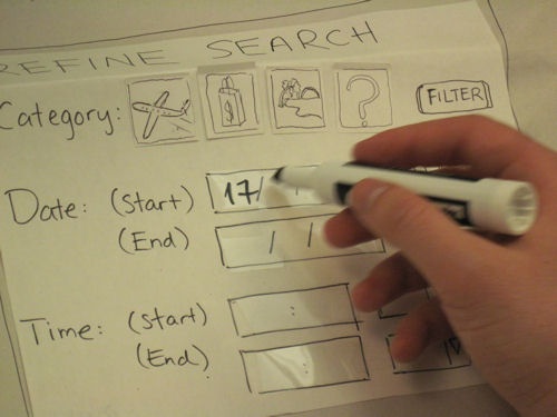
The user can refine the listing by filling out the refine search form on the left side of the prototype.
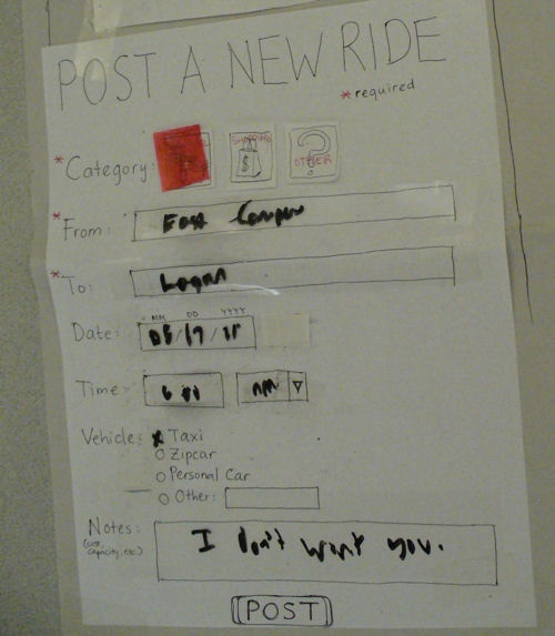
If no rides match their needs, they can post a new ride, using the post a ride form.
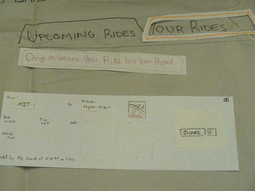
When the ride is posted, the user is taken to a page showing just their rides with a confirmation message. The user now has the options to delete one of their postings or share them with friends.
Briefing
RideShare is a website to find people who can share a taxi or a car ride with you. There are two main functionalities of the website:
- You can search for available rides to match your needs (going to the airport, going to the supermarket to buy groceries, etc.).
- You can post your own ride to find people who want to share it with you.
RideShare is only open to the MIT community.
Scenario Tasks
Scenario Task #1
- Find all rides to the airport.
- Search for a ride to Logan Airport from MIT on May 17th at 6AM.
Scenario Task #2
- There are no matches; post a new ride listing advertising a taxi ride to the airport on May 17th at 6AM.
Scenario Task #3
- Invite some friends to share the ride with you.
Observations
During our user testing, we noticed issues that were easily fixed in our second iteration, though we also noticed a few issues that we are planning on clarifying for our prototype impelementation.
Problems specific to our first iteration:
- The category buttons were confusing and their function was not obvious from their initial design.
- The appearance of Filter buttons for each type of field in the Refine Search panel was confusing.
- The button to "Share" a posting was small and hard to find.
- A lot of users didn't realize our date fields had a calendar widget right next to them and typed in their desired date instead. One user typed in the date using the Day/Month/Year format instead of the standard Month/Day/Year format.
- When adding users while trying to share a posting over email, users didn't understand the paradigm we designed to enter an email address, and click "Add" for each desired recipient. One user tried to enter all the users into the box for adding, which would be an error case.
Higher level problems:
- One issue that we also grappled with was the user's definition of start and end locations when posting a new RideShare. Should the user enter "MIT" as a location or something like "East Campus". We made the design decision that either one entered by the user would be ok since we will not filter by start and end location, only trip category, and a person looking for a ride would need to visually inspect all the options when looking for a match.
- Users were confused about the meaning of "Refine Search" in our interface, and didn't realize that that consists of a search.
- It is somewhat unclear to users what it means to "post a ride". They don't understand if one "posts a ride" to offer other people to share it with them or to indicate that they are searching for a ride at that time.
- The left hand panels were distracting for users who were not logged in; they should not be able to interact with these panels before logging in.
- We didn't take into account editing your posts after you've submitted them. Right now the user would need to delete a post and enter it again in order to change it.
Prototype iteration
Design |
First Iteration |
Second Iteration |
|---|---|---|
Category buttons |
Buttons consist of the icons of an airplane for the "Airport" category, a shopping bag for the "Shopping" category, a beach for the "Travel" category, and a question mark for the "Other" category. |
"Airport" and "Travel" categories are merged into "Travel" with an airplane icon because the distinction between the two is not obvious. Words are added to the icons to aid comprehension. |
"Filter" buttons in "Refine Search" panel |
After a user changes a field in the "Refine Search" panel, s/he has to press the "Filter" button next to the field in order to refine the search results according to that field. |
The "Filter" buttons are removed. Search results are dynamically updated as the user manipulates the fields. |
"Date" fields |
Users can enter the date by either typing in the field or clicking on the calendar widget next to it. |
The calendar button is removed. When a user clicks on the date field, a calendar appears automatically and the user picks a date from the calendar. |
"Vehicle" field in "Post a New Ride" panel |
The field does not exist. |
The field is added so that users can specify the type of vehicle they want to use. |
"Share" a posting button |
The button is too small. |
The button is made larger and more obvious. |
"Email" field in "Share" panel |
Users type in an email address in the "Email" field and press the "Add" button next to it in order to add the email address to the recipient list. |
The "Add" button and the recipient list is removed. Users type in multiple email addresses in the "Email" field separated by commas. |
1 Comment
Unknown User (glittle@mit.edu)
Great job! It looks like you guys built a nice paper prototype, and learned a lot from it.