GR2 - Designs
Scenario
Our scenario builds off of our persona, Aly, from GR1. Aly is an MIT sophomore who has a flight home to Florida at the end of the semester, on May 17th at 6 AM. She always buys cheap flights, which often leave in the early morning before the public transportation system operates, as is the case for this particular flight, so she wishes to take a cab to the airport. Aly uses RideShare to find people to share a cab with her for this flight. The tasks she needs to perform are:
- Search for a ride share
- Post a new RideShare listing for her desired time and destination
- Invite friends to see her RideShare post
Designs
Design 1
The main feature of this design is that it consists of only one page. When a user clicks the buttons to navigate through the website, different sections of the page will pop up and disappear, but the user never leaves the home page of the website.
Storyboard
Aly opens the RideShare website. The website will ask her to provide an MIT ceritificate immediately because the site is only open to the MIT community.

After Aly provides her certificate, all of the basic functionalities of the website are shown on the home page. If Aly wants to find a ride, she can fill in the form on the left side ("FInd a Ride") and click the "FIND" button; if she wants to post a new ride listing, she can fill in the form on the right side ("Post a Ride") and click the "POST" button. The two forms are basically identical. She has to enter the origin (From: ), destination (To: ) and the date and time. In order to specify a location, she can either type in a complete address or choose popular destinations from the drop down list. On the right side of each field, Aly can specify a range, such as ±1 mile for location or ±30 minutes for time, so that everything within that range will be considered a match.

Other features of the home page include buttons to check the previous posts ("Posts"), to edit the user profile ("Profile"), and to log out ("Log Out") in the top right corner. The page also provides an "Invite Friends" button to encourage users to increase the functionality of the website by inviting their friends. At the bottom of the page, the user can see the recent ride postings of other users ("Recent Activities"). There are two main benefits of this section: (1) it helps users advertise their ride postings, and (2) it helps new users learn to use this website by seeing what other users have done with it.
Aly decides to find a ride. She fills in the form and press the "FIND" button, and the webpage displays the search results at the top of the page (see below). The results are sorted by how well they match the query. The user can click any of the results and the section will expand, showing more details (such as the type of transportation, the expected cost, and the option to contact the person who made the posting). Below the search results are the other parts of the page.

Aly can't find a ride posting that she wants, so she decides to make her own posting. The "Post a Ride" form below the search results have been auto-completed by the website based on her search query, so now she only needs to press the "POST" button.
After she presses the button, the form will pop up to occupy the whole screen. Now she can add more details to her posting. She can specify the mode of transportation (taxi, zipcar, or something else), the capacity of the car, the expected total cost, etc. She can also specify if she wants to get notifications regarding the posting through email. When she finishes, she presses the "POST" button again.

The pop up disappears, and she returns to the home page. Now the page displays the summary of the posting she just made, and gives her the option to edit it with the "Edit Post" button. The page also suggests her to invite her friends to share the ride with her ("Invite Friends" button), to update her profile so that other users can read about her ("Update Profile" button).

Following the suggestion, Aly presses the "Invite Friends" button. The "Invite Friends" window pops up and now Aly can type in the email addresses of the people she wants to invite. She can invite both the people who have and have not used RideShare, and invitations will be sent through email. The window also shows the summary of her ride posting and gives her the option to modify the content of the invitation email. When she's done, she presses the "INVITE" button.

Now Aly is done and she returns to the home page of RideShare. When another user is interested in sharing a ride with her, she'll be notified through her email.

Analysis
Pros:
- Having all the main features on a single webpage greatly increases visibility. Users do not have to navigate around to find the things they need. It also increases efficiency by decreasing loading time because the user only loads a section of the page every time he performs a new function.
- Asking the user to provide an MIT certificate upon entering the website lets the website identify the user immediately. For instance, when the user opens the site, the page can notify the user immediately if someone is interested in sharing a ride with her.
- The "Recent Activities" section increases the learnability of the website and helps users advertise their ride posting, as has been explained in the Story Board section.
- The auto-completion feature increases efficiency and prevents typing errors.
Cons:
- Asking users to provide a certificate when they enter the website may turn them away, especially if they don't have the certificate installed on the computer they are using.
- This single-page design may be more challenging to implement than the designs that uses multiple pages.
- The "Recent Activities" section may discourage users from using the website when there are not many active users. It may be a good idea to add the feature only after the website has many users.
- Specifying a range (±1 mile for location or ±30 minutes for time, etc) when a user fills in the "Find a Ride" or "Post a Ride" form reduces efficiency and may not be necessary. The task should be performed automatically by the website.
Design 2
Storyboard
Aly navigates to the RideShare homepage. On this page, she types in all of the details to look for her desired ride ("Destination: Logan Airport, Start location: MIT, Date: May 17, Time 4AM. When she clicks submit, the browser-specific certificate request pops up so that RideShare can automatically log her into the system, and the search results page appears.

Above, we can see that Aly's search returned 3 results. On the left hand panel of the site, there is a form to edit the search and check again, but Aly mainly focuses on the middle of the page where she sees that the three listed options do not fit her needs. Therefore, she clicks on the "Post your own" button at the bottom of the screen.
Below, we see the posting page, which is automatically partially filled it based on the information Aly was looking for already. She proceeds to fill out the remainder of the information such as the cost for splitting a taxi and additional notes, and clicks the button to post the Ride Share.

Now that her listing has successfully been posted, she wants to share it with friends. Below her new posting, she can either share the link to her posting on facebook or email it to a friend to publicize the opportunity.

The below image is a depiction of the Profile Management page that Aly navigates to to change her settings.

Analysis
Pros:
- This design features a top horizontal menu bar that exhibits all of the main features of our website--searching for a ride share, posting a new listing, and managing profile settings. It is a design that favors simplicity and visibility, with access to the three main features of the website prominently displayed.
- The map preview feature in search results allows the user to see exactly where the meeting location is, which provides a useful visual cue to the user about where the Ride Share would occur.
- Efficiency is augmented with the pre-population feature that fills in the form for posting a new Ride Share after the user was unable to find a matching Ride Share in a search.
- The annoying certificate popup occurs only after a user action that requires login, postponing the hindrance to efficiency until it is absolutely necessary.
- The side modification panel for refining a search allows for error recovery if the user would like to search for something else other than what the user has already searched. The pre-population of that panel means the user would only need to tweak the fields and search again in the case of an error.
Cons:
- Though the horizontal menu is cute, finding the different functionalities of the site requires extra clicking, which reduces efficiency. An interface with all the functionality on the same page would provide greater visibility still.
- The interface is slightly unappealing aesthetically, with a very boxy feel rather than a smooth web 2.0-style appearance.
Design 3
Storyboard
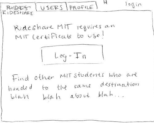
The third design features a tabbed design similar to design two. When Aly navigates to the RideShare homepage she is presented with a home screen that will tell her a little bit about the service and let her log in using her MIT certificate. Once she logs in, the home screen is replaced by a window that lists available rides.
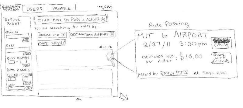
The RideShare window first displays all rides (in a paginated fashion) by date posted. Aly can then add 'tags' using the panel on the left to refine her search. She adds tags for Origin, Destination, and Date so that the search results only display rides going to the airport from MIT on the date she wants to travel. The tags can be easily removed by pressing the x next to the tag.
The zoomed in part of the image above (on the right) shows the layout of a ride listing. The interface uses a metaphor here, laying out the listing similar to a train or bus ticket. The listing allows Aly to message the poster, share the ride with friends, or view information about the user that they have posted on their profile.
However, Aly isn't happy with any of the listings she's found, so she decides to post her own.
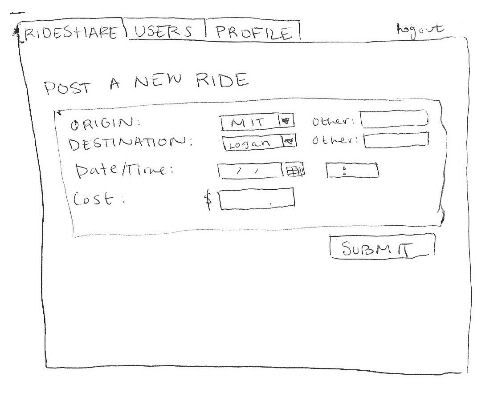
Clicking Post a New Ride (a prominent button at the top of the rideshare page) takes Aly to a new window with just the form for posting a ride. It asks her to enter fields such as 'Origin', 'Destination', 'Date/Time', and 'Cost'. All fields are required, for simplicity.
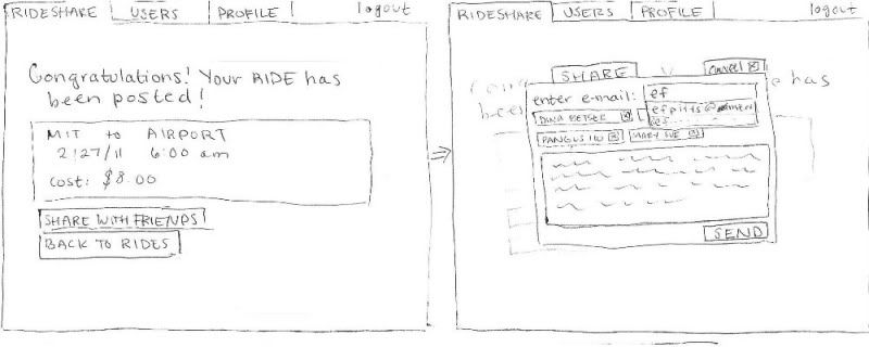
After she presses submit, she gets a confirmation message that shows exactly what she posted and options to share with her friends or go back to browsing rides. She decides to share her ride with some friends to see if they are interested. A window pops up over the current screen that allows her to add friend's emails in a system similar to the tagging method of refining results. She can also edit the default message before pressing send, which causes the window to disappear and take her back to where she was before.
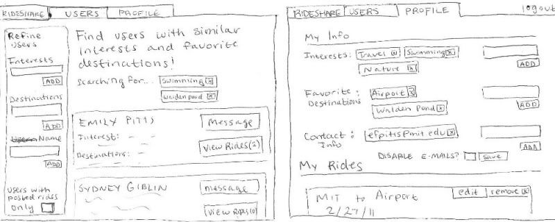
At this point, Aly has completed the task at hand, but she could also fill out some information about herself in the profile tab (right) or browse for users with similar interests (left) to find people she might want to travel with. Note that the tagging system is used again to add interests to the profile or to refine the list of users Aly is searching for.
Analysis
Pros
- Using tags to refine search results (rather than requiring the user to enter all the information about their desired ride) allows the user to browse a broader spectrum of rides and might help them find what they want faster if they don't know exactly what they're looking for.
- The tag-based searching system is used throughout the site, providing simplicity and consistency.
- Tabbed navigation makes the purpose of each window very clear and organizes the layout nicely.
- The design provides good feedback on what the user is doing (i.e. showing the user exactly what he posted after he presses submit).
Cons
- More navigation is required in this design than the first, where basically everything happens in one window. This could be confusing to new users.
- Although the ticket metaphor looks nice, it may not be the most efficient way to convey the information about the ride to the user.
- The tagging system might slow down users who know exactly what they are searching for.
1 Comment
Unknown User (glittle@mit.edu)
great job!
thoughts:
- think about size. If less than 10 rides are on the site at a time, may want an interface that takes advantage of that by using all your screen real estate to show those items, rather than having a fancy search interface
- you mention showing a listing to your friends.. is that really what you want? seems like people might know their friend's availability for ride sharing already, and they are using this site because their friends aren't going to the airport that day
- in general, I would think along the lines of "what can we remove? what is the least amount of functionality we could supply, while still being useful?". I might consider dropping things like "favorite destinations" in the user profile, (unless you have in mind a particular benefit). Everything you add to an interface has a cost in terms of complexity for the user, and you want to make sure they get enough value from the complexity to make it worth their while.