Scenario
(Managing)
Sally likes to online shop sometimes, and goes on Anthropologie's online store (anthropologie.com). She sees a dress she really likes, but it is too expensive. She wants to bookmark this dress to check out later, in case it is on sale, but does not want to create a browser bookmark to the webpage. She heard about a wishlist website called Wishdex from her friend Megan and decides to check it out. Once she goes onto wishdex.com, she uses Facebook Connect to log in and creates a new Wishdex called "Spring Dresses." She then copies the URL of the item from Anthropologie and adds it to “Spring Dresses.” She continues to browse Anthropologie’s website and finds four more dresses that she also likes but does not want to immediately buy, and also adds them to her first Wishdex.
The next week, Sally is browsing Zappo’s online store and finds 3 pairs of shoes that she really likes and would like to remember to check out at a later time. She logs into Wishdex. Her birthday is coming up in the next month, and she wants people who might buy her a gift to know what she likes. She decides to rename “Spring Dresses” to “Birthday Wishlist,” and adds the three pairs of shoes to the Wishdex, and now her “Birthday Wishlist” has 7 items. She checks out one of the dresses that she added from Anthropologie last week and decided that she doesn’t like it anymore and removes it from “Birthday Wishlist”.
A few weeks later, her mother, Anne, calls because she wants to know what Sally would like for her birthday. She usually can’t remember what she wants for her birthday, but she remembered that she has been keeping track of items that she likes on Wishdex. She logs on to Wishdex and shares “Birthday Wishlist” via email to her mother.
(Viewing)
Anne opens the Wishdex link in her email. The website prompted her to login with her Facebook account or view the page “as a public user.” She decided not to login with Facebook. She sees Anne’s “Birthday Wishlist” of 6 items, and clicks on each one, which brings up the URL of the original item from Anthropologie.com or Zappos.com. She decides to buy two of the items for her daughter’s birthday. She realized that Sally is probably showing this wishlist to her other friends and maybe her aunts and uncles as well, so she decided to “claim” the items anonymously so that other people don’t buy the same item for Sally. However, when she tried to claim an item, she learns that she has to log in with her Facebook account to prevent spam. She logs in and claims the items.
(Managing)
At around the same time frame, Sally’s friend, Megan, decides to procrastinate on her homework and revisits wishdex.com after a month hiatus. She logs into Wishdex and updates her own Wishdexes because she has purchased some of the items in the past month on her Wishdex.
(Exploring)
She hasn’t shopped online in a while, and wants to see what other people on Wishdex are wishing for. On the home page of Wishdex, she sees the top wishdex of the week.
(Managing)
She checks it out and adds an item from it to one of her own Wishdexes called “Shoes.”
(Exploring)
She browses through some random peoples’ Wishdexes from the list of Popular Wishdexes. She also wants to see what her Facebook friends have on Wishdex, so she looks at some recent activity and sees Sally has been adding to her “Birthday Wishlist.”
(Viewing)
Megan sees a pair of shoes that she really likes on Sally’s Wishdex, and decides to “Like” the item and leave a comment “I saw these on sale on Amazon.com.” Megan knows that Sally’s birthday is coming up, but the items on her Wishdex are too expensive. She saw that two of the items were marked as “claimed,” and decided to buy a small accessory that she saw on another Wishdex that would go with the two items for Sally’s birthday.
Designs
We show three possible designs which we have loosely named "Hipmunk" (use of tabs), "Pulse" (use of scrollable navigation bars), and "Finder" (use of panes). We divided our storyboard designs into three sections corresponding to our task analysis:
- managing, which involves Sally's initial actions in the scenario above
- viewing, which involves Anne's and Megan's visits to Sally's Wishdex to find out what they should buy for her birthday
- exploring, which involves Megan's investigation of featured/popular wishdexes and recent activity
Descriptions of interactions with specific parts of the storyboard designs are shown within the images. Analysis of learnability, visibility, efficiency, and error prevention is included for each design, along with some general analysis that applies to all designs at the end.
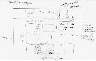
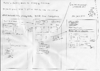
"Hipmunk" Design
Managing:
Viewing:
Exploring:
Analysis:
- Learnability
- Tabs are a commonly used navigation tool for Internet browsing, making them easily learnable.
- There are no affordances for hovering on the item images to let the user know that further information is available if this action is taken.
- Visibility
- Tabs allow for visible navigation state.
- Editable boxes for item information on the managing page only appear upon hovering over the item images, making this ability less visible.
- Entering in a search in the exploring page opens the results in a tab, which may not be adequate visible feedback for the user.
- Efficiency
- Because hovering on an item is an indicator of user interest, immediately opening item information on hover provides good anticipation.
- Editing item information on the managing design or seeing further item information on the viewing design requires continuing to hover over the item's image, which may be detrimental to efficiency.
- Error Prevention
- A simple button or keyboard shortcut could be added to allow the user to open the last closed tab, similar to what Firefox and Chrome allow to prevent navigation errors.
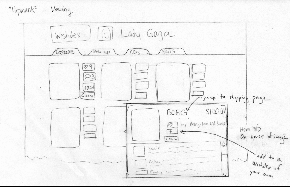
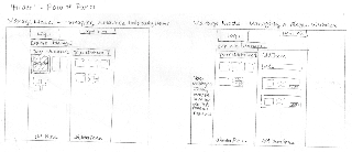
"Pulse" Design
Managing:

Viewing:
Exploring:

Analysis:
- Learnability
- The Pulse-like horizontal navigation panes provide a natural mapping to a rolodex.
- Having both a clickable item image and clickable hover icons in the same space does not allow affordances for clicking the space around the hover icons to bring up item information page.
- Visibility
- The rolodex at the top of the view page provides the similar visible navigation state to tabs but with greater information scent through the use of images to describe the wishdexes.
- Efficiency
- Viewing a large number of interesting wishdexes while exploring will require multiple clicks through the rolodexes, which may be less efficient than scrolling.
- Further item information is only available by clicking on an item and reaching a different page, which may be less efficient than the hover-boxes used in the other design.
- Popup boxes for adding items provides fast return to the managing page by clicking anywhere off of the box in the window.
- Error Prevention
- Accidental navigation through the rolodex at the top of the view page can be easily corrected through highly visible forward and back buttons on the rolodex.
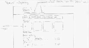
"Finder" Design
The "Finder" design resembles the Finder in MacOS by showing two panes at a time, out of three types of panes. The pane on the right is always more specific than the pane on the left, and there will be animations to indicate the switching of panes.
There are three levels of building block panes and the modes that they occur in:
- List of Wishdexes level (most general):
- List of Wishdexes pane - Viewing/Exploring and Managing modes
- Wishdex level:
- Wishdex pane - Viewing and Managing modes
- Item level (most specific):
- Item information pane - Viewing mode
- Item adding pane - Managing mode
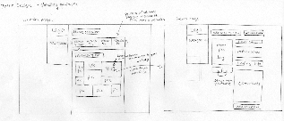
Viewing/Browing Overview:

Viewing/Browing Panes Detail:
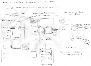
Managing Overview:
Managing Panes Detail:
Analysis:
- Learnability
- Items can be dragged and dropped in the managing mode to different wishdexes, which is a model that is learnable because it is externally consistent and has a natural mapping.
- The use of three basic panes (wishdexes, items, item information) for both exploring and managing provides good internal consistency.
- Visibility
- The user can easily see if he is in the Explore or Manage mode at the top of the page.
- Switching between panes will be frequent and must not have long loading times to prevent issues with feedback.
- Efficiency
- Similar to the "Hipmunk" design, providing item information on hover is a good example of anticipation.
- All three panes cannot be viewed at once, which requires heavy use of the back button in viewing multiple wishdexes while exploring.
- Error Prevention
- Although the Explore and Manage modes are visually separated, their action sets may not seem disjoint because they involve similar navigation patterns. This may cause errors, particularly if the mode buttons are not in the user's locus of attention.
Overall Analysis:
- Learnability
- Use of Facebook, Twitter, and email icons is externally consistent with many other websites.
- Heavy use of images for wishdexes and shopping items allows for good information scent, and is consistent with the design of other shopping websites.
- Familiar icons (sharing, adding, # of likes, # of comments, editable) allow for affordances for understanding the meaning of icons.
- Visibility
- There may be feedback issues when the user attempts to add a new item using keywords or a URL because of the time needed to process the query. Progress indicators will definitely be needed.
- Efficiency
- Filling in the item information using a query of URL or keywords makes use of defaults and reduces the time needed to add an item.
- Login will only be allowed through Facebook Connect, providing efficient account creation by using preset information for a user's profile picture, name, email, etc.
- Error Prevention
- There is currently no way of recovering a deleted item, but an undo feature in the managing designs could be easily added.
1 Comment
Anh Dang Viet Nguyen
- Very well written. Detailed scenario with highlights on tasks and good analysis of designs.
- Designs are very differed and innovative. I like the practicability of the first one, attractiveness of the second one, and the flexibility of the third one. The last one reminds me of tweetdesk but I think this is even cooler in a way that panels are supplement to each other and you can have all sorts of interaction between the two.
- Great job!