Briefing
Our application is Wishdex.com, a site that helps you keep wishlists, which you can use to track of items you find online, show your friends and family gifts you want, and see what your friends or celebrities are interested in. We're doing this test to get some feedback on how well we've designed the user interface. There are probably a lot of problems with the design, and we need help finding them. Keep in mind that we're testing the computer system, not you. Also, the results of this test will be kept completely confidential, and you can stop and leave the test at any time. My name is Susie, and I'll be reading out the tasks we want you to perform. This is Emily, and she will be moving around things on the screen, pretending to be the computer. This is Ashu, and he'll be taking some notes to help us remember the problems we find.
Scenario Tasks
We divided our scenario tasks into three sections corresponding to our task analysis from GR1:
- Exploring
- Find interesting/popular items you may want to buy
- Look at what your friends are wishing for on Wishdex
- Find Maggie's wishdexes
- Viewing
- Like an item on Maggie's wishdex
- Add a comment to an item on Maggie's wishdex
- Claim to buy the item for Maggie and view item on Amazon
- Managing
- Create a new wishdex called "Birthday Wishlist"
- Add new item (a laptop case) to this wishdex from an Amazon URL
- Edit name of item
- Move "Crazy Shoes" from "Shoes" wishdex to "Birthday Wishlist"
- Share "Birthday Wishdex" with your mom
Prototype Photos
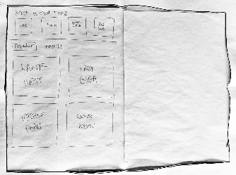
Prototype 1
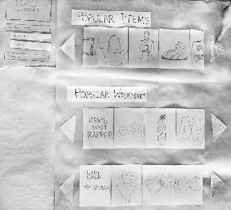
Exploring Popular items |
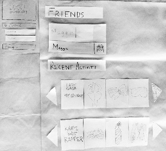
Exploring friends' Wishdexes |
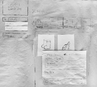
Viewing a friend's Wishdex |
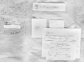
Managing your own Wishdex |
|
|
|
|
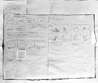
Prototype 2
Exploring popular items and Wishdexes |
Exploring friends' Wishdexes |
Viewing a Wishdex |
Viewing an item |
|
|
|
|
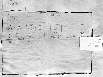
Please note that we chose not to include Tasks in category 3 (Managing) for prototype 2 because the interface will simply be a combination of the panes in prototype 2 and the managing view in prototype 1. We focused prototype 2 to study the user's understanding of the moving panes and hierarchy. We feel that the managing tasks are well studied in prototype 1.
Observations
Summary of Important Observations
For all observations, see the Appendix.
- Meaning of "claiming an item" (Task 3c, Users #1-#6)
All of the users who tested our design were unsure what the "Claim It" button did on the page for an item in a friend's wishdex. Some thought that it referred to telling the friend they were going to buy the item for themselves, which was in fact the exact opposite of what we wanted the button to indicate. The distinction between "buy it" and "claim it" was also unclear to some users. This confusion was also clear because many users asked what the checkmark button did when hovering over an item during the managing tasks. - Distinction between different wishdexes (Task 2a, Users #4, #6)
Two of the users did not understand when first viewing a friend's page that the categories at the top indicated different wishdexes. They were more likely to have a single wishdex and putting all of the items they want into it, and therefore did not expect a friend to have multiple wishdexes on their page. It was also not clear that the categories were different wishdexes created by the user instead of being divisions of one wishdex created by the backend system. - Buttons did not seem clickable (variety of tasks, Users #2, #4, #5)
Our designs made frequent use of large images as buttons for tasks such as going to a person's wishdexes, opening a wishdex, or going to an item page. It was often not clear that these images were clickable. This may have been an issue with the paper medium, but there are also probably issues with the design that could have increased their affordances for clicking. - Textboxes did not seem editable (Tasks 3a, 3c, Users #1, #3)
Our designs also used text areas that would become editable if clicked on but seemed to be plain text before this. This was an especially an issue with adding a wishdex, because some users tried clicking on the plus button next to the textbox for the wishdex's name without entering a name first. Again this may have been an issue with the medium, but the design could have provided more affordances. - Unclear ability to drag and drop items between wishdexes (Task 3d, User #1)
We intended moving an item to a different wishdex during managing to involve dragging the item to the name of the destination wishdex in the left navigation pane. Our first user did not see that this could be done because nothing else in the interface was drag-and-drop and a lack of affordances.
All observations
Observations noted during the user tests can be found here: http://etherpad.mit.edu/813usertesting
Prototype iteration
We decided to use our second round of prototyping to explore a different approach to the viewing and exploring tasks that involved panes for navigation (inspired by the "Finder" design from GR2). However, we did perform iteration between user tests during each round for each of the important observations summarized above.
- Meaning of "claiming an item"
After realizing this problem, we attempted have the facilitator offer a clearer explanation of what claiming actually was. We could incorporate this into our design by showing a brief explanation of claiming the first few times the user hovers over the button, or in some initial tutorial when a user signs up on Wishdex.com. Although this did reduce some of the confusion, it was a difficult concept to convey succinctly. Further improvements such as changing the name from "claim" to something more descriptive or adding a separate button for adding it to wishdex of the viewer are probably necessary. - Distinction between different wishdexes
For one of our users (User #3), we did the managing tasks first. This user was then able to more clearly understand viewing multiple wishdexes. This suggests that we should take new users to the managing page first. Similar to the previous issue, this is a case when some explanation when the user first visits a friend's page as to what the categories are was useful. - Buttons did not seem clickable
We mitigated this problem by introducing shading that would come up around the image when a user hovered over it. This was fairly successful, and was also more similar to how the computer implementation would be made. - Textboxes did not seem editable
This problem was somewhat harder to solve on the paper medium. We attempted add an ellipsis ("...") after the default text in the editable areas after realizing that this would be consistent with what most other sites do. Other solutions could be attempted in our computer implementation, including making the default text in the editable areas lighter than non-editable text on the rest of the page or making the borders on the editable areas more defined. - Unclear ability to drag and drop items between wishdexes
The item images all had versions that appear when the user hovers over them. We modified these images after the initial user test to clearly indicate the cursor changes to a crosshair. This made it more apparent that dragging and dropping was possible, and we did not see this problem again. Other solutions we may want to explore include providing an additional method for moving the item to a different wishdex in the edit pop-up menu.
1 Comment
Anh Dang Viet Nguyen