These are the results of Kristin Berry's (kree@mit.edu) and Roman Kowch's (rkowch@mit.edu) 2010 Balanced Motion experiment. Feel free to email us if you have any questions about our results or would like to obtain our data for your own analysis.
Radial Inflow Experiment
Read about the general setup of our experiment
Data Analysis
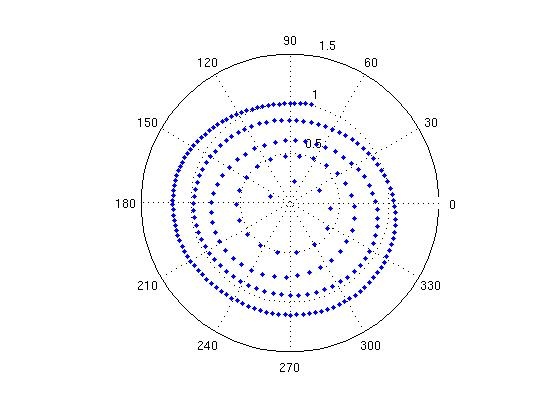
This is an example of one of the particles we tracked and selected for analysis. Note that its radius steadily decreases as it spirals inward, as we would expect, but that its path appears to be slightly ellipsoidal and off center, which introduced error into our calculations.
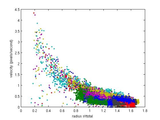
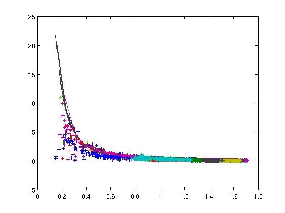
looking at v vs r, we find that the particle's velocity increases as it gets closer to the center of the tank, as we would expect from conservation of angular momentum.
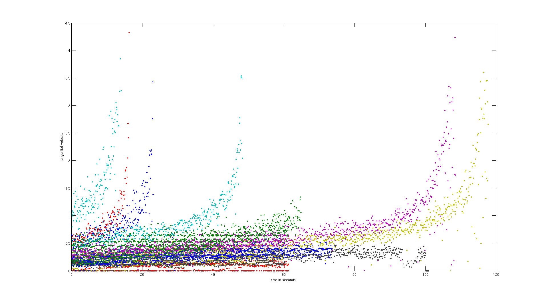
This shows basically the same thing, though less directly. As time goes on and particles move closer to the center of the tank, their velocities increase, consistent with conservation of angular momentum.
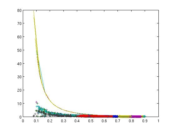
This was our first plot of theoretically predicted Rossby number with our experimental data. Note that the fit is terrible!
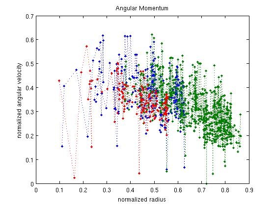
We think that this result was due primarily to the angular momentum not actually being constant. After all, there is a net loss of mass through the hole in the center of the tank. If we look at a plot of angular momentum per unit mass versus radius, we see that it is, in fact, not constant.
In all of our calculations, the radius was computed as a normalized radius equal to the measured radius divided by the total radius of our bucket, which was 190 pixels in the camera units. Since all of our other data was in pixels, there was no need to convert to "real world" units for a meaningful comparison.
If the radius is scaled to an effective radius of 0.53 the normalized radius, we get a much better fit.
We tried, but failed to correct for the oscillations in the graph of radius versus time shown below.
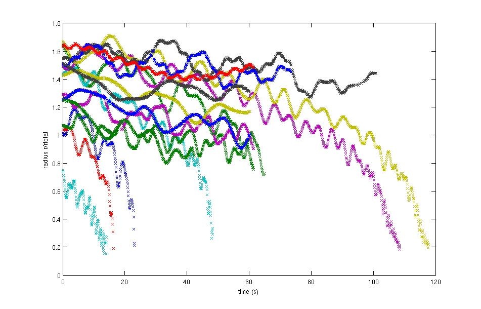
I thought it would be a fairly straightforward couple of sinusoidal oscillations (one for being off center, the other for the particle's paths actually being ellipsoidal) added onto the smooth r,t curve we'd expect, but Fourier-transforming this data resulted in hard-to-interpret gibberish.
Analysis of Hurricane Gustav
We decided to analyze hurricane Gustav using the scatterometer data found at the following sites:
Actually download the data here
It is actually important to select a hurricane that does not move too quickly because the data available for download is averaged over a whole day. This destroys a lot of otherwise beautiful candidates for study.
Selection of Hurricane Gustav
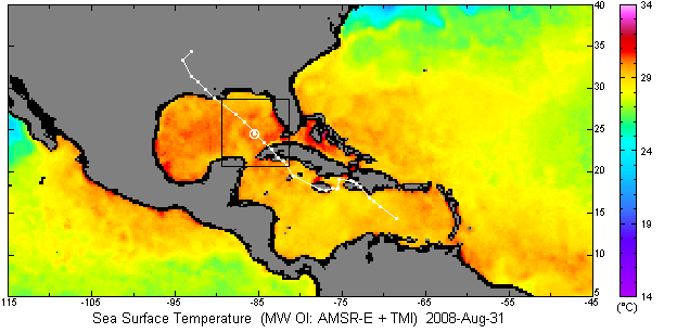
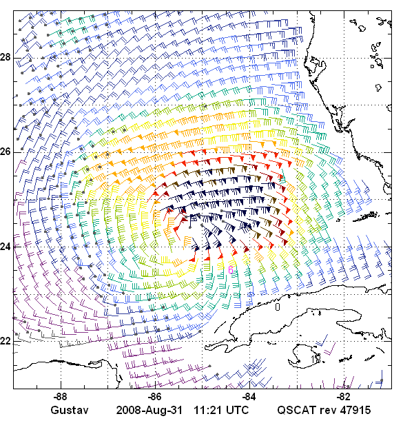
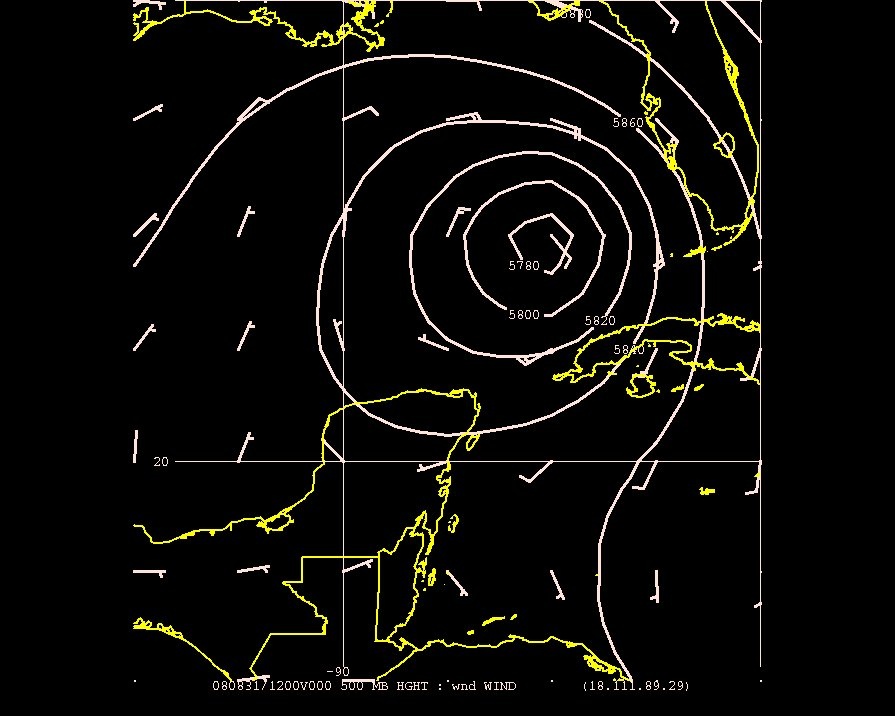
This is the position of hurricane Gustav at the time we analyzed it.
Graph of surface winds from scatterometer data. Note that the winds exhibit the same inwardly spiraling shape that the particles did in the radial inflow experiment.
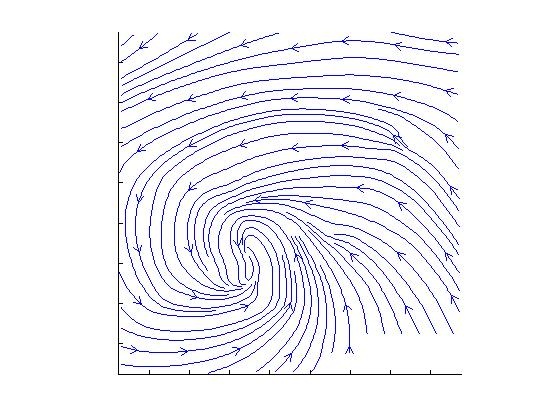
This is even more obvious if we look at a graph of the streamlines:
Graph of wind speed contours:
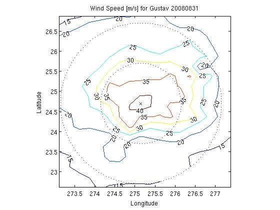
Note that they increase as we get closer to its center, much like in the radial inflow experiment.
We selected the 4 paths for analysis. The first two were along the center longitude line, first going north from the center and then going south from the center. The other two were along the center latitude line, first going east from the center and then going west from the center. These paths were chosen for ease of calculation.
Data Analysis
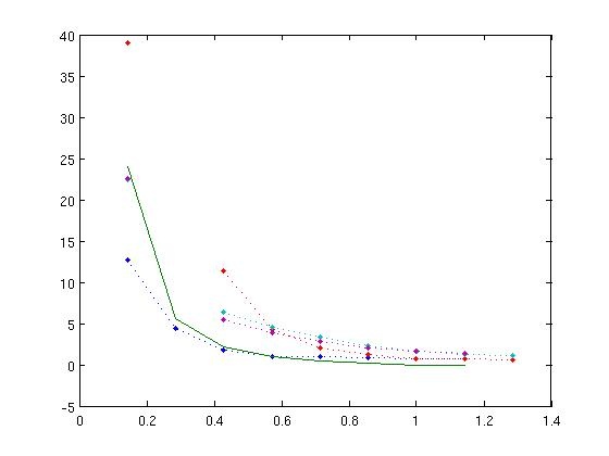
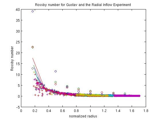
This is a graph of the Rossby number calculated for the paths we selected in hurricane Gustav. The solid line is the theoretical prediction. Again, when we computed the Rossby number using an unscaled radius, the fit we got was terrible, so we scaled the hurricane's normalized radius by 0.75. It was actually kind of unclear how to define the radius of the hurricane in the first place, so this might not be entirely accurate.
If we look at a graph of observed wind, we see that the wind barbs, cross the isolines, indicating the presence of surface friction. Much like in the radial inflow experiment, this could explain the necessity of scaling our Rossby number.
Connections!
Graph of Rossby number using scaled radaii for Gustav (’o’), and the radial inflow experiment
(’x’), and the theoretical prediction (straight line.):
As you can see, they're quite close!