Last year's winning poster
WHAT WE LIKE
Sub group oriented
Obvious flow
Emphasis on something
Good title (Brief, Understandable)
Good section titles
Brief, digestable context
Eye catching
Size proportional to importance
Conclusion / future impact
WHAT WE DON'T LIKE
Too much structure
Too much text
Too little text
Irrelevant figures
Bad/Wrong plots
Missing captions
Verbose captions
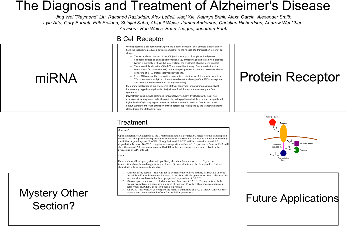
WHAT IT LOOKS LIKE AS OF NOW (9.21.14)

Another poster version: poster.svg
Some drawings of receptors: Receptor.svg
WHAT ELSE SHOULD GO ON IT?
Subgroups sent me project descriptions today and pictures too (which i have yet to find space for). Thoughts on Layout? Post them here so the poster can keep changing
UPDATE: There's an attachment called Receptor.svg that contains some preliminary drawings of receptors for use on the poster - feel free to edit this in Inkscape!