...
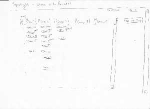
Design Idea 1: Elegant & Simple
This design focuses on a simple interface that optimizes for sharing among friends. Features having to do with sharing are highlighted. It utilizes visual representations of images together with upload and create group functions to create an easy notion of groups as objects.
Storyboard | Visibility | Learnability | Efficiency | Errors |
|---|
  | Pro:
- Create group is on the top most level, so it allows and encourages more group creation
- User has to click on the icon to see what creating a group requires
Con:
- Somewhat dissimilar to the album pictures even though they appear in similar layouts
| Pro:
- Conceptually implying that creating group is the first step to have a collection of photos, since it is on the same level as other photo stacks
Con:
- Do not have a very clear suggestion of friends that are available to be invited
- Requires recall rather than recognition for friend names, emails, etc
| Pro:
- One click step to create a new group
Con:
- Selecting from a list is possibly more efficient than typing individual usernames
| Con: - Only the text strings are the identifying information about users, user could confuse similar usernames
|
 | Pro:
- All groups that this user belongs to are in one place
Con:
- Less interaction with other groups due to less exposure
| Pro:
- Very simplistic layout that correlates with groups
- Photo stacks and individual photos draw attention to the difference between collection of photos and individual photos
| Pro:
- Drag and drop operation for uploading, more intuitive and efficient than dialog box
Con:
- If one photo needs to be uploaded to multiple groups, it needs to be dragged to multiple groups
| Con: - If photo is uploaded to the wrong group, the user has to go into the group for removal
|
  | Pro:
- No disruption to viewing when uploading photos
Con:
- On groups with lots of photos, user may not be able to see the upload photo icon at the bottom
| Pro:
- Ample affordance once user starts to drag and drop files
Con:
- User may not understand that drag and drop from file system works with browsers
| Pro:
- Simple drag and drop operation is the only step required to upload new photos to groups
Con:
- Browser window has to be resized for drag and drop to work
- (It could potentially be difficult to implement folder dropping.)
| Pro:
- Status bar allows user to cancel at any time
|
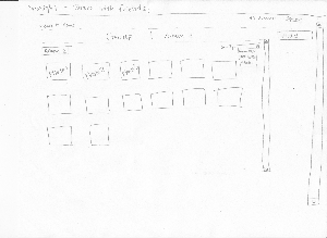
Design Idea 2: Organization
This design focuses on allowing users to organize their photos collaboratively with friends. Note that in this design there is a secondary organization level of albums in addition to groups, one that allows more categorization of photos within a group of people.
Storyboard
| Visibility
| Learnability
| Efficiency
| Errors
|
|---|
| Pro:
- Collapsible windows makes it easier to see all the albums and which group they belong to. It also makes it convenient to minimize groups you are not currently looking at.* Adding a group has a very clear button on the very right.
Con:
- Having some groups collapsed may give the user a notion that there is nothing there.* You do not get sample of what pictures are in the album.
| Pro:
- You can go into an album easily by clicking on the button for it. There will be an indicator of whether the album has been newly created and shared with you, or if an existing album has been updated. The groups that appear first are the ones that have been edited. The other ones will be collapsed when you land.
Con:
- Collapsible windows are not normally used on photo sites so this may be confusing to the user.
| Pro:
- It is very efficient to add a group, add a new album to a group, or go into an album. These are all one click functions.
Con:
- The button for add a new group takes up space, making the main window smaller. Thus, this may increase the need to use the scroll bar.
| Pro:
- It is very easy to undo mistakes. If you collapse a window, you can open it again easily. If you click on something, you can go back easily.
Con:
- It might be easy to confuse albums or to have a hard time locating one. A user may also create an album that already exists. This has to do with depicting album in list form rather than by giving a sample of photos.
|
| Pro:
- You can view all the pictures in the album very easily here with a small sample. * Uploading has a very clear button on the very right.
Con:
- You cannot view information about a photo. You do not know who added it or when it was added.
| Pro:
- There is a very clear upload button, making it easy to know how to add pictures.
Con:
- The ability to organize the photos in an album by moving them around may be lost in this interface. We offer a way to view the album by the date it was added and by the uploader. However, we also want there to be a sense that you can move around photos when looking at the album order to organize what you have. That may not be intuitive to the user.
| Pro:
- Again, upload is just a one click function, making it very efficient.
| Pro:
- It is very easy to undo anything you click on.
Con:
- Given that this is a collaborative site, one person may change the order of the photos. This may be very hard to reverse if you do not agree with their decision.
|
| Pro:
- Viewing a photo is very simplistic. You have the photo itself, arrows so you can move to the previous or next picture, and comments.
Con:
- Viewing a photo takes you out of the main album. Thus, there is not as strong of a scent of which album you came from. You also can't view the other photos in the album simultaneously.
| Pro:
- It is very simple to move from one photo to another or to add a comment.
| Pro:
- Having the previous and next button makes it easy to move to another picture without going back to the album view.
Con:
- However, this may be inefficient if you want to view the photos in a random order because you have to click on each photo to view it, return back to the album, and click on the next photo.
| Pro:
- Easy to go back to the album if you are not looking at the right photo.
|
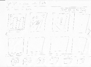
Design Idea 3: Publishing
This design focuses on publishing individual photos to the public, rather than sharing multiple photos among friends. As the result, viewing is focused on individual photos as well as featuring new and/or popular photos.
Storyboard | Visibility | Learnability | Efficiency | Errors |
|---|
  | Pro:
- More attention is given to share publicly, so there is less visibility on creating groups intentionally.
Con:
- For people who have specific group to share to, the button may not be as visible.
| Pro:
- Creating group/account management is traditionally on the top right corner, which is consistent
- Once clicked, creating new groups only consists of easy steps
Con:
- Requires recall rather than recognition for group creation
| Pro:
- Similarly, only simple steps are required to create group
Con:
- Creating multiple groups is not very efficient
| Pro:
- No interruption on viewing if accidentally clicked
Con:
- Requires looking through text carefully
|
| Pro:
- You can view similar groups easily.
Con: - You cannot see all the pictures in the group at once.
| Pro:
- There is a very clear upload button.
| Pro:
- Uploading is just a one click function which is very efficient.
Con: - Scrolling to different pictures in the group may be inefficient.
- Moving pictures around is also inefficient.
|
Pro:
- It is easy to reverse errors.
Con: - If you click on an album in similar groups, you might not remember where you came from.
|
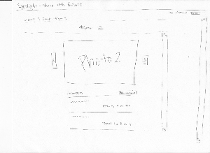
 | Pro:
- Image display is maximized to occupy most of the screen space. Putting the content front and center and very visible
Con:
- The large image size pushes the comments on the image further down. On small screen sizes the comments might be clipped completely and not be noticed by the userPro:
- Image display is maximized to occupy most of the screen space. Putting the content front and center and very visible
Con:
- The large image size pushes the comments on the image further down. On small screen sizes the comments might be clipped completely and not be noticed by the user
| Pro:
- The left and right image navigation buttons appear on hover over. The horizontal "film strip" analogy makes the transitions between images easy to understand
Con:
- A user who does not hover over the image would never see the left/right buttons appear. If the user gets into a paradigm of using the "back" button to go back to the album and find another image, he could he stuck using slow navigation and never discover the more direct navigation feature
| Pro:
- Having left/right buttons appear allow the user to navigate directly to the next or previous image. This allows immediate navigation to the next image on interest instead of having to return to the album each time.
- Since the view does not change when transitioning between each image, a user's spatial recognition is maintained and does not need to reorient when navigation between images.
| Con:
- Since the rest of the albums photo are not visible, a user might mistakenly navigate in the wrong direction when trying to find a photo. A mis-click on the image would confuse the user since there is no evidence to what direction the transition came from.
|