...
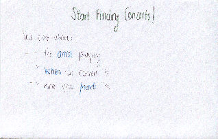
- single overarching visualization for bands
- user lands immediately on the band visualization
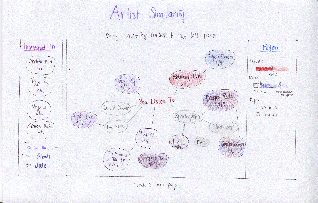
- artist page has visualizations about future prices and interested friends*
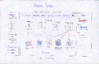
- friends page has visualizations about similarity*
- allows you to curate friends (subtask)*
LEARNABILITY:
- all the information neccessary is presented in the home page. All you do is find the visualization that you want (eg if you’re finding a concert click concert visualization, if you’re looking for a new artist, click artist visualization). The only thing that is neccessary to “learn” is that these visualizations exist, but seeing as this is the point of the website, it is safe to assume that the user realizes concertBOS has visualizations. It is also easy for the user to learn which visualizations exist, because they all appear in the same drop down menu
EFFICIENCY:
- ConcertBOS is very fast because almost all of the information is presented in the home page. The only thing that is necessary to do is click on the right visualization (so that you can find what you are looking for), then click on the band/concert/friend that you are interested in to go to their page. All the information about this band/concert/friend is listed on their page, so there should only be two pages that any user needs to visit (the home page, and the band/concert/friend which they are interested in).
Static Sidebar
Salient Features:
- One question page before you get visualized results
- Three main pages with visualizations: band cloud, calendar, friends multi-map
- All main pages have the same 2 sidebars: interested concerts, and filters (price and date)
- subpages have “details” instead of “filters”
Storyboard
Sparklepony starts by logging in with her Last.fm account.
She lands on a page that asks her what she's most interested in in a concert. She selects the "artist" option.
She's taken to a page that displays a graph of the artists she listens to on last.fm. Artists on tour have the date of their Boston concert displayed. Sliders on the right allow her to display information about the certain criteria (price, date, age restrictions) by coloring nodes on the graph. She drags several concerts she finds interesting to the sidebar.
She then notices that she can filter the selected concerts further by clicking the "explore these by friends" option at the bottom of the sidebar.
Errata
The coloring for date filtering isn't quite right. I'm bad at tinting properly.
Analyis
Learnability:
- Dragging has no affordances, so it’s initially difficult to discover that you can drag concerts to the left sidebar. There’s helpful text at the top of the screen that should ease this discovery.
- It may be initially unclear that you can progressively filter concerts through the “explore these further” option at the bottom of the sidebar
Efficiency
- easy progressive filtering allows you to maintain a single consistent list of interesting concerts
- prevents the user from flipping back and forth between interfaces to remember what they thought was interesting before
- possible to get from any one screen to another in at most 2 clicks (longest would be from an interface to a specific artist/venue page: visualization → concert → venue)
Safety
Any action is undoable. - dragging a concert onto the “interesting” list can be undone by dragging it back off
- dragging a concert off the “interesting” list is confirmed by a notice at the top of the list: “Removed <uninteresting concert> Undo”
- navigation errors can be undone with the back button (or by using on-screen navigation links)