...
Errata: The dot depicting how far she is along the process is supposed to be present in all frames, as are arrows to go back and forth, and a button to logout at any point in the top righthand corner.
Analysis
Learnability
- The use of a wizard makes selecting options simple
- Sentence by sentence navigation with options clearly underlined so that it is obvious they are linked, as well as words made into buttons make it clear based on past conventions that user can click on words. However, this assumes past knowledge.
- The use of popup directions help the user along.
- The design has some hidden features that the user may not pick up on immediately, such as an autocomplete bar that also has a button for inspiration on the side of top 5 hits based on their preferences.
Efficiency
- The use of a wizard can slow the user down, because it limits how many preferences they can indicate at any given point. If they change their mind, they also have to navigate back through the sequence, so this design sacrifices efficiency in favor of clearly limiting the amount of information that the user has to parse at any given screen.
- Features like autocompletion and intelligent suggestion of similar artists and highlighting of bands that are currently touring help increase efficiency in frame.
Safety
- As mentioned before, the wizard interface sets the user up so that if they want to change a preference, they may need to navigate backwards in order to change their preference during the search, which may be frustrating, so there is less safety in this regard.
Kitchen Sink
- single overarching visualization for bands
- user lands immediately on the band visualization
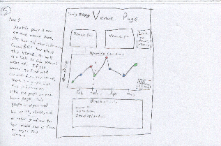
- artist page has visualizations about future prices and interested friends*
- friends page has visualizations about similarity*
- allows you to curate friends (subtask)*
LEARNABILITY:
- all the information neccessary is presented in the home page. All you do is find the visualization that you want (eg if you’re finding a concert click concert visualization, if you’re looking for a new artist, click artist visualization). The only thing that is neccessary to “learn” is that these visualizations exist, but seeing as this is the point of the website, it is safe to assume that the user realizes concertBOS has visualizations. It is also easy for the user to learn which visualizations exist, because they all appear in the same drop down menu
EFFICIENCY:
- ConcertBOS is very fast because almost all of the information is presented in the home page. The only thing that is necessary to do is click on the right visualization (so that you can find what you are looking for), then click on the band/concert/friend that you are interested in to go to their page. All the information about this band/concert/friend is listed on their page, so there should only be two pages that any user needs to visit (the home page, and the band/concert/friend which they are interested in).
SAFETY:
- The only thing that could be unsafe is if your preferences were changed somehow. But at every step of the way you can edit your prefrences. Also, by default your prefences come from last.fm, if everything is uploaded from last.fm automatically there is no way for the user to mess anything up
...
- Dragging has no affordances, so it’s initially difficult to discover that you can drag concerts to the left sidebar. There’s helpful text at the top of the screen that should ease this discovery.
- It may be initially unclear that you can progressively filter concerts through the “explore these further” option at the bottom of the sidebar
Efficiency
- easy progressive filtering allows you to maintain a single consistent list of interesting concerts
- prevents the user from flipping back and forth between interfaces to remember what they thought was interesting before
- possible to get from any one screen to another in at most 2 clicks (longest would be from an interface to a specific artist/venue page: visualization → concert → venue)
Safety
Any action is undoable. - dragging a concert onto the “interesting” list can be undone by dragging it back off
- dragging a concert off the “interesting” list is confirmed by a notice at the top of the list: “Removed <uninteresting concert> Undo”
- navigation errors can be undone with the back button (or by using on-screen navigation links)


